
Open
Set Subject
Prints. - Set Subject - Food.
*B Grade - Food
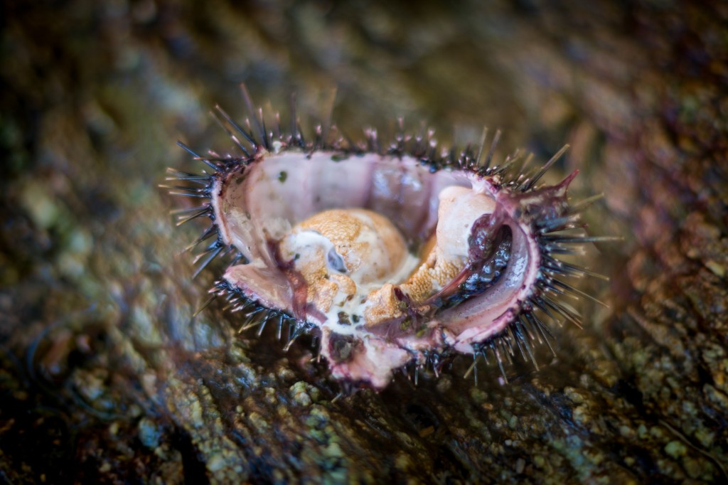
Kina. - I love the subtle colour tones of the blue/greens and mauves in this image of a kina. I don't consider the limited focus area a problem, as it has created a lovely soft background. With the ridges of the rock and a slight lean from upper left to the bottom right you have crafted a very nice image. Congratulations.
Honours.
*A Grade - Food
Afternoon Delight. - I find the direction of the lighting has left a shadowed area in the centre of the pomegranate and the spoon. Perhaps a reflector may have been a help. The position of every element of an image must contribute in food photography and be carefully arranged. I am not convinced the partial glass of wine is necessary in this image.
Not Accepted.
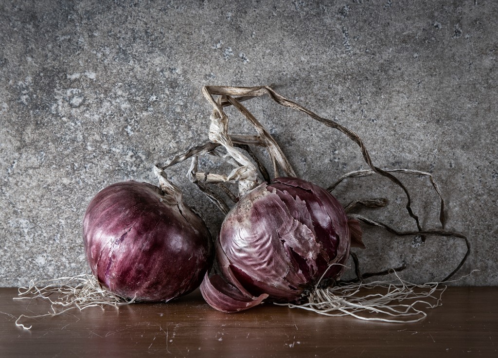
Chefs Best Friend. - The natural stone wall really complements the two red onions which are leaning nicely towards each other. Although there are only two onions, the image is balanced. I have enjoyed the red and grey tones and the complimentary textures you have arranged. I would be pleased to hang this image on my wall.
Honours.
Oranges In A golden Dish. - I personally feel the background is a little heavy and has overwhelmed the main subject. You have composed the oranges and leaves in the dish very artfully, and I think a more subtle background layer could result in a stronger image.
Accepted.
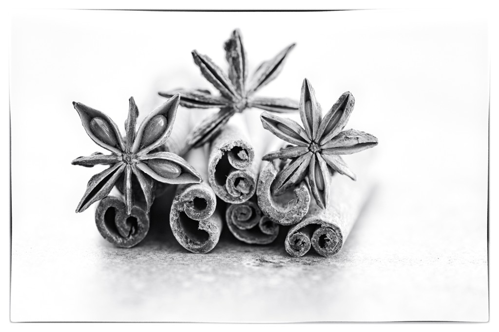
Spicy. - The white vignette helps to focus our attention on the arrangement. I like the placement of the left star anise with the large seeds. Keep an eye out for the small hairs, as I can see two on the cinnamon quills that could be removed if you print again.
Merit.
Prints. - Open
*B Grade - Open
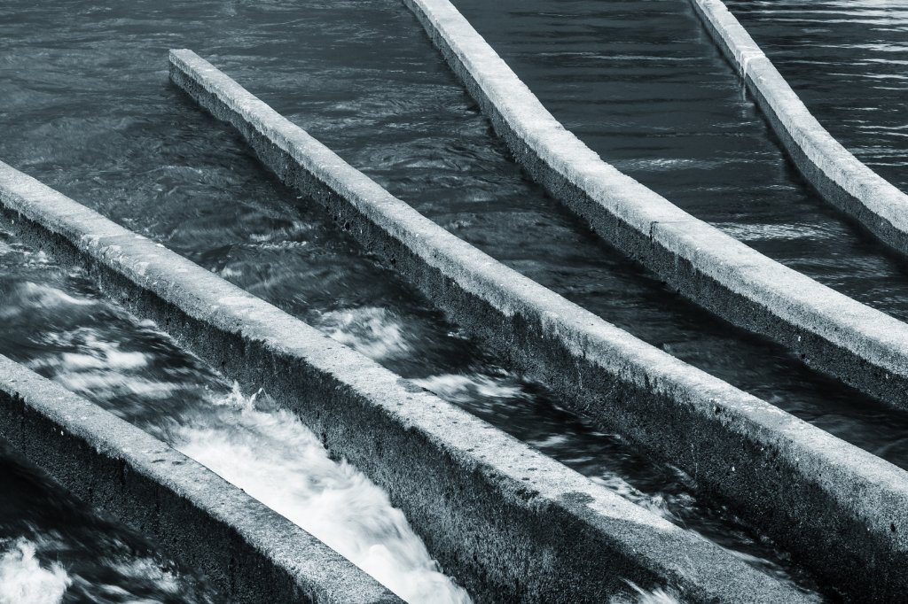
Channels. - You have a good eye for symmetry. You have arranged the angles well and created a well balanced image. It suits the black and white. Well seen.
Merit.
*A Grade - Open
Alpha Steel Wire Nails, - The blue tone works well against the browns, and the limited colour pallet suits the subject. Removing a few distractions to the left before taking the image may have helped to strengthen the composition.
Accepted.
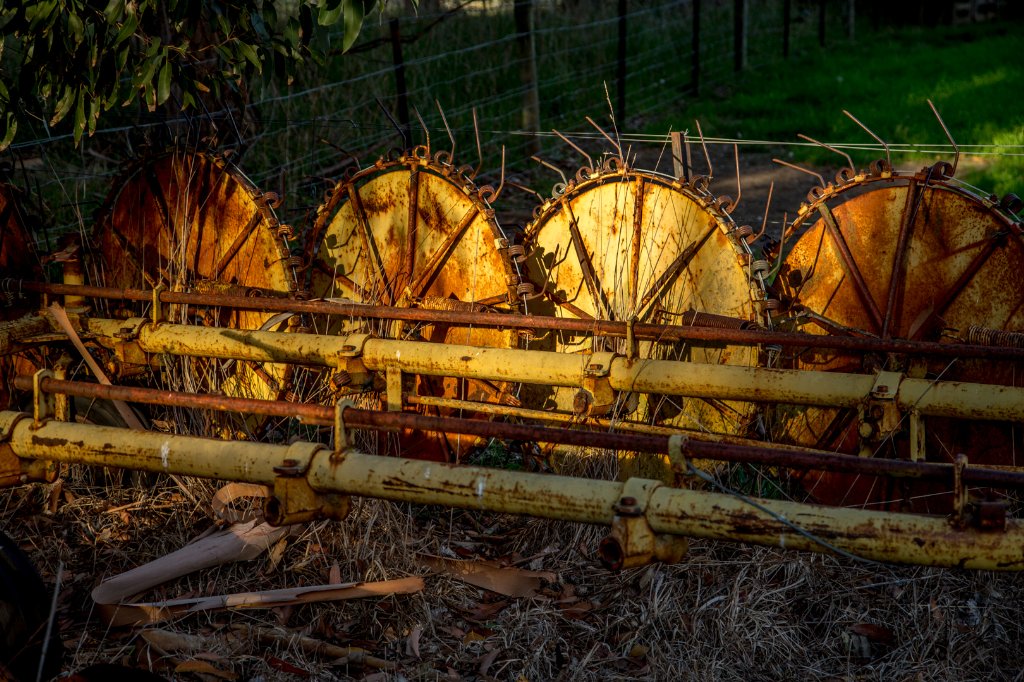
Dreaming Of Past Harvest. - I like the name of this image as it gives me an idea of what you were thinking. The soft evening glow enhances the rust and also helps tell the story. The vignette is dark but helps to disguise the distractions around the border .
Merit.
Evening Above The Taylor. - I have had this print sitting before me for several days considering my thoughts. I feel the strength is in the bottom half of the image with the strong golden light contrasting with the well defined shadow. The light just catching the line of trees angled towards the left bottom is lovely. In my opinion I feel the sky takes up a little too much space.
Accepted.
Digital - Set Subject - Food.
*C Grade - Food
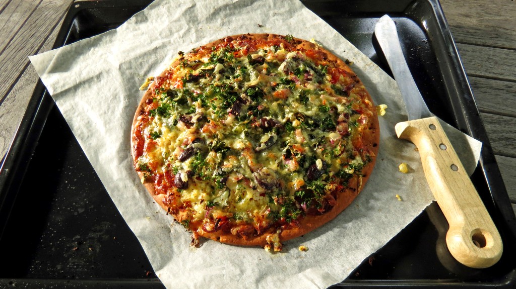
Pizza - I like the way you have composed this rustic image of the pizza and knife. The lighting is even, and it is a simple and effective image. Well done.
Merit.
Walnuts - A casual arrangement of some walnuts in the process of being shelled. The focus is sharp and I like the boards behind running on the angle. Think carefully about what you include in your image. Personally I would like to see the entire nut cracker, or maybe not include it at all.
Accepted.
*B Grade - Food
Posh Porridge Scotland - A nice view looking down directly onto the porridge. I find the surrounding elements distracting, as they are only partly in the frame and don't add to the overall effect.
Not Accepted
Dessert - I certainly hoped you shared this dessert with someone special! The plate is in a good position with a little more room to the right. I believe you may have taken this image in a restaurant in low light as I can see some noise, and I think it is not quite sharp. I would however like to eat it so that is the main test.
Accepted.
Garden Produce - I like your colour palette and the white plate against the dark background. I believe flash has created shadows, and also highlights on the avocado. In my opinion food photography is better tried in natural light, or with just a touch of fill in or bounced flash. Otherwise lighting can be uneven and shadows created. The avocado looks too dark and heavy in comparison to the other produce on the plate. Items that have similar tones are generally easier to work with.
Not Accepted.
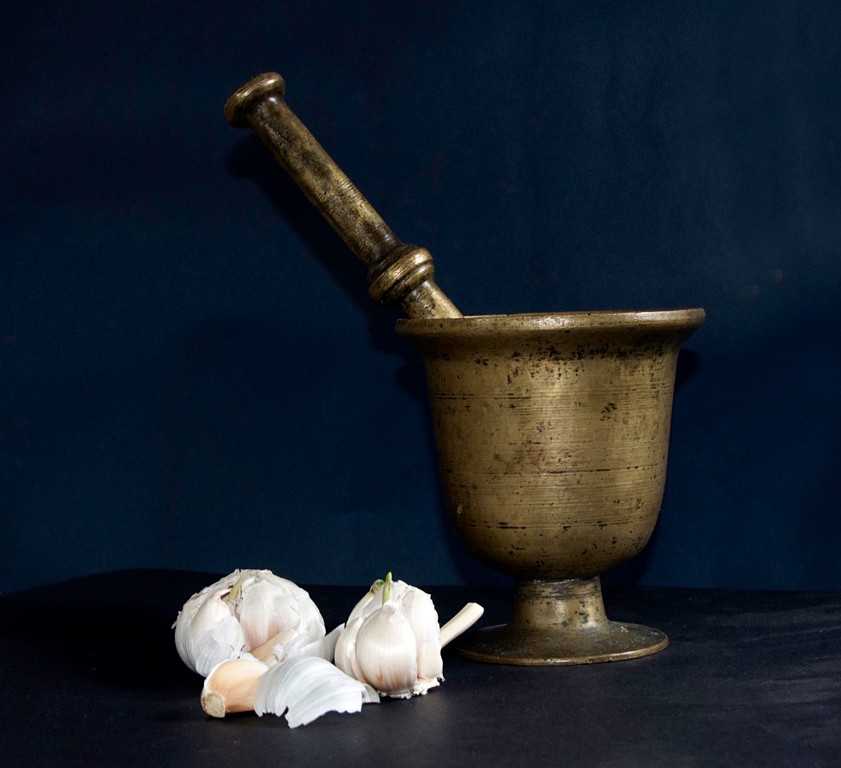
Garlic - A strong simple arrangement. I would like you to have straightened the top of the bowl as it is on a slight lean. there is just a hint of a background which supports the main subject. Well done.
Merit.
* A Grade - Food
A Tasty Morsel - I always miss these moments. The insect has added interest to your image. I can see noise on the birds breast and in the background, which in my opinion, may be due to high ISO or a tight crop.
Accepted.
Boosting the Flavour - An example of less is more. The golden grain contrasts with the black pan and background. I would suggest it would be better to clone out the handle, as the silver is touching the border and keeps drawing my eye out of the frame. If you burned the right side a little to even the background, you would have a very strong image. I would advise trying this image in another competition.
Acceptance.
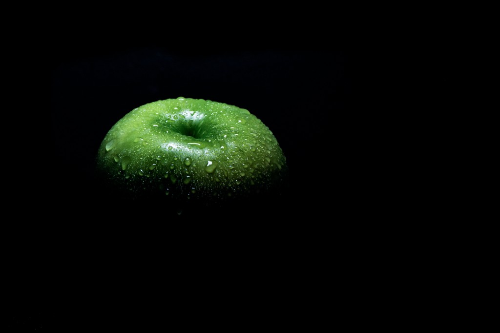
Green Apple - This simple image attracted me when I first viewed it. It is paired down to the essential elements of the image. I like that you have not added a white border to define the boundaries. A brave image and well done.
Honours.
Green Smoothie Goodness - The surface of the lemon has been overexposed, and I feel the ingredients are not arranged as well as they might be to showcase the image. I would like to see more depth of field, and the partial lemon on the left, either entirely in, or taken out of the image.
Not Accepted.
Homemade Lunch - I wouldn't mind this one for my lunch. The lighting is well directed and the colours are artfully arranged. I feel a little more room is needed in the front of the sandwich.
Accepted.
Persimmons - The 2 persimmons and the leaf are well positioned on the third. My eye keeps being distracted by the noisy and bright background, and I would have liked the lighting on the persimmons to be a little more even.
Not accepted
Summer Produce - The red, green and yellow are punchy and vibrant. I would like to see more separation between the subjects and the background, with your focus point more towards the front. This would put the greenery in better focus and make the background less defined. In my opinion the courgette is a 4th element which is not needed.
Not Accepted.
Wine and Grapes - A nicely composed image. The colour palette suits the three elements. I would like to see the background situated a little further back, as then it would add some colour without appearing so strong.
Accepted.
Woodhen latte - I appreciate the humour and I hope the Wood Hen didn't burn his tongue. In my opinion this image is not quite strong enough for an A grade competition entry. The head has a little movement, and an eye level image would be more appropriate.
Not Accepted.
Digital - Open
*C Grade - Open
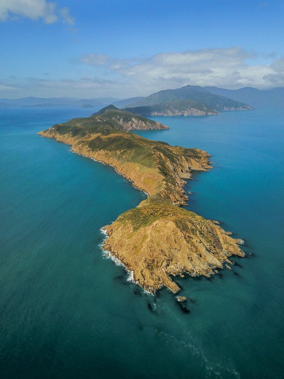
Cape Jackson Outer Sounds - This eye catching aerial view of the golden land against the blue sea, takes our eye on a journey from the tip of the land, to the distant mountains and then to the clouds and back again. Well done.
Merit
Like A sailing Ship - This image of a small island shows you have grasped the basics of composition. The small island is on the right third and although this rule can be broken, it is a good idea to use it in the beginning. It is exposed well.
Accepted.
*B Grade - Open
Vernon Station Cliffs - The leading line of the sea takes us into the image, then my eye wanders with no point of interest. On a grey day when the sky and sea are not adding interesting detail to your image, it may be better to concentrate on looking for subjects along the tide line, or there may be interesting detail in those cliffs.
Not Accepted.
*A Grade - Open
A Vino in the sun - The black and white treatment has turned this into a more graphic image. I feel you may have been better including the entire base of the glass, and the glass sits a little too far to the right. Perhaps another glass or two and a re enactment might be called for. Give me a call.
Not Accepted.
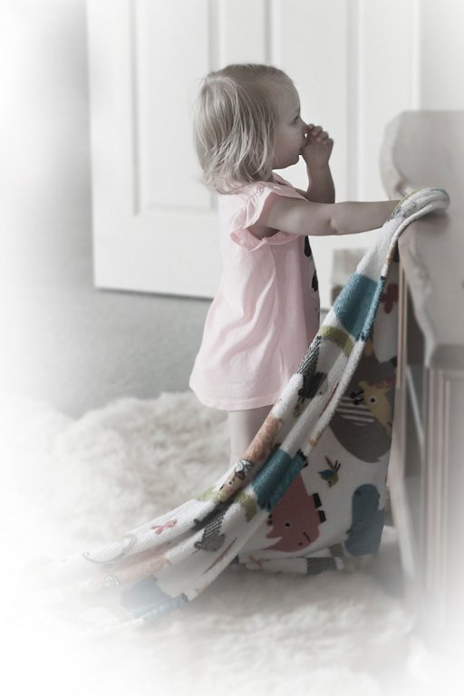
Focussed - I have thought long and hard about the space on the left of this image. My eye is always more comfortable with the left side being more occupied and space to the right. You probably had to work fast to capture this image of a little girl, and I will make a guess that she is contemplating herself in a mirror. I love the drape of the blanket and the soft white vignette which focuses our attention on the subject in this image and I do appreciate the image.
Merit.
Garden Nymph - I am finding that the white vignette is drawing too much attention away from the subject, and I am personally feeling the need to see at least part of the subjects face. In my opinion, the weight and size of the chair on the right, is a little heavy, and takes our attention away from the child.
Not Accepted.
Jetsam - This image of a rope covered in lichen is well balanced with the main interest in the bottom left third. The background is suitably out of focus and more muted in colouring. A little more contrast would make the yellows stand out more.
Accepted.
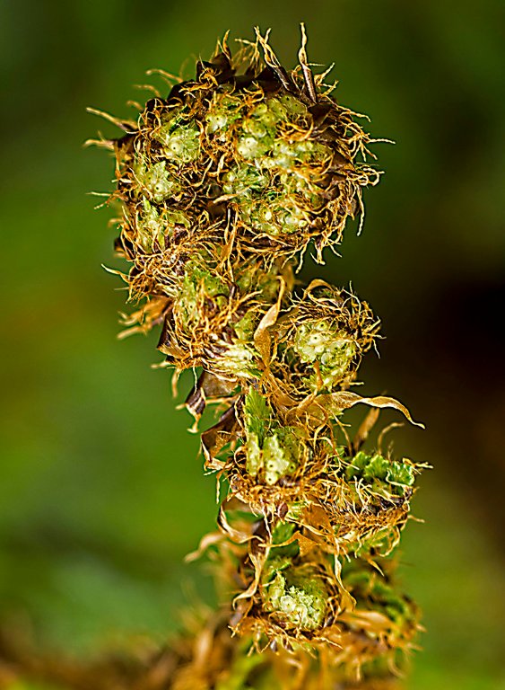
Koru - I think you have judged the lighting, contrast, and depth of field very well. The background is softly muted with no distractions and the s curve of the koru has a nice balance.
Merit.
Kowhai Bells - In my opinion this image has not translated well to black and white. It is under exposed and needs more contrast to showcase the Kowhai flowers.
Not accepted.
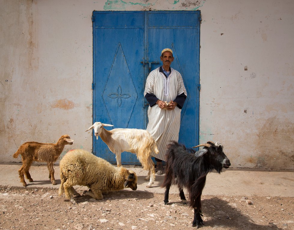
Worldly Goods - A well composed image and I like the quality of the light. The animals are well placed and separated. The man is framed by the blue door and placed just to the right of centre. The room to the right of the black goat balances the image well as our eye moves from left to right.
Honours.
Digital Of The Month - Green Apple. This stood out as a daring image to me. I think the lack of a frame around it was a good decision. It would look good my the wall.
Print of the Month - Kina. This was a difficult choice as the standard in the prints was high. Kina was of a very high standard for B grade however and won my vote.
Thank you again for the opportunity to judge this month's competition.
Irene Callaghan APSNZ.
Share:


