
Open


Set Subject


Judge’s Comments
Hi this is Ann Bastion and I’m your judge this month.
Thank you for allowing me view and asses your images, I will give you a brief outline of what I look for when assessing images.
For me the composition and crop of an image are the first things that I react to, and are as critical to an image as the technical competency used to create it. The opinions I express here are my own opinions and another judge might see it quite differently.
Botanical photography is different to landscape photography in respect of how you portray your subject. With landscape, you are usually trying to show us a beautiful vista. In Botanical photography it’s about featuring the plant, but some times not necessarily everything around it. There are several ways to approach this, one of which is to show us the plant in its environment. This requires a fairly good depth of field to encompass the environment yet still have the plant the main subject. Another is to take aspects of a plant up close and subdue the background into a soft blur that highlights the plant and doesn’t compete for attention. In this case you need to crop in close so it becomes all about the plant.
You will notice that I mention this several times throughout my assessments. It’s a suggestion for you to try and see what you think of the result.
You club brief was:
“This is your chance to photograph any plant life, flowers, roots, vegetables, leaf. But out of the constraints of Natural history, so you can be creative if you wish and change backgrounds. You may want to go macro and shoot just part of a leaf or flower.
So let’s get started:
Digital Images
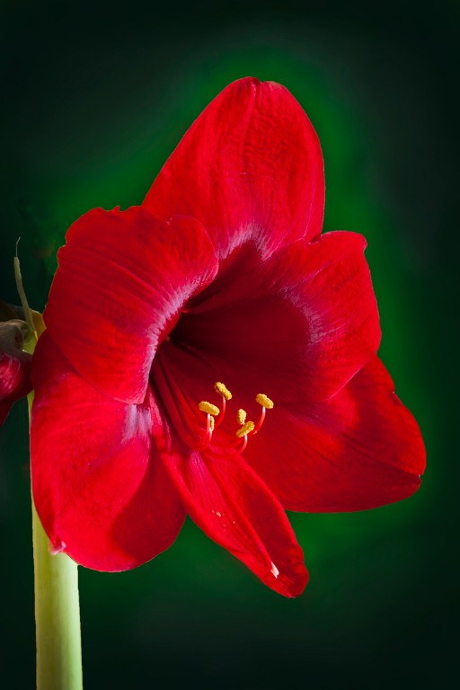
Amarillis
This has been beautifully exposed and the well-lit stamens are sharp forming a place for your eyes to rest on. The other petals of the flower are well defined and you can see the texture in them. A well chosen crop with nice pale complementing green colour framing the red of the bloom makes this a well deserved Honours . Well done.
Blue Clematis
You have done well by getting right up close into the centre of this Clematis. The composition is good and the square crop suits the subject well. When you are taking macro shots, the depth of field is very shallow and it is harder to get sharpness right through subjects that are deep rather than wide. In this image your depth of field plane has caught the outer stamen and petals but just misses the very centre. Next time, if you raise your F stop a little, you will have a better chance at getting the centre sharp as well. Good try.
Eddie's White Wonder Cornus
Well done in capturing this shot with such detail. The water drops are sharp and some even act like little magnifying glasses showing even more detail of the veins in the petals. This is an example of a shallow plane of focus e.g. square on to the camera and thus more is in focus. The only comment I would like to make is the bright green leaf in the top right is a bit distracting and would benefit from being toned down a bit and possibly the stalk is well. Nice position in the frame. Well done
Iris
You have good colour saturation and the composition is lovely. I especially like the angle of the green leaf forming a backdrop to the Iris. The camera has focused on the front petal instead of the centre stamen which has left the stamens out of focus and the fact that they are white means your eye gets drawn there only to find them unsharp. As I have mentioned previously when you have a deep subject you need to up your F stop if you want to get depth in focus. There is a counter argument to this though, and that is the distance your subject is from its background. If there is good distance between subject and background then you can use a higher F stop provided of course that the light allows it. If, however, your background is close to your subject a higher F stop will render your background sharper as well which is not always desirable. In this instance you will be forced to choose a lower F stop but you need to be precise where you focus e.g. the stamens or centre of interest of the subject, as there will be a limited plane of sharpness.
Ravaged beauty
A good effort with this image. The rose head has rich colours and is nicely lit giving emphasis to its beauty, the background is muted yet showing us other aspects of the rose, such as its leaves and buds. Your centre of focus is on the centre petals as it should be. The angle of the stem coming in from the side is pleasing as is the crop you have chosen, well done.
Autumn colours
You have taken a simple colourful image of autumn leaves and given it an artistic look that has a message of colour as opposed to form. It’s a celebration of colour and would look good on the wall in the right settings.
Alpine daisies
A well chosen depth of field focuses on the centre daisy as the subject rendering the rest soft, culminating in a muted background. The panorama crop is a nice ratio for hanging on the wall which this image is well suited for. Just be a bit aware of the edges when you compose your shots. Little things like the petals just protruding on the bottom left border and again on the right border could be cropped off or dulled down. This is just a personal suggestion but I would like to see a bit more vibrancy and exposure. Try it and see what you think.
Camellia seed Pod
This image shows us just what it’s like inside a camellia seed pod and is very informative. It is nicely sharp through all its depth whilst still having a muted background. Well done. I would like to suggest that you crop some off the left as it is superfluous to the subject which is the seed head. If you keep the same amount of space on the left as you have on the right it will be balanced.
Frozen bracken
Well seen and well exposed. I can clearly see the icicles like little crystals protruding all around. The dark muted background has set off the shapes of the icicles and fronds very well. Well done.
Ice Flower
well seen. Your composition is good with the angled position of the flowers. Considering the flowers were under the ice, the colours are still discernible. If there was any way you could have got some light through this ice it would have been a more vibrant image as the colours would come alive. Next time see if you can do this, you would be delighted at the difference to the image.
Last of Persimmon Fruit
A nice composition showing where the birds have had a feed. Good colours and backgrounds. Your image could be a little soft in areas, it looks like the camera has focused on the leaf at the top of the of the lower fruit and leaving the front of the lower persimmon and all of the back persimmon out of the plane of focus. In close up photography like this it’s critical where you have your point of focus.
Magnolia seed
This image has good colour saturation and separation from the background. Your camera has focused on a strip in the centre of the board the seed pod is sitting on leaving most of the seed unfocused. I find my eyes searching around for something sharp on the seed to focus on but there isn’t anywhere. I would like to suggest that the seed be turned to lie horizontal on the board which would give a better chance of being sharp as it is parallel to the camera and thus not as deep to focus on. A tighter crop may also have helped this image. If you can do it again why not give it a try.
Spring is coming 1
A nice composition with complimentary colours. Flowers are sharp, although you have quite a lot of haloing around your flowers and leaves. This can be caused by pushing your post processing too far. It is quite distracting. It is something one needs to be aware of and look out for.
Summers beauty
This has been well handled and well captured showing the vibrant centre colours and detailing on the petals. The background colours complement the composition and the crop is well chosen. Just watch that bright stalk in the bottom right corner. Well done
Tree felled by Beavers
This is an image that would be unique to many New Zealand photographers. You have chosen a good angle to show us the rows of teeth marks. Your image also shows us the natural surroundings of the subject. I feel the image could benefit from a reduction in highlights to bring back a bit of texture in the bark as well as a bit more clarity to show up the texture on the teeth marks more.
Tulips from Amsterdam
I know they look like tulips but they are actually wood. I’m sorry but I think you should have entered this in open. Although I can’t accept it as it is not “Botany” I will critique it regardless. I like the shot, it is well exposed, colourful and the position of the notice is well placed in the frame. I would have liked to see a bit more on the left side to get a feel of the scene. It looks like an intriguing little shop with real flowers and knickknacks.
Bush track
You have achieved a lovely soft sumptuous feel with this image that pulls me into it, wanting to be walking in there. The only thing I would like to suggest is that you crop off the second track on the right to about half way between the edge and the tree this would leave the path coming in from the bottom right and removes the area distracting me on that side of the tree. Well done
moss and Fern
there is good saturation in this image and the composition matches the title. You have done well to capture this moss with some detail, and I can discern the Fern in the background. I know I seem to harp on about cropping but removing unnecessary areas makes the subject bigger in the frame. You might like to crop off some of the top and bottom of this and a bit on the sides. Doing this will hone in on the moss while still seeing enough of the Fern to represent the title.
Agapantha
There is good saturation and colour rendition here, and the angle you have taken this is pleasing. The black stamens draw your eye and the forward ones are sharp enough to give a place to rest your eye. I find the bud on the right which is also dark and somewhat sharp, a bit distracting drawing my eye between the two points of interest. I feel you have two images here. Try cropping off the bud on the right and making the flower a square crop. A slide up of the clarity slider would also help this image.
Alpine Anemone
Here we have an example of a botanical specimen in its environment, which is the ground. You have chosen quite a nice angle to take this shot getting the stamens and back petal sharp which shows off the fragility of these petals nicely. The fluffy stem is also well presented giving us good information of the growth and habitat of this anemone.
Alstroemeria
This high key artistic approach is etherial and has a light feel to it. The essentials like the stamens and centre colours are defined. The image then fades out quite quickly leaving a lot of white. I feel a lot of that white could be removed by cropping off the left up to the leaf and all of the other side just coming into touch the edges of the petals where there is still some colour. This would define your image more and give it a bit more life, as at present I feel it is almost lost in a sea of white which is washing it out. Just a suggestion, try it and see.
Autumn quince
You have captured well the quince with all its wrinkly skin which is well defined. It is well exposed and has a well-defined reflection. There is only one small thing that would balance it better and that is if you were to remove some off the left side and bring the quince into the centre of the frame. Well done.
Blue berries
I like the angle of the subject in the frame. The back ground has toning blues and greens which sit well with the subject. Again, this has been taken square on to the camera giving better chance of a good depth of field. I find the big patch of background on the left distracting from the main subject which is the berries. If you were to crop it off you would have a stronger image. Your image is also a bit dark I would like to suggest moving the black slider forward to reduce some of the black and open it out more as well as some more clarity try this and see what you think.
Cut flower by window
Your camera has focused on the back petal capturing the nice colours, leaving the stamens undefined. You have chosen a difficult angle to shoot this image from which leaves big areas down the throat out of focus. I do not know what is in the background but the dashes are quite distracting. I would like to suggest you crop hard around the flower incorporating just a bit of the green leaves below, removing most of that background. This will bring your attention back to the flower itself.
Different view
You have a shallow depth of field which has blurred out your background nicely. There is not a lot of detail in the white flowers which could be a result of the aperture you have chosen or simply because it was a bright day. White is a very hard colour to capture detail with in those conditions. A crop to just enclose the flowers would have helped also. If you are trying to show a subject in its environment then your background becomes part of that image. But, if you are showing us the flowers with background muted then crop around the flowers and truly make them the dominant subject.
Elegance
Beautifully captured and presented. There are several elements in the composition of this image that work to pull it all together. 1 the triangle formed with the leaves 2 the soft curve of the flower just resting on the leaf 3 the detail and rich colours in the flower with the less detailed leaves give emphasis to the flower 4 the chosen frame compliments the contents which fit snugly within. This has become a piece of art.
Ethereal tulip
Here we have another artistic image which has been well crafted. There is a lovely soft S shape which sits well proportioned within its frame. The texture overlay is a nice touch and gives it that extra bit of individuality. The vignette also aids to keep your eye into the image.
Frosted hydrangea
I think the frost has begun to melt, however you have captured some nice light across the centre row of flowerets. The others further back do not have the same moisture on them and are out of the range of focus. This creates a natural border giving more emphasis to the centre row where all the attention should be. It’s good to see the darkened area on the bottom which holds your eye on the centre. I would like to suggest the top right corner be darkened off as well because it is very bright and distracting.
Go lovely rose
Soft and velvety is my first impression. The softened defocused outer petals draw me into the deep velvet centre of the rows where they cumulate in a spiral of sharper edges. The centre of the rose is well positioned on the top left one third intersection. The image has good light and saturation. Well done
Kowaowao Fern
Well composed with the midrib of the leaf echoed by the curve of the aerial root to its right. The saturation is good and the leaf detail is well defined.
Kowhai
This composition is softly curving and supportive of the yellow kowhai flowers in the middle. The curve coming in from the top one third exiting on the opposite bottom one third is very compelling. The beautifully muted background compliments and supports the subject well. The only thing I would like to see is a bit of a slide up in the clarity to define the flowers a bit more. Well done.
Lancewood
This image has jumped out to me with all its contrast colours and radiating lines. I find my eyes being pulled around in all directions by the yellow lines, a bit like Star Wars. I would like to suggest you find a view to shoot from where there is a more isolated leaf and less Chaos around it. This would create a more peaceful view of aspects of the Lancewood.
Life's Beginning
It’s fascinating to see these fronds pop-up and unfurl. While you have shown me the furled frond, there is not a defined area of focus which is sharp. Perhaps if you were to try getting down lower and closer to the centre of the furl and making sure it is in focus, it would make a more interesting image.
Mountain Gentian
Here we have another plant in its natural habitat. It is clear that it lives and flowers in between rocks and scoria. While parts of the flower are clear and in good light, there is a shadow cast over the other side which detracts from the bloom. Perhaps next time you could use a reflector to reflect light into the shadow side. Composition is nice but I would like to suggest a slight crop off the right to put the flower on the top one third also a bit cropped off the top that isn’t needed, this would help tighten the image up and balance it better
Nikau
This image has good saturation and composition. The portrait crop chosen shows off the repetition of the bands in the bark and one can clearly see the little areas of scarring. The square on angle of the shot has enabled you to get good sharpness across this image. A nudge of the clarity slider would also help define the scar bands which are the result of growing stages where there used to be leaves.
Poplars
This stand of poplar tree trunks is a good example of the gnarly way in which these trees grow. It is showing the bark detail and scraggy lower branches. The image is quite dark and I would like to suggest the shadows be opened out a bit. I also feel a crop off each side to tighten up the image would be of benefit.
Pussy willow
Nice light with the bright blue sky sets this capture off well. I would like to suggest you crop closer into the subject by bringing the left side into the upright bud, and the top down to the top of the cloud which compliments the fluffy pussy willow with its fluffiness. This eliminates unnecessary background focusing more on the subject.
Sparkling sundew
It’s good that you have got down low to capture this image which has put it on a parallel plain to your lens, thus offering you the best chance of getting good detail. You have captured well the little water droplets on each little tentacle. Nicely composed with blurred background which emphasises the little droplets of water.
Beauty of St Bathans
This looks like a nice place to be on a sunny day. Exposure has been well handled. Image is rich in colour and nicely sharp.
Coast bush walk
A scene familiar to most of us, a place of tranquillity and calm. I feel this image might have been over sharpened making it less restful to the eye. If you were to pull back the clarity slider a bit it would make your image softer to the eye with better colour control. I note the trampers are walking out of the frame and would like to suggest that if you were to move back down the track a bit, then you would capture the walkers in the distance before they started to walk out of the frame. I feel this would produce a stronger image.
Crossover
Excellent choice of crop. You have captured well the path of the planes and the soft curves they have created. The planes have been captured just at the right moment and the fluffy clouds complement the scene well. Good saturation and well handled. Well done.
Feed me
An apt title for this image. A good action shot showing typical behaviour of a juvenile waiting to be fed. It’s good to see inside the mouth and the bits of stuff caught on the beak. The eye has catch lights. I feel the image is a bit soft and could do with a bit of clarity and the amount of background could be reduced by cropping in the sides. This would make it less distracting.
Helga
I am taking a punt that this is a husky. What compelling eyes, they draw me right in and hold me in there. The blue background saturates them even more. Helga looks as though she might have been playing in the snow with the odd splotch showing on her fur. Her muzzle is a bit soft but those eyes are so compelling one doesn’t really notice much else.
King of the jungle
Somehow, I don’t think he is in the jungle as there appears to be very geometric shapes in the background. You have managed to get a good close head shot showing his tangled main. A push to the right of the clarity slider would give the image a bit more punch, try it and see what you think. There are grey areas covering the top bottom and sides of the image which look like you have focused through the wires. These are quite distracting and I would like to suggest you put a vignette over them which might help.
New Zealand Falcon
What a fabulous headshot of this bird. You have great feather detail and the beak is sharp showing us all the bits stuck on it. The eye is sharp with catch lights and what a great view of its nostrils. A well deserved honours.
Prints
Chalky tulips
I have come back to this image several times trying to make a decision. Whilst I love the treatment, the colours and the proportions, there are a couple of aspects that bother me. One is the large pink smudge around the middle tulip, and the other is the little tip of a leaf at the bottom between the third and fourth tulips which could so easily have been removed. I am feeling that I want to pull the bottom crop down to include just a bit more of the leaves to give a bit of weight to the bottom, but also realise that to do so, would unbalance the proportions you have. The bee is a nice touch. Coming back to the pink smudge, I have noticed other small areas of pink smudges which have distracted me from enjoying the image to its fullest.
Elegant
The choice of black matting was good and complements the colours of your print. The print appears to be nice and sharp on the seed head. Your soft background compliments the seed head giving it the main focus of attention. I feel however that it is a bit lost size wise. I would like to suggest that you crop about one third off the bottom and if possible add some more to the top if there is more in your original image to get this from. This will stop the head looking cramped at the top and remove the bright background at the bottom.
Empty seed case
I like the proportions of your mat which offsets your image nicely. The mat is so important to the overall presentation. Good choice of crop with just enough space around the seed head to give it space without being dominant. Depth of field is just enough to show the structure of the little pods that held the seeds. It’s good to see the fine hairs and details of the spikes as well. Well done
Grass weed
The lovely soft muted colours are the prevailing attraction of this image. Here we have an image without an area of sharpness which is exactly what this image is about. Soft impressions of shapes blending to create an impression of the form. The only thing I would do is to perhaps crop off half the distance from the left edge to the edge of the seed head. This would take the seed off the centre yet retaining space for it to sit in to the right.
Flax seed pods
I would say that the flax seed pods take second place to the spider’s web which is what catches my eye first. The pods are simply a means of support. The web is intact and positioned well in the frame. Nicely sharp with lovely background complementing the scene. Here I go again but I would be inclined to crop this into a square. A circle within a square is quite a strong shape.
Orange flower
Very creative and nicely done. There has been a lot of thought put into this. You have offset the geometric shapes of the fruit petals and single straight chive down the centre, with the softer lines of the other chives. The lovely detail of the dried tie on the bottom of the bunch ties it all together in more than a literal way. I find the background just a bit dominant with areas almost melding in with the subject. This would also look stunning on a plain white background.
Seasonal changes
I like your concept and the Panoramic crop you have chosen is good. It is a shame that pine tree had to be growing right in the middle of the row of trees. I am wondering whether you could have moved more to the right and taken the shot at an angle just missing that pine tree would have produced a different outcome, and perhaps give a simpler cleaner image. Good colour in the sky.
Viking
I think the black-and-white is a good choice which suits the cold desolate era of your subject. The barren rocky background also adds to the feel of the scene. Exposure has been well handled with a good range of black through to white and lots of nice sharp details, especially the hair. Composition and crop are good but watch the shoulder in the left corner as it has become large on account of it being closest to the lens. It’s also very bright. I would like to suggest you tone this down as it is very distracting.
Waiting for attention
This car looks like it has been waiting for a long time. Good choice to go black-and-white as it evens out the multiple colours leaving just the car as the main point of attention. The black-and-white has been well done showing the varying shades of corrugated iron stacked down the side of the car and reflections in the window. Everywhere you look there are pine needles piling up to add to the story of a car waiting to be attended to. The spade is a nice touch, sort of hinting that if it’s not attended to soon, it will need to be dug out. Well done on your composition.
My choice for best Print is: “Waiting for attention”
My choice for best Digital is: “Elegance”
Share:


