
Open


Set Subject


Judge: Tracey Scott FNZIPP, FPSNZ, AFIAP
C GRADE SET SUBJECT DIGITAL
MINE – MERIT a lovely moment between the cat and its owner, excellent choice of angle and good harmonising colour palette, if you had cleaned up the distracting elements in the back ground this would have been an honours. Well done
DEVOURING A POSSUM CARCASS – ACCEPTED well done on capturing this bird in the process of eating the possum they so often fly off as soon as you stop or pull out a camera. Just found the background a bit over powering the shadows a little clogged up but the light on the right side of the bird gives wonderful detail. Keep at it good attempt.
GREEDY GOLD MINES VERSUS NATURAL BEAUTY – NOT ACCEPTED I can see where you were going with this concept but unfortunately for me the who image is over shadowed by the red lines, it actually cuts the whole image into two and because red is such a dominant colour it’s hard to look past them. If you have more shots taken at the same time you may be better cropping them and presenting them as two images side by side or even a tryptic.
The image is sharp and well exposed which is not always easy with aerial imagery.
C GRADE OPEN DIGITAL
A CLUSTER OF HOUSES – HONOURS well seen by the author and interesting image that I just want to keep exploring. You have managed to crop well especially at the top where you have kept the two white houses equally intact.
ABANDONED BOAT – ACCEPTED the reds and greens work well together, the grey washed out sky didn’t add to the image and I would like to have seen a little more space around the boat to give context as to where it was. But in saying that you have managed to keep the background clean and tidy of other distractions.
B GRADE OPEN DIGITAL
ANTARTIC ICEBERGS – MERIT You have chosen well this is an impressive shaped iceberg, would like to have seen perhaps a slower shutter speed to smooth out the water a bit as it is competing for attention in all that texture in the foreground. I do understand that’s not always possible so perhaps in post-production as this was not a nature competition. You have managed well in not blowing out the high lights and keeping details in the shadows.
HIGH COUNTRY – HONOURS a well-crafted Image from the camera position giving us those wonderful leading lines to the waves of light on the central hill tops, the brooding sky and the dark mountains, giving us foreground, middle ground and a back ground. Finished off with a wonderful simple focal point in the road sign that helps lead us thru the image, great colour palette. Well done
NW PASSAGE GRAVES CANADA – MERIT I’m sure it was a very moving moment standing seeing this for the first time, there is some compositional elements that work well such as the diagonal line of the tombstones drawing us into the Image but after that I feel I’m left wanting more. Perhaps even taken showing more space around them may have added to the sense of how few and how small they are in such a harsh wilderness, just needs a little more drama to take it to the next level.
SETTING SUN – MERIT – The sun is well framed between the clouds and the trees could have done with trees going all the way to the right to add to the symmetry and balance. A little darkening along the top edge would have helped to accentuate the sun’s rays also. Beautiful fiery colours.
WINTER IS COMING CENTRAL OTAGO – ACCEPTED Good detail and texture, but the lighting is flat, and its lacking strong compositional lines to draw me in and also lacking a strong focal point, my eye is skimming all over the Image and I am left wondering what it is the photographer wanted me to look at. Pleasant colour palette of muted browns and greens gives a restful feel to the Image
A GRADE SET SUBJECT DIGITAL
7 DEADLY SINS – HONOURS – A well planned out and executed Image, showing the viewer the author’s concept in a very clear way. Excellent work
DOGGIE ENVY – NOT ACCEPTED I looked at this Image for a long time and was still left confused. The set subject is seven deadly sins and I’m not sure why they are in heaven?? Or what their sin is?? There is some attempt at composition with the eye being led from the dog in front to the little one behind but then the dogs face in front is half covered in material and on the top right there seems to some attempt to clone something in or out and it has left an unresolved area.
I did however enjoy the expression on the smaller dogs face.
ENVY 1 & 39 IVE BEEN WORKING TOO BOSS – NOT ACCEPTED well exposed Image but this is another Image I was left feeling somewhat confused about. I’m not getting a sense of eny from the Image. It feels like a snap shot where the man looks almost surprised as he looks up, no connection between the dog and his master. Well framed.
GREED – HONOURS. Another excellent Image, The author has taken the time to think of a concept to illustrate one of the seven sins then carefully craft that concept into an image, very simple yet very effective. Well done
LIVID – ACCEPTED this is an example where attention to detail can make or break an Image.
I enjoyed the concept of anger. The Image is sharp and very well exposed contains all the details in the whites and the blacks. And I thought that the use of desaturating everything except the bird’s beak and legs worked well to keep our focus on the bird. Unfortunately when you use this treatment you need to pay great attention to detail and at a grade I was disappointed to see touches of Green where the bird’s feet met the grass.
LUST – ACCEPTED The Image is sharp and well exposed , but as this is entered into an open section here and not a pure nature I felt more could have been done to correct the shadows and bright areas such as the bright light rock directly above them which takes far too much of my attention.
Good catch lights in the eyes.
NATIONAL PRIDE – ACCEPTED well exposed Image, be careful with vertical lines at the edges of frames i.e. the window frames here are not straight. Also be very careful of objects that get cut off by the edge of the frame as her flag pole does. It can draw the viewer’s eye out of the frame. But the diagonal line of the pole does help to lead our eye thru the Image. The use of a shallow depth of field would have helped to separate your focal point (The flag bearer) from the people behind.
PRIDE IN WORK – ACCEPTED A clean simple Image, The man is well placed within the frame with few distractions other than the red thing on the ground at his feet, try cloning it out. Would have been nice to see the reflection of his face in the paint work and not just his shirt. Otherwise well exposed.
WRATHFUL MURDER – ACCEPTED A great idea and you have put a lot of work into creating the Image which you must be commended for. I just felt the large white? What looks like a paper towel? cuts off the diagonal flow of the composition, just more leaves would have worked better as it stands my eye is jumping from the feet to the paper towel and back such a shame as this could have scored a great deal higher. I’d like to suggest you go back and re shoot it without the paper towel
A GRADE OPEN DIGITAL
AUTUMN GOLD – HONOURS Great Image very simple fresh and inviting. If I had to be picky I’d suggest removing the yellow post to the left but it’s still a very lovely Image with it in. well seen and well captured.
BLUE FUNGUS 2 – HONOURS Simple clean Image well placed well exposed. Well done
BUSH SCENE 2 – ACCEPTED This Image contains a wealth of very beautiful textures. I found the composition a bit lacking my eye starts to get led in then stops at the flax bush which is a strong focal point. I’d like to have been led into the image with stronger line like a natural pathway. Just needed a little more mystery or another element to hold my attention longer.
Well exposed.
CIRCLE OF LIGHT – NOT ACCEPTED an example of a great concept and not so great execution.
I’m not sure if it’s the post production technique used but the image felt un sharp all over. There were also small details close to the edges that drew too much attention from the patterns of the lights. I.e. The cord and black u shape at the top of the frame and the high lights on the tiles at the edges of the frame. This Image has so much potential, it was a well seen composition it just needs some retouching and sharpening to bring it up to its full potential.
LOOKING WEST – ACCEPTED the line of the road leads my eye into the frame well but from am left wondering what it was the author wanted me to look at??? Landscape photography is about light of which there is some nice light to the left coming thru the trees. It is also about foreground which this Image has with the road, Middle ground, this is where it begins to get let down by cows growing out of trees. And back ground which we can see very little of.
Perhaps the real Image was more to your left and that beautiful light in the trees. ?
DAUGHTER – ACCEPTED getting the mother to lie down next to her child has worked well to minimise the size difference and to bring them closer. The mother looks happy but I’m not so convinced by the child’s expression. Be aware of blown out highlights in the hair and heavy vignette won’t fix it, instead try using a white shower curtain over the window to diffuse the light. Good use of black and white to minimise distractions.
SEEN BETTER DAYS – MERIT wonderfully lit, compositionally speaking ‘m not so sure the bottom half of the image adds a lot. Great texture and detail
THE AUTUMN ROAD – ACCEPTED the eye is lead nicely through the Image by the winding road. The flat grey sky adds nothing to Image so I’d suggest cropping it out and I’d consider a tidy up of the grass on the road and patches in the grass in the foreground as they are drawing unwanted attention. Great colours in the trees
WINTER BLUE HOUR HAVELOCK MARINA – HONOURS the boats have been well placed within the frame to draw the viewers eye along the line, great mood light in the mist and the blue tones add to the feeling of a cold quiet time. If I had to nit-pick I’d suggest you desaturate the yellow at the side of the second boat in. well seen and well captured.
A GRADE SET SUBJECT PRINT
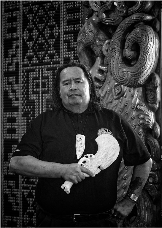
PRIDE – MERIT a good black and white portrait of a very proud man. The main feature of any portrait is the persons face; the other important elements are his surroundings and possessions. These help to tell the story of who this person is and in this instance they have been included to help tell that story.
Just be aware of the small details, ask him to lower his arm a touch to give separation between his bone Patu and the logo on his shirt.
Also if you had turned him slightly more to the right it could have given more shape and mouldings to his face and softened the light.
Also try darkening done some of the elements that are not important such as his belt buckle and his watch. The carving and Tukutuku panels add well to the story and it’s good to see you have kept the vertical lines close to the left side straight.
A GRADE OPEN PRINT
AUGERS – MERIT Good mood lighting and good use of a repetitive shape to give a sense of pattern and design. Just needs another element to take it into honours. A distinct focal point as it is my eye wanders pleasantly over the image but doesn’t settle anywhere in particular.
AURIPO ROAD – MERIT The letter boxes act as a good strong focal point and the road works well to draw us thru the rest of the Image. The lighting is a little severe with shadows that are a bit blocked up and highlights a bit too bright but other than that a very pleasing landscape telling the story of a rather isolated existence.
BEACH PROMENADE – ACCEPTED A very attractive model on a deserted beach in what looks like cold bleak conditions. This is another instance where the models pose and expression don’t match the scene or location and making it difficult for me to be drawn into a believable story.
The model is well exposed and sharp but the sky and light are rather flat and washed out.
It does have some merits but you need to ask yourself what story I am trying to portray to the viewer.
GEORGIA – MERIT – Excellent choice of paper for the subject the matt paper adds to the art quality of the Image. I like your choice of model she is edgy as is the setting, what lets it down for me is the pose and expression she looks less than impressed like why am I standing in a pond and that’s a good question? Why is she standing in a pond? If you are going to get a model into a site like this it needs to look believable like she is wading out to drown herself or going for a quite swim on a warm summers day something but I don’t know anyone that would wade out and stand around with their hand on hip. That aside it is a very good attempt at pushing boundaries and you have succeeded in all but her expression and pose. Keep experimenting.
MIRAGE – HONOURS A wonderfully creative take on a tourist shot that has been done countless times before. Well seen, well captured and ex post production.
PREHISTORIC – MERIT Stunning detail in the lizard’s body and eye, great colour palette, would like to have seen the background darkened more to help him stand out and to get rid of some of the noise. also found the crop a bit tight at the bottom. But nice vertical lines carry us through the Image and his head makes a good strong focal point.
THE EREWHON CLYDESDALES – MERIT a well composed Image with good detail all the way through the image. A slightly lower angle could have helped separate the horses from the trees and a little more to the right and you would have been able to give separation between the right front horse and the back left horses head.
Good tonal range and good lighting.
Share:


