
Open

Set Subject


Judge: Neil Gordon APSNZ
|
Title |
Media |
Grades |
Subject |
NA |
A |
M |
H |
Comments |
|
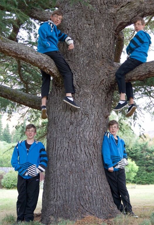
A foursome |
Digital Image |
C |
Set Subject |
|
|
M |
|
Very clever to do a multiple exposure for four different poses of the boy – unless these are quads of course! Exposure on them is good, but I did find the bright background a little distracting – the image would work better for me if there was a narrower depth of field and not such a bright background. Well done. |
|
Liquid assets |
Digital Image |
C |
Set Subject |
|
A |
|
|
I always like a good title, and this one made me smile. That’s a lot of wine (I assume) maturing nicely in this wonderful cellar, complete with identifying numbers on the barrels. It’s always a bit tricky composing shots in a situation like this – do you go for wide angle to include as much as possible? Or focus in on some of the barrels? Use a small or large depth of field? In this case the wide angle does show us the details of the cellar but then that risks becoming the subject, rather than the barrels themselves, as the brickwork is quite bright by comparison with most of the barrels. I suspect that a flash was used here, because the close barrels are much brighter than the far ones. An alternative approach might be to use a tripod and a slower shutter speed so that the lighting is uniform throughout. With the image as is, it might be worth darkening the brickwork to put more focus on the barrels, and also darkening or cloning out the barrels in the bottom right corner which I find quite bright and distracting presumably because they were closest to the flash. I hope the photographer and others find my longer comments on this image helpful – thanks for submitting it, because it raises many interesting issues about choices a photographer needs to make! |
|
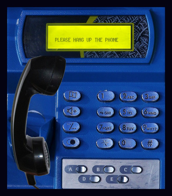
Numbers - Don't Call Me |
Digital Image |
C |
Set Subject |
|
|
M |
|
A very graphic image that reminds me of the old days before everyone had cellphones and you needed to find a payphone to call someone. The handpiece looks like it may have been added in, and this is been quite well done because it appears closer to me as if I could grab it. The yellow colour complements the blue well. Quite effective. |
|
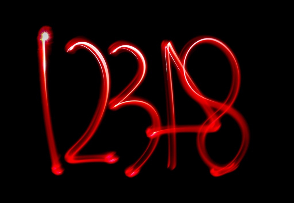
Out At Night |
Digital Image |
C |
Set Subject |
|
|
|
H |
A very graphic image which I’m guessing was produced using light trails with a torch. Not sure why the 4 is back to front, and why we then skip to 8, but in some ways that adds some interest to the image since it made me curious! Exposure, composition, and sharpness all look good. |
|
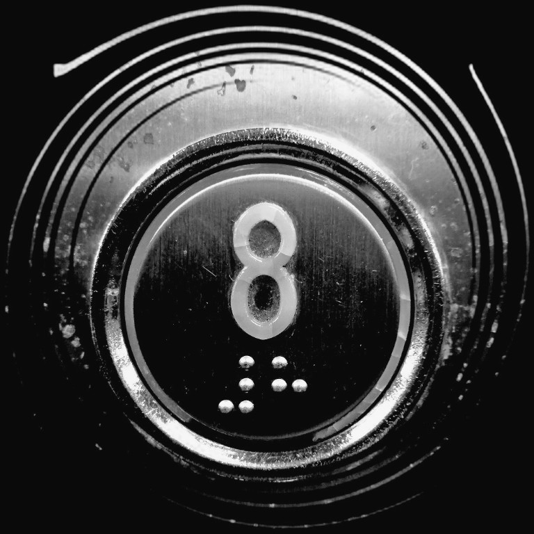
Press this button for 8th floor! |
Digital Image |
C |
Set Subject |
|
|
M |
|
Now this button looks worse for wear, with some kind of expanding spring around it (why?). I like the attention that has been paid to just keep it within the frame. It took me a while to realise that the bright dots below the 8 are actually Braille – for “.#8”. The image is quite high contrast and I wondered whether the highlights could have been toned down just a little. Nicely seen. |
|
Ravaged by Time |
Digital Image |
C |
Set Subject |
|
A |
|
|
I’m not sure if this is genuinely ravaged as these clocks may be able to be purchased kind of pre-distressed. That doesn’t matter though, as it certainly looks the part. I like the central, symmetrical framing of the clock, although I think there is a smidgeon more space on the right that could perhaps be matched with the space on the left. A monochrome treatment suits this kind of subject, but there is a surprising yellow halo around parts of the outside of the clock. This could be easily fixed by converting to black and white in any post processing program. Everything is nice and sharp and exposure looks good to me. |
|
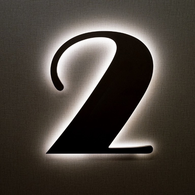
Two |
Digital Image |
C |
Set Subject |
|
|
M |
|
A very graphic number. I appreciate it when it looks like care has been taken in composition – with the number nicely framed, while the darker bottom provides a base for the image. Exposure has been well handled and I enjoyed the texture of the background. Very competent. |
|
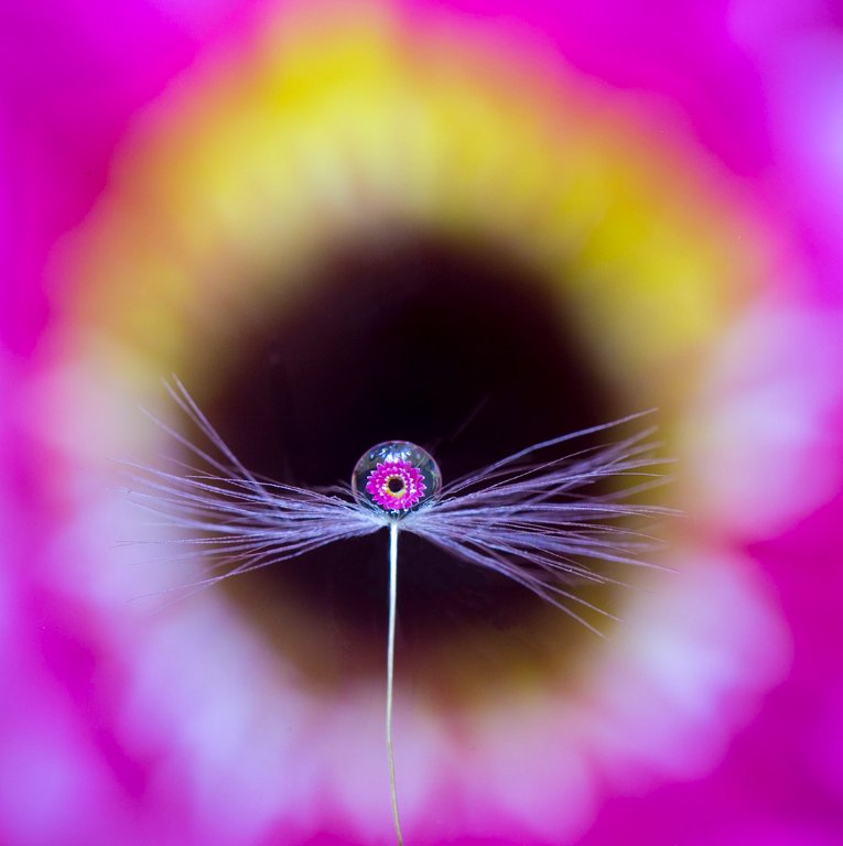
Droplet Sitting on Fairy |
Digital Image |
C |
Open |
|
|
|
H |
I really loved this view of the flower through the droplet. The upside-down image in the droplet is in sharp focus, while I enjoy the de-focussed colours of the actual flower. It’s a very central composition which I think works well for this subject. My only small suggestion for any future images of this kind would be to try putting the droplet exactly in the centre, while also keeping everything central for the flower itself. Well done. |
|
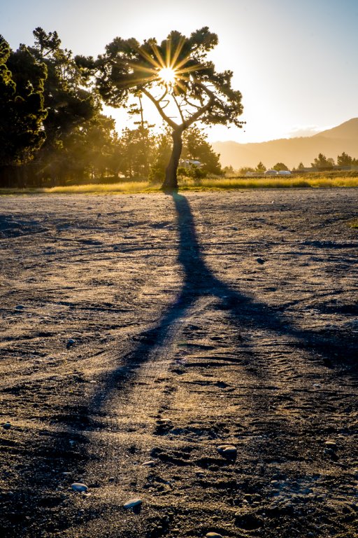
Lazy Days |
Digital Image |
C |
Open |
|
|
M |
|
Feels like summer to me, with a wonderful shadow of the tree providing a leading line up to the tree with its impressive star burst sun. The haziness on the hills supports the soft feel of a lazy, summer day. Although the edge of the gravel or sand is not a horizon, I think it this would work be better if the image was rotated so it is exactly horizontal. Good use of the rule of thirds. |
|
Man on the Moon |
Digital Image |
C |
Open |
|
A |
|
|
This looks like a stunning location, and the low sun angle provides some good texture to the foreground snow. The man is positioned on the thirds, with his shadow leading out to what I presume is an expansive view. Personally, that frustrated me, because much of the image is taken up with the foreground snow and I really, really wanted to see more of what the tramper was looking at – there is just a tantalising glimpse of a ridge line. Exposure is well handled for a very bright scene and a good depth of field means everything is in focus. |
|
Astronomical Clock |
Digital Image |
B |
Set Subject |
|
A |
|
|
I was lucky enough to visit Prague last July and see the astronomical clock, but when I was there it was being worked on and had scaffolding around it, so it’s nice to see more of the detail here. This image shows much of the structure. I found myself wishing that the very top of the clock hadn’t been cut off – it might have been better to show a bit more (interestingly, there is an almost identical image on the Wikipedia page for the clock which goes a bit higher). I’d suggest a very small crop in from the right so we don’t see that non-vertical sliver at the edge. Exposure has been well handled on what looks like a sunny day, and It is a good record of this famous clock. |
|
Sundial |
Digital Image |
B |
Set Subject |
|
A |
|
|
Takes us back to the days when the sun was all we could use to tell time. It took me a while to work out what I was looking at here, and from what direction, as the metal rods and the shadow are similar in colour. Perhaps that was deliberate on the part of the photographer, but it bent my mind a little. In my view, when an image is made of something with such strong rectangular lines, it’s best to try and straighten those up, so I did wish that the bricks were all horizontal and upright. It’s frustrating to me that we don’t quite get to see the closure of the triangle at the bottom right – so near, yet so far. Aside from those points, it is quite an effective image with the leading line from the sun down to the corner, and interesting textures and colours. |
|
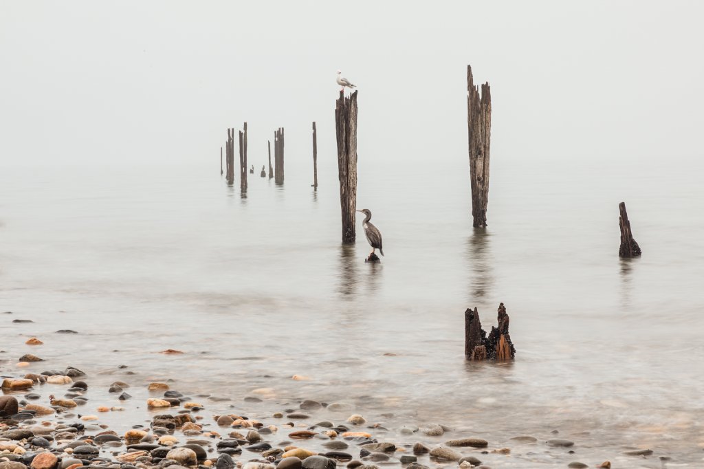
Needles point |
Digital Image |
B |
Open |
|
|
M |
|
I think this is a competent landscape of a lovely location. Composition is good, with my eye being led down to the sea along the ridge, and the horizon on the thirds. The photographer might consider cloning out the darker cloud in the top left corner – I find that quite distracting. It was a shame that the dimensions of the image were just 1380 by 845 pixels – the image was not as crisp as it would be if the available full width of 1620 pixels had been used. Lovely, inviting colours in the sea. |
|
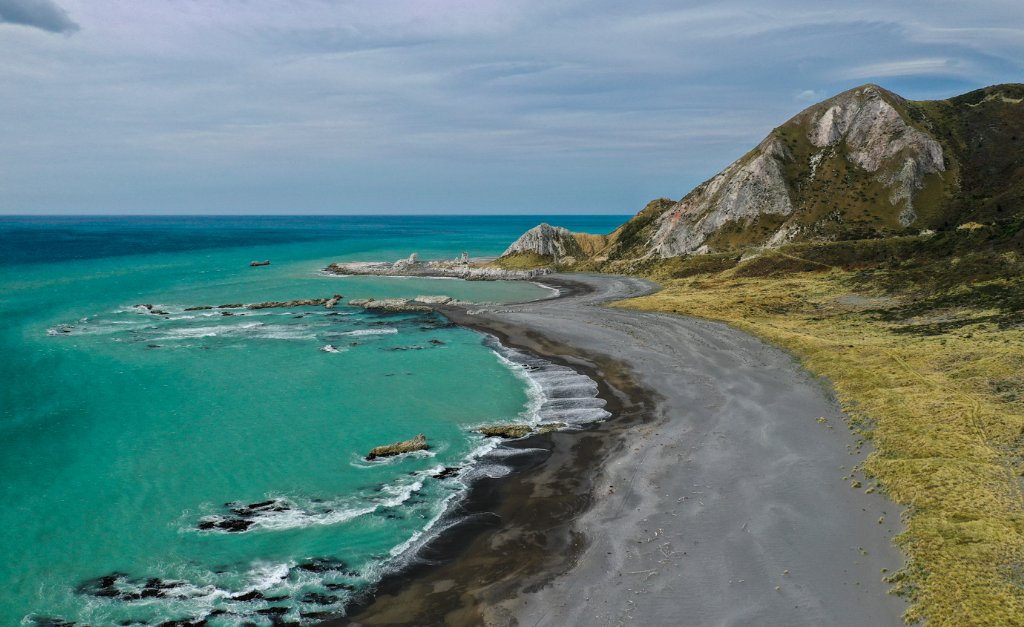
Sounds swirl |
Digital Image |
B |
Open |
|
A |
|
|
A lovely landscape in the Marlborough Sounds, and a very interesting swirl in the water indeed which is the focus of the image. It is a shame for this image as well that it is sized at just 1380 by 920 pixels rather than the available 1620 by 1080, missing out on more detail. I like the composition with two-thirds land and sea and one-third sky. The photographer could try darkening and adding more contrast to the sky, which appears a bit washed out to me, to give it a bit more punch. Similarly, I think the shadows could be lifted a little to see more detail in the bush, which is quite dark, particularly on the right. It’s still a a nice view. |
|
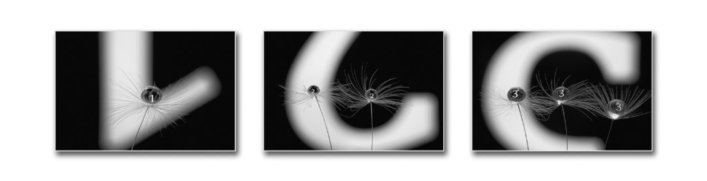
123 |
Digital Image |
A |
Set Subject |
|
|
|
H |
It took me a while to realise what I was seeing here. How very clever, to use the droplets in the “fairies” to show the inverted numbers as if they are little signposts, and doing 1, 2 and 3 of them. An extremely well-done triptych. |
|
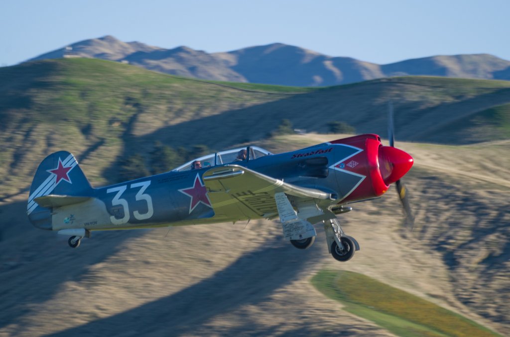
33 is airborne |
Digital Image |
A |
Set Subject |
|
|
M |
|
I can almost hear the buzz of the engine as this plane swoops by very close. The plane is well positioned in the frame, with room to move in front of it. I would have preferred that it was a bit sharper, but it’s tricky of course with the speed of the plane. It’s nice to see the passenger in behind, but unfortunate that we can’t see all of the pilot’s face – just a matter of timing. Great action shot though, with the out of focus hilly background adding context without distraction. |
|
Bob's your Uncle |
Digital Image |
A |
Set Subject |
|
A |
|
|
Well that brings back memories – we used to have a set like that when I was growing up. For an image like this I prefer to see things nice and square and also symmetrical– and would rather that the back of the set was horizontal, and that there was equal bumper bars shown on the right and left. That’s just my preference. There are some distracting highlights at the top right that could be cloned out. I think it was a good choice to use narrow depth of field and focus on the numbers, with the cue stick providing a nice leading line into the middle of the image. |
|
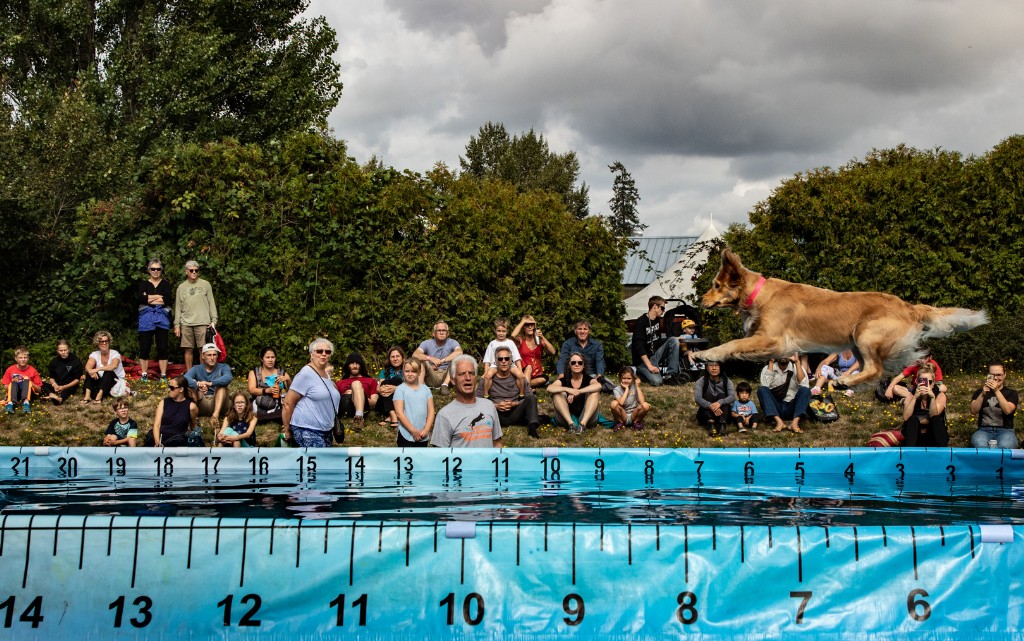
Canine Olympics |
Digital Image |
A |
Set Subject |
|
|
|
H |
Wow – what a fantastic action shot. I love the reactions of most of the people watching – and they draw attention back to the dog. Though it is interesting to look around and note a few gazing in the wrong direction. It appears that a fast shutter speed must have been used to capture the dog nice and sharp, and exposure is good. Great image! |
|
Countless white crosses in mute witness stand |
Digital Image |
A |
Set Subject |
|
A |
|
|
It makes me sad to see sights like this, of the tragic human cost of war. The lighting helps emphasise the crosses against the dark, bare ground in front. Although the title includes “countless”, close inspection of the image shows that the crosses appear to stop at a grass verge in behind, which was a bit of a disconnect for me. The photographer might like to consider darkening down the highlights a little on the right – the right is quite a lot brighter than the left, which tends to stop me from exploring the rest of the image. I do like the use of leading lines, and the crosses in front are nice and sharp. |
|
Engine # 608 |
Digital Image |
A |
Set Subject |
|
A |
|
|
What a lovely old steam engine this is. The viewpoint chosen helps to emphasise how massive it is. For me it feels a bit too cramped and close to the top and left of the framing – I’d prefer more room around it there. It looks like bit of a tricky lighting situation, with the sky behind pretty much blown out. The foreground platform is also quite bright, which tends to draw my eye away from the engine – I’d suggest darkening that area a little using a gradient filter or adjustment brush. I do like the overall composition with the leading lines of the carriages up to the engine, and the lines and shadows on the platform. |
|
Games |
Digital Image |
A |
Set Subject |
|
A |
|
|
This looks to me like part of a snakes and ladder board, with a very fearsome looking snake! It was unclear to me whether this was just the board, or whether it is a composite with other features such as the dice and the grid added. Setting aside such assumptions, and viewing as an image, I would suggest that the photographer try cropping down from the top, to put the snake’s head more roughly the top thirds, which for me makes it more prominent and very clearly the subject of the image. This could also be enhanced by use of a subtle vignette to draw attention to the interior of the image. Everything is nice and sharp (as it should be for what is effectively is just two-dimensional) and well-exposed. |
|
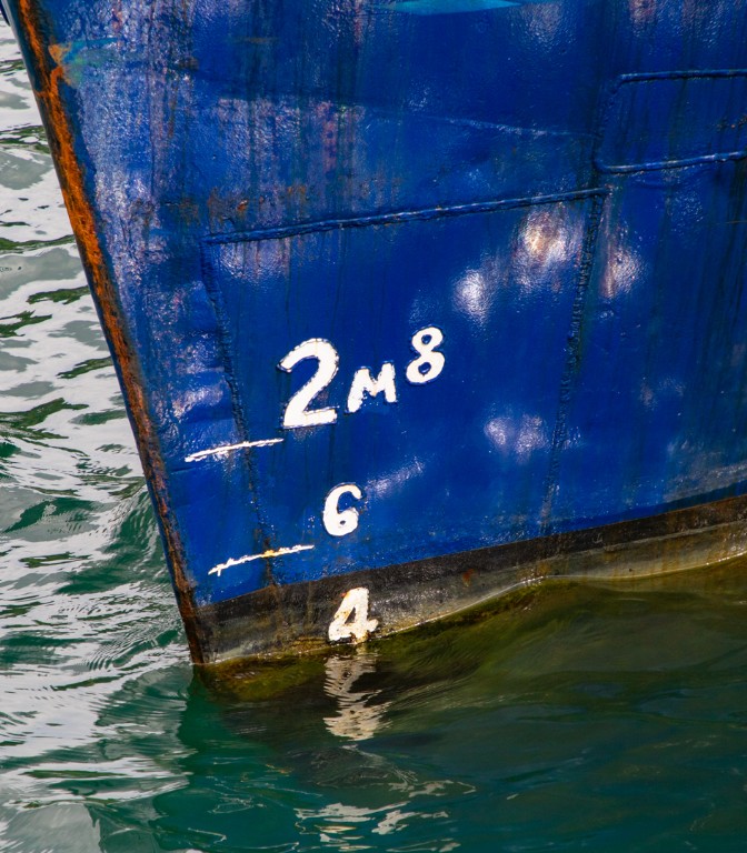
In the Deep |
Digital Image |
A |
Set Subject |
|
|
M |
|
I found these numbers on the side of the vessel quite intriguing, as I couldn’t work out quite what they meant, and that added to the interest of the image for me. I like the composition, with the bow going exactly into the top right corner of the image, and the solid blue hull is sharp and well exposed with interesting textures and reflections. |
|
Lucky Strike |
Digital Image |
A |
Set Subject |
|
|
M |
|
I hope those are the winnings! I think this is a very well-constructed image, with sharpest focus on the coins in front, the tickets nicely scattered, and colourful and darker notes in behind, so that attention remains on the yellow tickets. Well done. |
|
lunch time |
Digital Image |
A |
Set Subject |
|
A |
|
|
Yep – looks like lunchtime (at a school?) is coming up. This small clock tower is well isolated using a narrow depth of field, and framed by vegetation. It pays to check edges – there is a distracting small dot at the top middle that could be cloned out. While the vegetation is out of focus, the leaves on the right are also quite colourful, so I found that they drew my eye away from the clock. Exposure has been well handled and the tower is tack sharp. |
|
On track |
Digital Image |
A |
Set Subject |
|
A |
|
|
This looks like quite dense bush to be tracking through, and I assume from the layout of the two triangles in front, then two more blue ones leading off to the left, that this is the direction we are supposed to go? The pink triangle looks very saturated, which makes it hard for me to take my eye off it. Overall, for me, the image appears a bit too saturated and I’d suggest toning it down a little. Good use of depth of field to have the background bush more out of focus. |
|
Road Bling |
Digital Image |
A |
Set Subject |
|
|
M |
|
This image is a good example of things that are all around us, or below us, which make very effective images. The photographer has zoomed in to just show interesting details rather than trying to capture the whole cover. Nice textures and colours. Good exposure and focus. A judge’s classic (or cliché) comment of “Well seen” very much applies here. |
|
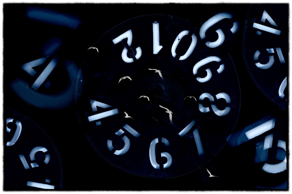
Rockin' Around The Clock |
Digital Image |
A |
Set Subject |
|
|
|
H |
I was very taken with this image – certainly fits the set subject and the added birds combined with the numbers and the subtle round clock-shaped circles just works for me. I like how the numbers in the top right area are brighter, which helps focus on that area as well as where the birds are. Very cool. |
|
Shipping Container |
Digital Image |
A |
Set Subject |
|
A |
|
|
Certainly plenty of numbers on the side of this shipping container! The composition is almost split into two by equal parts the hinged corner, and because the right-hand side is quite bright that tends to draw my eye away from what I think should be the focus of the image – the numbers on the left. I’d suggest that the photographer tries cropping in from the right and also darkening the right-hand side to remove the distraction. It might pay to straighten it up just a little, too, so the hinge is exactly vertical – it’s rotated slightly clockwise as can be seen by the wider gap at bottom right. I do like how the numbers are nice and sharp. |
|
Sunshine Years |
Digital Image |
A |
Set Subject |
|
A |
|
|
Someone’s just had a significant birthday? It’s a nice collage of items with good focus. There are bright reflections on the sun, and on the five, which may have come from a bright light source or flash and I find these a bit distracting. The 7 and 5 for me should be the main focal point, and should be equally bright and preferably lit in a way that they both look more three dimensional (the 5 does). I was frustrated by the snippet of words “Perso.. and Each…” in the bottom layer – not enough to guess what might be said there, which may or may not be significant and interesting. Many happy returns to the birthday person! |
|
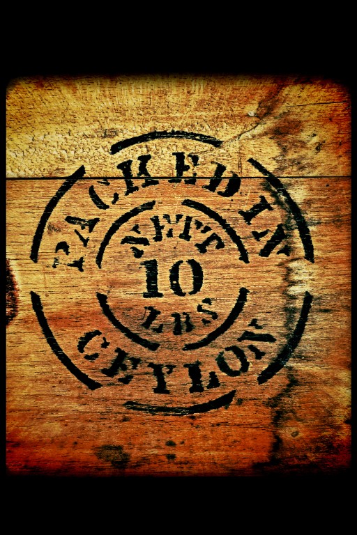
Tea Box |
Digital Image |
A |
Set Subject |
|
|
M |
|
That was be quite a large box if it held 10 pounds, and of course quite old with the name Ceylon. For me, the extra black space at top and bottom is a bit much, and I would have been happy for it to be cropped in at the top to match the left and right, and cropped a bit less at the bottom to still provide a base to the image. I like the treatment to make the wood look intense and perhaps still aromatic. |
|
Waste High |
Digital Image |
A |
Set Subject |
|
A |
|
|
From a combination of the title (Waste) and the brown stain I’m assuming the water is not the cleanest? We see a view across to a large tree and part of a rather bright building on the opposite bank – I’m not sure what relevance this building has, and whether we need to see what may be part of a fence post on the left. I’d suggest maybe cropping in from the left, plus it’s a pity to me that the marker overlaps the tree trunk – it’s always good to try to separate out elements in an image if you can. The marker is nice and sharp and I like the supporting green foliage around it – the marker almost looks like it is just one more growth from the river bank. |
|
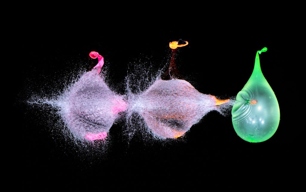
Bursting Balloons |
Digital Image |
A |
Open |
|
|
|
H |
Wow. Just wow. Two burst balloons and one about to burst – my favourite part of the image is the ripples around the projectile entry point on the green balloon where a full burst will have a short time later. Odd numbers of objects always work well, and I like the different colours for the balloons. Plus the green balloon acts as a literal and metaphoric full stop. Love it. |
|
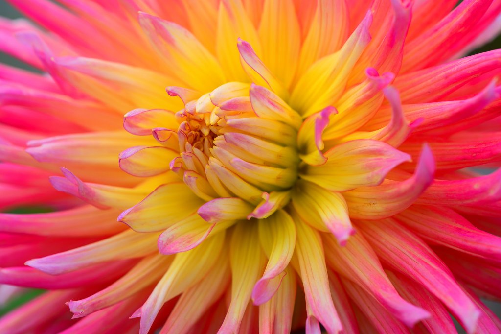
Dahlia |
Digital Image |
A |
Open |
|
|
|
H |
What a beautiful and colourful flower this is. The central part is in sharp focus, with the soft-focus red petals supporting it, with no distractions. I would like the photographer to try flipping the image left-right and see what they think – sometimes we find images more pleasing when they “read” from left to right. Gorgeous. |
|
Evening on the Danube |
Digital Image |
A |
Open |
|
A |
|
|
This is a rather urban view of the Danube, with the main feature for me being the path on the right with the prominent sunbursts from the lights. The overall tone appears a bit too blue to me – the photographer might like to try warming it up a little and see what they think. I’d suggest worth cropping in a little from the right to remove the last light which to me is a bit awkward on the edge. It’s a nice touch to see some stars in the sky. |
|
Explosion |
Digital Image |
A |
Open |
|
|
|
H |
I’m not sure what has caused this (Indonesian?) Coke can to explode, but it sure makes for a spectacular result, and quite a mess. I like the composition with the can on the right and off-vertical (which gives more feeling of dynamism) and most of the fluid on the left. There’s no doubt what the main subject is with the vibrant red colour. Focus on the can is very good with the gash showing up sharply. I wonder how many cans were ruined to get this clever shot? |
|
Japan 1 |
Digital Image |
A |
Open |
|
A |
|
|
This is a somewhat jarring combination of waterfront industry with a beautiful mountain in behind. There’s a number of layers leading back from the foreground piece of land, which I like. Overall the image appeared a bit dark to me, and I couldn’t see much detail in that foreground. As a record of a place that has been visited it is fine. |
|
Japan 2 |
Digital Image |
A |
Open |
|
A |
|
|
I get a feeling of busy-ness and confusion from this composite image, which appears to be a double exposure of some kind of café tables, together with many urns. Perhaps the urns contain tea or something? And there may be a serving person on the right. The area at the front edge of the table appears blown out to me. I do like some of the interesting touches, though, such as the hooks on the end of the table to hang your bag! |
|
Lake Chalice Stream |
Digital Image |
A |
Open |
|
A |
|
|
A very peaceful, almost canonical New Zealand scene alongside a stream. The incoming water, diagonally entering the image, made misty through a slower exposure is the clear focus of this image for me. The image doesn’t appear particularly sharp to me. The bright patch of sunlight on the bank to the right of the water competes for my attention. The photographer could try cropping in about a quarter of the image from the left – there is less interest for me over there – and a little from the bottom - and then the focus would come on that bright patch with the water as a nice backdrop second feature. We are so lucky to have places like this to visit and record. |
|
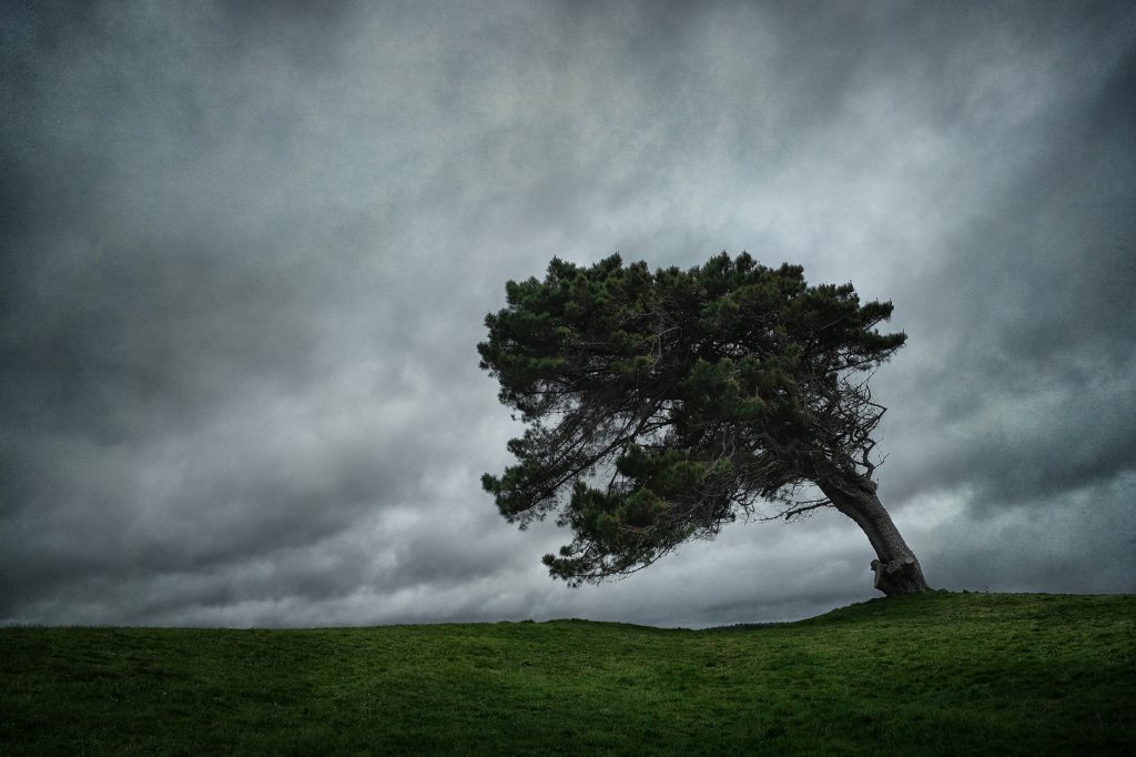
The weight of time |
Digital Image |
A |
Open |
|
|
M |
|
I really do get the impression that this tree is feeling the weight of time, and gradually keeling over. It shows up starkly against the sky, and is positioned nicely on the right-hand-third to help its dominance in the image. I think the green grass provides an excellent base to the image. The sky is a little bit noisy, but that doesn’t bother me too much. The photographer might like to try lifting the shadows a little in the tree (or overall) and see what they think – just enough to reveal some more detail there, but not to enough to take away the quite effective moody feel. |
|
Yum, that looks nice! |
Digital Image |
A |
Open |
NA |
|
|
|
The cake does look nice indeed, and the girl on the right probably does wants some of it. I would have like to have seem more of her face, but it is hidden by her cap. It looks to me as if the sharpest focus is on the deck at the back, rather than on the girls in front where it should be. I think the exposure is a bit too bright, with blow-out highlights on the plate and cake. I suspect that a slow shutter speed has been used, as the hands of the girl on the left are blurry through movement. I regret to say this image is not up the standard I would expect from A Grade, but it does make a nice memory of an interaction between two clearly loved girls. |
|
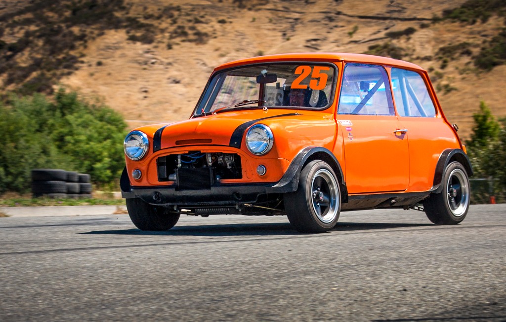
Cats View of No25 Racing Past |
|
C |
Set Subject |
|
|
M |
|
A good low-level view of the mini going by. The car is nice and sharp and separated from the background, and we get some impression of speed from the blurred wheels. Exposure is good in what looks like harsh light. It’s good to see the face of the driver … the photographer might like to try brightening that up a little to make it more prominent. Composition is also well done, with room to move in front of the car. Well done. |
|
Mood Room |
|
C |
Open |
|
|
M |
|
The colours and geometric layout of this print certainly give it a moody feel for me. I think that the mostly solid blocks of colour work well. The print as received was not labelled in terms of orientation, and could readily be viewed on any of four orientations. I have reviewed it as advised by the competitions Secretary… in landscape form with the solid block of colour at the top. This feels unbalanced to me. My personal preference would be in portrait form with the solid block at top right. I do find this an intriguing and graphic print … well done. |
|
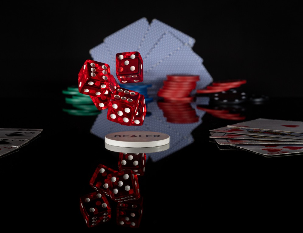
Roll the Dice |
|
A |
Set Subject |
|
|
|
H |
I do get the feeling that these dice have just been thrown. Nice surrounding supporting features of cards, and reflection in a shiny black table. Well-constructed. |
|
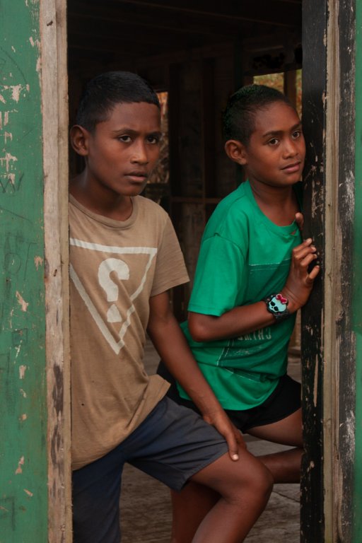
Onlookers |
|
A |
Open |
|
|
M |
|
For me this image is all about their eyes. I go straight to them and wonder what they are looking at. I think that the boys are nicely framed in the doorway, with the green painted wood balancing the green T shirt. Exposure looks good, with the dark interior not providing any distraction. Sharpest focus is on the right-hand boy’s face, but that doesn’t bother me too much. Nice print. |
|
Remains of Onekaka Wharf |
|
A |
Open |
|
A |
|
|
It sure looks like there is not much left of this wharf, and what is left is very decayed. It’s good to have an odd number of elements, and here we have three bits of wood. It does feel a bit weighted to the left for me, with the small piece of wood on the right not providing enough balance for the quite dominant pieces on the left. I also wish I could see more of the rocks at the bottom .. for me, there would be more of a base to the image if those stretched across the entire frame. I like the use of a slower shutter speed to smooth out the water, which contrasts against the quite sharp and well-focussed wood. |
|
Remnants |
|
A |
Open |
|
|
|
H |
This looks like the same wharf remnants as another print. I really like this. There is a nice leading line with the remnants appearing to go off into a misty distance. The two birds are a bonus, although as a small point I wish the bird’s beak was separated from the pile. Here, I think we have a nice balance between the line of piles, and the triangular area of rocks on bottom left. Lovely print. |
|
Stapafell Morning |
|
A |
Open |
|
A |
|
|
This is quite a majestic scene, with the iconic Icelandic mountain on the left. I find the lighting relatively flat, with just a hint of rosy sunrise light appearing behind the mountain and in some clouds in the sky. Exposure is good, and the entire scene is sharp with interesting textures. A nice record of the area. |
|
Tourists |
|
A |
Open |
|
A |
|
|
I feel quite chilly looking at this scene, with icy terrain and a gloomy sky. Then I see the small figures on the horizon referred to in the title … this is a fine example of how such small elements of an image can nonetheless be quite dominant and important. Without then, the image would have much less interest for me. I think a monochrome format suits this print, as it helps convey the bleak mood |
Share:


