
Judge: Simon Forsyth
Three topics - Mono Print, Colour Print and Digital Open. Previous club comp entries may be entered but not previous Shot of the Year entries.
For "Shot of the Year" there are 3 competitions/trophies. Please submit into the correct competition under OPEN
a) The three categories for Shot of the Year are: Colour Print, Monotone Print, and Digital (projected image).
b) ONE entry in each category may be submitted, and print entries are to be handed in at the June meeting.
c) The subject in each category is: “OPEN”, unless otherwise stated in the competition programme.
d) You can enter images from previous club competitions but previously entered photos in the ‘Shot of the Year competition’ are not eligible for entry again.
e) A Trophy will be awarded to the winner of each category.
Open
Set Subject
Marlborough Camera Club - Shot of the Year - DIGITAL
Judge: Simon Forsyth
3rd: The Old Way
2nd: Sunrise on Moeraki Beach
1st: Towards the Culling
Baby May
This is a lovely image which I feel is helped by the use of black and white. This removes any distractions that would be present in the way of Colour.
The use of a slight vignette and the light tones of the face ensure that the viewer is drawn to the child and away from everything else.
Framing is good but cropping a little more off the bottom would help reduce the dominance of the dark sleeve at the right. Also cropping the left will make the image more focussed on the child which is probably the aim. Exposure is great.A little more depth of field would be good so that the child’s hands are in focus.
Early Snowfall
This is well composed and seen. I like the fact that the sky has detail in it as opposed to being blown out.
The shape of the hills lead the viewer into the image from the bottom left with the slight rising across the image.
Colour is nice although personally I would brighten the lighter areas in the lower hill to make it pop a little more. To me it looks as if another snowfall might not be far away! The slight blue cast in the snow helps give a feeling of cold. Tonal range is well contained so that nothing is lost.
I feel that this would look good framed and on a wall.
Ethereal in Pink
I like how you have composed this image. The placement of the subject at the bottom left creates a tension in the image probably because it is so unusual especially as the image fades to white towards the top right.
I like the high key treatment of this image with the pastel colours that results. I used the auto feature in Lightroom which created a darker image which also worked well for me. It comes down to what the author saw and wants to show the viewer. In an image there is not necessarily just one “correct exposure”!
The use of depth of field here to make the front water droplets stand out is great and helps give a feeling of depth in the image.
Apart from the possibility of adjustments in the processing, there is nothing that needs to be done to this image.
Full Throttle
This is a well captured image with plenty of action.
Watch to see that horizon is level as it appears to be slightly off.
The contrast between the dark of the water and the background and the white of the spray and the boat work well to bring attention to the subject.
The cropping is good here with more space at the right for the boat to move into. The fact that you have placed the subject on the bottom third also works well.
I feel that a slight increase in the whites would make the right part of the spray stand out a little more.
I feel that to get the full effect of this image it would look good printed large and on a wall!
Very nice.
High Flyers
I like the textures you have got here. This has a nice abstract look to it. It appears that you have used a combination of a slightly longish exposure combined with a bit of camera movement which combines to produce a pleasing image.
My only suggestion would have been a bit of flash to add some sharpness along with the movement to the birds. The positioning of the birds just above the horizon, while natural, is good.
The rather limited tonal range here works well here.
This is another image that to be seen properly needs to be printed large and put on a wall! This will help show the subtle tones that are in the background which really add to the image.
Hummingbird waiting for Nectar
The colours are great here and the use of aperture to throw the background completely out of focus is great. Did you use a flash trigger?
I feel that the image could be helped by a couple of things. First, I would crop some of the empty space at the right as it doesn’t add anything to the image.
Second, I would tone down the highlight areas on the flower as being bright they tend to draw the viewer away from the birds.
Apart from that exposure is excellent.
Images such as this look simple to get, but in actual fact there is a lot of learning that goes into being able to get results like this and lots of trial and error. This image shows that the time spent on improving technique does eventually pay off!
Light Trails
Another example of trial-and-error ensuing that eventually through experience you are able to get great images.
This image works well with the photographer having worked out the sort of range that the light trails will fall and ensuring that they will be included in the frame.
In most circumstances putting the horizon near the middle of the frame is not a good thing, but in this instance, it works helped by the slight angle of the pier.
Since the light trails create an arrow shape at the right end the space at the right end helps, I feel.
Personally, I would darken the blacks a little more to make the trails stand out more and remove the stones at the bottom left.
This is also another example of there not being one “correct exposure”. One person’s idea of how something should look isn’t necessarily the only option. Personally, I would tone down the highlights to give more of a golden tone to the trails, but that’s just my opinion.
Redhead Fungi Family
This is a good image. Good use of a slight vignette to focus attention on the subject.
Personally, I would like to see the fungi being brighter, but I don’t know the correct colour or tone of the fungi.
You have managed to achieve good depth of field without it being too much and getting too much of the background in focus which with closeup work is a balancing act.
Possibly, you could crop some of the space off the top of the image as I feel that there is a little too much space which drew my eye. Another option would be, if you can, to get a bit lower.
You could possibly darken the grass at mid left slightly, so it doesn’t draw attention away from the subject.
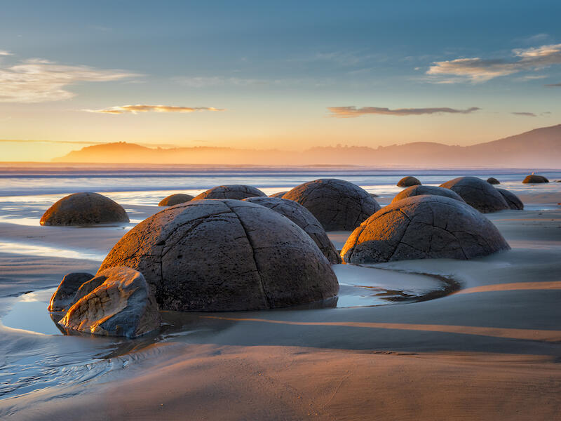
Sunrise on Moeraki Beach
This is well composed with an extensive tonal range, and nothing blown out. The warm tones of sunrise are present as well and detail in the shadows.
I like the fact that the placement of the boulders in the image lead the viewer from the bottom left diagonally across to the hills in the background which then lead the viewer back to the left.
There is lots to see here and the image requires the viewer to study it.
Watch out for horizons that appear slightly off even if they aren’t.
Very nice! Well done!
The Dawning
This image is full of rich oranges and dark blues that are typically present pre-dawn or after sunset.
I like the composition with the horizon being at the bottom and relatively simple. The placement of the tree at the right third allows the viewer to look across the image from the left and then up into the sky.
It’s a simple and restful image. Exposure is well controlled with no blown-out highlights and the silhouette of the bottom and the tree.
Again, this would look good framed and on a wall. With the advent of digital photography and being able to view images so easily on a screen the simple act of printing images has largely been forgotten, which is a pity as there are many images that would benefit from being displayed on a wall, that never get there.
Very nice!
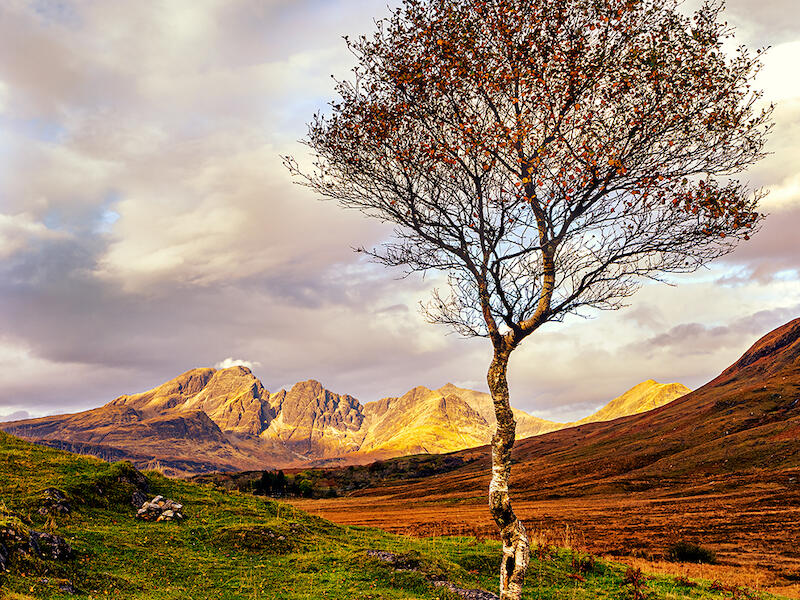
Towards the Cuillins
I like the placement of the tree here as it is dominant.
The intersection of the hillock and hills in the background leads the viewer down towards the lower right in a nice sweeping motion.
Exposure is good with a wide range of tones and colours. The tree is basically backlit which makes the leaves take on a glow.
This image for me would benefit from a white frame around it with maybe a black line.
Looking at the white balance, although technically it is a little too warm, this helps the image and if it was cooler the image would have a completely different feel to it.
Again, a very nice image.
Fantail Frolics
Well captured!
The important thing in bird photography is usually to have the eye sharp and you have achieved this well. The important parts of the Fantail are sharp while also showing some movement.
The use of a blank featureless sky helps make the Fantail stand out.
With long lenses depth of field tends to be limited and this coupled with a need to get a fast shutter speed to arrest the movement and you have achieved this well.
I like what you have achieved here. Like most aspects of photography, the need to constantly practice with bird photography is a necessity and this image shows that you have plenty of practice.
The cool colours of the sky and the grays of the bird complement each other well.
For me personally I would crop a little off the left side and maybe the bottom, while still leaving room for the bird to move into.
Underground Chamber
I like the way you have framed this with the opening being on an angle across the image. The colours are nice and rich, and exposure is handled well.
If possible, I would have bracketed the exposure to give a little detail in the shadow areas. I find the shadow areas draw my eye away from the rest of the image and I find I want to see what is in those areas.
The use of a very wide-angle lens here has resulted in some distortion especially at the right side, but if this was corrected in post-production, I feel the image wouldn’t be so interesting. The lean at the right side leads the viewer into the middle of the image.
I suggest that next time you in a situation like this that you bracket exposures so that you have the option of using the additional images to expand the tonal range later if you want.
Golden Swan
There is good use of depth of field here with the background well out of focus. Having said that slightly more depth of field would help to ensure the swans neck and beak are sharp. A little sharpening may help here.
Exposure is well controlled here, though I would apply a local shadow light on the swan’s head to reveal a little more detail.
The highlights on the water do tend to draw the viewer away from the subject.
For me, there is too much space on the left side. It is important in situations like this to allow space for the subject to move into, however I feel there is too much here. I would crop off about a third off the left side. This will still leave space for the swan to move into.
This is a good attempt and I suggest you keep practicing!
Woolshed Pianist
This is a nicely captured image. I like the way you have made use of the light on the right side of the subject while also ensuring a little light on the subject’s right eye.
The position of the light also helps reveal the whiskers.
The use of a dark background is good, although I would clone out the dark line in the background as it draws my eye away from the subject.
This image would also benefit from converting to black and white which would accentuate the light and texture of the face.
You could possibly crop some off the right side of the image while still retaining space for the subject to look into.
A little more contrast would help the image.
I’m sure the subject would be pleased with this image.
Ballooning at Sunrise
Composition is good here with the placement of the balloon at the right. This allows the viewer to be drawn into the image along the dark horizon line to it.
Colours are nice and rich and the hills in the background stand out well.
The only thing I find distracting is the brightness of the sun which is dominant and very distracting. This can be fixed in a number of ways by wither cloning it out or painting over it to reduce the highlights. This would make the image much better I feel. If you don’t know how to do this ask someone to show you how to do it.
Exposure is good, the sun notwithstanding.
If you could have captured this before the sun was in this position that would have helped, but obviously things don’t always line up.
The fact that you have decided on a silhouette for this is good as I feel that if the colours in the balloon were revealed it would take away from the colours of the sunrise.
Harvest Nights
This is a nicely captured night scene. There is good detail in the lit areas with the shadows nice and dark.
Ideally, the best time to capture scenes such as this is when there is still some blue in the sky, about half an hour after sunset.
Personally, I would crop some off the bottom to lower the subject. I feel that as this is presented the subject is too much in the middle. With the fact that there is no detail in the sky, you could also crop some off at the top to make a panoramic shape.
I like the warm tones of the lighting, although you could tone them down slightly, I feel.
Night photography takes time to master, as with all areas of photography and I suggest you get out before sunset and carry on shooting to about half an hour after sunset and see the differences in the results. This then gives you an idea as what to expect the next time you go out.
Kaka
This is well framed. Exposure is good though there ae some things you could do to further enhance this image.
Darkening the branch that is coming towards the camera will help as, being out of focus and bright causes a distraction.
Ideally, more depth of field would help with the focus on the Kaka. The eye seems sharp, but the rest of the bird could be sharper.
Also, if you could darken the background so it isn’t so bright that will help.
Lake Rotoiti
I like the way the light reflection in the lake leads the viewer from the bottom left to the break in the mountains in the background.
You could crop some off the bottom of the image to shift the horizon from being in the centre. This I feel will work better.
Exposure is good and the light is great.
Personally, I would darken the left side of the sky, so the very left isn’t so quite so distraction.
Very Nice!
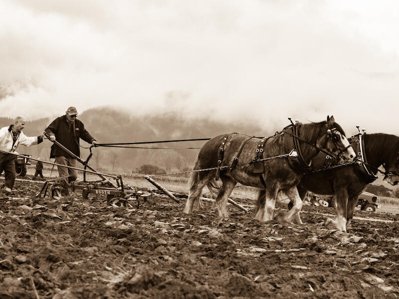
The Old Way
The treatment you have applied to this image works well with the old-world way of working.
Toning and processing treatment are good and the way you have cropped the left side to minimise the modern way of doing things, is good.
About the only thing I would do is reduce the highlights which would bring out detail in the sky!
You could possibly crop a little off the bottom, but this is a personal choice.
Very nice. Well done!
Descending New Zealand
This is a very challenging situation to make an image with the extreme levels of contrast. You have done very well containing the misty light in the opening at the top.
The fact you have also maintained detail at the bottom on the rocks is also good.
I suggest that you crop some of the black area off the left side so the that opening isn’t in the middle so as to create a little tension in the image. You won’t lose anything in the image as the area is devoid of detail anyway! Possibly, depending on the noise you could add a little light in the shadows to slightly reveal a little more detail in the wall behind the rope.
An excellent attempt.
Share:


