
Judge: Craig Phillips
Anything sports or game related ....
Sports photography is a branch of photo journalism. Using Physical Activity. Using Sports Apparatus. Any type of games. Balls, Boards, cards, family games. Motor sports. Swimming, Cycling. Look for action of the field and look for emotionally charged moments in or off the games. Interaction with activity.
Open


Set Subject


Preamble comments for feedback session.
In evaluating an image, these are the aspects that I consider important to an evaluation which all relate to the visual communication and the way in which elements in the image contribute to the visual communication:
The club’s requirements:
- Instructions provided to members were: “Sports photography is a branch of photojournalism. Using Physical Activity. Using Sports Apparatus. Any type of games. Balls, Boards, cards, family games. Motor sports. Swimming, Cycling.
- Look for action of the field and look for emotionally charged moments in or off the games. Interaction with activity.”
- We have four different categories for the judges to use when judging the images. These are: Not accepted, Accepted, Merit or Honours. The criteria for these are as follows:
- Not accepted: A photograph which is not up to reasonable standard to exhibit in a club competition. It may have basic technical faults or be too much of a snapshot. If this is your rating, the member’s name is not displayed.
- Acceptance: A photograph which fulfils your basic criteria for a reasonable photograph.
- Merit: A photograph with that extra something that brings it out of the ordinary category.
- Honours: An exceptionally good photograph. Such photographs could well be accepted in a national exhibition.
- As a rough guide, between 1-2 areas for improvement, and/or 1-2 strong points of an image would be about an appropriate level of commentary (assuming an image has this many issues or features that you can identify.
Principles taught by PSNZ for image evaluation:
- Do I think the image communicate with a purpose?
- Do I think the composition (visual design) supports the communication?
- Did the image create an emotional impact on me as the evaluator?
- Do I think the image exhibits freshness and creativity?
- Has the photographer shown their intent (the story) for the image through the visual elements of the image?
- I.e., the title should reflect the visual story and not be the sole means of revealing the story
- In other words, how has the photographer used the building blocks of composition to reveal their intent (Light: tone, colour; line, shape, texture and perspective).
- How has the photographer arranged the building blocks of composition to bring a sense of order, purpose, and clarity of the story. What feeling if any, does this arrangement of the building blocks give to me.
- Technical excellence (e.g., my thoughts on the lighting, depth of field, focus,)
CRITIQUE - PRINTS
|
Title |
Rating |
Comments |
|
A GRADE - SET SUBJECT |
|
|
|
Poise and Texture |
H |
This print is outstandingly made. The composition captures the drama of the surfing action well, including the wave size, the balance and poise needed in this sport, the concentration required and some space for travel along the wave direction, implying movement. The one element in the image that nailed the connection for me in the print is the light on the surfer’s face. The printing is superb as it ensures the light is beautifully presented in every aspect of the image and makes clear the story is the surfer and not the waves. The image is beautifully sharp throughout. |
|
Racing on the Waimakariri |
H |
The title tells me the river’s name. In contrast the visual story doesn’t seem to care about the name of the river but does care about the excitement and action of what I think is probably jet boat racing. Quite an engaging image as it leaves space for the boat to race into, so a lot of action is implied. I like the way the background trees are used to contain my eye on the line of spray, the boat and the lines of the river. |
CRITIQUE - DIGITALS
|
Title |
Rating |
Comments |
|
C GRADE - SET SUBJECT |
|
|
|
Batter-Up |
A |
Nice blur on hands and bat to indicate motion. Nicely placed to give visual weight to the eyes focusing on the ball. Visually, I was looking to see where the ball might go – framing an image such as this to leave space for the imagined flight of the ball would in my opinion add an extra dynamic quality that would create more energy for me. Remember to check your background is consistent with your intention for the image. For example, how do the piles of dirt in the background add to the drama or context of the story? Is I found the background to be a significant distractor? Remember to ask yourself about the value of each element in the frame before you finalise your composition and shoot your image. This is just as important for an image that captures a special moment as well as for that dramatic landscape. |
|
Flying woodchips |
M |
I enjoyed the large woodchips flying through the air with a little bit of blur. This gave me a strong sense of the dynamics of the sport. Shutter speed selection helps freeze the chopping action enough to see the power generated in the stroke. I liked the way the background contributes to a feel of a woodchopping competition. The placement of the horizontal line of the log along the third line gives me a strong sense of the power needed for this sport, and the vertical line of the woodsman brings the wood and the human elements together. I would have likely felt a stronger connection to the dynamics of the sport had the shutter speed selected allowed more motion blur to be an element of the image. Nicely seen and composed. |
|
Headshot |
M |
I liked the way you have used the position of the two vertical lines (the competitors) to be the dominant elements in the image. This together with the depth of field selected drew my attention to the two combatants. I also found the intensity of the gaze of the kicker gave me a reasonably strong connection to the image. Having shot a great many sports images earlier in my life, I found that sometimes using shutter speed to give motion blur can create a stronger emotional impact. In this image I sense the moment the kick has “landed”. For me it is a good example of capturing the decisive moment, although I was left wondering if a dynamic element created by motion in the leg might give me a stronger emotional connection to this decisive moment. I also felt that as the kicker seemed to be the main subject, perhaps the sharpness of the image could be determined by the main subject instead of the back of the person receiving the blow. |
|
Howzat |
A |
I enjoyed the excitement of the action – Given the title, I wondered if this is a beach cricket game, and the fielder has made an outstanding effort to make the catch. While the title suggests the action relates to cricket, the image contains no elements in it that indicate what activity the catch might relate to. It could be force back or some other throw and catch activity and I wanted the image to tell me more about the activity and not just rely on the title. For me the visual elements need to tell the full story you wish to convey, and a title should reflect the story of the image. I love the expression on the face, and the realisation that this young man is about to get a dunking in the water. I hope the watch is waterproof. |
|
Kite Surfing |
A |
the light is mostly on the back of the kite surfer - this holds my eye’s attention. I wanted to see the man’s expression – Digitally you could lighten the facial expression with a brush – this is possible in most digital photo software such as Lightroom, Photoshop, and the free software GIMP for desktop and Snapseed (Android and Apple). Panning is not an easy skill to master as one must consider the sharpness of the subject as well. Here the motion blur in the waves gives me a dynamic feel. However for me, the lack of brightness on the kite surfer and what I felt was an unsharp quality on the main were a significant distraction to what I thought the composition tried to convey to me. Make sure that your main element has the appropriate sharpness for your story. . |
|
Leap of Faith |
A |
I felt a sense of deep concentration on the leaping athlete’s face. The background elements of the left third kept drawing my attention. This made me think the image contained ambiguity as some of the elements seemed to be about resting athletes and some were about the action in the centre of the image. While the central position of the two combatants gave a feeling of dominance for these elements, the brightness of the tones in the background were distracting to my eye. I have learned from shooting many sporting events that a perspective that minimises the impact of background elements needs to be thought about before lifting your camera to make a shot. I wondered how much more I might have enjoyed this image had the tonal brightness of background elements been reduced by burning down or blurring them with something like a radial filter in digital software. |
|
Wing Foiling |
M |
I quite enjoyed your perspective in this composition, where the human element is reduced to a supporting role to the story of the way in which wind and a sail and a foil board can work together to produce a sense of drama. I felt the e sharpness of the board and sail elements and their tonal contrast with the sea helped make the main element stand out to me. I like the way you have left space for the board rider to move into – for me this implied a dynamic sense. In my opinion, had you increased the contrast a little bit and lightened the darker tones in the sail, this would have given the image more “pop” and I would have rated it more highly. |
|
C GRADE - OPEN |
|
|
|
A vintage past its best |
A |
I liked the way in which you have used monochrome to limit the impact of colour in this image. I enjoyed this creative element. My eye is drawn to the barrel by its lighter tones and then drawn away from this element by the lighter tones on the ground and the right-hand side of the cart. The tension created left me feeling a little unsure about what the main story of the image was – the title suggests to me that that the story might be the entire cart and barrel. For me the visual elements need to show the viewer what the story. I wondered if the story might be clearer had you used a digital brush to lighten the cart and barrel (dodging in film darkroom terms), and also darkened the grass in the lower right quarter, again with a brush. In my opinion, this would have made the story clearer for me, and I would have rated the image more highly. |
|
B GRADE - SET SUBJECT |
|
|
|
Eyes Wide Shut |
M |
I was drawn to the kayaker/ canoeist by the lines of brighter tones and the colour contrast. I liked the way the brighter tones in the water implied a movement from left to right of the image. This feeling of motion was reinforced by the direction the canoeist is facing. In one sense the image gave me sense of excitement and in another sense, it gave me a sense of tension. The excitement I felt came from the experiences I have had canoeing on rivers many years ago while at university and the sheer exhilaration of going through a bit of white water. The tension I felt was about whether the canoeist might have lost control and had shut her eyes expecting an inevitable dunking, or maybe the photographer is having a laugh at the canoeist’s visual approach in the white water. Overall, I found the image quite engaging, and I particularly liked the way you have kept the lower two thirds of the image as one rectangle by making the top third an implied rectangle using tonal difference. I would have rated this image more highly had I not felt some ambiguity in the visual story. |
|
Finding the sea critters |
A |
I found myself drawn to the extreme contrast in this image between the lighter tones and the dark tones. I noticed that the legs of the person on the left of the image had some detail and so this person didn’t have the same silhouette characteristics of the other two people. The detail on this person made me either want to see more detail in all of the human characters or it was a significant distraction from using a silhouetted approach to the composition. I noticed the motion blur in each of the people and that gave me the impression that each of these people were undergoing some coordinated activity. While the title suggests they might be searching rock pools, the lack of tonality in the foreground rocks did not provide me with any visual clues to the story. For me, the sepia wash over the sea didn’t quite fit with the idea that the people were searching rock pools. I struggled to understand what or how the sepia wash over the sea was trying to contribute to the image. It is important that all elements within a composition contribute to telling the story and I felt this aspect of the composition distracted me from understanding the story. |
|
Hand Up |
H |
I wasn’t particularly clear from the composition why the title asked me to pay attention to the hand up toward the top of the image. I liked the way you have included three complementary elements to the sport of bull riding. The bull and its rider, the rodeo clown who acts as a safety valve for the rider and the spectators who seem to be really enjoying themselves. I enjoyed the way the depth of field provided me with a sense of inclusion of the rodeo clown in the story and the blur on the spectators which for me gave them a largely supporting element. The action of the bull suggests a strong sense of dynamic and danger and this is strengthened by what I see as a little bit of dust stirred up around the front legs. The bull’s eye also suggests it is not very happy about the situation. It seems to show a degree of anger about what is happening. For me well put together composition and a very clear story that a viewer could connect with. |
|
Wingspan |
A |
An interesting composition that shows me a good sense of creativity using various seemingly unrelated objects to frame the words on the board “lay eggs”. I was a little bemused by the title “wingspan”, as the only element in the composition that conveyed a sense of wingspan was heavily blurred. I wondered why the depth of field was chosen as in my opinion it makes many elements unfocused and that left me wondering how they supported the story of what seemed to me to be about egg laying by birds. The placement of the words made me feel the image needed to be rebalanced – as the right sided elements tended to create a strong visual weight which competed for my eye’s attention. - |
|
B GRADE – OPEN |
|
|
|
Fishing Kotuku |
A |
To my eye the image feels underexposed, and I wondered if you had not adjusted the tonality because it is a nature shot. My understanding is that dodging and burning are allowed for nature images. While my eye is drawn to the brightest tones (the bird and its reflection), I felt the subdued lighting resulted in a slight grey/purple cast on the back of bird and tended to make the dark background have a level of visual weight that distracted me from my enjoyment of the scene. The context of the hunting trip of the kotuku contains a lot of interesting things about where the bird will go to hunt. I would have rated this image much more highly had the darker toned areas been addressed to reveal more about the hunting environment. |
|
Kotuku hungry chicks |
M |
I am drawn to the story of the chicks and the parent bird by the nicely placed converging lines of the birds, the brightness of tone and the dominant position of the main elements. For me this image is very well composed, and the story dominates. In this image, I see the dark background tones to the left as supporting your story and making the chicks become the key part of the visual story. I felt this image also felt a little bit underexposed as a whole. In addition, the blurred fern at centre bottom of the image kept pulling my eye from the chick – I understand removing this element would not be allowed under nature photography rules and this may be why you left it in the image. As an open competition, this blurred element, in my opinion, detracted from my overall enjoyment of the image and without this distraction I would have rated the image more highly. For a shot like this it may be worth previewing the focal length through the focus preview function on your camera to ensure everything is focused as you want. |
|
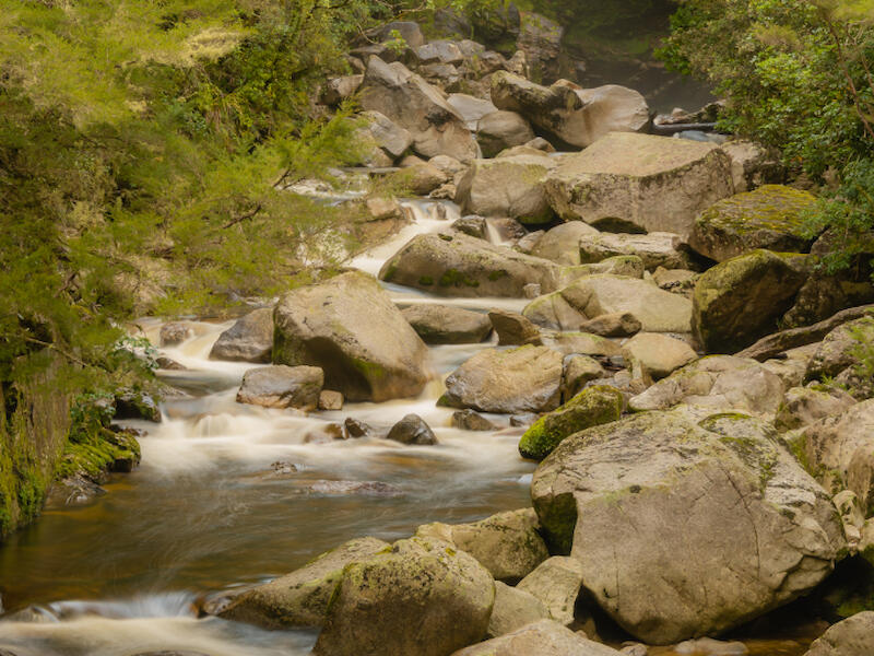
Rocky River |
H |
I see this story as being very simple, the image is well focused right through from front to back, shutter speed selected presents a story of the continuous flow of a back country stream using a vertical orientation to help present the downward flow of a river. The story gives me a strong sense of serenity and has no distracting features. An outstandingly composed image in my opinion. |
|
Sunrise lighting the shipwreck |
A |
It is clear to me by the lines and shapes in this image that the story is about the wreck. It reminded me of a time I was able to visit a wreck in Keneperu Sound and the challenges one had in getting light to fall in the right places for the image. Fortunately, I was there long enough to get different light angles and this memory made me wonder how much more I might have been attracted to this image had the darker tonality on the shore side of the wreck been brightened with some dodging of the tones. Most digital software programmes contain a brush tool that allows you to brighten the darker tones to give stronger emphasis to your story of the wreck. I would have rated this image more highly had the shoreside of the wreck been given more light (e.g., a soft flash at the scene, or using a brush tool) It is important to visualise your final image when shooting and use all available tools to assist your vision. |
|
The industrial footprint |
M |
I liked the way you have placed the way man’s intrusion into the natural world as something that creates environmental concern. Without knowing much about the science of environmentalism, I get an immediate sense of the feelings of the photographer about both the visual pollution and the environmental impact on the immediate environment. I felt the reeds in the river were a little underexposed and this presented some ambiguity for me. I wasn’t sure whether the lowered brightness on the river was to give a foreboding feel about the situation (damage has already happened), or whether you were trying to say the environment is in danger and we need to do something about it. This ambiguity led to the image not having such a strong impact on me as might have been suggested by the polluting characteristics. More brightness on the reeds and the river and the trees would in my opinion have given me a stronger feeling about the environmental impac.t |
|
West Coast fence |
M |
For me, a nicely presented story of an old fence line, showing the lichens, the rust, yet still showing the tensile strength of the fence itself. I enjoyed the light on the image, which really brings out the richness of the colours. I also liked the perspective which greatly assists in reducing the distractions contained in the background. There are a few highlights in the grass behind the fence, and they created a distraction for me from enjoying the age and textures on the fence line itself. Burning down these tones using a brush tool would in my opinion have given greater emphasis to your story about the fence line. |
|
A GRADE - SET SUBJECT |
|
|
|
Climb Out |
A |
I was struck by the perspective – the backend of the climber - as this is a novel way of looking at the visual story. I noticed the line of footprints ahead of the climber and wondered who else has been up here. I struggled to understand the title and its relationship to the visual story as the image gives me a story about someone climbing up. In my experience, climbing up a snow-covered hill is not often a way out. Visually I enjoyed the number of highlights on the snow, reminding me of how bright a snowscape is when on it. I also enjoyed way you have shown the line of footprints leading up to what may be another pathway. Apart from these two aspects, I did not feel a lot of connection with the story given I found it had confusing context as between the title and the image. For me the title should be reflective of the visual story and not be used to fill in what might be considered gaps in the visual story. |
|
Competitor and Fans |
M |
The visual story presents to me as a fun family time as the expressions on the children’s faces and the man (presumably the dad) all show a connection to the cyclist. A distraction to my enjoyment of the image is the lack of focus in the line of the clay bank leading to the cyclist. I liked the way you have used this line to lead my eye through the image, although the depth of field chosen in conjunction with the point of focus of the camera has allowed this quite important element to the story to be diminished in its effect for me. Having shot a lot of sport images in my day, I learned that it is important to take some preparatory images to check on the best depth of field and point of focus for the camera before going to live action. |
|
Future Fiji Sevens Team |
A |
An interesting title to give an understanding of what you were thinking when making the image. In this situation the title provides a humourous context, or should I say a hopeful context? I note that there would even be at least one reserve for the future team. To my eye, the image captures a joyous time for youth who are engaged in disparate water play activities. The two at the back left and the two to the right don’t seem engaged with the ball game. While I thought the title gives some context to your thinking, the image elements contain 3 separate activities, and none of those elements gave me a feel of a team. So, while I found the title interesting, I also find it is not reflective of the visual story- take care with your titles to make sure they represent the story in the image. |
|
NZ Ploughing Competition |
M |
I found this image to present the story of competitive behaviour and it must relate to ploughing. As I have farming relatives, I can quickly see this is not the usual ploughing and pasture management. I quite enjoyed the background crops which reinforces the rural element of the image. As a whole the image seems to lack a little contrast, may reduce the and the impact on me of the story. For me, the image shows a strong creative sense in looking for those unusual stories that are worth presenting. Nicely composed. |
|
Runner |
A |
I enjoyed the lines used in the composition to create a sense of where the runner has come from and where he is going to. Looking at the sky, it feels a little washed out, giving me a sense that the image lacks a little contrast and may be a little underexposed. Brush tools are available in a number of digital software programs for photography, and these can be used to make your story have greater impact to me, the viewer. |
|
Texas Hold 'em |
H |
I have to say I am not a gambling person. However, that didn’t prevent me enjoying the visual story here. The background chips added context to my understanding of the story by indicating that these are probably the “currency” of the gambling table. For me the image is very innovative, and the technical elements of the image capture the key elements well, without any distractions. |
|
The Big Score. |
A |
For me, the gaze of the batter and the fielder behind tell me of the concentration required for the game of cricket, and the feelings of disappointment when a batter makes runs. To my eye, the eyes of the batter and the fielder needed more light, and this could be added with a brush tool. Because their eyes are in deep shadow, I tended to lose connection and my eye wandered off to look at the background. I have to say that the title doesn’t seem to have any connection to the story as the title suggests a much longer time context, as compared to the image which is about a moment in the game. Remember the title should be reflective of the visual story, without adding context that doesn’t show in your visual story. |
|
The halfback |
H |
It looks like Otago v Canterbury, given the colours of the shirts and the sponsor brand on the shirts. I love the expression of both the halfback and the player trapped in the bottom of the ruck as week as the player looking toward the scrum half just on the other side of the ruck. For me these three facial expressions catch my eye and hold my attention. This allows me to really see the intensity of the halfback’s gaze on the coming passing action. Nicely composed to draw my eye to the action, and also to leave room for a pass to travel toward the camera’s direction. Nicely sharp and nicely lit where it needs to be- on the halfback and the ruck. |
|
The Way Ahead |
M |
Ah, a wistful wanderer enjoying his tramping outing. I got a sense of peacefulness in this scene, reminding me when I was able to go tramping and enjoy our outback and backcountry river valleys. I enjoyed the sense of taking a breakout of the fierce heat of the sun to contemplate what lies ahead. I felt the image would have had a stronger impact on me had its exposure been a little brighter in the shaded area. |
|
True Grit |
A |
The facial expressions me a story of the effort and training required to enter such an event. The competitor labels tell me this is likely the Mt Vernon Grand Traverse a run of about km. To my eye the image feels underexposed and needs a little more contrast. This aspect inhibited my connection to the story. The main thing I look for in a story is what are the dominant elements, what are they saying and has the photographer made those elements stand out and so that the viewer can get a strong connection to the story. These tonal adjustments are all possible in most digital software programs either globally (for the entire image) or locally (for specific elements of the image. |
|
Under Attack |
A |
This image connects me to the concentration required in the game of field hockey and the intensity of the game. This I could gather from all the facial expressions in the image. For me the image felt unbalanced, as there is a large space to the left half of the image, and there is no space for the action to continue to the right (which is implied by the direction of the player’s positioning). Take care when composing that your story includes all the elements that would allow the viewer to get a good connection to that story. While the image is nicely sharp where it needs to be, for me giving the empty space a prominent part of the image was a major distraction for me. |
|
Yacht Race |
A |
This looks like an evenly contested race, or it is close to start time. For me the image feels a little underexposed, resulting in the background hills looking grey and washed out. While this held my attention on the yacht line, this made me question what is it that the background hills contribute to the story. For me, the connection to a photo is important, and this comes from the arrangement of the elements of photos to tell the story, the way in which light is used to catch my eye and lead me around a photo. I like the space in the foreground which leads my eye in the direction of travel of the yachts. |
|
You can make it |
H |
Wow, I am glad I never did anything like this even though sometimes as a teenager I would come home looking like this after a football match. Those were the days. I like the way the 2022 man is looking towards his running mate and appearing to be saying something. I would have liked to see more of the right side of the face of the woman- maybe here a local brush would bring out more of her expression and create for me a stronger connection to the struggle that she seems to be having. I liked the exposure of the image overall as it shows clearly the challenges faced. I would have rated the image more highly had I seen more of the woman’s expression (the woman in the stream) |
|
A GRADE - OPEN |
|
|
|
Evening light |
H |
A great image using lines and light to take me back and across the image. Overall, I felt the image was slightly underexposed and could have a little more contrast to create a stronger connection with the viewer. The main distracting element is that in the background the lines of vines taking me left led my eye out of the picture with no way within the elements of the image that allowed my eye to re-connect to the image without consciously moving my eye. It is important to me that the elements of an image retain my connection within the frame and not lead it out of the frame. |
|
Granny's Bonnet |
H |
I like the way the subject is isolated to give me a clear sense what the visual story is about. For my taste of lighting, I felt the area of the petals and the flower head below seemed underexposed. With more light on these areas, the emphasis given by this brighter tone would have allowed me to be more connected to your story. Tones can be adjusted in most digital software programmes, and this can be across the image as a whole or with a brush, which allows you to adjust tones on a specific element. Because photography’s original meaning is “telling a story with light” for me the light is important to how I get a connection to a visual story. Otherwise, the image is very well composed. |
|
Hops Vines |
A |
For me this is a very busy photograph with many elements. I do not know what maturity the hops are at but likely quite and early stage in their growth cycle. My senses felt a bit overwhelmed by the similarity of the green hues, in particular the greenness of the grass, as the green hue of the grass seemed to be the dominant element to my eye. That didn’t seem to be your intention. Maybe you could try seeing how this image works in black and white (monochrome) to see if the hops elements become more visually dominant. |
|
Moving water |
M |
I really enjoyed the meeting of the stream and the sea with a bit of action from the waves as well. I love the flow of the stream which is created by the shutter speed selected and this also creates an energy impression in the waves on the shoreline. I liked the exposure generally, as all elements have nice light and all textures on the rocks can all be seen clearly. I did wonder if the image might have a stronger impact if the pebble beach area in the right corner was brightened a little, perhaps by using a linear gradient from the right corner or a brush tool. I felt that would have created a stronger connection for me to your story. |
Share:


