Judge: Anita Kirkpatrick FPSNZ
Hay On Wye entiries only
20 images from Hay On Wye. No more than 2 images per person.
Topic - Minimalism
Online Zoom session for results:
Saturday 1st August morning 08:30(NZST) making it the Friday 31st June evening 9:30pm for the UK (Day light saving applied)
Open
Set Subject
Judges Bio
Anita Kirkpatrick FPSNZ FIPF joins us from Northern Ireland, where she has been passionate about photography since her teenage years. She spent three years in Canada as a member of Windsor Camera Club before moving to New Zealand in 2007. There she was involved with Dunedin Photographic Society, Dunedin Camera Club, Timaru Camera Club, and served as Secretary of Christchurch Photographic Society before returning to Northern Ireland in 2014. Anita received a Gold medal for her landscape photograph in the PSNZ National exhibition in 2013.
Anita and her husband Dave have four sons. Alongside helping with family farming and fisheries projects, she runs two award-winning self-catering properties: Shamrock Cottage overlooking Lough Erne in County Fermanagh and an apartment overlooking the beach in Castlerock on Northern Ireland's Causeway Coast.
www.stunningshamrockcottage.com
She works as a part time photographer, teaches photography privately and is Chair of Maguiresbridge camera club, and an ex-chair and committee member of Enniskillen Photographic Society. Anita held the role of President of the Northern Ireland photographic Association (26 Clubs) from 2022 to 2025 and is now an executive committee member of the Photographic Alliance of Great Britain.She is also a volunteer photographer for Remember My Baby, providing remembrance photographs for families who have lost a baby.
Anita has successfully completed a number of distinctions panels, both in New Zealand and in Ireland. Her most recent Fellowship panel was completed in Ireland on trees all based on her home farm and reflects her passion for still life photography, although she enjoys working across many genres.
And when Anita isn't doing all of the above, she is judging camera club competitions....
| Title | Composition | Communication | Creativity | Technical | Auto Total | Critique |
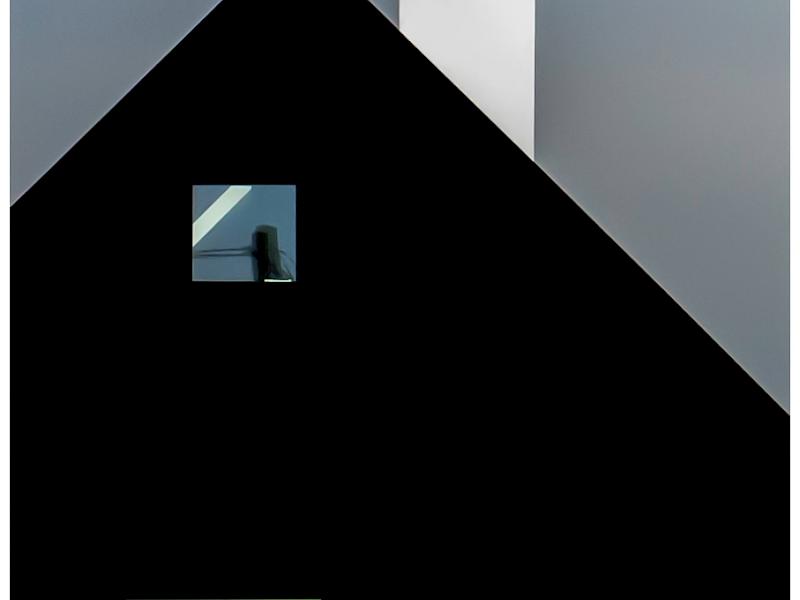
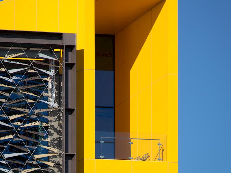
| A Study in Shapes | 4 | 3 | 5 | 4 | 16 | An unusual take on a house. I like the creativity of this photographer, in reducing a house to strong shapes and striking colours. I have been trying to guess what’s in the windows as that adds a layer of intrigue. Strong shapes and colours create an interesting composition. |
| Affluent Outlook ASB Building -Sue Smith | 3 | 5 | 4 | 4 | 16 | The chairs positioned in the yellow area suggest this building is very large. I found the immediate impact of the strong shapes and complementary colours to be very striking and whilst I feel that’s is a strong photograph it somewhat busy for a minimalist theme. Great verticals, totally straight. |
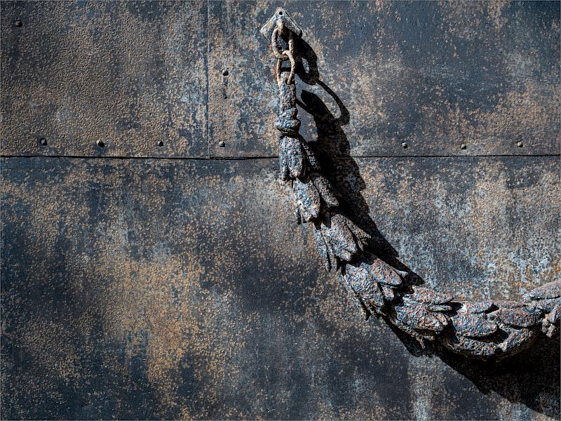
| Architectural Ironmongery | 4 | 4 | 4 | 4 | 16 | What an elegantly made chain. I note the photographer has chosen to narrow in on a weathered area where the joining lines add interest to the background whilst letting the chain become the focal point. The strong shadows from the side lighting showcase the texture and give dimensionality. I wonder if this is on the side of a ship? |
| Bent Reeds - Rose McConchie | 5 | 4 | 4 | 4 | 17 | Reeds are a great subject especially with reflections. I believe that the scene was duplicated on the other side and this has given symmetry to the image. I did wonder if it was enough as a half to give increased simplicity. I find the panoramic crop works well. I would like to have seen the water area slightly lighter in tone which I feel would add to the minimalist feel. I’m sure the photographer took lots more shots on the day! |
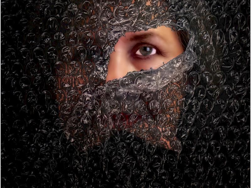
| Bubble Eye | 3 | 3 | 4 | 3 | 13 | An usual concept by this photographer. I note the composition is fairly central and the texture across the bubble wrap is even, with the brightest areas around the focal point. I am yearning for the eye to be sharp in this image and it feels just too over processed with the whites of the eyes standing out. I believe it would be stronger with the person sharper. An interesting concept worth further exploration. |
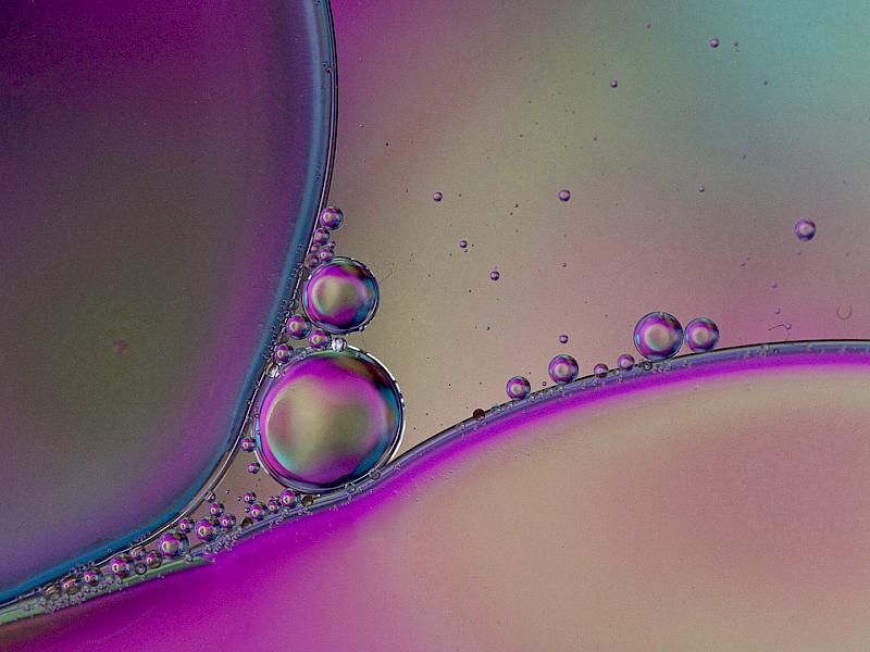
| Bubbles - Trish Brown | 4 | 3 | 4 | 4 | 15 | Super colours across these bubbles. I enjoy how the smaller bubbles are squeezed around the larger ones. There are three fine hairs in the image which I find quite distracting and could be removed in editing. I use colourful ‘gift bags’ when I’m trying these images, I have some favourites. |
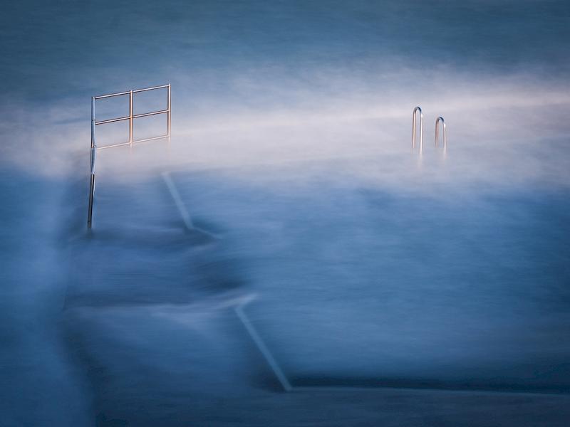
| Bude Sea Pool | 5 | 5 | 5 | 4 | 19 | Oh, it feels cold! I wonder if the photographer has chosen a blue tone to really increase this feeling. I find a lovely visual balance of the metal rails and the water outflow, nicely complemented by the whiter area along the top third. There are a number of dust spots around the outer edges of this photograph which I feel could easily be removed in software, and a sensor clean would cut down on that work! Have you been in for a dip? |
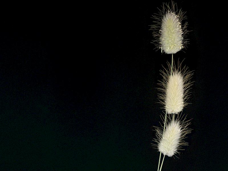
| Bunny Tails - Michelle Brown | 3 | 4 | 4 | 4 | 15 | Indeed they look like bunny tails too. Here I find a pleasing still life subject, arranged heavily to one side showcasing a large expanse of negative space. I wonder if a more triangular arrangement of the plants would give this image more dynamism and help reduce the visual weight of the black which I feel dominates the image. Lovely sharpness and detail and I note an increase in seeds towards the top head. |
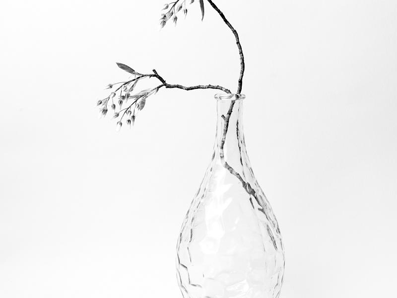
| Cherry Blossom in Vase | 4 | 5 | 5 | 4 | 18 | A high key minimalist still life. The photographer has given good thought to the vase and the branch, to give three simple elements within the composition, positioned just off centre. I like the texture of the vase and the simplicity of the buds, though I feel that increasing the blacks would have increased the tonal range and make this more impactful. An image that really suits black and white. |
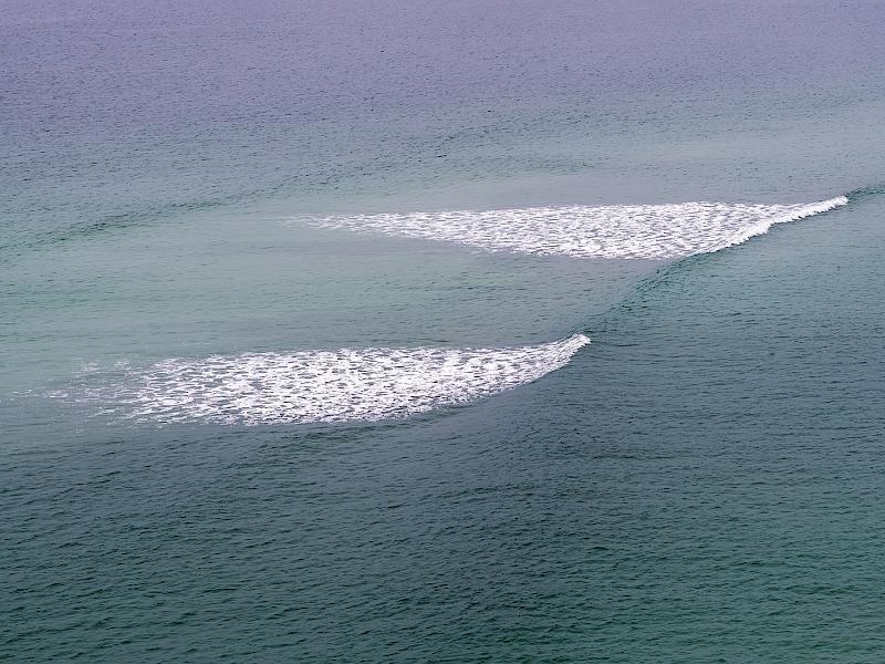
| Close Finish | 3 | 3 | 3 | 3 | 12 | A wave rolling into shore. I like what the photographer has seen here and from an interesting vantage point. The larger areas of white gain my attention and the simple texture across the image is pleasing to me. I find the magenta cast at the top quarter of the image distracting though perhaps this could be due to sunset colours. Whilst I find this image lacks impact it is a image that feels calm. |
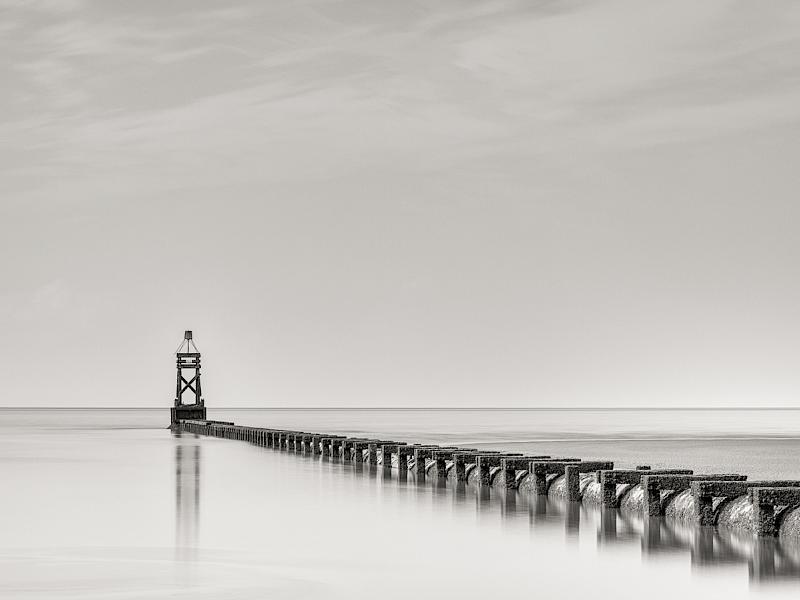
| Crosby Overflow Pipe | 5 | 4 | 4 | 5 | 18 | Structures going into the water are so photogenic. This overflow pipe with all the lines and shapes really adds a lovely leading line towards the end structure in my opinion, and it suits conversion to black and white with all the lines. I like the simplicity of the reflection, enhanced by the slow shutter speed, plus the fine details and lighter tones in the sky and the right side beyond the pipe. This minimalist landscape is almost a documentary photograph as well. |
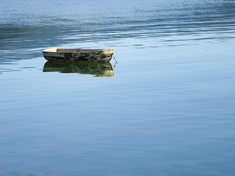
| Dingy Dinghy - Liana Bull | 5 | 4 | 4 | 4 | 17 | Moored up, waiting on company! There’s a nice simplicity to this image for me with just the water and the boat and a gradation of more texture in the water to a smoother look from top to bottom. I note some small highlights in the water, which could be cloned out so they aren’t visual distractions. I wonder if a slower shutter speed would have further simplified this image and created a stronger scene. Estuary, lake or sea, it looks shallow in the foreground. |
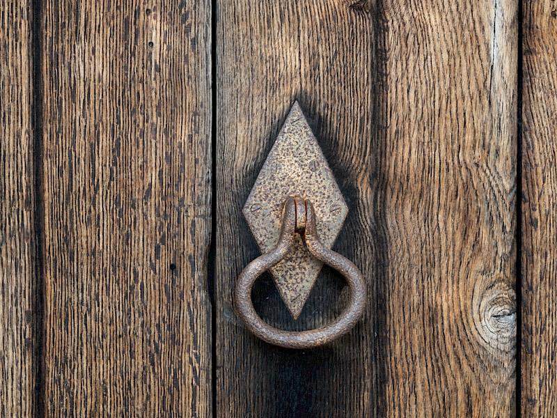
| Door Handle | 4 | 4 | 4 | 4 | 16 | Knock knock! This door handle and door shouts out texture to me and the photographer has been very successful at having straight lines through out the image. I like the small indent below the handle. In my opinion this is a little busy for the theme, yet it is a very competent photograph. |
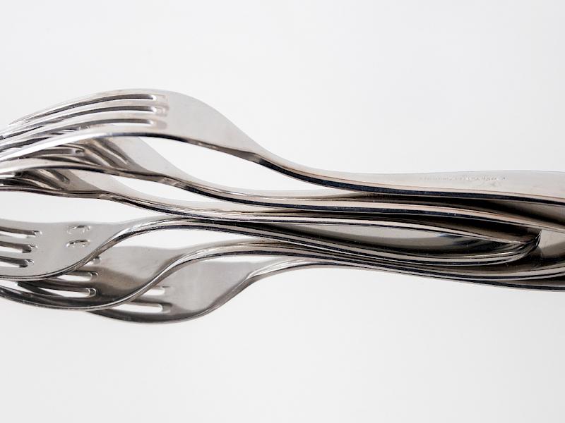
| Flower Fork - Lorraine Atherton | 3 | 3 | 4 | 3 | 13 | Perfectly balanced, just like a flower lying down. This is unusual and I think would have taken some time to set up to give clean lines, a strong sense of structure and to have the background clean and bright. I believe it has been set up on a mirror. I find the two smaller circles on the central fork to be a little distracting, and partly that’s because I’m trying to figure out what they are. The photographer has managed any reflections really well, as that can be very tricky with reflective utensils. A creative concept for this theme. |
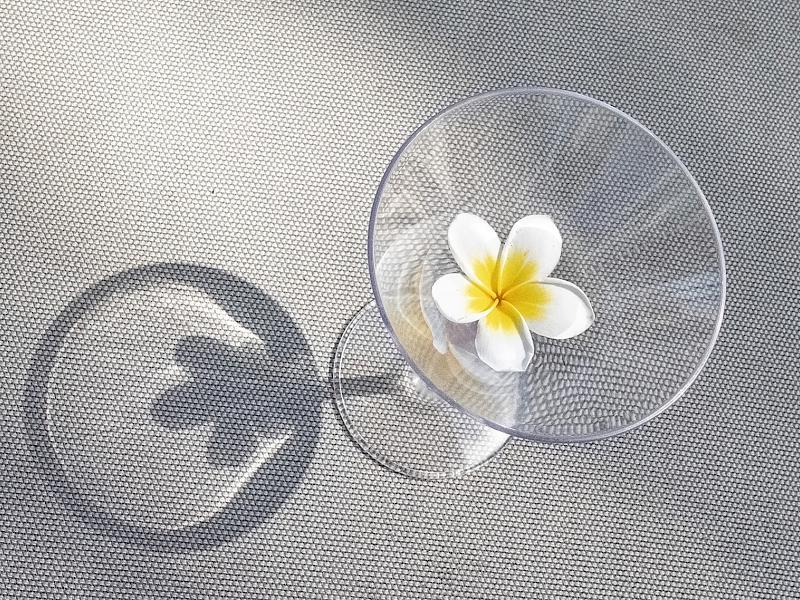
| Glass Shadow | 5 | 4 | 4 | 4 | 17 | Inspired by a pretty flower. I’m drawn to the simple flower in the glass and the strong shadow. Out of curiosity, I have rotated this image a few times and it does work in other directions too. I like the simple colour range of yellow, white and greys and the background is unusual though even in texture. It’s amazing how the addition of a shadow can elevate an image and I think the simplicity of the flower and its shape gives strength here. |
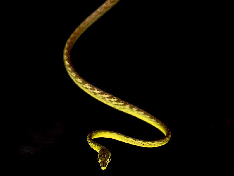
| Hanging Out - Trish Brown | 3 | 3 | 4 | 3 | 13 | This reminds me of a snake that dangled out of a tree one night we were camping in Australia many years ago! I find this is a strong S-shaped composition leading to the snake’s head as a focal point. I note that the sharpness is right on the head but the rest of the body is quite out of focus and I feel it may be stronger with more sharpness across the body. I also see that the light is coming from underneath and I would like to have seen the head being the brightest part of the image to really get the viewers attention, plus a little more room for it to move into. Perhaps this is a close as the photographer wanted to get! |
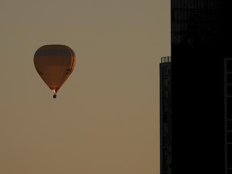
| High Rise - Susan Howarth | 4 | 4 | 4 | 4 | 16 | The title is a great play on the balloon and the building. Here I find the moment is nicely captured with the gas lighting up the balloon and the position within the square crop is very effective. I would like to have seen the balloon a little lighter in colour to really grab attention and I think if the buildings were less dark they wouldn’t feel so visually dominant at the side. It must have been an exciting trip. What a terrific way to travel. |
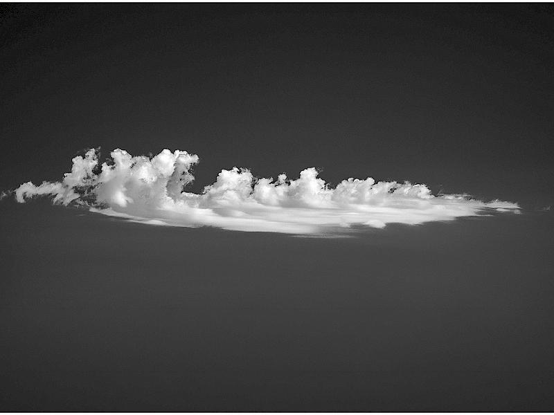
| I Wandered Lonely as a Cloud | 4 | 4 | 5 | 5 | 18 | Aotearoa - Land of the long white cloud. I find this an aesthetically pleasing cloud to have photographed against what was likely a blue sky. The details in the cloud shape adds to the composition and I have been considering if a crop off the top would further strengthen the scene. I note some horizontal and vertical lines in the image which may be due to cloning and could easily be removed. Great tonal range across this image in my opinion. |
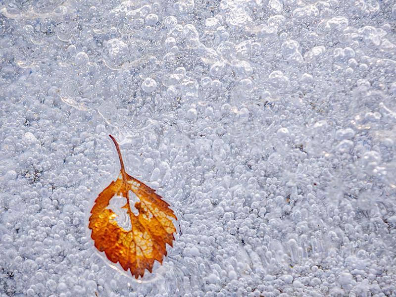
| Ice Bubble Bound - Iain Galloway | 4 | 5 | 5 | 5 | 19 | Totally trapped for now. This is a technique I would like to explore myself and I think this is a simple composition with a pleasing variety of texture in the background. I know it could feel overpowering but the simple colour palette of whites, blues and greys complement the warmer tones of the leaf which has a strong shape and form. I wonder what other items the photographer has tried to freeze? |
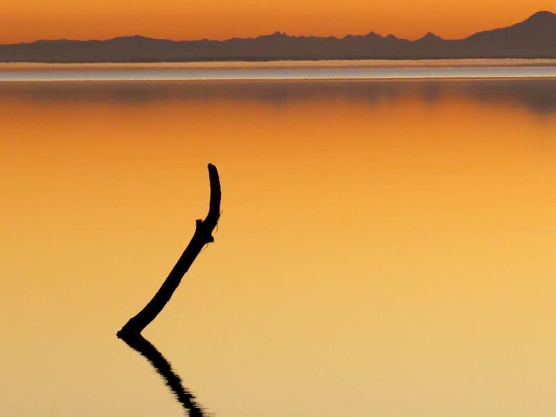
| Last Light at Lake Ellesmere - Rose McConchie | 5 | 5 | 5 | 5 | 20 | A stunning sunset, with lovely warm tones. A simple minimalist landscape scene with two elements, the horizon trees/water and the stick and in my view each would be too simplistic without the other. I like the balance between the stick and it’s strong reflection, against the softer tones in the background and somehow the heat haze matches the reflection. It feels like it’s taken with a long lens giving compression to the scene. A calming image. |
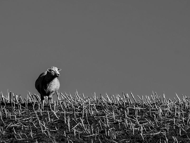
| Lone Sheep - Steve Angus | 4 | 5 | 5 | 4 | 18 | We have sheep on our farm and they are seldom lone, always trying to find each other! This sheep is perfectly posed in the image, looking out into the negative space with the sun lighting its face and in my view, the shadows created add strength to the focal point and contribute to the tonal range. I see the texture of the grazed crop in contrast to the softness of the wool. Simple, yet effective. |
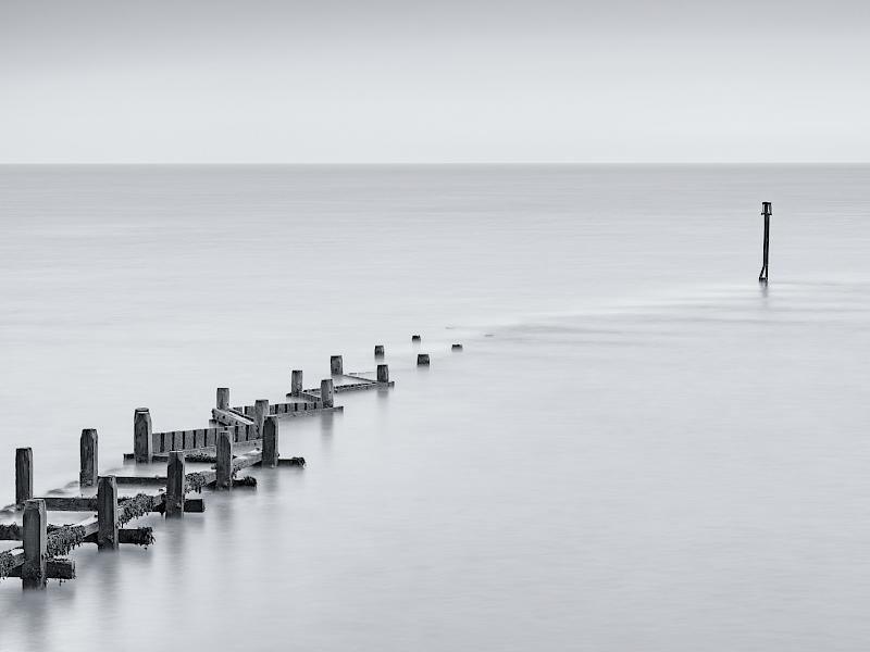
| Overstrand Groyne | 5 | 5 | 5 | 5 | 20 | I wonder if this is full tide. Here, the groyne appears to be partially submerged and with the slow shutter speed the photographer has managed to make the groyne really stand out from the background and even gained some texture in the submerged lines on the lead in to the end structure. I feel the higher positioned horizon gives predominance to the water area and the simplicity of the sky adds visual lightness. A little more contrast would strengthen the look of the groyne I feel, though this is a pleasing minimalist seascape. |
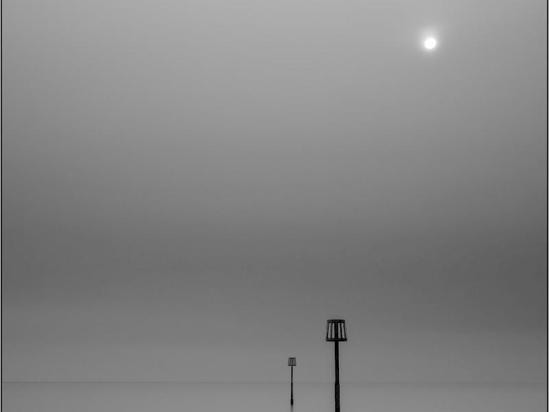
| Peace | 5 | 5 | 5 | 5 | 20 | Pure simplicity. There’s a moodiness to this image which I feel comes from the greyness and the sun attempting to push through the mist. My eye is drawn to the two structures in the water, one more visually dominant, in terms of colour and size, than the other and then to the sun and back round again. I like the lower positioning of the horizon in this photograph and the hint of white towards the bottom left adds some contrast to the scene. The slow shutter speed has rendered the entire water body to flat calm and in my view, created the minimalist look and feel here. This would look nice printed I think. |
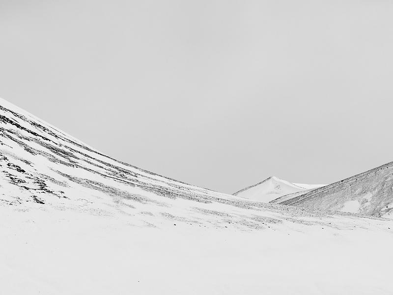
| Peak - Iain Galloway | 5 | 5 | 5 | 5 | 20 | This image reminds me of the work of Bruce Percy who favours minimalist landscapes. In this photograph the larger mountain on the left leads beautifully across the photograph and is balanced by the two smaller features I feel, though the focal point is very much the peak in the distance despite it’s diminutive feel. I like the subtle texture of the scree on the landscape. Snow simplifies many scenes and offers a wealth of photographic opportunities. |
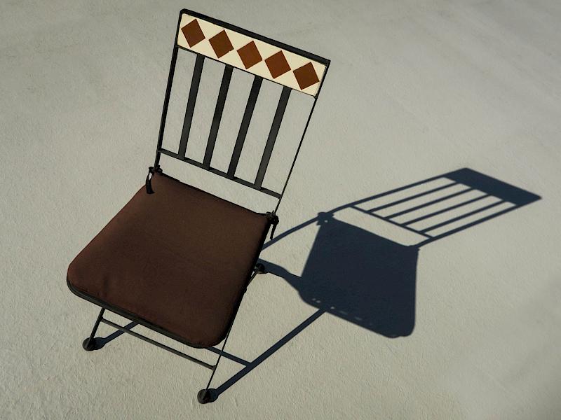
| Please Be Seated - Chris Beech | 3 | 4 | 4 | 4 | 15 | An interesting chair with a simple colour palette. I think the strong shadow created adds a graphic element to this photograph. I note the background on the top right has lines on it and I’m not sure if this is part of the wall or if cloning has perhaps introduced some diagonal lines. The simplistic colour palette is soothing in this photograph. |
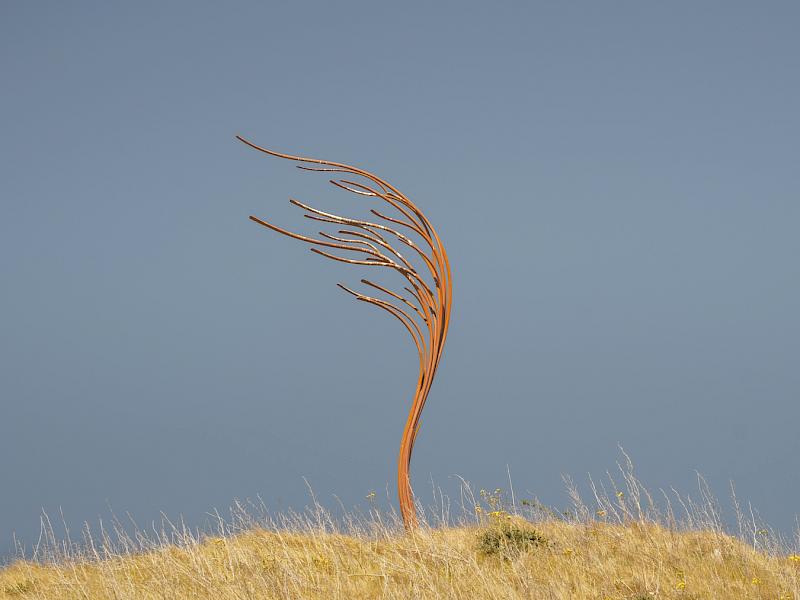
| Pride of Place - Eunice Belk | 4 | 4 | 3 | 4 | 15 | What a sculpture which appears to echo the shapes of the grasses in the foreground. I was taken by the negative space around this sculpture and initially wondered if a square crop to exclude a third off either side would make the image stronger. I feel that the photographer has chosen to keep it central for the visual balance and I quite like that. Complementary colours of yellow and blue are for me visually strong here. It certainly feels like it’s pride of place in this location. |
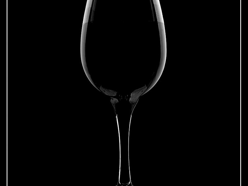
| Rim Lit Wine Glass in Mono | 4 | 3 | 5 | 4 | 16 | A lovely glass of the finest Marlborough pinot noir perhaps. My favourite! The photographer has managed to control the highlights on the glass really well and created the lovely rim lighting. I feel the centrally placed image gives strong symmetry and the subtle level of fluid inside on the third line gives somewhere for my eye to rest. I note part of the base of the glass to sit forward of the base and I can’t see why that might be. Perhaps it’s not wine in the glass at all… just my wishful thinking. |
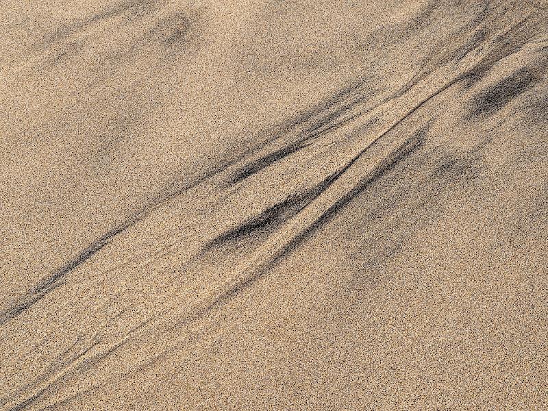
| Sands of Time | 3 | 3 | 4 | 3 | 13 | Streaks of darker sand can create some great patterns. I often enjoy walking on the beach and looking for patterns. This image has a strong diagonal theme and I notice this runs from corner to corner. For me, I would like to have some more depth in this image, like some of the ‘sand trees’ that can form, or perhaps stronger side lighting to give some 3D relief. The colours are true, and I very much enjoy the texture across the image. |
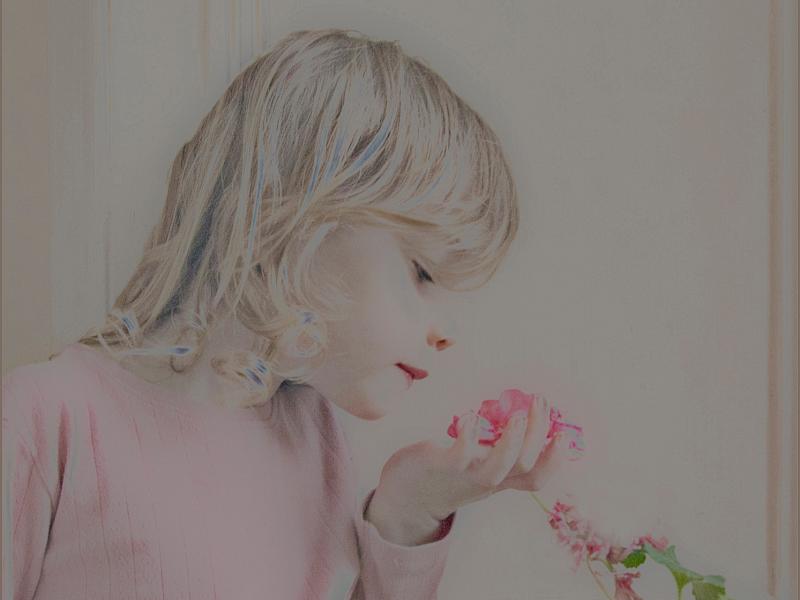
| Simple Pleasures | 3 | 3 | 4 | 2 | 12 | Smelling the delicate flowers. I find this a simple arrangement from the child to the flower and back again with a strong diagonal emphasis. I like how the pink colour matches across the flower, jumper and even to the lips. For me the editing of this image has introduced odd colouration in various areas of the image, in particular the hair, as well as some part of the flower that’s missing and that takes away from the image. This is a great subject and composition so I encourage the photographer to edit lightly. |
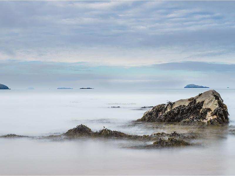
| Slow Seascape | 4 | 5 | 5 | 5 | 19 | I can almost smell the seaweed in this photograph. I think there is a realism to this photograph that makes me want to reach out an touch the screen! I like how soft the lighting is and the slower shutter speed has reduced the undulating movements to smoothness. For me the island behind the large stone on the right is almost the inverted version of it. I can see two separate photos here, almost like a diptych and both equally strong in their own ways. I find the sky very pleasing with the diversity of cloud types and the simple blue/grey colour palette. |
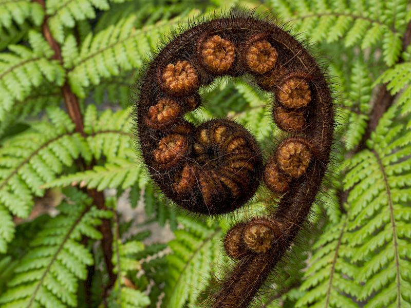
| Spiral of Life - Grant Udy | 4 | 3 | 3 | 5 | 15 | Nature is stunning, especially when we take the time to notice it and to check out the close up detail. I find this is beautifully balanced composition and the brown unfurling fern is dominant against the out of focus green background. I would like to see the brighter area in the background darkened as that takes my eye with it being the brightest area in the scene. I do feel that whilst this is a strong photograph, that it is a little busy in a minimalist themed competition. |
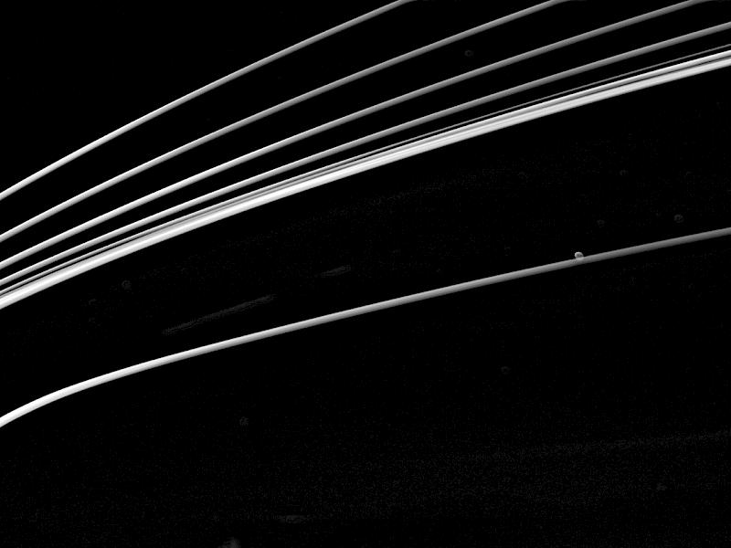
| Streaker - Maryjane Hillier | 3 | 3 | 4 | 3 | 13 | I wonder if this is a traffic trail or if it has been created by various torches? The lines form a lovely diagonal composition and I believe the chosen crop adds emphasis to that. I note some brighter circles and I feel these are distractions which could perhaps be removed. The photographers choice of black and white really draws attention to the lines. |
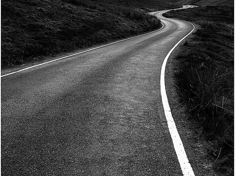
| The Long and Winding Road | 5 | 5 | 5 | 5 | 20 | What a great road to drive! I am immediately taken by the road right into the middle of this picture and into the beautifully layered landscape in the background. Both the road and receding hills are critical in my opinion. There is a great tonal range I feel and the textures across the road and landscape vary from coarse to fine. The light is even and the image moves from darkness towards light, with the strong white road lines really add solidity to this composition. |
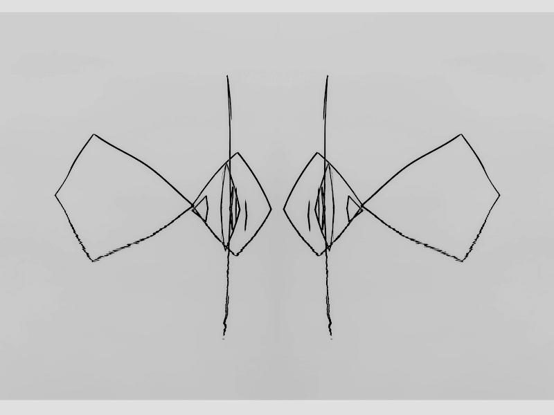
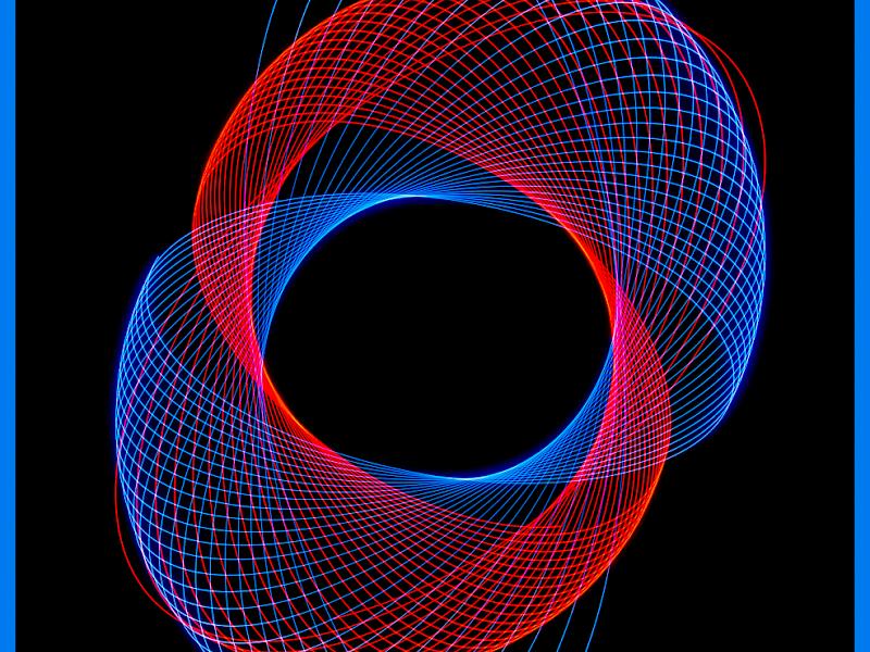
| The Pair Become One - Sue Smith | 4 | 4 | 4 | 4 | 16 | Fractals are quite mesmerising. The photographer has chosen three simple colours of black, blue and red here and the lines all bisect each other to give a phenomenal repeating and satisfying pattern. I feel the open line at the base is important in the composition to allow the viewer to either start or end on the lines. |
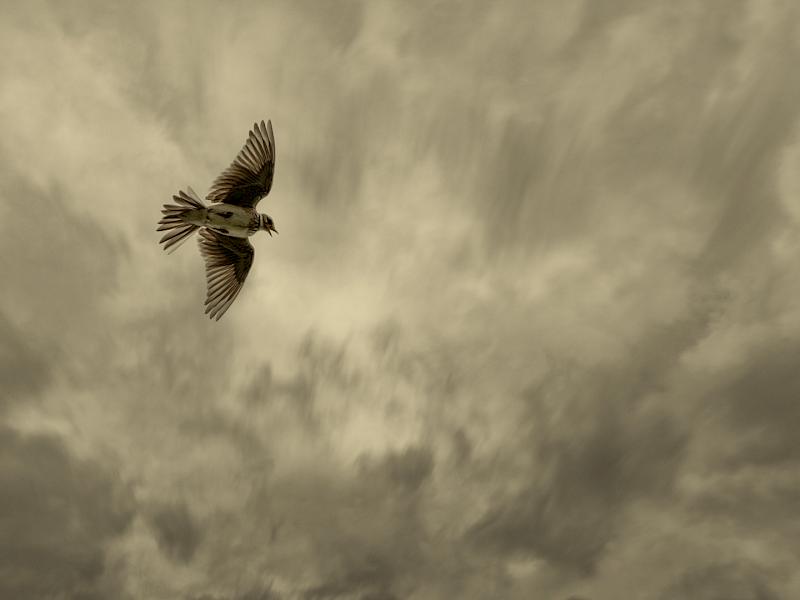
| The Skylark - Sue Henley | 4 | 4 | 4 | 4 | 16 | Skylarks are sweet birds, a joy to listen to when out walking. In this instance the skylark has been photographed with open wings and mid song and the open beak adds a nice context to this photograph I feel. I do wonder if the sky feels just a little busy, though perhaps it adds to the atmosphere in the image. I like the sepia tone across the image to give continuity in the look. |
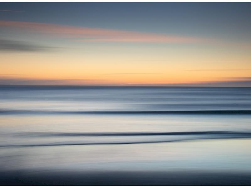
| Tranquil Seas | 4 | 5 | 5 | 4 | 18 | Beach scenes are great for Intentional Camera Movement (ICM). The photographer has used a slower shutter speed and swiped the camera from one side to the other here, running the approaching waves into line and I feel this has been effectively done. I like the warm sunset or sunrise tones against the cooler blue water tones. |
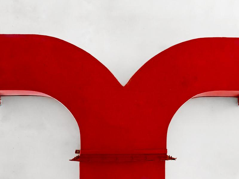
| Vented - Robin Mainprize | 4 | 4 | 4 | 4 | 16 | Vents in the shape of a V. The photographer has captured an everyday object and simplified the composition. Red is a striking colour and here I feel it really stands out against the white background. I see some blotchy areas in the white which could be cloned out, these are either black dots or a white one bottom right. A simple, quite minimalist composition. |
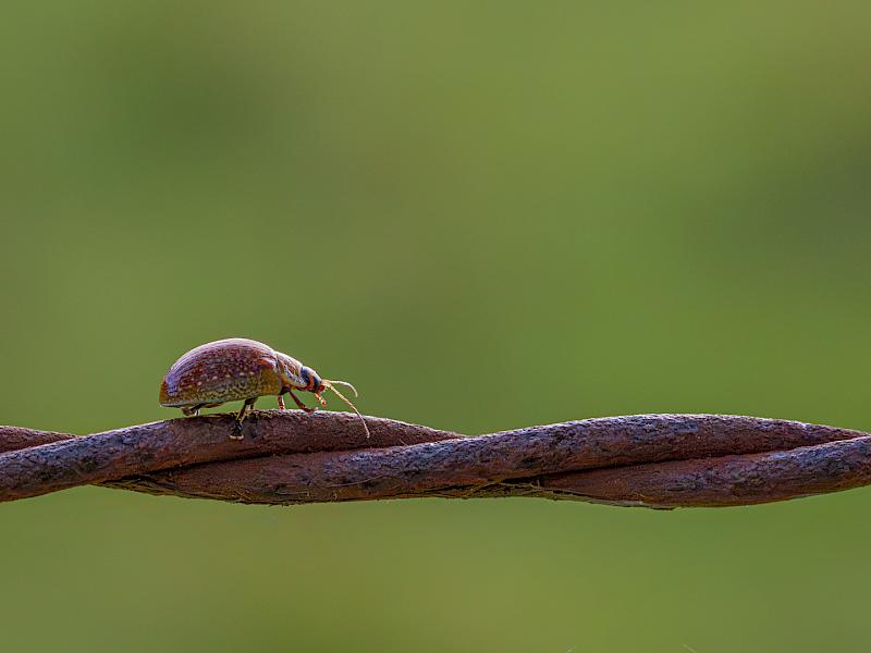
| Walking the Wire - Sue Henley | 5 | 5 | 5 | 5 | 20 | The wire is like a tightrope for this insect. I am in awe of the scale here, as I believe this this barbed wire so the photographer has captured a very small insect in this macro photograph. I feel the expanse of the nicely blurred green background and negative space really diminishes the size of the insect and adds impact. Lovely rim lighting is particularly good. Thread carefully wee one! |
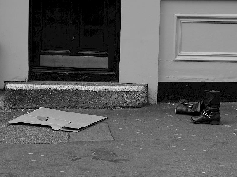
| What Happened Here | 3 | 3 | 3 | 3 | 12 | Boots cast aside near the door. I guess there is a story to be told (or maybe not). I would like to see more detail in the door and a closer physical connection between the shoes, door and cardboard. I feel there are too many elements here for a minimalist photograph and it is more documentary. |
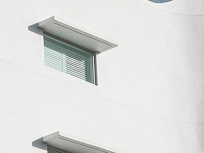
| Windows | 5 | 5 | 4 | 5 | 19 | Such a simple subject. I am enjoying the muted colour palette here which adds to the simplicity. I believe the little curve on the right side of the building is essential to add interest, and it permits the negative space to the right of the windows. The subtle texture in the clouds matches nicely to the texture in the walls where it’s visible on the right side. A simple intimate photo of some architecture, putting the photographers view on it. |
Share: