
Judge: Bob McCree
Medium: Digital and/or PRINT.. Max number of images: 2 (Set and/or Open).. B&W. Monochrome as in shades of grey, sepia, blues, greens ... manipuate an existing photo!!
Restrictions: Digital and/or PRINT. Two images allowed to be submitted (Set and/or Open)
An image where all colour has been removed (in the post digital process or in camera). It consists of shades of grey tone that generally go from dark (black) to light (white).
Whereas Monochrome is an image displaying a single colour or different shades of a single colour – where black & white is commonly the most prominent example of monochrome photography.
Let your imagination go wild.
https://photographylife.com/black-and-white-photography
Open
Set Subject

From Bob McCree
PRINTS then DIGITAL results and critique
| Set or Open subject | Title | Rating | Comments |
| C Grade - SET | |||
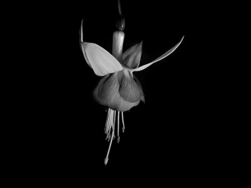
| Set Subject | The Ballerina | M | A nice sharp image of this fuchsia rendered in a rather soft lighting circumstance and placed against a dark, featureless background. With nature type images such as this I prefer to see them placed against a natural looking and feeling background, whether in monochrome, or colour. Thus, just a semblance of light and form in the background would suggest a more natural background more in sync with the softness and beauty of a lovely flower. Having said that you have handled the representation of the flower quite well suggesting by the use of soft lighting and subtle tonal balances the delicacy of a bloom. But, to my eye the dark featureless background destroys any semblance of a complementary natural environment in which this flower is growing. A pity, perhaps, but for all of that the representation of the flower has been well handled with good sharpness and subtle detail. |
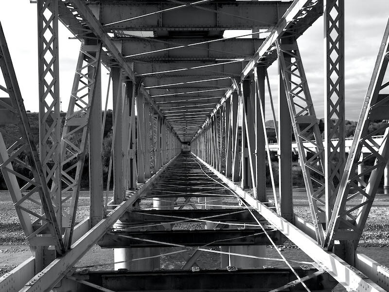
| Set Subject | Seddon Bridge | M | The all but square presentation of this image has allowed you to present the shape and form of this structure well in a literal geometric form. This composition has allowed you to show the regular pattern form of the steel work as it is but perhaps, gives us a less satisfying composition than placing these elements in a more dynamic but unequal format. But the fact that we see off on the right the new structure that replaced this one does at least give the image more interest. There is some interesting light and shadow here which adds contrast and interest but I would have liked to have some of the darker shadow areas lightened up a little to show us some of the texture and form in those areas. There is good sharpness throughout which suits the subject but I would just like to see a little detail in the darker areas of the structure. |
| B Grade - OPEN | |||
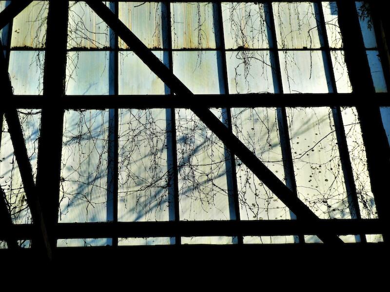
| Open | Inside the old barn | H | An interesting concept of looking out of the barn. I enjoyed the strong representation of the window structure offset by the more delicate tracery of the bare shrubbery set against the subtle form of the building behind. I felt the stark and almost monochromatic statement of the window mullions sat nicely against the more subtle treatment of the and gave the image a strong dramatic feel. Given that the image draws its strength from the geometric nature of the window I believe that accepting the parallax distortion that pointing the camera upwards has given you I suggest you may have been better advised to have corrected this in your photo editing to really reinforce this aspect of the image and its setting against the softer and more delicate background. But other than that caveat I feel this is indeed a very interesting concept, and image. |
| A GRADE - SET | |||
| Set Subject | The Remnant. | H | An excellent image in all respects. Beautiful placement of all the elements with some wonderful subtle rendering of of the moody tonal values on the subject and in the earth, sea and sky. It all sets a wonderful mood aided by the muted tonalities throughout. A truly superb rendition of this scene. |
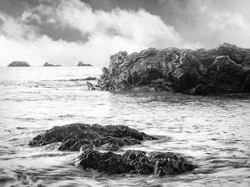
| Set Subject | Gnarled Coast | M | Yes a gnarly old coast perhaps but not exactly represented in this image – spoilt perhaps by the lack of detail in much of the sea and in the lighter areas of the sky above. We have some reasonable detail in the rocks to suggest the title but I felt this was spoilt by not having stronger detail in the sea and particularly the sky where the white clouds are almost totally blown out. For this one to live up to its title we need this detail and for the darker form and structure of the sky to be accentuated to suggest the promise of the title. Monochrome is the ideal format for your concept but it needs to be worked up selectively to really bring out the drama that your title suggests. |
DIGITAL
| Title | Rating | Comments | |
| C Grade - SET | |||
| Up the Creek | A | A good story telling image but one that needs some more sympathetic post production work to bring out its full value. As submitted, whilst sharp with good depth of field, it is rather underexposed and lacking in contrast, both of which could well have been corrected with some sympathetic adjustment in your photo editing. There is a fall off of lighting as we move into the image but this could have been readily corrected selectively before some additional contrast was fed into the image. Quite a tight crop used here and I wonder if the composition could have been improved if you had included all of the outer sides of the two lower boats were included to serve as leading lines into the image and the top boat had been included a little further to the right of off centre to strengthen the diagonal composition? | |
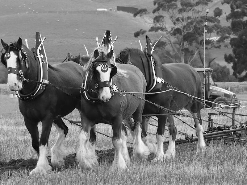
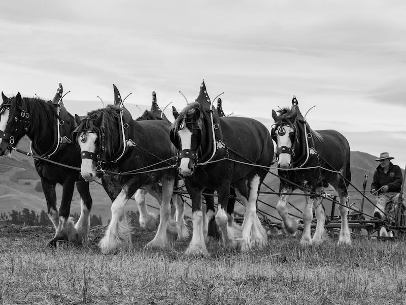
| The old fashioned way | H | A well handled image with the monochrome conversion nicely done to preserve the detail in the horses and driver. I enjoyed the fact that you have got down a little lower and placed the horses in a prominent composition within the frame. You have been able to retain some detail in the cloudy sky although I would suggest that you could probably have brought out a tad more detail there in post production and, also, just a little lightening up of the horses would be worth doing to bring out more detail there. But, overall, a nice image well worthy of an Honours in your grade. | |
| Ploughgirl and team | H | This one is similarly, a rather well handled monochrome image, particularly in a technical sense with some good tonal values and sharp detail. The composition is good, too with the horses taking pride of place in the frame and good contextual detail in the background – perhaps just a little intrusive with that distant tractor on the L/H border. There are good story telling aspects to this image all enhanced by a very competent handling of the taking and post production technical aspects. Nice image! | |
| my ole shed | A | A rather literal representation of this shed, reasonably well handled, but one that could be improved markedly with some sympathetic post production treatment. For example, some selective contrast and tonal adjustments in post production could lift the image somewhat but the middle of the day lighting really is not doing you any favours here. Particularly in monochrome, look for more directional light that will give you more distinct light and shadow that is ideal for the black and white treatment. And, perhaps, look for an interesting vignette within the scene – for example that old cream churn and associated old gear – heaven sent material for an image, particularly when the lighting is more directional. | |
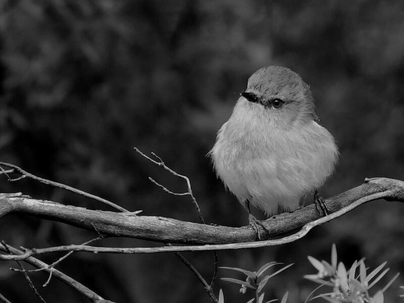
| Grey Warbler. | H | I have been trying to capture one of these birds for yonks and always seem to be defeated by their propensity to hide in the thicket, so to speak. I am impressed with that which you have captured here with that beautiful detail in the bird’s feathers and the separation you have achieved between it and the background, yet still retaining the sense of the natural environment. Well done! The branch on which it is perched is fine although I suggest you tone down a little that foliage bottom right. Do not remove it – simply tone it down to retain the context. But, really, in your grade this a particularly well handled N/H image well worth the highest reward! | |
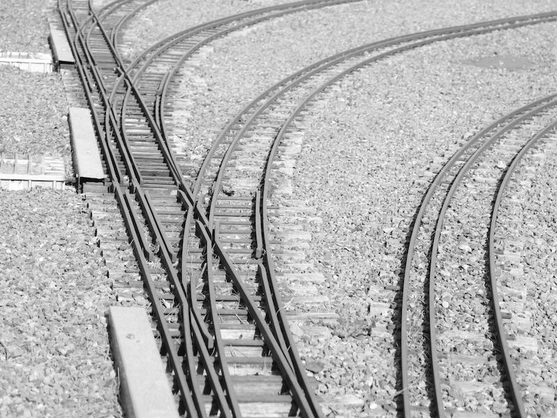
| eny meny miny mo | M | Model, or real? Good title. I sense that this image is just a tad overexposed and lacking in essential contrast, both of which could be readily addressed in post to give this image a little more punch. The idea of having the curved lines branching off the mainline works quite well in compositional terms except that they do tend to lead the eye out of the image. I suspect, also, that straightening the main line into a true vertical would accentuate the outgoing curved nature of the composition, too. I tried flipping the image around, both horizontally and vertically, to see if there was a stronger composition in there by so doing but in the end came to the same conclusion as you in its format. | |
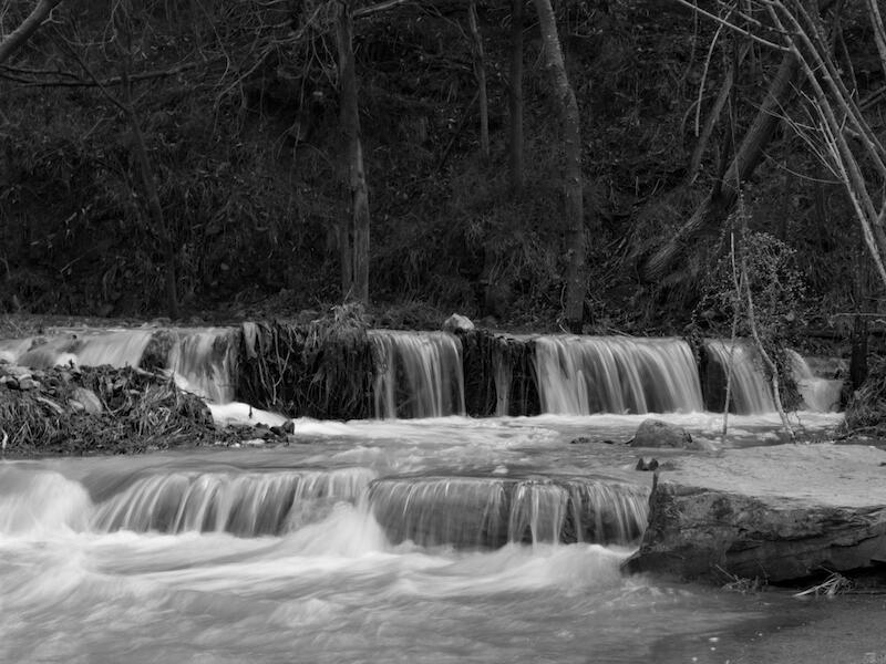
| After the storm | M | A pleasant scene reasonably well handled. You have captured the movement in the water well and some nice environmental detail behind the waterfall but I feel that these areas could be further enhanced by some selective lighting adjustment, particularly in the background, to bring out the detail there a little better. Whilst the balance and composition of the image is good the bright tree on the L/H side of the image is a worry and I suggest the image would be better if it were eliminated, either by cropping, or, if possible, by using a slightly different camera position. Please do trey to avoid placing a bright item on or near the sides of an image. | |
| B Grade - SET | |||
| Surreal Flight | M | An interesting and potentially, a compelling one, but one that just lacks the essential touch and vibrancy to make it a compelling image. I enjoyed your different approach to this image but feel that you have not quite taken it through to its logical conclusion, in that the image as presented lacks that extra wow factor. Why – because I suggests it lacks that contrast and brightness to really give it punch. You have used a rather surrealistic approach rather than a literal approach and thus can well push it even further into a more graphic realisation by enhancing both the brightness and contrast. As supplied it is sharp with well delineated detail which could be enhanced further to lift it out of the generally muddy appearance it currently has. If pushed to its limits it could well be both a fun image, but also a very compelling image, indeed. | |
| Stormy seas | A | Well, rough perhaps? An interesting part of the coastline with some active wave action which aspect has been reasonably well captured. However, there are some problems elsewhere in the image with the horizon not being levelled and the light areas above the top L/H cliffs capturing the eye, These are issues that could easily have been fixed before presentation. Could I suggest that some sympathetic action in post could/should be undertaken to brighten up the water areas a little and give that area more vibrancy and for some selective dodging and burning to be done in the shadow areas to selectively lift detail and/or contrast, to suit. I would suggest that more work be done on the sky area to lift and enhance detail there, as well. There is potentially great detail here but the image needs much more post production effort to lift vibrancy and make this image a more compelling view. | |
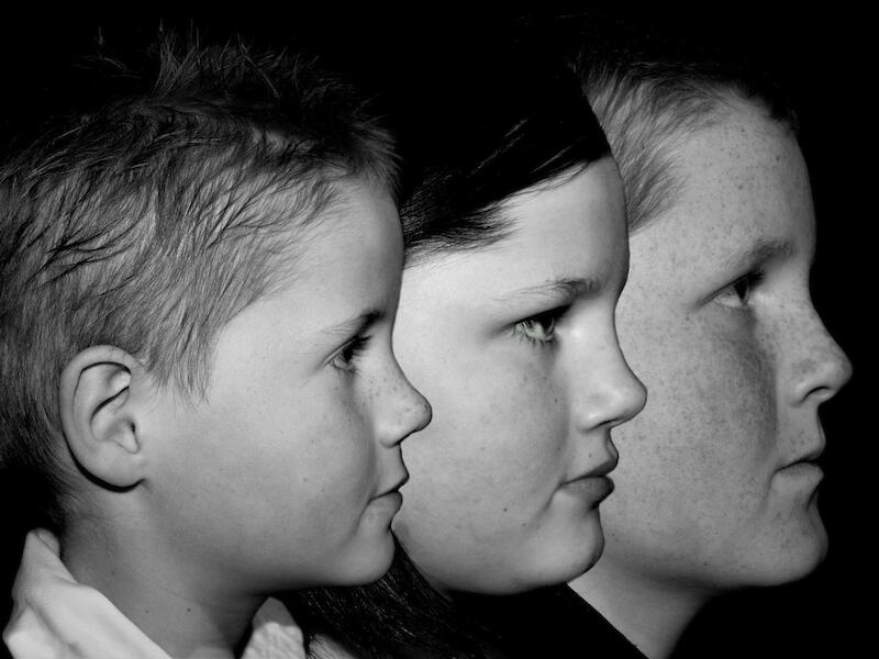
| Siblings | M | Love the concept of this one and when viewed superficially, all seems fine. But, when viewed more analytically, it seems that there are a couple of problems that need to be attended to. For example, there seems to have been a little too much contrast wound into the image with some slight burnout on the faces of the front two boys and a lack of detail in the darker hair areas, and any positive delineation between the hair lines of the two rear boys and the jet black background. Or indeed, much detail in that middle boy’s hair, in particular, has been totally lost. Perhaps, some attention to the lighting on the background would have been helpful too to achieve this subtle delineation? Overall, I would like to have seen these issues tidied up in either the taking, or in post, and then you would have a wonderful record of these three siblings. | |
| Old Naval Sheds | A | A fairly literal shot of these sheds which you have embroidered somewhat by applying an overlay. Given that the lighting appears to have been rather flat the application of such an overlay may have been worth trying but in this case I am not at all convinced it has lifted your image to a higher plane. For a subject such as this a more dramatic lighting condition needs to in place to pick up the inherent patterns and texture in such a building. The overlay appears to have reduced the contrast and given the image a rather flat appearance. From a compositional viewpoint the image lacks a more dynamic aspect that the use of perspective may well give it and seems to have been cropped rather too tightly to have enabled you to do this. For example the roof line of these buildings offer a strong architectural perspective but you have cropped out the top of that on the left and given us only half of that, and its building, on the right. I suspect there is a much stronger image here than that which you have shown us and I would have preferred for you to have thought a little more about that before the taking and come up with a more compelling image, overlay, or not. The material is there but it needs more sympathetic lighting and a stronger feel for a more dynamic composition. | |
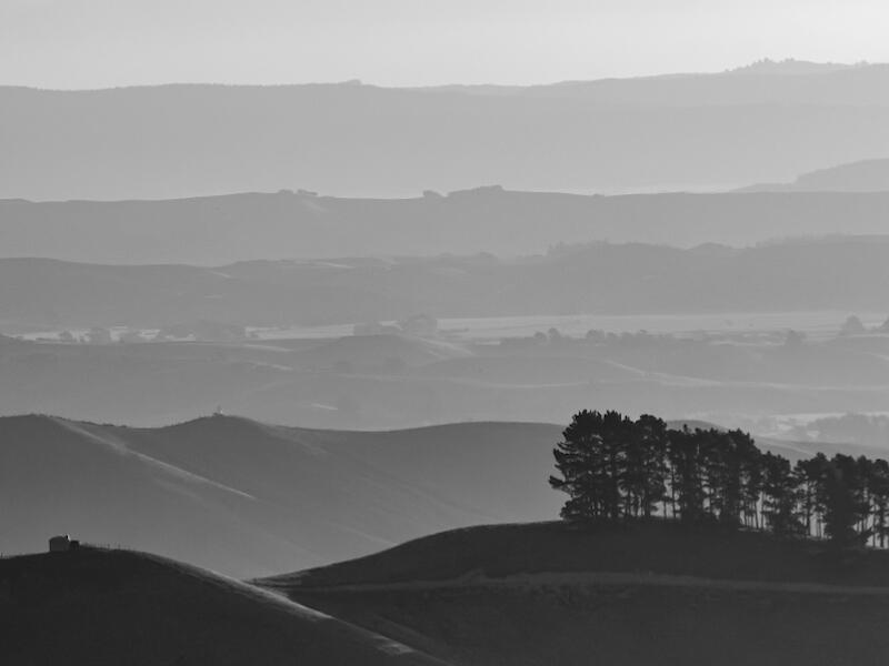
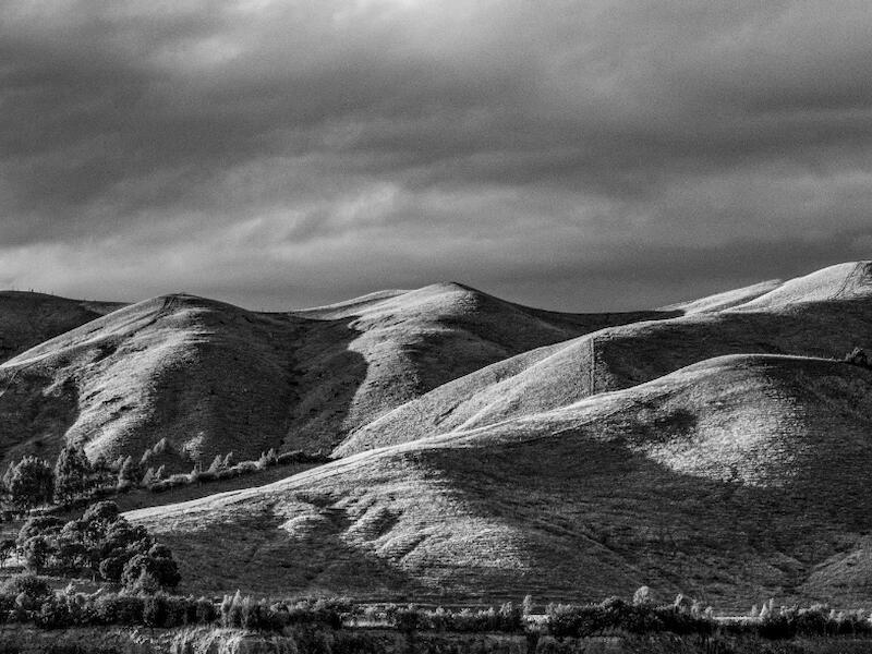
| Marlborough Hills | M | Did you plant all those hills there? Nice recession and capture of the atmospheric conditions in this image with the progressive lightening of the hills as we move through the scene and nice capture of the rim lighting on the darker foreground hills. A couple of things, though – I find the dark area at the bottom of the image and the corresponding light sky area across the top just a little distracting. My suggestion would be to crop out approximately half of the bottom dark area and try perhaps, a light vignette across the top of the sky to help hold the eye into the image. Given the range of lighting values and tonalities across this type of image it is difficult to get the balances right and perhaps you might like to consider selectively manipulating these more gradually and progressively from the darker lower tonalities through to those in the upper hills? A little bit of post window dressing but such subtle manipulations can add immeasurably to the feel of the final image. | |
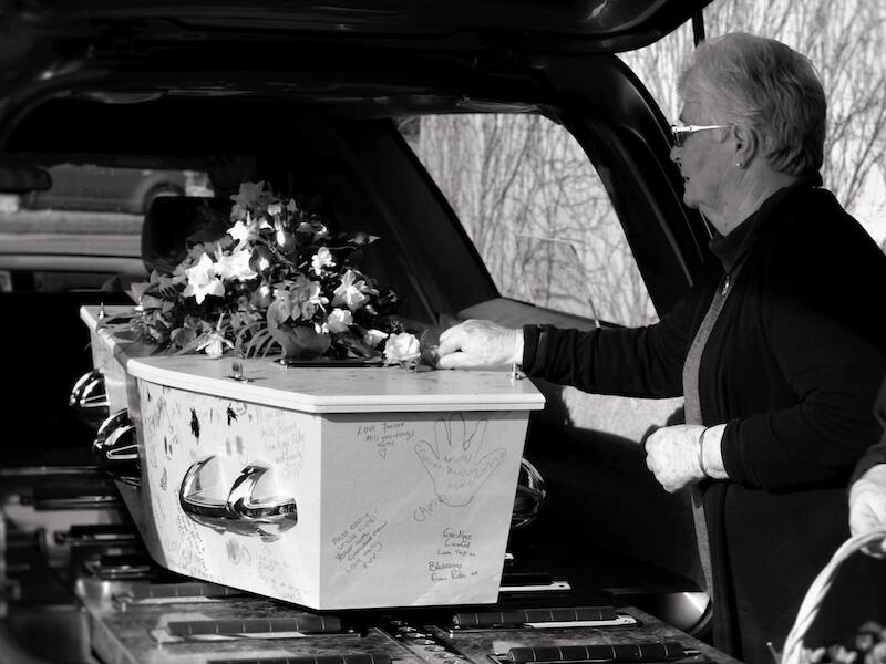
| Final farewell | M | An emotional image captured quite well in, and suitable for, monochrome. As commented elsewhere some of the feeling in this image has been lost by the high contrast levels in the monochrome conversion. For example, much of the detail of the interior of the hearse and the lady’s clothing has been lost and the brightness of the background behind her is dominating the image. Some lifting of the shadows and suppression of the highlights would be helpful, for starters, as well as some sympathetic lifting of the skin tones on the face. Also, watch the intrusion of that person(?) in the bottom right! Yes, I know you have to grab what you can in such occasions and work around the lighting conditions at the time, but there are a number of things that you can do in post production to ameliorate the lighting conditions dealt you. Such is the joy and challenge of PJ type digital photography! It is well worth doing for such a touching image. | |
| Climb the Wall | M | Another good monochrome conversion with good control of your blacks and whites. Whilst the climber is nicely positioned within the frame it is a pity that she is looking out of the frame. Perhaps in the taking, had you positioned her on the L/H side and looking into the image you would have a stronger image. Cheating, of course, but then it would be a simple matter to flip the image and then have her looking back into the image, thus completing the compositional cycle? But for all of that you have achieved an excellent monochrome conversion in a technical sense – just a little unfortunate that the attitude of the climber looking out of the images detracts a little from all the otherwise fine qualities of this image. | |
| Calm before the storm | H | This image has some good qualities and sets the mood as indicated in the title. The monochrome conversion has been done well and it seems you have done some good post production work to really bring out the feel of the day with the approaching storm clouds looking threatening and the almost calm water reflecting this. Perhaps, your horizon is a little central and for my money I would suggest a crop off the sky, down to just above the poplar trees, to give the image a stronger compositional balance. The important thing is that you have captured well the feel of the weather and its effect on the scene, helped by the conversion to monochrome. Feel in Landscape is so important, and full marks to you for having captured this! | |
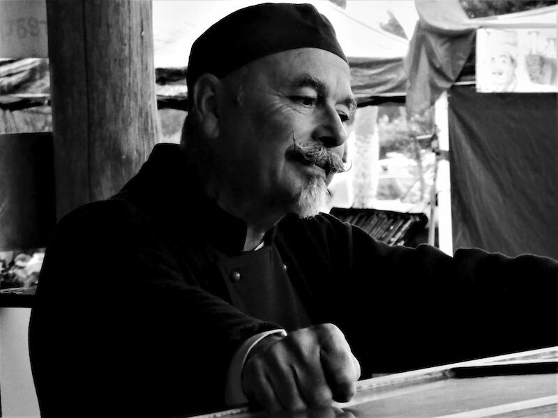
| Between customers at the market | M | A difficult image to pull off given the brighter background lighting. The success of such images often relies on using a sympathetic background and seeking a lighting ratio whereby the subject is in a better lighting condition than the background. Not sure here whether you could have moved around a little to give a better, less distracting background but given what you have taken here perhaps you should consider some more selective and sympathetic lighting adjustments in your post production processing to lift the shadow areas on his face and clothing and to suppress the brightness in the background. On the lo res version I have here a reduction in the overall contrast plus selective lighting adjustments on both the background and the subject have resulted in a better balanced image, I suggest. Similar working off the original hi res image could well give you an even more balanced and pleasing image? The image as presented does have some potential for improvement in post processing but, if in taking future such images, do try to move around the subject if you can to find a more sympathetic background. | |
| Anchoring Back | M | You have used a narrow DOF here, purposefully, I suggest, giving you a narrow band of in focus wires. Whilst I can see your intent here I feel it would have been advantageous if a little more of the area on the L/H side had been in sharper focus to give the eye a stronger lead in to the image. Overall, the monochrome conversion has been reasonably well handled but a little lift in the contrast levels would give you a more graphic image, I feel. These strong diagonal lines suggest a lead through to a point of interest but with that point of interest being distinctly in soft focus some of the dramatic effect is lost, I feel. | |
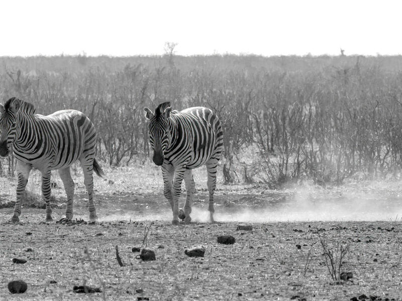
| A Dusty Path Travelled | M | I enjoyed the fact that you have cropped this image down to a panoramic format but suggest that you could have taken this even further by cropping out the sky entirely and, possibly, cropping a little off the bottom. This would tighten the composition and remove the brightest distraction - the sky. Whilst your monochrome conversion has been done reasonably well the histogramme shows a degree of over exposure thus I would suggest some further adjustments in post production to adjust both the overall exposure and some selective adjustments to increase the contrast values on the two zebra and the bush background and really make this image sing. Another suggestion – you may consider flipping this image horizontally, which would place the zebra in a stronger position within the frame and use the windblown dust behind them as the lead in line to the image. The elements are all here – a little fine tuning would help lift it to a higher level. | |
| B Grade - Open | |||
| Spy Valley no longer | A | I guess you all feel a little safer without that facility up the road? A rather literal image of this facility taken with an unusual set of camera settings. Whilst you could argue that the two domes are well exposed the rest of the landform areas are rather underexposed and could benefit from some selective lighting adjustment in post to lift both the detail and colour. Whilst I can understand why you have not got closer to your subject the image would benefit from a much closer composition of the domes and buildings and some quite severe cropping of the areas around them, and particularly much of the sky which is currently dominating the image. The image is essentially one of record rather than one with strong compositional elements suitable for competition use but, as presented could well be improved by cropping down to the essential elements and by some more sympathetic post production work. | |
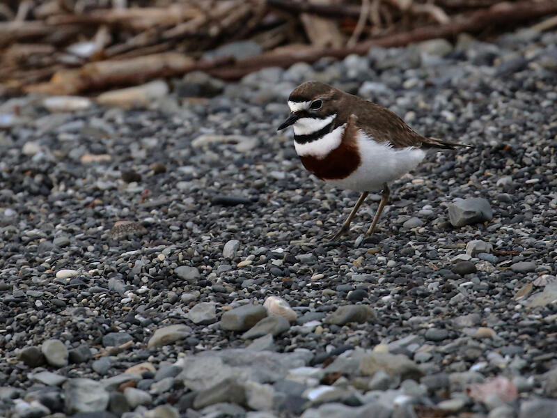
| Banded Dotterel | M | You are lucky that you have better access to seeing these birds in your area than we do up here. They are cute little birds with interesting markings which you have captured reasonably well here. Your exposure on the bird is quite good with some good feather detail evident in the white areas although I would have liked to see you make some selective exposure lifts on some of the darker areas of the bird’s body. The environment is typical of this bird’s inland habitat but I suggest much of it could be cropped out without loosing this essential environmental information and thus enabling us to view the subject in closer focus and detail. All the elements are there – it just needs a little more work to lift this image to a higher level. | |
| A Grade - SET | |||
| Winter Trees | M | An attempt at an impressionistic interpretation of this scene that works at least in part for me. The base and the treatment applied to the trees seem fine but the background that has been applied behind them just seems a little artificial and a little out of context to me. Perhaps it is the conflicting angles between the trees and the background that is having this effect for me or maybe it is the more realistic aspect of the background against the impressionistic feel of the trees that is causing this conflict for me? Also, some rather heavy handed vignetting has been applied around the trees destroying in part, the ethereal feel that I suspect you were seeking for this one. An interesting interpretation of this scene but one that does not quite come off for me. Full marks though for trying something a little different. | |
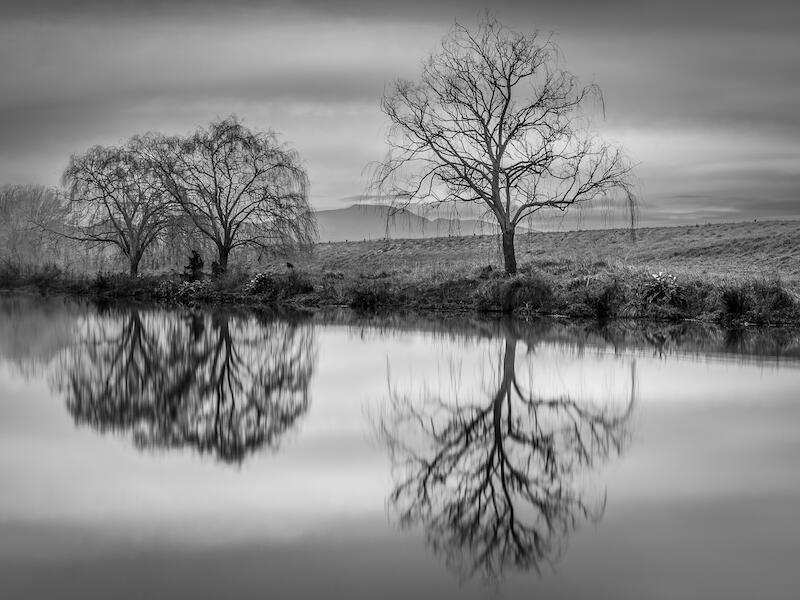
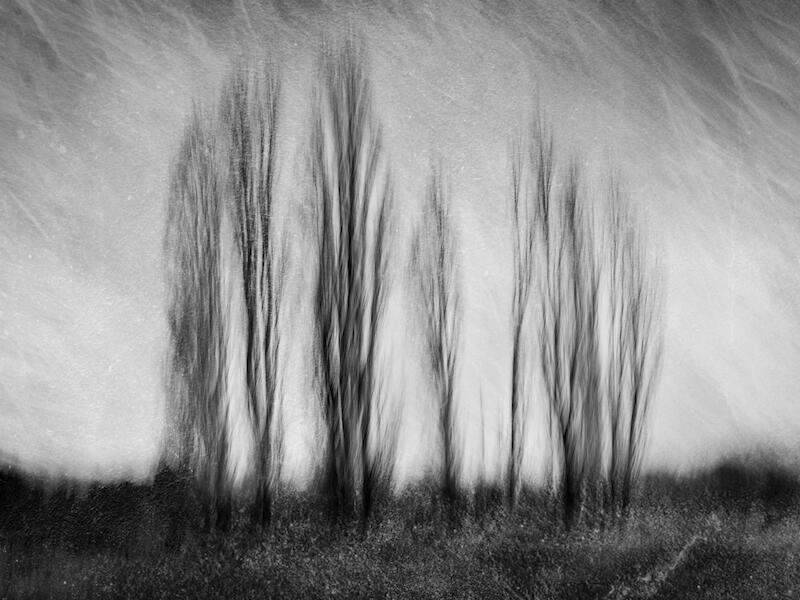
| Willows In Winter. | H | Another interesting and moody winter image. I enjoyed the capture of the mood here together with the fine detail capture of the bare winter trees all set off against the moody grey sky and duplicated in the equally enchanting reflections in the water below. I wondered if you needed all that blank space on the right and whether a crop there would be helpful but otherwise you have really captured the essence of the winter mood here. I did wonder if the image might just benefit from a little bit more contrast but on “reflection” felt it may be best to leave it where it is rather than run the risk of destroying the wonderfully moody feel you have captured. | |
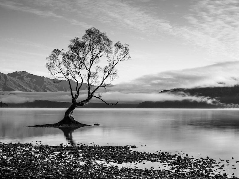
| The Willow Tree | H | That confounded tree again! But a pretty good representation of this often photographed icon of Wanaka. This image has been well composed with the tree well placed and using the shoreline as a base and getting down low to place the upper parts of the tree against the sky. The mountains, etc, in the background are enhanced with the fog bank running along in front of them but whilst the light sky works well as a foil to the upper limbs of the tree, I feel it has been left just a tad over exposed resulting in the higher cloud there only just delineated. For me I would have preferred to have seen the sky toned down somewhat just to bring out the finer detail in those angled upper clouds and to give that final finishing touch to what is otherwise a well handled image. | |
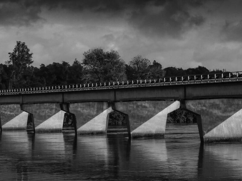
| The Eclipse | M | Technically, a well handled image with good sharpness and reasonable tonal balances. Although, some selective lighting adjustments on the main body of the bridge, for example, would be helpful, I suggest. You have captured the angled lighting on the bridge abutments, and the complementary reflections, well and the contrast between these areas and the rest of the image make for a good strong composition. I enjoyed, too the detail you have captured in the sky together with the darker top clouds which have the effect of holdijng the eye back into the image. Perhaps, a little tweek in the contrast levels just to give the image a little more vibrancy would be helpful, though? | |
| Sutherland Stream Bridge | A | Presumably, the same stream but a different place and a different olde world type feel to the image. Some good compositional elements in this one with the sepia treatment adding to the feel of it. Unfortunately, the treatment you have applied has resulted in a severe degradation of the image which tends to negate the feel and effect of this filtration. This is particularly so in the sky where digital noise is very evident. Also, the vignetting that has apparently been applied around the image is rather heavy handed, particularly across the top of the image. Your concept for this image is fine but, unfortunately for me, the effects that you have applied have not really enhanced the image – an image that could really have been a lovely image if the effects you have applied were better managed. | |
| Sutherland Stream | A | An impressive S curve dominating here, well lit by the backlit sun shine. Perhaps a little too much of the stream in the foreground such that I would suggest a crop off the bottom of the image up to the first bend to give a lead in of the stream from the bottom left and to really emphasis the S curve composition. As it is the bottom half of the image holds little interest whilst the upper half, with the surrounding tree and bush lines act as an interesting compositional counterpoint to the flow of the river. Whilst your exposure is balanced towards that of the river I suggest it would be helpful to selectively brighten some of the areas in the background to give these areas more structure and context as a balance to the brightness of the river. A pleasant enough image but one that with some more sympathetic treatment could more fully realise both its potential and, presumably, that of you as the author. | |
| Silky River | A | A rather literal representation of this river rendered in a rather soft focus. Whilst the diagonal composition works OK I suggest that you could have made more of this scene by being more selective in your composition by using a lesser number of the boulders in the river as the focal point(s) in the image and the water flows around such as the counterpoint. There are several interesting areas in this scene which would draw strength from a closer composition and would better display the river flows here, particularly if the form and texture of the river flows were more sympathetically handled to bring out this subtle detail and structure. Overall, the image is not very sharp and could thus do with a little sharpening. . |
|
| Shadowlands | M | A great subject for monochrome landscape with all that light and shadow but I feel you have not quite made the best of the material you have captured. The compositional balance is OK although I suggest some cropping off the sky would be helpful to direct our attention down to the light and shadow on the hills. Combined with this I would suggest the sky be darkened somewhat and that you do some dodging and burning on the hills to really increase the contrasts there. This latter work needs to be done subtly but this usually results in a more dramatic representation of the lighting across the faces of the hillside which combined with a more dramatic darker sky above should give you a more compelling image. Watch your treatment of the sky, though – it is showing some evidence of digital noise there. A good image that with a little more sympathetic post production work could be an excellent image. | |
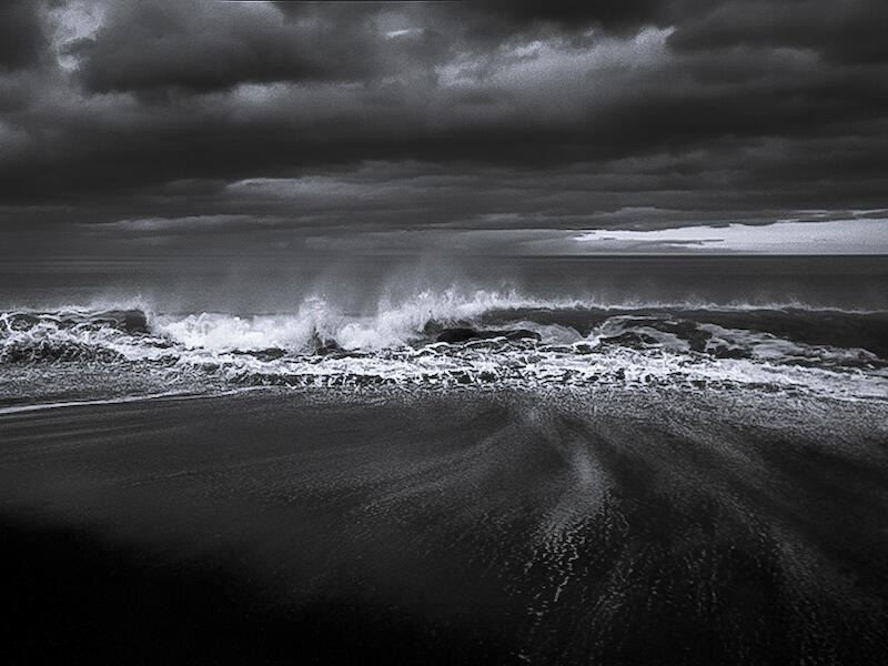
| Rarangi Wave | M | A strong and brooding image of this beach. Rather too dark in some areas resulting is some loss of detail, witness the bottom L/H corner and arguably, in the sand areas of the beach. The histogramme suggests that there is a rather excessive amount of under exposure in these areas. The other point that you might like to consider relates to the position of the horizon, which is almost central. I would suggest that some cropping off the top of the sky to just below the brighter areas would place the horizon in a stronger area and allow us to concentrate more on the wave and particularly, that potentially interesting sand pattern detail on the beach. Whilst you have achieved a dark brooding feel to this scene I suggest that with a little more sympathetic reworking you could really make this one a compelling image. Certainly, a great candidate for monochrome treatment. | |
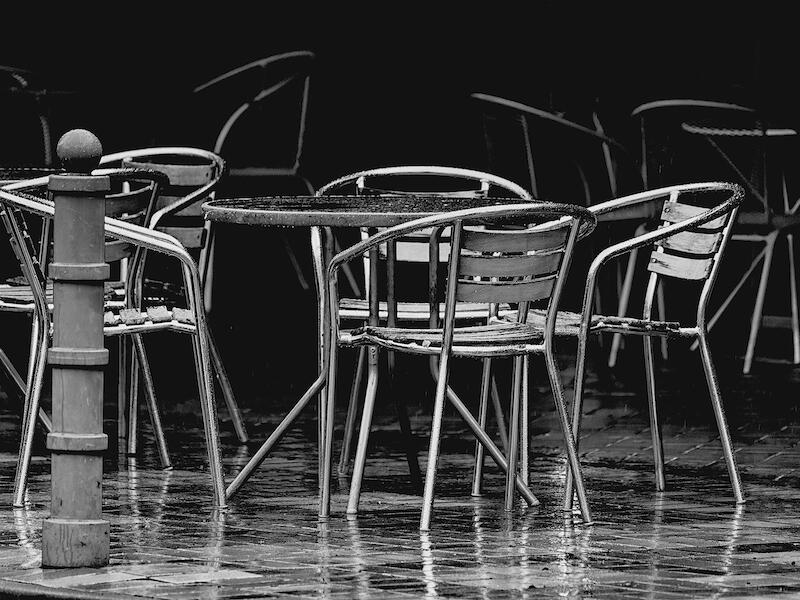
| Rained Out | H | A nicely composed image drawing its strength from a composition around part of this outdoor cafe scene. The monochrome conversion has simplified the composition to allow us to concentrate on the graphic elements without the complication of colour. I prefer this one flipped horizontally with the post on the right and using the space on the left as the lead in, but whichever way, it is an interesting and compelling image. The wet pavement with its subtle reflections together with the suggestion of further tables in the background all combine to give us a pleasingly graphic image. | |
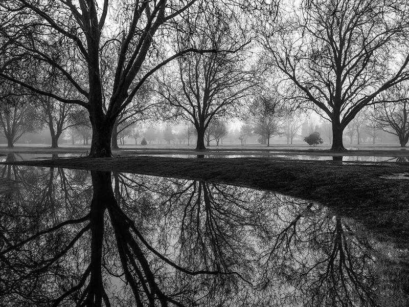
| Puddles and Mist | H | A nicely handled monochrome image starkly reflecting the feel of a foggy winter morning in Hagley Park, Christchurch – I believe. The monochrome conversion has been rather well handled with good tonal balances although, perhaps with just a little too much contrast resulting in some lack of detail in the shadow areas – the L/H tree trunk, and grass bank around the lower pond area. A little selective lightening in these areas is all that is needed, in my view. But, overall, this is a pleasant image with a good compositional balance with the large tree on the left nicely offset with the more distant trees across the balance of the image. A very suitable subject for monochrome treatment. | |
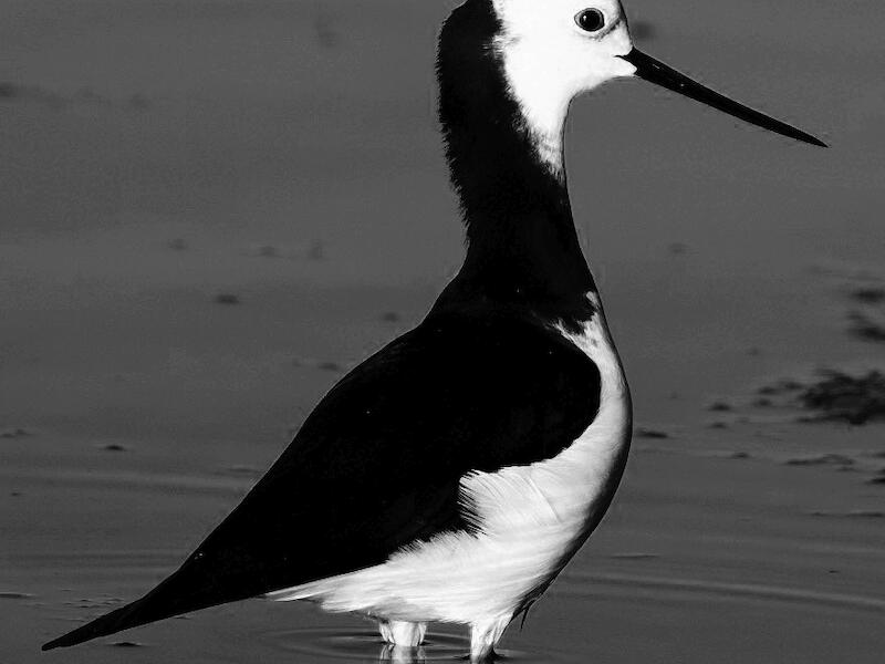
| pied stilt | M | Nicely filling the frame and sharp but an image that is loosing some of the essential fine detail on the body of the bird. Not sure whether you have lost this in the monochrome conversion but the exposure as presented has little, or no detail in the black back feathers of the bird and little in the white feathers, particularly around the head. Perhaps some pulling back of the contrast during the processing would be helpful to prevent this loss of detail. The positioning of the bird is good with the crop nicely filling the frame, as is the out of focus environmental detail around the bird. This should have all lead to a satisfying image but the loss of the important feather detail on the subject and the overall high contrast on this image has resulted in a somewhat degraded representation of the bird. I suggest. | |
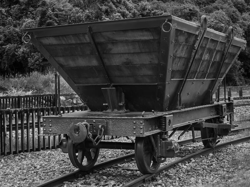
| Old Coal Wagon | M | A technically well rendered but literal representation of this old coal wagon. The monochrome conversion has been well handled to bring out the detail on the wagon and environment but could probably do with some more selective exposure and lighting adjustments just to really make this image sing. It is a good story telling image but with this historical material, one which cries out for a more artistic rendition to give us an even more compelling image. | |
| New Life Begins | N/A | Sadly, this image is not sharp and contains a number of peripheral out of focus elements that distract our eye from the heart of the image – that of the ducklings at water’s edge. I note that you have taken this image at 1/25 @ f18 and ISO100 – a recipe for disaster with the long tele lens that you have used. Such a pity, as the subject matter is there for an interesting image but poor taking technique has conspired to let you down badly. Apart from the camera technique be careful how you compose an image to ensure you feature the subject matter without the inclusion of distracting, out of focus elements, such as you have shown us here. This image needed a much higher shutter speed, even if a tripod was used, and more selective focusing onto the subjects. Even if you were seeking a good depth of field for this image I would be reluctant to use such a small aperture given that the use of such will often result in a rather degraded level of sharpness, particularly with zoom lenses. | |
| Nature's Pearls | A | Some good shape and form in this spider web but really let down by both the severe under exposure through out most of the web and lack of shapness through out. I note you have used a 30 second exposure here so perhaps there was some movement in the web during the exposure? Given the delicacy of such webs and the general narrow depth of field when working up close to a small web it is not unusual for there to be some movement in the subject, thus a higher ISO and shutter speed is usually recommended. Again, I am not at all sure that a monochrome treatment of such a subject is the best solution, given that we have ended up here with an amorphous black and uninteresting background which is not suggestive of a natural nature background. Also, watch the bright areas around the periphery of the image – particularly that top right. Potentially, the beautiful shape and form of this spider web should have given you a lovely image but, sadly, I feel you have not realised this in this rendition. | |
| Misty Seascape | A | An expansive scene which is suited to the monochrome treatment which should allow you to bring out the drama and shape and form of the coastline and the sea patterns. However, your rendition has not quite realised this potential, in part through a general lack of sharpness and by a general lack of detail being revealed in both the coastline and in the ocean. Yes, there is considerable sea mist evident as suggested in your title, but some more selective lighting and contrast adjustments in post processing would help bring out more detail and give this image more punch whilst still retaining that mystical feel. The overall feel to this image is one of muddiness which with some careful selective processing could really lift this one into a more compelling and mystical an image, I suggest. | |
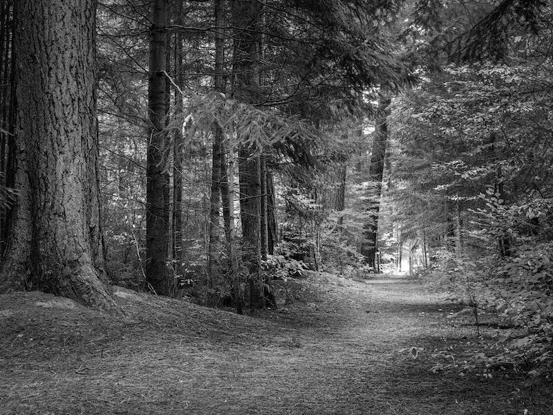
| Forest Walkway | H | Some good tonal values and detail captured in this image which has been taken in good subdued lighting enabling you to bring out this lovely detail. The composition is good, too, with the curved angle of the pathway through the bottom of the image nicely balanced by all the fine detail in the trees and foliage, all leading us through to the subtly lit area at the end of the pathway. The tonal values here, helped by the lighting, have been particularly well rendered, reflecting the excellent exposure you have chosen. Perhaps, a person, or persons, walking through the scene would really set this image off, but in all other respects this is an excellent monochrome image. | |
| Follow the Leader | A | I suggest that this image would be so much stronger if much of the water across the bottom was cropped out to give us a panoramic format, and thus allow us to concentrate on the subjects. Perhaps, too, a crop off the R/H side to give us a composition around the group of three birds would be stronger? As an image the background is the brightest and most dominant part of the image and should arguably be toned down a little, as well as some selective exposure adjustments on the body of the birds to open up the detail on the shadow areas. I am not at all sure that a monochrome representation of this scene is the best rendition given the brightness of the background and the darkness of the birds. | |
| Camp Mother | A | Potentially, a nice image, but one let down by poor lighting balances. Sadly, the brightest part of the image is the window whilst the subject herself is in the poorest lighting condition. A pity as this really destroys the whole context and intent of the image, I suggest. Perhaps some selective exposure adjustment in post would help although from the low res sample supplied it appears that noise problems already exist in the shadow areas suggesting you have already tried this. Perhaps, a more generous exposure of the subject in the taking and/or some fill in flash or use of a strong reflector, would have been helpful in your realising the full potential of this image. It is potentially a lovely story telling image that really does require more careful consideration to exposure and lighting to fully realise your intent. | |
|
|
|||
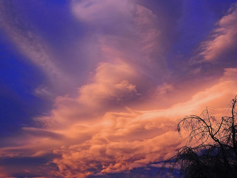
| Evening Cloud Formations | M | A dramatic image, polarised to bring out the drama of this sunset. Some interesting shapes and forms in these lenticular clouds and a strong wedge form composition which leads the eye into the image. Just watch the slight burnout in the exposure along the centre leading edge of the lower cloud stack. Whilst I guess you have included the tree bottom right to give some scale the corner positioning and the fact that the bottom is rather lost in the lower area lessens its effect. |
Share:


