
Judge: Jo Southgate
Creative photography refers to our ability as photographers to go beyond the basic representation of a scene or subject and to express our vision, feelings, and message artistically.
Creativity and art often go hand-in-hand because creativity can be seen more explicitly due to the tools we have available to us.
Knowing the rules of photography in terms of lighting, exposure, and composition and then breaking the rules.
Yes – AI Generative is allowed (allowed for this topic only) for composition - it is a rule that all aspects of the image must be YOUR own work.
https://www.imaginated.com/photography/composition/styles/creative-photography/
https://www.creativephotofolk.com/blog/why-creative-photography
Members Suggestions: ICM, Creative, Circles/Don;t be a square, Looking up/looking down, ICM/double exposure/creative/composite, Colour – yellow red, black, white,blue, green], Rim Lit, Shapes: Circles, squares, triangles, Windows: looking in/looking out
Open
Set Subject
Prints
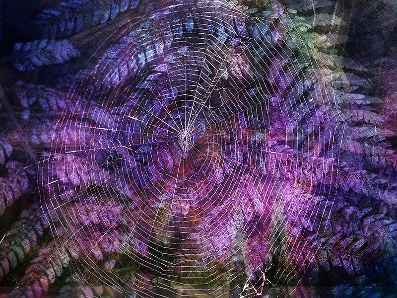
| Colour in the forest | B grade M | Great colour and great feel of texture without having to touch it. The colours are vibrant without being overwhelming, and the spider's web stands out well without being overexposed. The web placement, not being centred, is great, and my eye wanders around easily. The top left-hand corner is a little dark and does draw the eye; it could be worth experimenting with to see if lighter makes it better. |
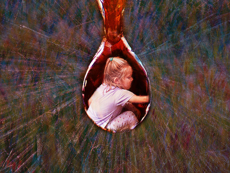
| Surprise in a water droplet | B Grade M | This is very clever and well executed. Not having the droplet centred exactly is good and adds to the creativity, and the background is well placed around the droplet, pulling the eye towards it and the girl inside. I would have liked to see a little more of her face and maybe had the hair not so bright, but both of these observations do not affects the overall effect of what you were going for. The lighting and exposure is well done overall; however, the bottom of the t-shirt is a fraction too bright and can be distracting. I hope you get the opportunity to experiment with what you have put in the middle of the droplet; anything is possible. |
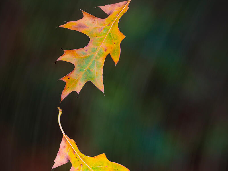
| Autumnal Flight Path | A Grade H | This is a striking image; the colours are exposed well, and the background is not overwhelming with its movement. It doesn’t matter which way I turn this image; it's eye-catching, it gives a wonderful feel of leaves falling, and what autumn is all about. I do prefer it in the landscape mode. I hope this was the way it was meant to be. The placement of the leaves is good, my only concern is the large leaf being so close to the edge but its balanced again by the end of the smaller leaf also being close, just something to be aware of for future entries in regards to cropping. Well done. |
Digital
C Grade - Set |
||
| a bit of drama | Accepted | I like what you are trying to achieve here, the lighting is moody and there is an interesting balance of dark and light. I would like to have seen the tree top included in the image and therefore a little less of the schrubbering at the bottom. I also think it could be worth experimenting with black and white to gain more mood or just see if that's better or not. |
| evening light | Accepted | These lamp posts and lights have such character and I like how it's positioned in the images but there are few major distractions of note, firstly the bottom right hand corner has something reflective and the light bulb glowing has the same problem. I think this image could have done with some underexposure being applied whether in camera or post production. I don't mind the wires but when you crop them off the images becomes more and it appeals. If you were going for the overexposed look as a creative tool, ignore everything I have just said; you achieved it. |
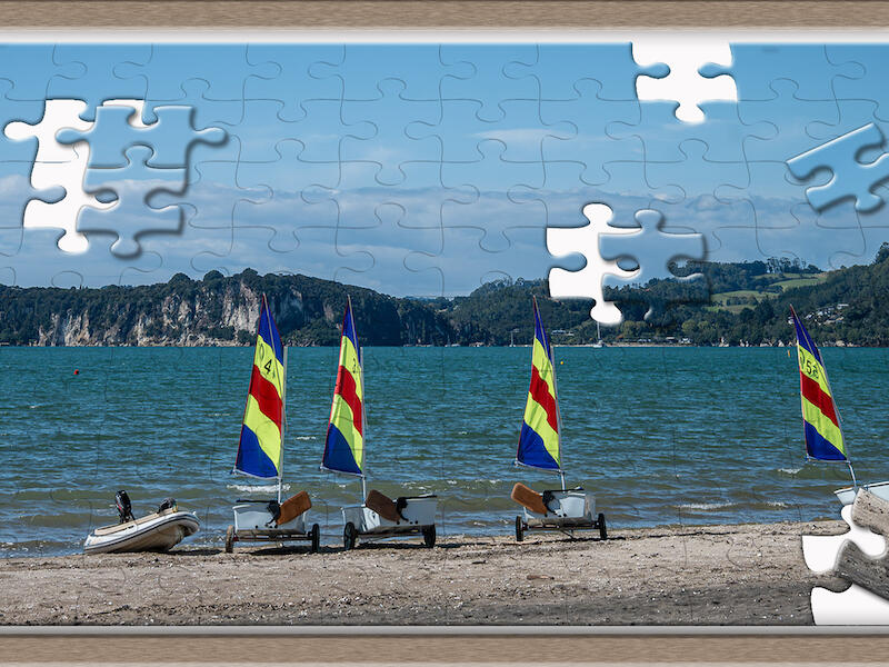
| Puzzle | Merit | So clever and well thought through, I like that you haven't taken pieces away where the main boats are, their flag colour is fabulous. I'm curious to know if you experimented with what pieces to move? I wonder if one on the left-hand side might have added to it or been too much? I like the tilt because it brings your eyes to the boats, and the overall colour and exposure are well executed. I'm thrilled you have your horizon straight!! |
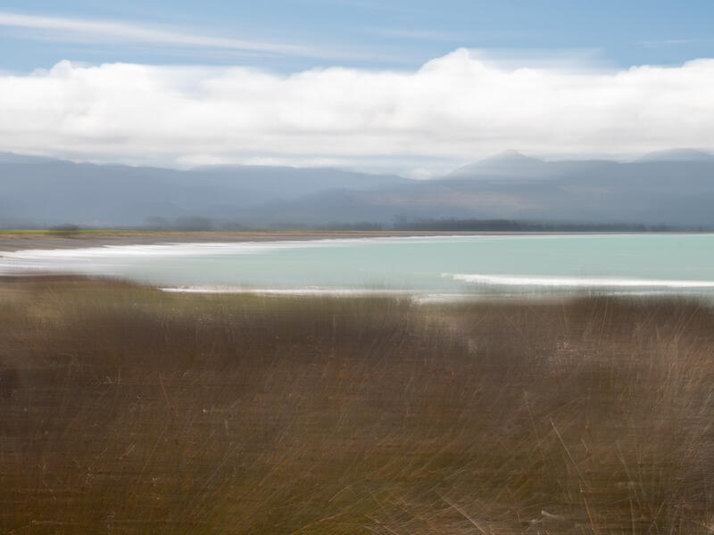
| The Beach | Merit | This is well executed in the fact you have your horizon straight and you've included the waves on the beach and not cut them off on the left hand side. The movement is satisfactory enough and not overwhelming and I do like that you can make out all parts of this, I hope you experimented more and got more movement involved, it's always nice to see the differences ICM creates. The grass and its feel is fabulous, I think this could have done with a little off the side and the rock not being there, and just a little more contrast over all to set some depth. Overall I love it, it appeals to my sense of ocean, freedom and creative soul. |
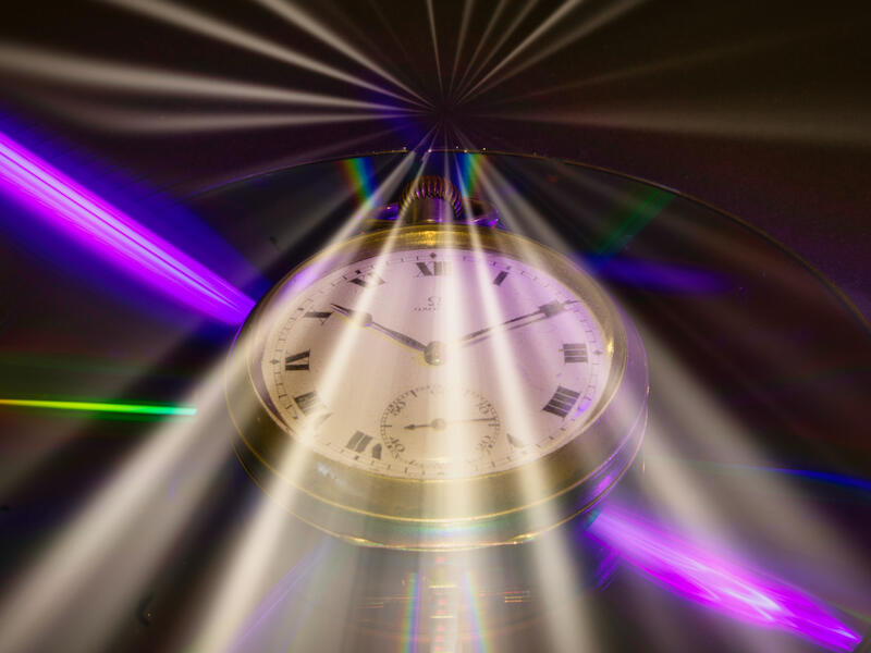
| Time travel | Merit | This is very cleverly executed and I enjoyed the feel of old time meeting new time, I can now envision myself time travelling. The exposure and centration are well executed but I feel the left side pink/purple ray could have done with a little dulling down as it drawers my eye away from the rest of the picture. The white light is well exposed. |
| Walking into the light | Accepted | I love spinning wool and the effects it creates in long exposures, you got that light perfect. Having the white light going through it adds another element to this image but I do wonder, was it necessary? As there is so much going on with the wool and then the people walking the dog, I think the white light is just a bit too much, an odd comment for this topic I know, but sometimes we can get caught up in the topic and over-do the 'creative'. My biggest concern is why is the bottom cut off? This image would have been so much more had the circle been complete and centred. |
B Grade - Set |
||
| My Family | Accepted | A cute family portrait in a more artistic way, the fireworks remind me of the Vegas showgirls with their feathery/glittery headpieces. I like the symmetry of the two children and the hearts. I wonder how this would have looked if the little girl could had been enlarged a fraction and the main gentleman was made a smaller size. The exposure on all the faces is lovely, just watch the cropping next time, the top of the fireworks are missing. |
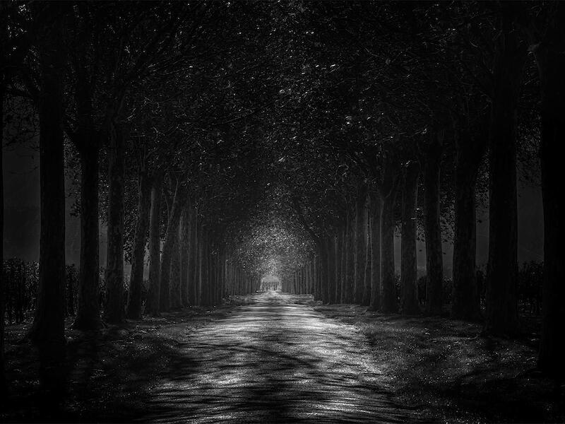
| Mysterious Driveway | Honours | When this first appeared as a thumbnail, I didnt think much of it, then wow, once enlarged, its engaging and thought provoking. This is well thought out and executed, the light illuminating the path and in the tress is very well exposed and sets the scene wonderfully. The balance of the black is good; it's not underexposed. It's lovely to see the detail in the tree trunks and also in the leaves. I like the eerie yet enticing element this provokes. The title is spot on. |
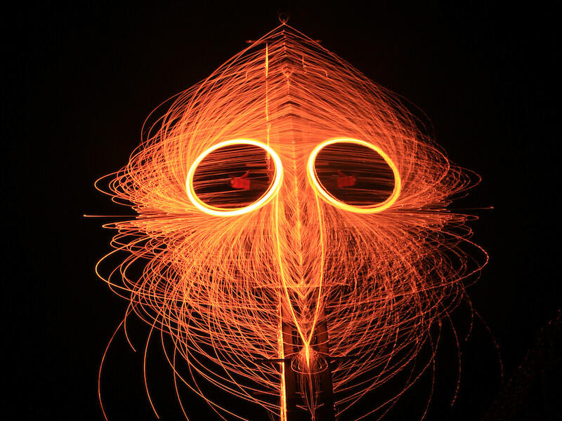
| Steel Wool Face Mask | Merit | This is a clever use of post-production, which has created an entirely new image; it's well executed. The exposure is good, a few expected highlights with spinning wool, but it doesn't distract from the images; it adds to it. The only suggestion I have for this image is to darken the bottom right-hand side, you can see the rocks, which would be from the shoreline, make them darker, and then you have a wonderful mask portrait. |
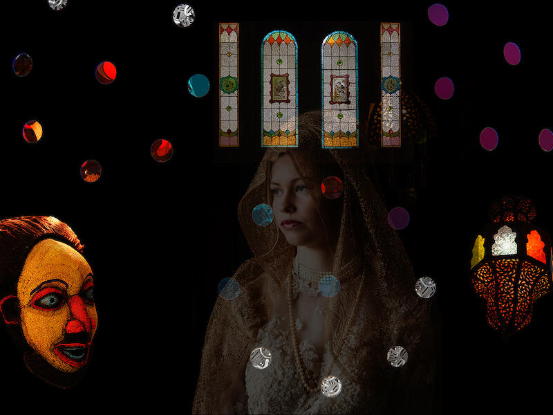
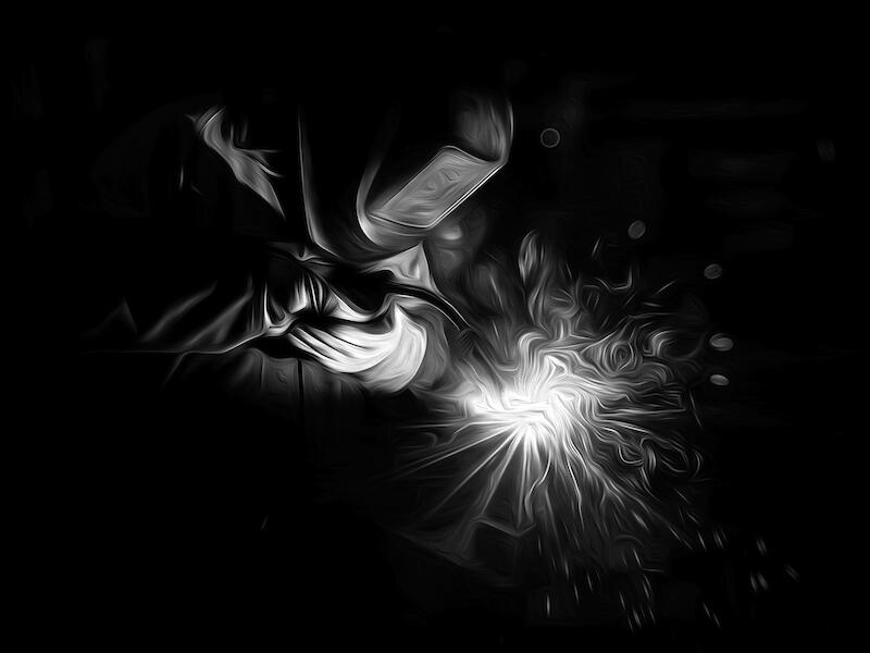
| The Fabricator . | Honours | Again, this was another image that didn't appear to be much as a thumbnail, blown up, however, you get to see the detail. You have executed this perfectly and created quite the artwork, this deserves to be big, huge in fact, plastered on a big brick wall at Cuddons or another engineering firm. Your exposures are fabulous, the placement of your subject is framed well. It’s quite something in my mind and you should be very happy with it. |
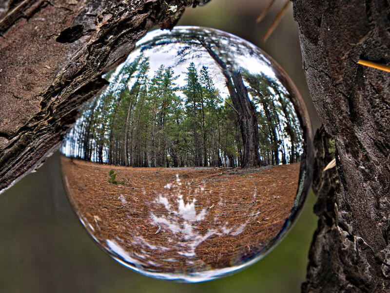
| Through The Glass Ball | Merit | Your exposure it really good for this image, especially given the day, cloudy, overcast. The clarity of the trees through the ball is really good, and the positioning with a straight horizon is good. Well done on positioning the large tree as well; it’s a nice element and not too distracting. Next time, experiment with the clarity of the bark on the trees. I wonder if it would have helped the glass ball pop more, if the bark had been blurry or not as sharp as you have it. |
| Tranquillity of the waves | Accepted | Great lighting and great capture of the water, it's soft and ethereal. This image would have been given a merit if it wasn’t for the black line on the right-hand side; it's unfortunately very distracting. One of the worse times to discover you have dust or dirt on your mirrors or lenses is when doing ICM, it would be worth blowing the image up extensively and slowly moving over it to check every inch. |
B Grade - Open |
||
| Customers are invited to take a pew at this church cafe in London | Not accepted | This is a nice picture of an elderly gentleman sitting in a church pew; however it is presenting more as a snapshot rather than a competition image. Firstly, take care where you are focusing, the image doesn't appear to have any crisp elements to it, the lighting is lovely and you have exposed it well, but the overall softness is letting it down. The dog sign is quite prominent, and when you have this in an image and you want to keep it, try widening your lens and capturing more around it. In this instance, I feel it would have been better to have focused more on the gentleman reader in a tighter crop, removing the sign, perhaps changing from landscape to portrait. You might also want to work on your title, using the thumbnail computer name for an image is really letting down any potential the image might have - eg smoko time in church or morning tea at church. |
| I think its Raining | Accepted | I think you're right!! And by the looks of it, it's rained a lot. It's a nice capture of what is obviously foul weather; the lighting is nice, but I feel it could have done with something more. It could be worth experimenting with your aperture setting and getting less depth of field, also changing angles so you get both expressions on the subject's faces. |
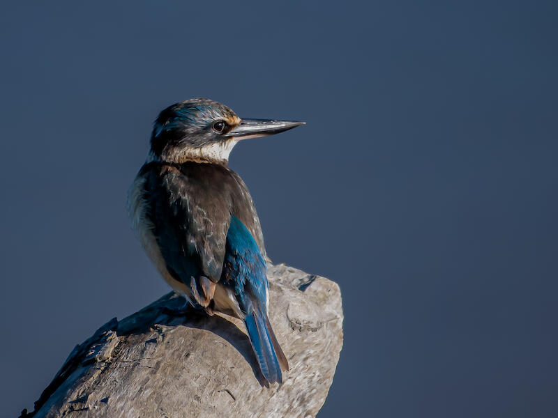
| Kingfisher at Wairau Bar | Honours | They are such busy and quick little birds with the most stunning colours, well done for capturing it so still. The light on his face is lovely, and the angle in which you have captured him is nice; it's very difficult to get them to pose and very challenging to move yourself to get a better angle. On zooming in, it was great to see the white feathers were not blown out, and the glint in his eye is gorgeous. It could be worth experimenting with the darker feathers on his left-hand side to see if they could be lightened. Well placed in the frame, with the right side having more space. |
| Pelorus Waterfall | Accepted | You have done well to capture the light here; bush light can be quite challenging. There are a few spots blown out, but I don’t feel it ruins the image, but it does let it down. The position of the waterfall is interesting as you have left quite a lot of space with nothing, was this intentional? I imagine you have played around with your aperture to get the lovely long exposure of the waterfall, the downside to this is, you get more background in focus. It may be worthwhile experimenting with some ND filters, especially if you want to shoot in the middle of the day or when the light is quite bright; they can help create quite a unique image. |
| Sunlight coming thru | Not accepted | This shot would have benefited from a bigger aperture to really capture the light rays, f18, f22. This image comes across as a snapshot changed to black and white. Some post-production in the foreground to lighten the darker patches would have helped, as well as some contrast. |
| Wet dog wanting to come in | Accepted | That face, how can you say no, so adorable. The black and white has been done well, and the exposure is good, especially on the dog's face. The door frame on the right is distracting as well as the wonky horizon. Try getting closer to your subject next time to have more of him/her in the frame and less background. |
A Grade - Set |
||
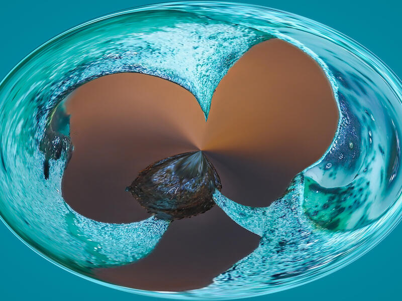
| A new planet | Merit | The colour is mesmerising and at times I'm just not sure what I'm looking at, is it a glass ornament, is it the ocean? This is a clever use of post-production on an image that is well exposed, no highlights or lowlights. The brown is centre pieces remind me of a butterfly, just the way the shape is. It is definitely creative. |
| Archer House, Ciara and Random Dots | Merit | Great use of light, colour and space and the main subject's face tells such a story, so expressive. Nice use of colours with the spots, and I'm glad you didn't place a dot on her face. One suggestion to be made, nothing to do with the photo but more so the title, try and come up with something that doesn't feel like a computer title or a generic description. |
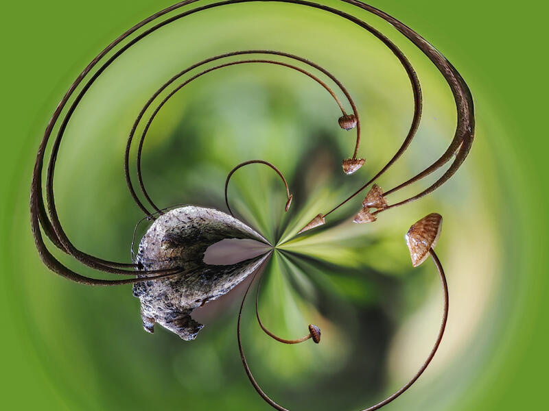
| From the forest floor | Honours | It took me a moment to realise these were mushrooms, it's cleverly presented and I instantly think of clover and their shape. This has very pleasing proportions and the colour is lovely, nothing seems to be over- or under-exposed and the background is beautifully blurry. I flipped it 90, 180 & 270, and it works anyway. |
| Fungal Invasion | Accepted | Wow, what a great find, there is soooo many of these, I'm wondering if these are some kind of Turkey Tail? Unfortunately, the front fungi are not sharp, and neither are the centre ones. This image could have benefited from some cropping, specifically in the front. You have balanced the light well. |
| Harbour Reflections or Rock Art? | Accepted | A great use of light, reflections and colour, it's quite mesmerising and abstract. Your proportions are well set, there isn't too much of the blue, black, beige or brown, and they work together well. There are 3 white dots and a singular white dot, which I wonder might be dust spots, worth checking your sensor as well as the image before submitting. |
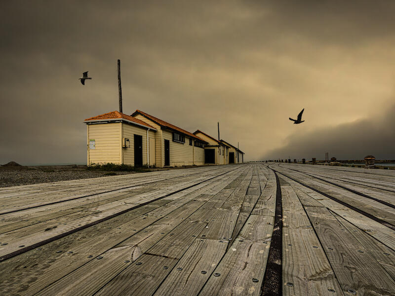
| Holmes Wharf- Oamaru | Honours | The angle you have photographed from has really changed what could have been a standard landscape shot to something more; the boards of the wharf are adding such character to this and give a sense of use in times gone by. The clouds are well exposed, and the colour of the huts pop enough to be a lovely addition and not overwhelming. The gulls flying past was perfect and you've clearly pushed the button at the right time. Your depth of field is excellent and I'm pleased the horizon is straight. I'm curious to know if this was meant to be in Open not set? |
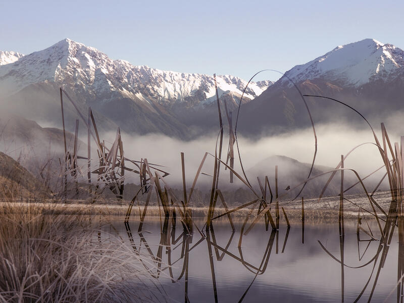
| Lake Sarah | Merit | As a small icon, I thought it was a lovely landscape with reeds in the small lake, on enlarging, I see your creative flair. I like how you have made these look like they actually belong, with some being bolder and some being softer. The grasses in the foreground, bottom left corner, have interesting light, and it's good you haven't made them too bold. The overall exposure is great. |
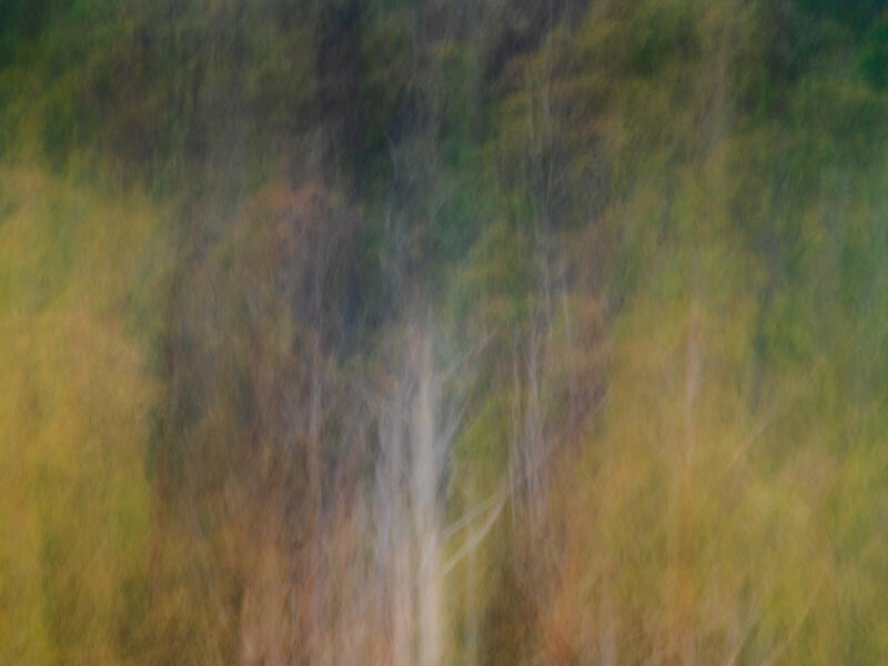
| Lost in the Forest | Merit | It's lovely to see you can still make out the trees and the lovely colours. I'm enjoying the movement; you have done enough to make this interesting whilst still capturing some texture. |
| Perception of Freedom | Accepted | Aptly named, and I get the sense there may be no freedom at all. It's dark and gloomy, and I can imagine being in jail and that feeling. The concept is good however, I feel it’s being let down by being a little too dark, the clouds' structure is wonderful and it may have been worthwhile playing with the highlights and lowlights to see what happens. I also wonder how this would have looked if you had blended the edges a little to go into the background. |
| Rush before the storm | Accepted | What speed, you certainly get the sense the vehicle is going fast. The processing you have applied has definitely given the impression of a storm coming however, it feels very over-processed. Because of this, you can forget about the speeding car; the clouds are very much the focal point. I do wonder how this would have looked had the clouds been a little less in contrast and the car more apparent. |
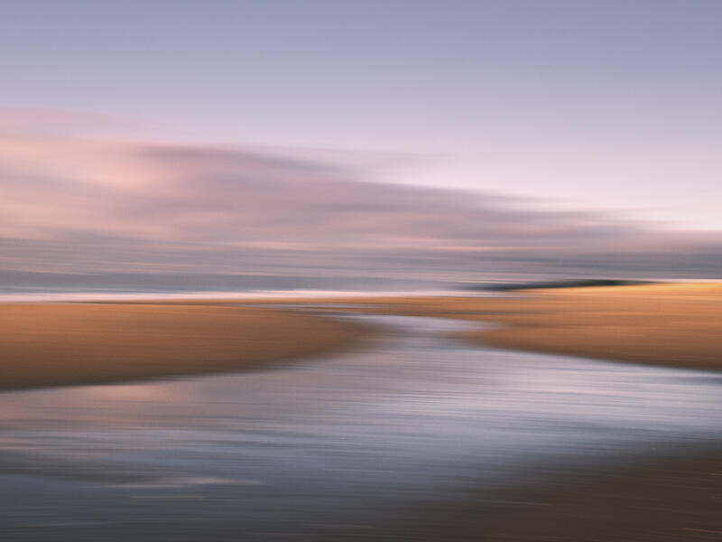
| Sunrise | Merit | This is a wonderful use of light and scenery, and the ICM has been created well. It's a pleasure to see a focal point, and you do get a sense of a river going to the sea. It's very well exposed, and the ocean meeting the sky is endless. One bug bear about ICM's is the spots that you can find, its worth going over your image numerous times with a fine-tooth comb to make sure you don't miss any. Once seen, it's hard to get past. I'm sorry to say, this would have had an honours if it wasn’t for the spot. Bottom right. |
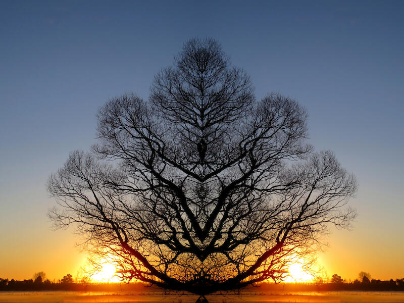
| The mystic tree | Honours | I thought this was a legitimate tree when I first saw the thumbnail, then on enlarging you realise what has happened, cos how would the sun be in two different spots so symmetrically?? You have used the space well and the symmetry appeals to my eyes, how you have framed it, the exposure it great. Great title to go along with this image. |
| Tsunami | Accepted | The colour of this is quite striking, and the boats in the bend of the wave certainly gives the feeling of a tsunami, not that I have ever seen one. The black seaweed in the foreground is a little distracting and I do wonder how this would have looked had you cropped in closer to the boats and then applied the distortion. |
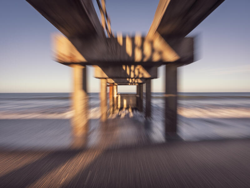
| Under The Wharf | Merit | This has messed with my eyes, wowzers. I find it quite challenging to look at for a long period of time without feeling wobbly. It's a great use of ICM and a slower shutter, and the exposure is great; it would have been very easy to get some of the warf posts underexposed. The horizon is not perfectly straight, and normally this is a huge bug-bear of mine, but this time it works. The placement of the wharf, or should I say yourself underneath, is good. The pattern on the sand is lovely with the tide going out. |
| Winters Willows | Not accepted | There is a significant amount going on in this image with the trees and because of this, I am struggling to find something to focus on or understand the creative intention behind it. The swan is there but not there, if that makes sense? Because the trees are so bold, the swan gets lost, it does appear you have attempted to lighten his head, but the body has remained too dark, and therefore, he does become obsolete in the left corner compared with the opposite side, where the light is brighter and clearer. |
A Grade - Open |
||
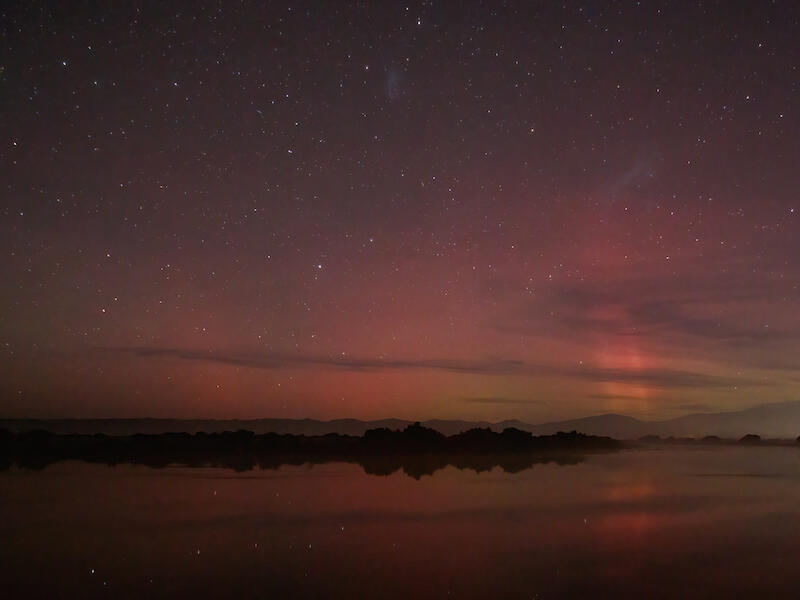
| Coudy aurora | Honours | What is it about colour in the sky at night that just makes you go wow!! It really is quite a special and wonderful experience to see the Aurora lights, and I think you have captured this moment so well, the reflection of the sky in the water is excellent, and the exposure is good. It's always challenging not to get the Earth's rotation noticed; usually the stars show it, and you've timed it well. |
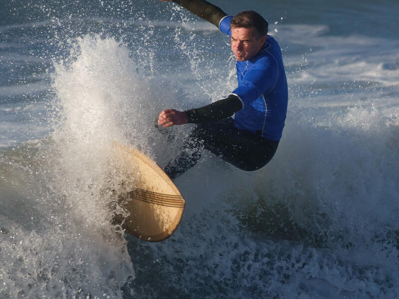
| Fast turn! | Merit | This is a great capture and the sharpness of the surfer is brilliant, you have captured his facial expression at the perfect time and you really get a sense of the effort he is putting in. The overall amount of water and board is good, but your choice of crop is different, and I'm curious to know why you went with square rather than a standard landscape. Your exposure is top notch, it's always challenging to get bright light and shadows equal, and I commend you for that. |
| Spring Blossom | Accepted | A perfect blossom, aptly titled. The exposure is lovely and you have framed the blossom well. You have effectively used your aperture to blur the background; however, it is busy and therefore pulling the eye away from the main attraction. I wonder if you could have changed angles to get less in the background. The top 3 buds are also sharper than the open blossom, was this intentional? Be mindful of where your camera is focusing. |
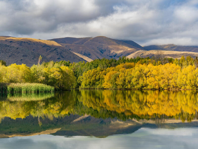
| Wairepo Arm Twizel | Merit | You get a true sense of yellow with this image; it's bright and evokes a sense of spring and summer. The exposure is handled well, and you have framed the landscape well, the reflection is wonderful. I am wondering how this image would look if you had dulled down the yellow, specifically on the right trees, ever so slightly, its brightness is immense, and it does pull your eye that way. Would a crop, removing some of the right-hand side, made this better? Yes, i think it would have. It's not often I crop an image myself, but when I did, I could see the difference it made; it would be worth experimenting. |
Shot of the Month
The Fabricator by Greg Wass.
Share:


