
Judge: Cushla Moorhead
uummm hands and/or feet - human, non-human; this will stretch the imagination :-)
Get Creative with images of your or someone elses hands and feet, does not have to be human.
They help us in every avenue of life: Working, Walking, Cooking, Creating.
https://www.gettyimages.co.nz/photos/beautiful-hands-and-feet
https://www.pinterest.nz/pin/64739313372207979/
Open


Set Subject
Marlborough Camera Club May 2023 (from Cushla
Hi Everyone, I found this topic very interesting with the many variations.
Congratulations to all who took the challenge to do it. I was particularly impressed by the ones in C grade. I can see the club is going to be in good stead for years to come.
I would like to remind you that Photography, from the Greek, means drawing with light. Whatever your subject, the important thing is how does the light show the subject? And makes sure that the subject or Focal point is obvious too. A test for this is to turn your back on your image and then quickly turn and see what hits your eyes first . You maybe surprised.
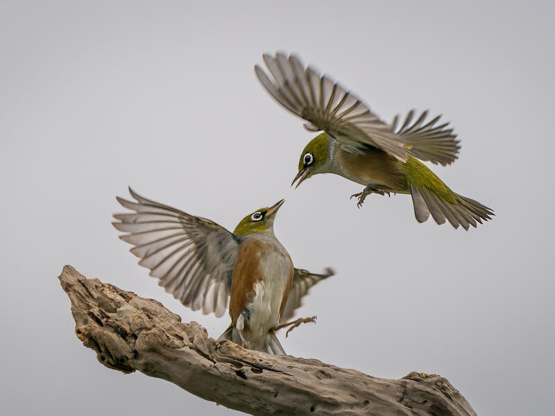
Good luck with all photography in the future. A special Congratulations for the best Image. "Waxeyes in Combat" by Sue Henley
Good luck with Seddon Shield. As I am moving to Christchurch I will not be attending it but I will be thinking of you all.
A Grade
Boot Camp - What a lovely collection of boots. I would have liked to see them with out the sticks as I feel they add nothing to the story. The part of the image that takes my attention because of the way it is lit, is the patch of floor surrounded by sticks that has a knot. The light needs to be concentrated more on the boots and maybe they needed to be rearranged to get the lighting showing them to advantage. The depth of field has been well handled with the boots all sharp so that I can see all the little details. Love the title. Accepted
Lighting the Wood Shed - I think the lack of colour was a clever decision as it concentrates my eye on the lighting which is what the image is about. I feel that some darkening of the light on the shed roof would have kept my eye in the image. I tend to look at the lovely lamp and then follow the light up the roof and out of the image. Just darkening this slightly would have kept my eye in the image and brought me back to the lamp. I think it would have created more atmosphere too. The image is sharp and I like the texture in it. The story has been well told. Merit
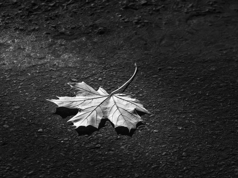
Lone Leaf - Simplicity. A wabi sabi image with only what is necessary for the story. The way the leaf is lit shows me the amazing veins on the leaf. The way the leaf has been placed adds a finishing touch, I feel. The stones at the top of the image are a tad distracting so I suggest a square crop. Merit
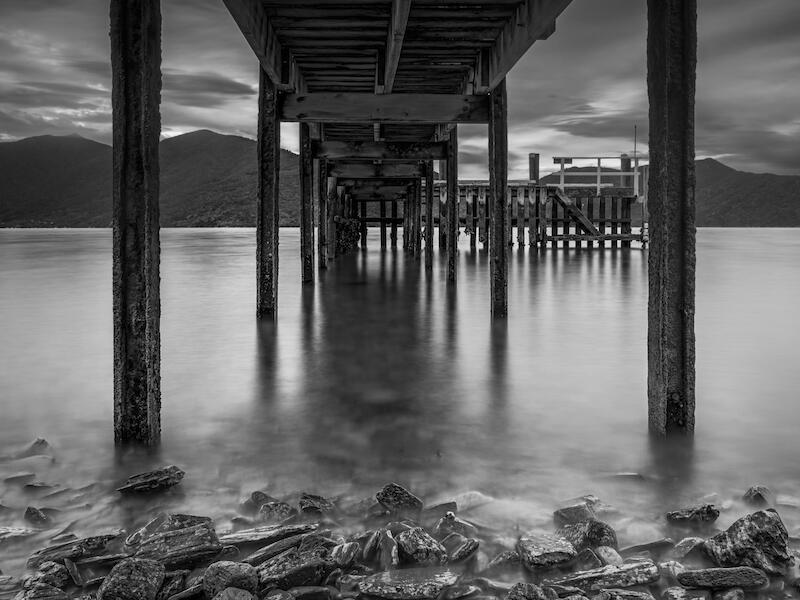
Under the Wharf - I see lots of images that show along a wharf so it is refreshing to see one like this. For me the use of the slow shutter speed has given the water that silky look that adds to the image in that the wharf stands out and yet the water adds a peaceful feel. This image has a foreground with the rocks, then a midground with the wharf and the background as landscape images need. The depth of field gives interest to all the elements. Merit
Waxeyes in Combat - Wow! This is an amazing image. The shutter speed has caught the detail in the birds and yet left enough movement in the wings to show they are moving. The composition is balanced with the log leading me into the birds who are well placed in the frame to give a triangle with the log and the birds. The background is clean so that the birds are shown to advantage. Honours **IMAGE OF THE MONTH**
Active Feet - I love the simplicity of this image. I would have liked to see the feet closer because I feel it is a bit like a ping pong ball with my eye going from one foot to the other. The background shows the subject well. In my view there needs to be some differentiation between the back and the floor to anchored the subject better. The dancer needs to be standing on something. The actual legs and feet are well defined with the lighting giving the depth and definition. Merit
Entertainer - I feel this was a good choice of subject.The hands are doing something and the shutter speed has caught them so that even though the left hand isn’t sharp it shows me the process. I feel that if the author had moved further to the right the image might have been able to be taken without the mic. being in the way and the hands would be closer together in the image. This, I feel, would have produced a more cohesive image. Acceptance
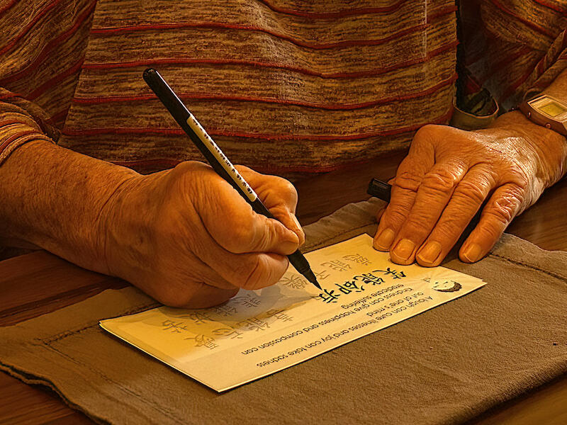
Fishy Hands - I love the way the right hand has been caught with the fingers working. Although the fish are part of the story I feel that cropping this so that it is a square image would focus on the hands even more and make it about the hands. Acceptance
Foot Rest - What a lovely story with the bird, a robin? sitting on one boot. There is a good depth of field so that all the important parts of the boots are sharp. I think a vignette would have eliminated the colour in the leaves
which I feel is a tad distracting. Also the pattern on the socks. Just darkening them a bit ,with a vignette, would make the boots more of a focus. Acceptance
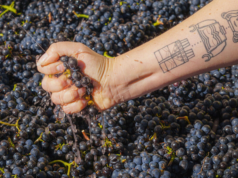
Holding a special vintage - When I look at this image, what takes my eye is the interesting tattoo. The hand is almost invisible under the grapes. It was an interesting idea that, for me, didn’t quite work. If the image was cropped so that it was square without most of the arm then it would tell a different story in my view. Sometimes I realise there aren’t enough pixels to do the cropping. Acceptance
Many Feet Make Light Work - I love the title. It is a clever pun on a common saying. Draught horses are so lovely and the feathers on their feet are intriguing I think. The different positions of the feet with some of the feathers really swirling around is fascinating. I love watching these big giants of the horse world. I am giving my age away when I say I remember these on my family’s farm when I was very young. The light and tone is similar throughout this image. I suggest using more contrast on at least some of these feet so there is a variation in lighting to give more depth to the image. Acceptance
Riding Lesson - There is good use of depth of field in this image with the wall behind slightly blurry and the horse and rider sharp. I like the way the image is cropped in to show the hand closer up. Because the jodpurs are a light colour the rider’s leg is the area that hold the most attention for me even though the hand is in the light. Just taking the brightness off the leg would bring more attention to the hand. Acceptance
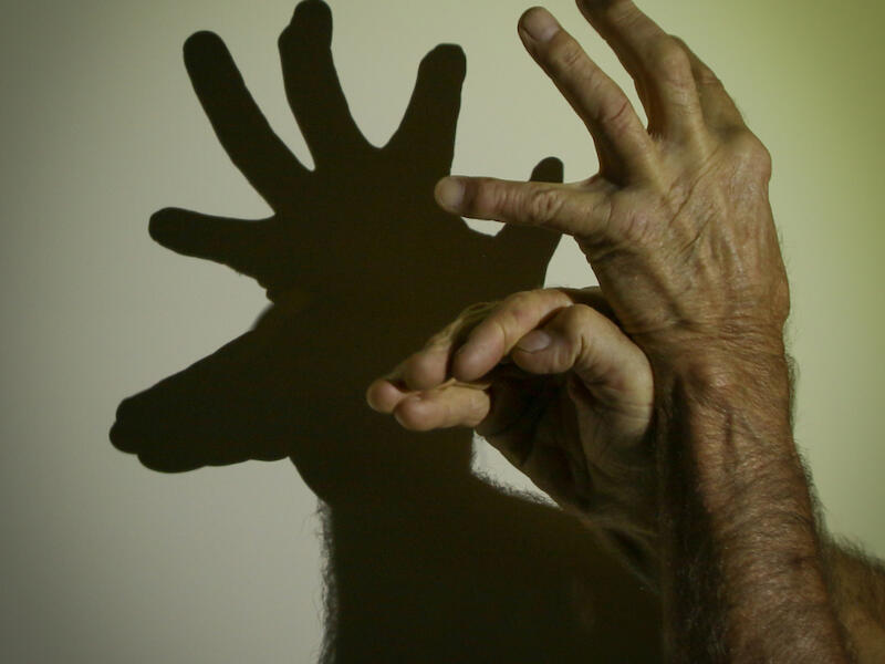
Shadow Play - I remember watching someone do this as a child and how fascinating it was. The hands and arms are clear, sharp showing the structure of them. The shadow on the wall, which is still hands, is the focal point for me as it is so stark against the wall pulling me in. I love how this image is so close that the hairs on the arms are showing in the shadow and look like the animal’s hair, adding to the story. Merit.
Skilled Hands - This is a lovely image in my view. The colours complement each other and the movement of the flames is evident of what is happening. The way her face is lit shows her to advantage. Although this image is entitled skilled hands, her hands are hardly seen and are certainly not the subject of the image, in my opinion. So for that reason I have given this image no award so that it can be resubmitted in another more suitable competition such as action or open. No distinctive.
Squeeze Me - We have seen this hand and arm before as it is very distinctive. Here the arm leads me into the hand and the hand is the centre of interest. I can see how hard the hand is squeezing with the juice running down. My eyes are held there by all the details the have been so well caught. The story is clear. The background with most of the grapes slightly out of focus shows that the depth of field has been well handled. Merit
Take Up the Gauntlet - I like the title. The sharp talons are well portrayed here. It would have been better if the second foot was seen too but I find there is a lot of detail in this one that tells the story. I feel the image would benefit from a vignette as that would draw my attention to the feet more. The handler’s shirt shows the falcon. It is round the edges that it would benefit from some darkening as the light coloured shirt is dominant. Even a tighter crop would bring the focus more on the feet. The depth of field with the blurred background has worked well. Acceptance
B Grade
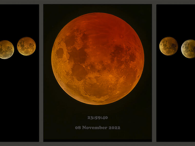
Lunar Eclipse - This is a great triptych. I love the way it shows the progression of the eclipse and then the red moon is bigger and shown in all its glory. I hope this is going in the Nelson Triptych salon. Well done Honours
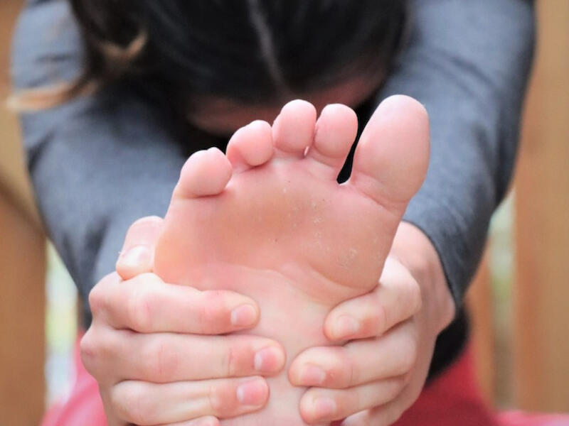
At a Stretch - I love the fact that the foot is close up and takes up so much of the image with the hands supporting it and showing the effort in the stretch. I feel cropping from the top to just below her ear would strengthen it and would eliminate the light coloured back ground. A well told story. Merit
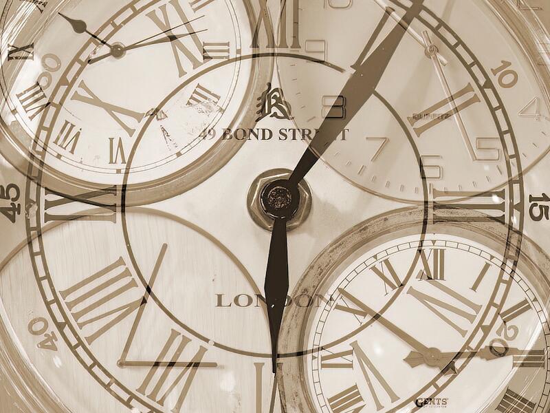
Hands of Time - I love the different take on the topic. Well done for thinking outside the obvious. I feel some more contrast might give this some depth but in saying that it is a well thought image. Honours
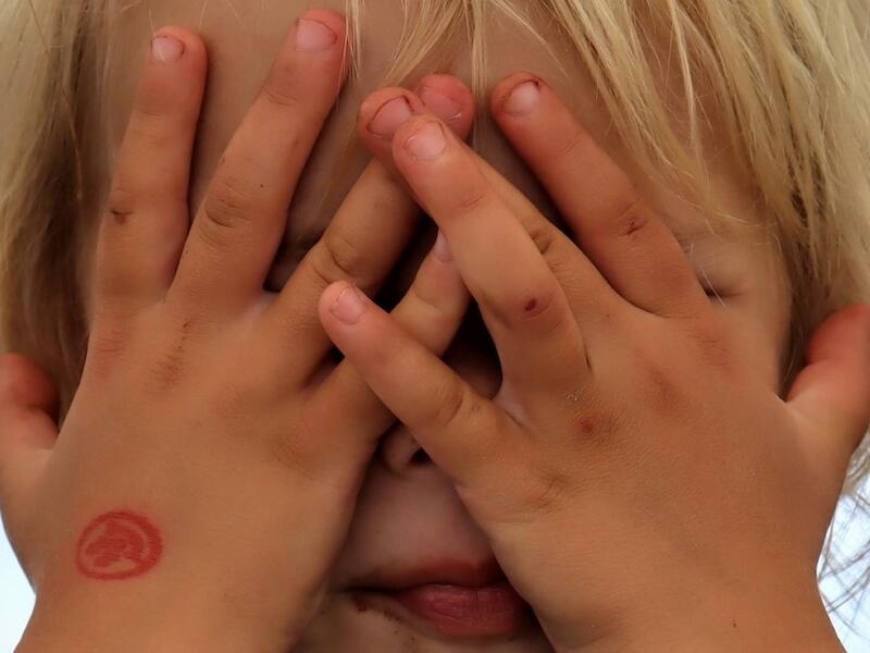
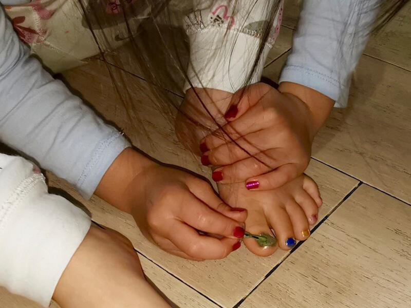
Hiding in Plain Sight - What a typical look and how often have I seen this when a child thinks they are hiding. Well done cropping in close so that the hands fill the image. The hands are shown in all their natural glory. It is a delightful image with a story that most of us can relate to. I can see some chocolate round the child’s mouth too. Merit
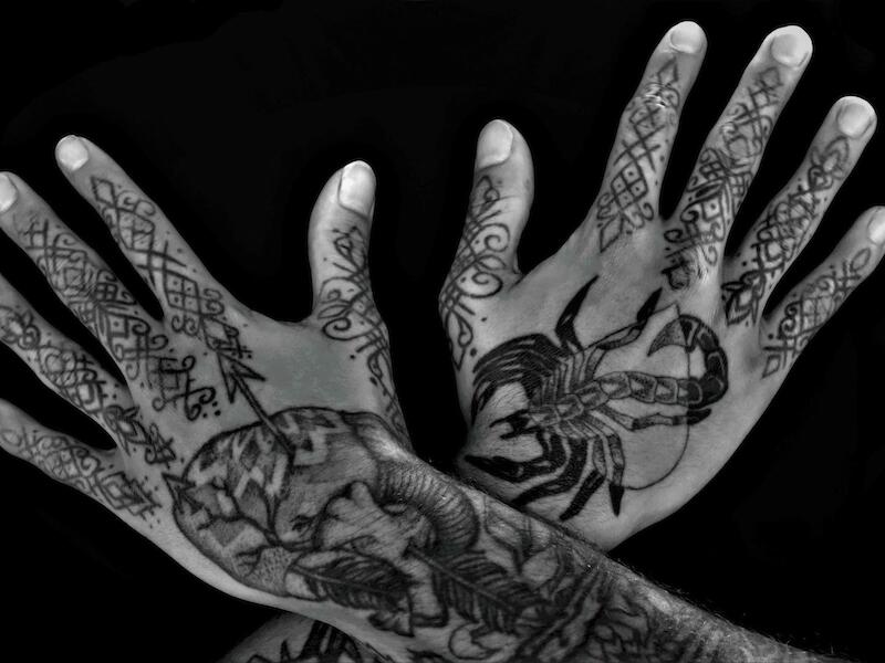
The Human Canvas - Well it is certainly all about the hands. The black background shows the hands well and is a good choice. Because the two hands go in different directions and there is so much ink on them, I’m not sure where to look. There are some interesting details and I would be interested to hear what it all means. Sometimes keeping it simple is best or even a different pose for the hands some that my attention isn’t split. Merit.
The Kick - This would have been a tricky subject to shoot I imagine. So well done. I like how close the foot is in the image. It is mostly sharp too an although it is softer on the instep that is part of it moving. What I feel would
strengthen this image is some cropping up from the bottom as the white of her uniform, I find, takes my eye passed her foot and to the girl. Even cropping to half way if there were enough pixels. The background is nicely blurred and I do keep coming back to her foot, which is the story. Acceptance
C Grade
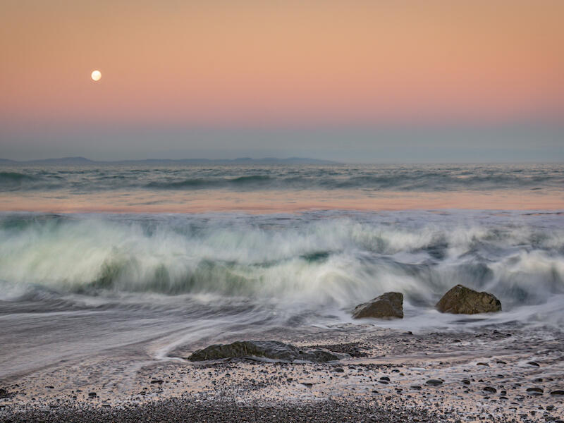
Dawn Surges - I love the soft light in this image. The shutter speed has been well handled to show the surges in the sea without making it too smooth. And that is where the story is. I suggest taking the top left corner and bringing it in so that some is cropped from the top and the left side but keeping the ration the same. This would bring the attention to the surges even more. That part at the top doesn’t add anything to the story especially the blue sky. The detail in the rock is interesting too. Merit
Old Man Pine Sunrise - What an interesting tree. I wonder if this could have been taken so that the colour was behind the tree and so give more cohesion to the image. As it is, my eyes go from the tree to the red clouds and back. This makes them compete with each other. Make sure that the focus of your story is the part that stands out in your image. I like where you have placed the tree on the third. Acceptance
Roaring Across the River - What a wonderful sight which you have captured well. I love the way the smoke plumes out which adds to the illusion of depth. I like the way the train has been taken looking up at it. The composition has been well handled and although there is plenty of things to look at such as the road bridge, They all fit in with the train being the subject. This makes a balanced and cohesive image. To take it up another level I suggest that the left side is cropped to the bit that juts out on the rails. That would eliminate the first bridge support and some of the bight coloured sand. Honours
Wairau Diversion Sunset - The lovely soft light sets the tone for this image. I love the way the water in the foreground is shown with the slower shutter speed giving the waves lots of movement and motion. Although the moon is interesting, I find it distracting as I feel the feel the real story is in the water where the two areas meet. Well done. Merit
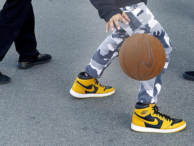
Ball Game Anyone - For me this tells a great story. There is one person who is eager to play and the feet of the other two show indifference as they point away from the player. Great seeing the chance. It is a great story. Well done. Merit
Colouring in - I like the way this composition has all the elements of hands and feet in the one area. The way her hair covers her face keeps my attention on her feet and hands. Because the light is more on along the bottom and that foot is leading outward it takes my eye out of the image. Some lighting where her hands are doing the action and some darkening on the bottom foot and along the bottom of the frame would have stregthened the image in my view. Merit
Concentration - I love old people’s hands. They have so much character in them and these hands are no exception. The way the light shines on where the work is being done and the lighter colour of the paper draws me in. The colours blend well together. A small vignette could tone down the light on the elbows. Otherwise a great image. Honours
Grassy Hands - Although the hands are prominent I tend to look at the grass rather than the hands because it is a different colour and stands out. The hands would have shown more clearly if the light area behind them was vignetted I feel. Then my attention would have been drawn to them as well as the grass. Acceptance
Hand Clasp - The pose of these hands leads me into the fingers where the main interest lies. I would like to see more room above the hands as the nails are almost touching the frame and that makes it feel cramped to me. The sharpness is there and a good depth of field. I’m not sure that the background works as it has lighter areas of colour that tend to catch my eye. even though it is blurred. I do like that the hands are close up and fill most of the frame. Acceptance
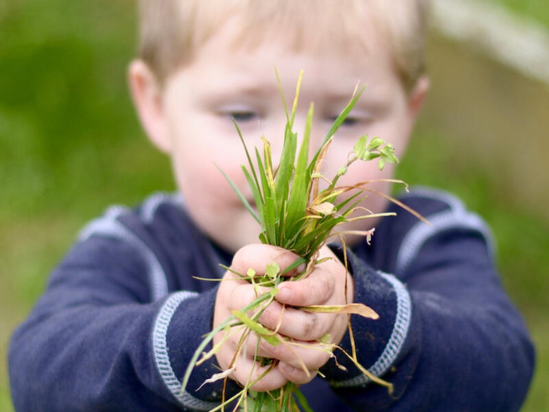
Lawn Gifts - The depth of field has been really well handled in this image so that although the child is there, the only bit that is sharp is his hands so well done. I feel that some cropping down from the top so that his eyes are not in the frame would focus all the attention on his hands. When taking an image like this always look at the background as that white line is quite distracting too. It is easy to concentrate on the subject and forget to look around especially when you are starting your journey in photography. Merit
On the Move - I think this was a good idea yet it hasn’t quite worked for me. I find that I am tending to look from the front foot to the back foot as they are sharp and my eyes glosses over the part in the middle with the blurred feet. I like that you cropped the feet in close and that fact that they are on the diagonal which all helps to create a cohesive image. Acceptance
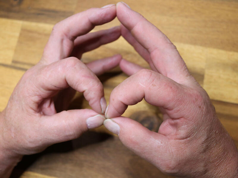
Steepled Fingers - Interestingly it isn’t the steepled fingers that take my attention but the thumbs and first fingers joining. The others are slightly out of focus but that doesn’t matter to me in this image as the front ones are sharp and that is where the interest is, in my view. They form a figure of eight which my eye goes around and comes back to the joining keeping my interest. Merit
Webbed Feet in the Outdoors - I’m glad they are in the outdoors as I don’t think I would like these feet in my house. It is good to see lateral thinking in this. I like the way the feet are cropped and fill the image. The depth of field
has been well handled to give some blur in the front yet the feet and legs are sharp. It is a pity that these are black feet against a dark background so they are not as easily seen as they would have been with more exposure. Adding more exposure would have lightened the grass and given the feet more prominence This could be done in post production and would make all the difference to the image. Acceptance
Sandy Feet - The fast shutter speed has worked well with this image as the sand is shown falling from the shoe in lovely detail. It is fascinating to look at. The legs are very dominant because of the colour. I like how much of them are included as it adds to the story. I feel quite a strong vignette would have darkened the legs and then the feet would hold the balance. Lovely idea. Merit.
Share:


