
Judge: Cushla Moorhead
Pets/animals, domesticated or worldwide. The animal can be moving or depicted in its own environment, or can be a photo of part or all of the face with the expression dominant.
Can be cute, funny or showing a relationship with person or another animal. The intent could be to display the likeness, personality of the animal/bird/pet/fish. The photo can include people and man-made objects.
https://expertphotography.com/animal-photography-examples/
Open
Set Subject

Marlborough October 2020
Hi Everyone
For those who don’t know me, I am Cushla Moorhead and I am an artist and a photographer. I have a diploma in digital photography and a diploma in art and creativity. I am an accredited evaluator for PSNZ.
I wanted to make some general comments before I begin the main comments. If the topic is something like pets or children remember that noone sees your pet or your children as you do and although they may be the world’s best and most amazing, for competition there needs to be some other element that you need to create to draw in viewers, such as lighting, action, and unusual view. A strong subject, great lighting, and simplicity are three things to consider.
And now for the comments
A grade Open
Akaroa Lighthouse - I like the way the lighthouse is backlit which has given the sky a textured effect. I would have liked to see the lighthouse itself lightened a tad with some editing as it is the sky that stands out. The leading lines of the railing has light on them that help them to stand out. A pity that there is a rail across at the end that forms a barrier in my opinion. An interesting sky.
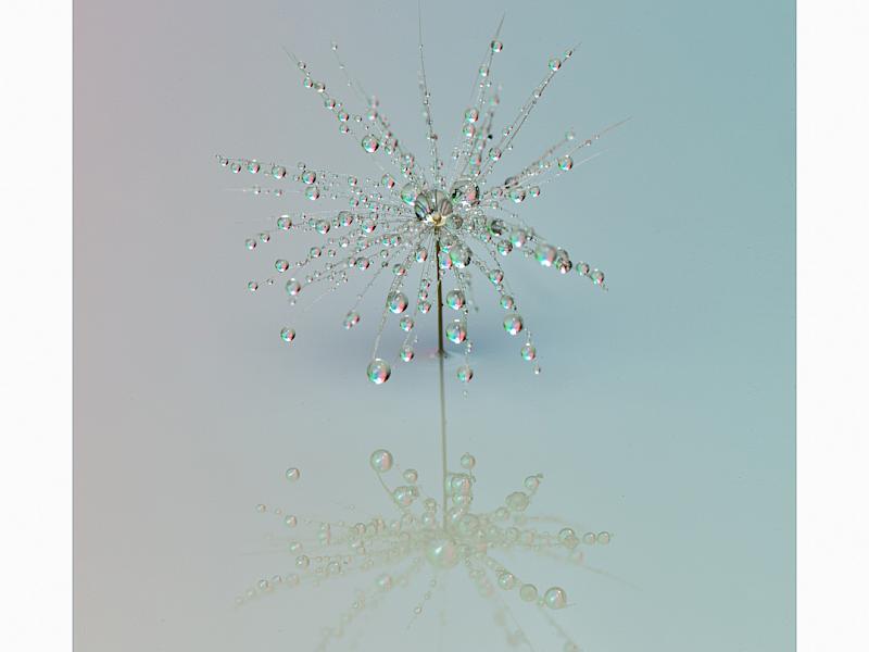
Droplets - A lovely dainty image in my opinion. The colour in the droplets is a brighter version of the soft lighting of the image and thus produces a very cohesive whole. I like the way the droplet element is asymmetrical too even though it is placed in the centre.
Fetch -The dog’s eyes I can see are firmly fixed on its target. Although a fast shutter speed has been used here to catch the movement, for me, nothing in the image is really sharp. I feel that the logo at the back is also a distraction and competes with the dog. It is a diffcult image to get, so good on the author for trying. I like the pops of red that give the image a lift.
Ghostly Trees - An interesting image for me. The way the branches all move one way suggest wind to me. I feel that there needs to be more of a point of interest so my eye can rest. I suggest brightening one of the other trees - maybe on a third and darkening the one on the left that for me is too white for the position it holds. The yellow gives the image a lift.
Lake Coleridge - This image took me back to when I used to skate at Lake Ida nearby. I like the sunlight on the hills with the one on the left in shadow so it draws me into the image. I suggest that maybe the tree sticking up in the middle of the lake could have been cloned down so it didn’t intrude so much. There is a small dust spot on the left in the sky too. I like how crisp the snow looks and I can see the texture in it.
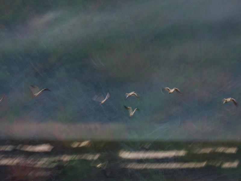
Lift Off - I love all the texture and subtle colours in this image, in the sky especially. I feel the white on the waves is distracting as it is such a contrast to the rest of the sea and competes with the birds who are the main subject. I feel that the image could have been lightened slightly. The way the birds have just enough definition to see them as birds yet is is obvious they are flying has been well handled in my opinion.
River Refections - There are some beautiful colours and textures in the water in my view. I find my eye keeps returning to the rushes as they are the lightest part of the image. It feels unbalanced to me. I feel that there could be more to the story than there is here.
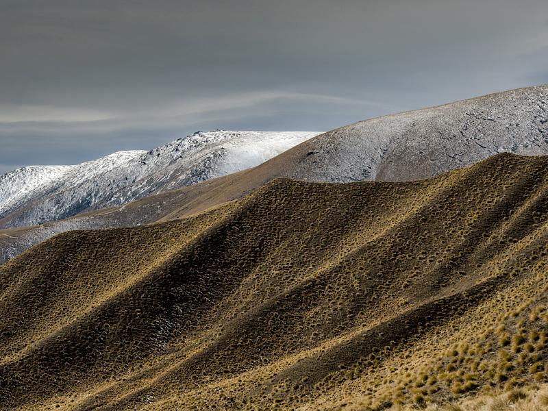
Spring Snow - I love the repeat patterns in the folds of the hills and the way the three different layers of hills give depth to this image. The colours with the brighter colour in the foreground then slightly cooler in the middle ground and the snow on the last as well as adding to the depth and detail gives a cohesive story of the country. Well done.
A grade - Set
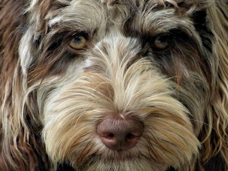
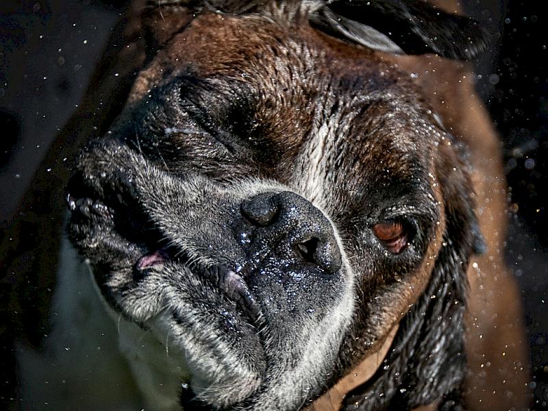
Bathtime Boxer - This image gave me a chuckle. I like the way it is taken close up so I get to see the closed eye and the look of forbearance, in my opinion, of the dog. On my screen this image is a tad dark. The depth of field shows most of the face sharp and the way the rest is soft gives emphasis to the face, in my view. The spots of water add to the story.
Christmas Puppy - A lovely looking dog. I like the bright look in his eyes. I find the bright red bits in the background distracting and although the glitter adds to the story it also detracts for me. Although the puppy’s eyes are sharp I would have liked to see the rest of the face sharp too, especially the nose, as it is the lead in for me.
Come and See -I think these animals are so cute the way they pop up to see and this one has been well caught. I suggest cropping in a bit more on the left to eliminate some of the brighter background. Seeing the fur so close like this has shown me more about these animals.
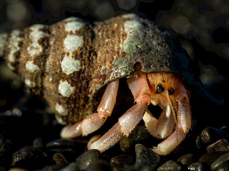
Coming Out - What an amazing photo of this hermit crab. There is just enough light on the stones near the crab to show its environment and so add to the story. I feel some of the light spots on the shell may have been less prominent if they had been darker. I wonder if some cropping on the left so there was less of the shell would help too. I like the bokeh in the background. I feel the positioning of the crab has made for me a good composition as the legs lead up to its eyes and these are on the third.
Curious Stag - I like the way the stance of the stag is shown here in this image. It is such a typical look and caught with two of his feet of the ground and the hair on his neck being blown makes it real. I like the mistiness of the background and the way it sets the scene for the stag. I do feel that cropping the bush on the left side would enhance the image and bring even more attention to the stag yet still leave him room to move.
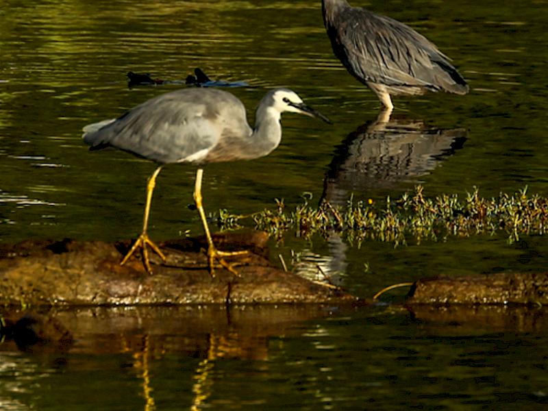
Egrets Meal Time - The way the birds are lit makes this image for me. That soft light across the water catching the birds and gives them definition and is delightful, in my view. The difference in their stances adds to the story and the flow of the image. The colours all blend well together to make this a well balanced image. I love the ripples on the water that gives it some texture. Great image.
First Mate - The dog and his mate obviously share a strong bond by the look of them together. I feel it is a pity that there is so much of this image is light coloured which together with the bright red of the boat I find distracting and even though the main characters are still seen. I do suggest that putting a vignette on an image often helps darken some of those distracting brighter areas. The yellow of the life jacket mitigates some of this as it is bright as well.
Getting Away - I love the way I can see into the pelican’s mouth and how the light shows how transparent that membrane of its bill is. I would have like to see a tad more in front of the pelican for it to to move into. The movement of the water adds more to the story and shows the movement of the bird.
Hard Life - For me this image is sharp on the horse and fades off to the background to show the author understand depth of field. I feel that I would have liked to see either more or less of the horse as the bit of colour at the edge of the image looks interesting - as if there is more to the story but is almost out of the frame. The horse’s hoof is cut off at the fetlock too and the tip of the other hoof is also cut. I like how the close up of the head shows the worn halter and gives evidence of the title.
I Feel Tired - A lovely clear shot of the seal, in my view. I feel the depth of field has been well handled too. For me, all the rocks are very bright and I suggest that by either taking two images for different exposures or using a vignette would have counteracted that. I love how much detail there is in the fur and inside the mouth.
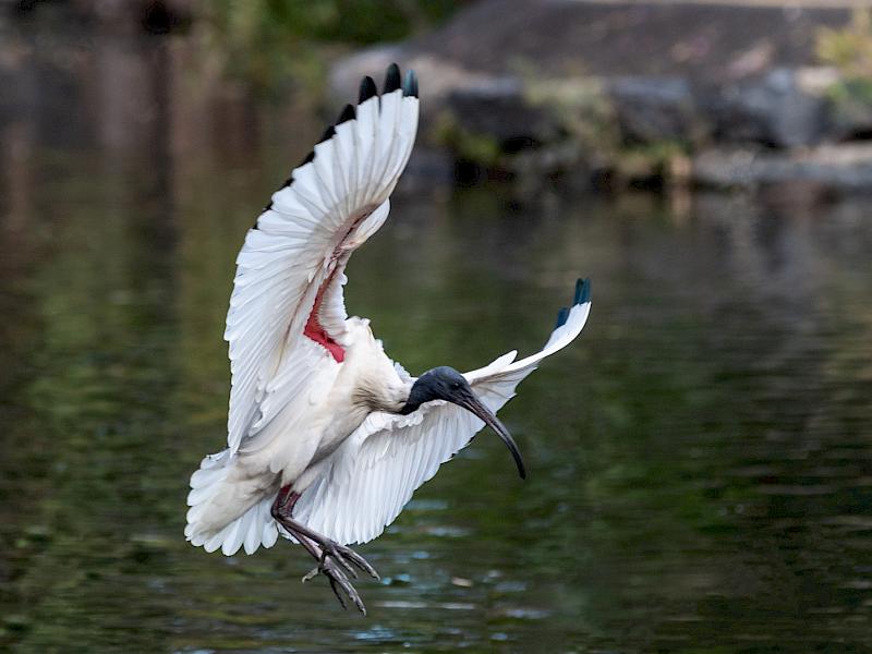
Ibis On Final Approach - What a lovely image this is, in my opinion. I like the faint blur on the wings and feet as, to me, it shows movement of the bird. The head isn’t as sharp as I would like it though. I love the detail in the feathers and the background is blurred to showcase the Ibis landing.
Mate - For me, this is more an image for natural history than for a camera club competition. Although the two kangaroo are sharp the background is uninteresting and they could be anywhere.
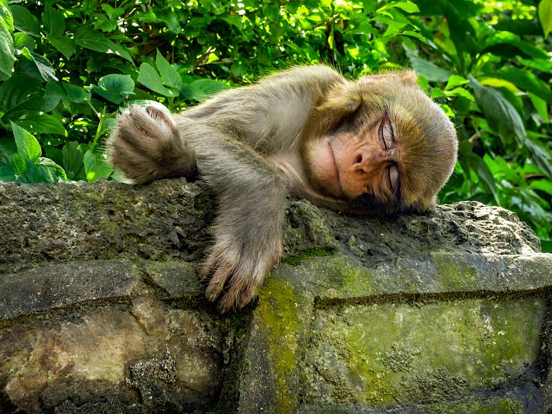
Monkey Business - I love the pose of the monkey on the wall. The wall and the monkey have great detail and go together. I find the bright green of the leaves behind a bit of a jarring note and suggest the a vignette, especially on the top half would help it become more cohesive. I like the flow of the composition.
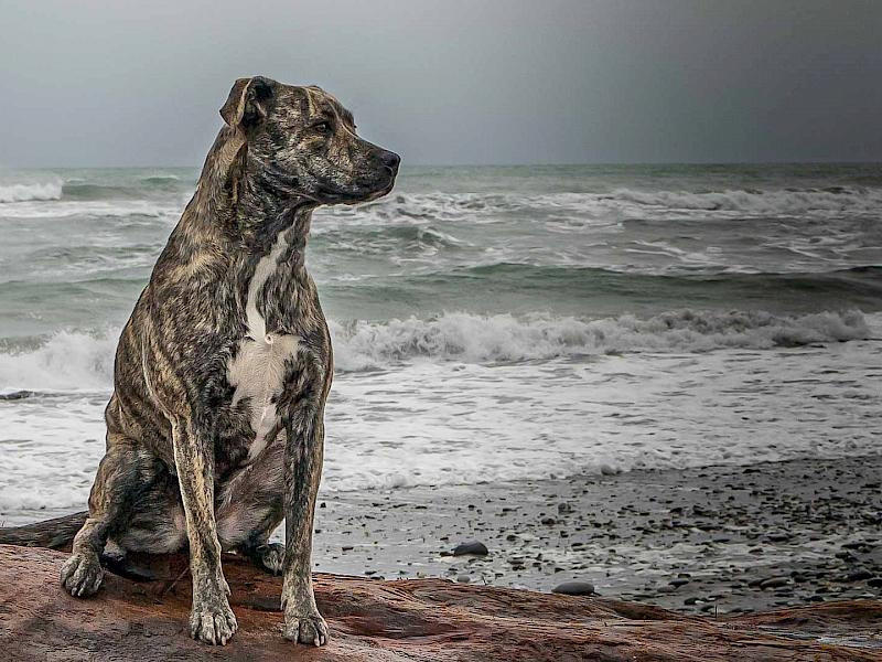
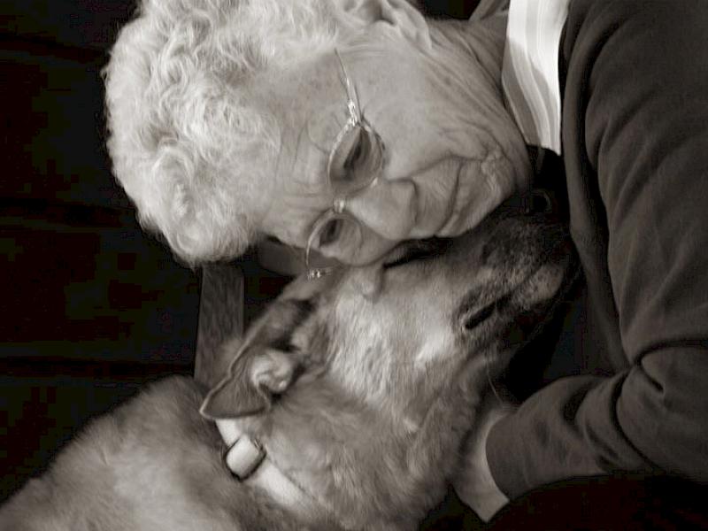
Pet Love - I love the composition of this image with the dog’s body acting as a lead in to the emotional pose which to me shows the loving relationship between them. I like the sepia finish as it, to my mind, suits the subject and leaves it softer than straight black and white. For me the back of the chair and the way it is cropped complete the picture.
Rosie - I really like the way the side lighting gives definition to Rosie and in my view creates an interesting image The mouse I feel could have been darkened a tad as although it adds to the story, it is a bit of a distraction too. Rosie looking straight at me gives me the feeling she is looking at me and connecting.
Sheep - The sheep are sharp and I like the way they have their heads turned. I would like more to engaged me in this story.
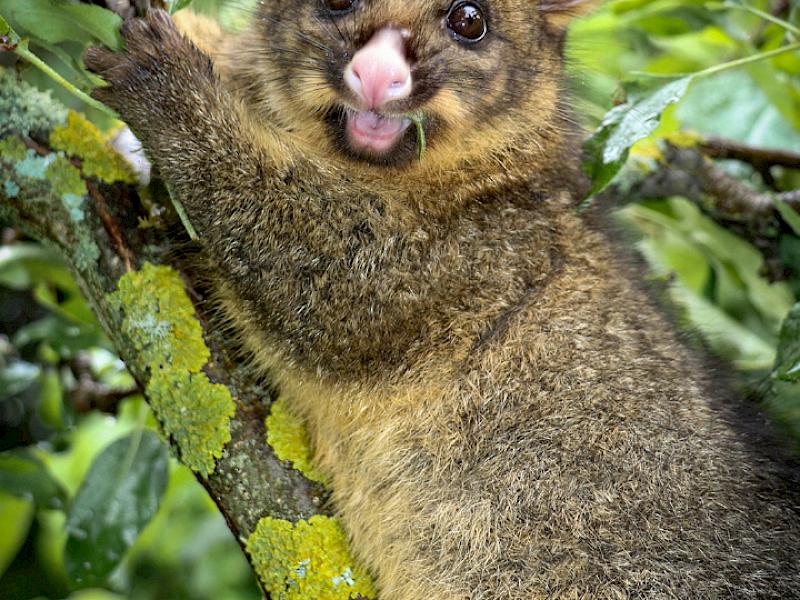
Pest - This opossum is showing its lovely soft fur which has been well handled in this image. I really feel that more is needed in this story.
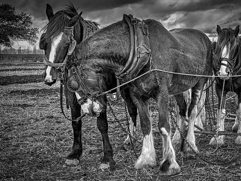
Working Draughts - This image takes me back to another era. It is lovely to see them in all their harness and I feel the back and white suits the subject as it gives the image an old fashioned look. The angle of the horses draws me into the image. I can see the sweat on the coat of the nearest horse so they have been hard at work. For me a well crafted image.
Open B Grade
Cygnet - I like the way this image has been made into a portrait of the cygnet so showing me all the little details of its head. It is a bit soft so another time I suggest using a deeper depth of field or move closer if you can. The way the background has been blurred supports the cygnet and helps it to stand out in my view.
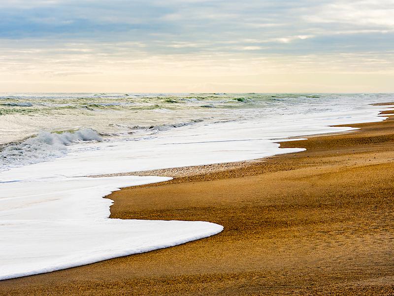
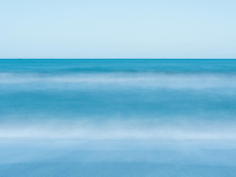
Restful Ocean - This is a peaceful scene in my view. The bands of blue interspersed with white give the image depth in my opinion. I would have liked to see more in the sky but sometimes it can’t be done. There are different textures in the colours of the water that adds to the story and contrasts with the smooth sky.
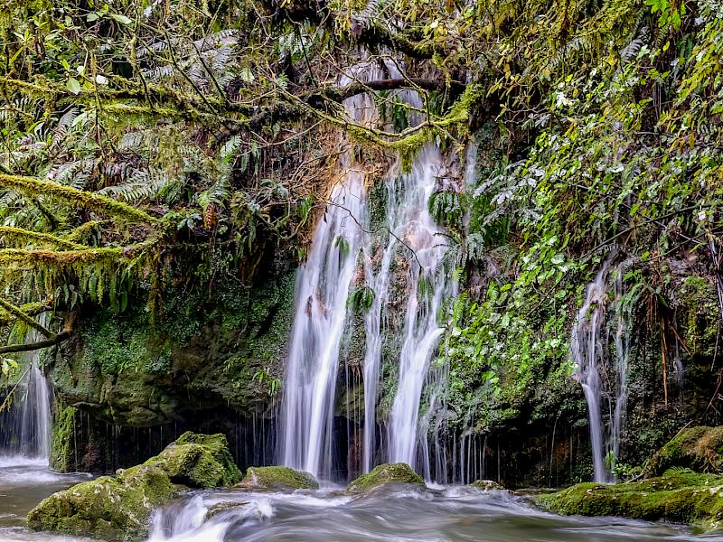
Waterfall - I really like the way a slow shutter speed has been used to produce this effect with the water. In my view it shows the waterfall to advantage with the silkiness of the water which, in my mind, makes it flow. I feel some of the green of the background and the lichen on the trees could be darkened a tad as they compete with the waterfall. The two smaller waterfalls add more to the story and add interest.
B Grade Set
Alan - I like the way the depth of field has been used to create an image where the head is sharp and then it gets softer further back on the body and blurs the background to create depth. The tags appear to be fastened to his tongue and a slight change of angle could prevent this happening. Or as in this case maybe cloning them out as they are a distraction because of the white. A bright alert looking dog.
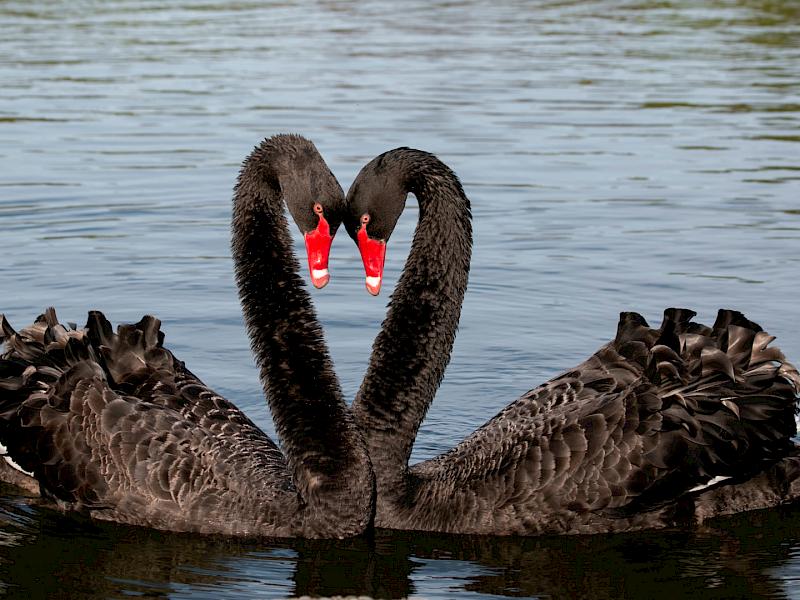
Courtship Dance - I love how their heads form a heart with the red bills forming the centre and adding that pop of colour. The swans feathers are beautifully shown with lots of detail and the depth of field has blurred the background to make the swans standout.
I’m Watching You - The way this animal has been taken so that only part of his body is shown draws my attention to his head and horns. I feel more contrast in this image would show up the details of the hair and horns as I feel it is a bit flat. The composition with the body leading in to the head and the fence in the background has been well handled and gives it structure in my opinion.
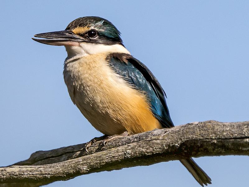
Mr Kingfisher - What a great shot of this kingfisher. I can see all the glory of its feathers in detail and the branch is part of the story and yet it doesn’t intrude. The sky showcases the kingfisher. Great work.
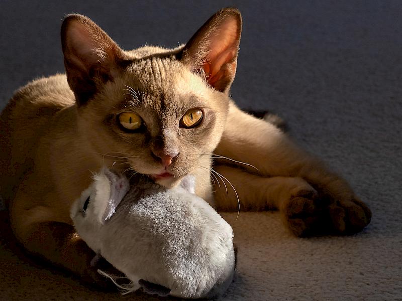
Playtime - I like the way the eyes and head are sharp. For me the toy is too bright and I feel it doesn’t really add anything to the story. The softness of the background has been well done so that the cat is the subject.
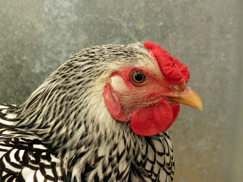
Seen at Poultry Show - A lovely portrait of a hen in my view. I like how I can see all the detail in her feathers and her head. Everything is sharp and the background complements the hen. In my opinion.
Shags - I feel the author has done well to get definition in the feathers as it is often hard with dark coloured birds. For me this is more about the tree than the shags. I wonder if cropping the image so that there are only the three lower birds would create a more balanced image.
Yummy Grass - I like the composition of this image with the one bird in the front the the others in the background. I feel cropping some of the bush on the right would give more balance to the image as it is quite dominant. Unfortunately nothing is sharp in my view so the use of a greater depth of field needs to be used. I like the little bits of grass in the young bird’s mouth which adds interest to the story
C Grade - Open
Alpacas On Alert - Something has caught their attention and I like the way they are all looking and I can see that they are moving too. The whole image is a bit soft and I feel that a faster shutter speed would have given a sharper image. Maybe using shutter priority. Also I suggest that looking round the edge of the frame just before taking an image would avoid bits of the animalsbeing cut off. The darker background helps the alpacas to standout in my view.
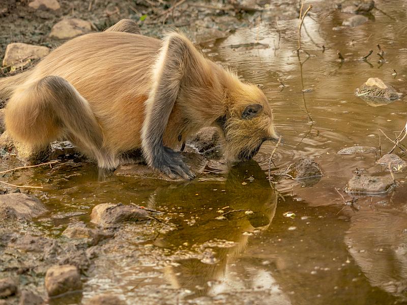
The Big Thirst - I like the clarity of this image and that it tells me a story. Everything about the animal is sharp so I can see details of its fur and hands. The colours are all in the same tones so produce a very cohesive image in my view. There is foreground, middle ground and background and this helps create a balanced image in my opinion.
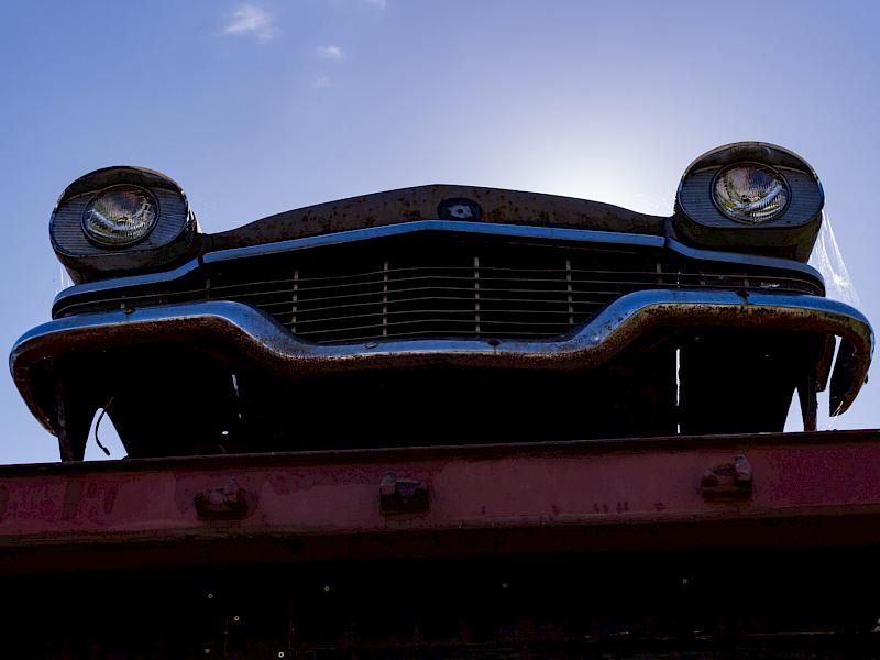
The Wrecking Yard - Well done for thinking outside the square and looking for an image that is different and taken from an unusual view point. The outlines stand out well from the sky. I especially like the way the light has caught the spider’s web which adds an unexpected delicate contrast to the strong lines and rusted metal of the rest of the image.
C Grade - Set
Bull in a Field - I’m guessing the author isn’t a kiwi with the use of the word field. For me there is a good depth of field here as the bull is sharp and the background slightly blurred. There are two white areas on this animal so I’m wondering if cropping in closer so that only part of the animal was seen would give more interest and focus my eye on his head and eyes. Otherwise my eye tend to flick between the two areas as white stands out. I can see lots of detail in the face so well done.
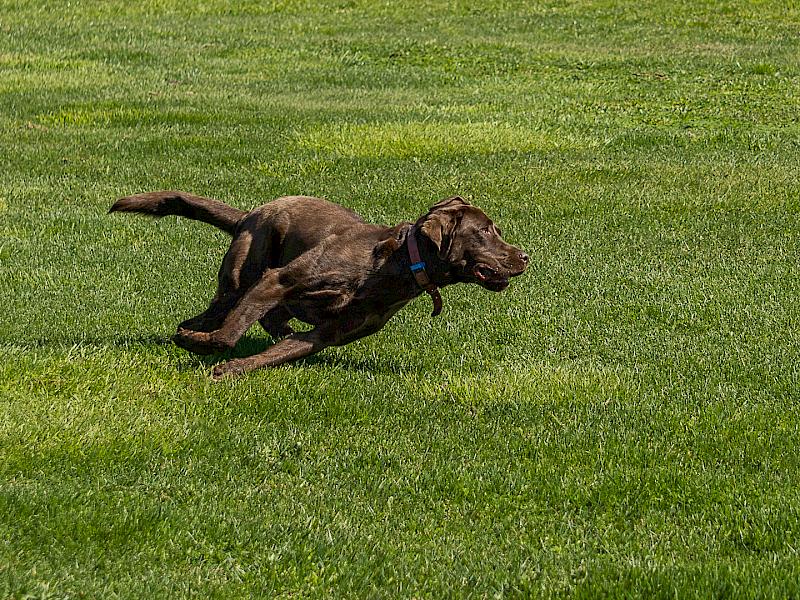
Dog Running in the Grass - Wow!I love the way this dog has been caught in full flight. It is a brilliant action shot of the dog. The fast shutter speed has captured all the action clearly and the dog is sharp. The green grass is quite bright and maybe some vignetting would help with this. Also cropping some on the left would, in my mind, shift the dog from the centre to focus on where it is going. Something to try next time is to use a slightly slower shutter speed and pan with the movement as this puts blur on the background and so emphasises the movement. It takes practise and is well worth the effort. Well done.
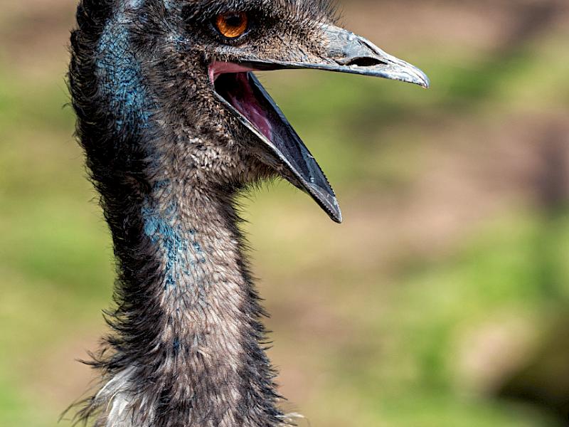
Emu - There is something about the emu’s attitude that made me smile. I like the way it is cropped so that I can see lots more details such as the blue of its skin. The background is nicely blurred so I feel that the depth of field has been handled well. A nice portrait.
Eye See - I like the play on words for the title. The look image there are different white patches and I suggest slightly darkening the paw and the white on the back of the neck would bring the emphasis to the face. The eyes are nice and sharp and the close in crop draws my attention there.
Goatie - For me this is a clear portrait of the goat. I suggest that different lighting could have given the face more definition - such as side - lighting so that some of the face is in shadow and some is lit. The dark background helps the goat to stand out.
Guanaco Family - I like the way I can see the environment as well as the animals. There is a foreground, a middle ground and a background which helps the composition. I feel the whole image is slightly blurred and wonder if there has been a bit of camera shake? I like the position of the three guanaco as there is a flow from the front to the baby.
Haast - I love the pose of the dog and the way it is positioned on the rock. The colours of the dog blend with the colours in the sand and create harmony, in my opinion. I can see some haloing along the edge of the dog so feel there has been some over sharpening. Maybe changing the depth of field would give some blur to the background which would leave it less intrusive as I find my eyes wondering off to the sea. I like the composition with the dog at the side.
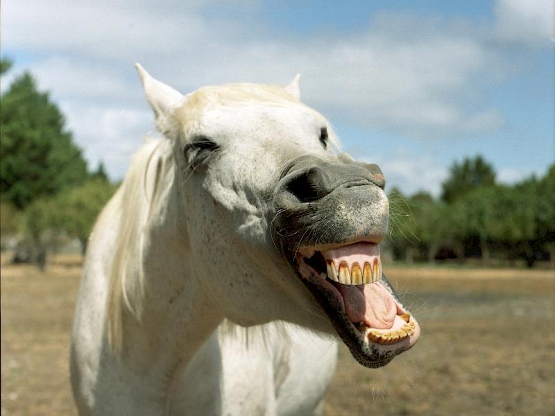
Horsin Around - Well caught image in my view and gave me a chuckle. The light and focus are on the horse’s mouth so draws my attention to the point of the story. I feel some cropping on the left side almost up to the ear would have made this image even stronger. This image is sharp where it needs to be and soft in the background. Good job.
I’m Waiting - I like the way the cat’s head is slightly titled. It adds interest for me. I’m not sure what is going on in this image but it is grainy to me. I like the dreamy feel of the image. The eyes look sharp and everything else is soft. I like to see more definition and sharpness in the face. Cute cat though.
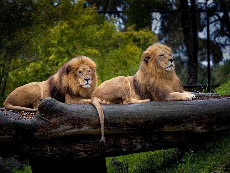
Malik and Zulu - These lions have certainly posed well for this image. I love that the first lion is alert looking and the way his tail is draped over the side adds to the composition. The other lion has a different pose and it all works together to form a cohesive whole in my opinion. The background is blurred enough to showcase the lions.
Master Harley - The cat is sharp which shows detail in his face and fur. I would have liked to see more contrast in the lighting. The white skirting board is a distraction for me. I like the way the cat is in a natural pose on a diagonal as that gives some flow to the image.
Mr and Mrs - The ripples on the water create a contrast in both colour and texture to the geese in my opinion. The geese are soft which I feel could have been managed at time of capture either with a faster shutter speed or maybe it is camera shake. I like the way the geese are on the diagonal looking into the water yet I am still able to see eyes.
Playing Possum - The last thing I think this opossum is doing is playing dead. It feels like it has been startled and is letting the author know it with that peculiar noise they make. The opossum is shown in its environment and is clear and sharp. Something to watch is the colour of the background as it is a tad bright but in this image the opossum is definitely the star of the show. Look at those long sharp claws - not as cute as it looks, I feel.
Road to Mandalay - This is an interesting insight into life in this area of the world, in my view. I suggest some darkening of the second animal and also the white fence at the back as they are a bit distracting. On my laptop I didn’t notice but on my desktop this image is a bit grainy, especially on the men’s faces. Did you use a high ISO? I like the composition as there is nothing extra in it - only the elements that tell the story.
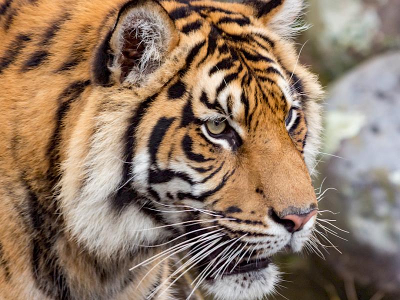
Sumatra Tiger - I like the way the tiger seems fixed on something it sees and has a look of intent. What a pity it wasn’t looking towards the camera although then it might be too scary. I like the way the image shows mainly the head in great detail.
Wait for Me - I love the way this dog’s ears are flowing backwards with the movement. I’m not sure what has been done here but for me it hasn’t worked. It just seems odd to me, to see part of the dogs face almost sharp and then the rest all blurred with the same blur which suggests to me that something was done in editing.
Water Buffalo - I like the way you have tried something a bit different. I’m not sure what it is the author wants me to look at. If it is the eye then it needs to be higher in the frame - preferably on the bottom cross of the thirds lines. The horns have blown out bits on them. I can see the mud on the forelock of the buffalo and above its eyes that adds to the story and gets me asking questions to know more.
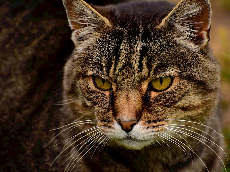
Whiskers - This cat seems to be well named as I can see its beautiful whiskers. I would have liked to see the cat looking at the camera yet that is a minor point. I like the way the composition of the image shows me the details of its face and then gets blurry so that the face is the subject.
Marlborough Prints, Oct 2020
A Grade Open
Journey’s End - I like the title for this subject. There is some interesting detail in the log in my view. I’m not sure whether the author has aimed for high key or if this is overexposed. I’m going with the high key. I suggest cropping most of the sky as there is no detail there and for me it is only empty space. There is some detail in the rest of the image especially in the sand. The stump acts as an anchor as well as being an interesting subject in my opinion.
Mananui - I really love the colours and the textures in this image. The composition with the scenery on the diagonal, in my view gives the image flow.The soft sky acts as a foil, I feel, for the restless sea., What I would have liked to see is a focal point of some sort - either in the sea or on the beach. As it is my eyes are left to roam around with nowhere to rest. I like the patterns the foam makes on the sand.
Winter Vines - The leaf and its vine produce a strong contrast from the sky that helps it standout in this image for me. The complementary colours also help with this in my opinion. I find the vine and the way the blue is in three distinct shapes on the left, a distraction. In my view some slight cropping here, so that only some of the vine is showing along the edge, would see it act as a frame instead. Then my attention would be able to focus on the beautiful leaf.
A Grade Set
Koala Bear - I feel that you have done well to capture a koala actually moving. I like the positioning of the tree and the koala and they are both sharp, showing lots of detail. What bothers me are all the light spots in the background that are certainly distracting and the fact that for me the whole image is underexposed. I feel this could have been alleviated in post production. It does tell a story.
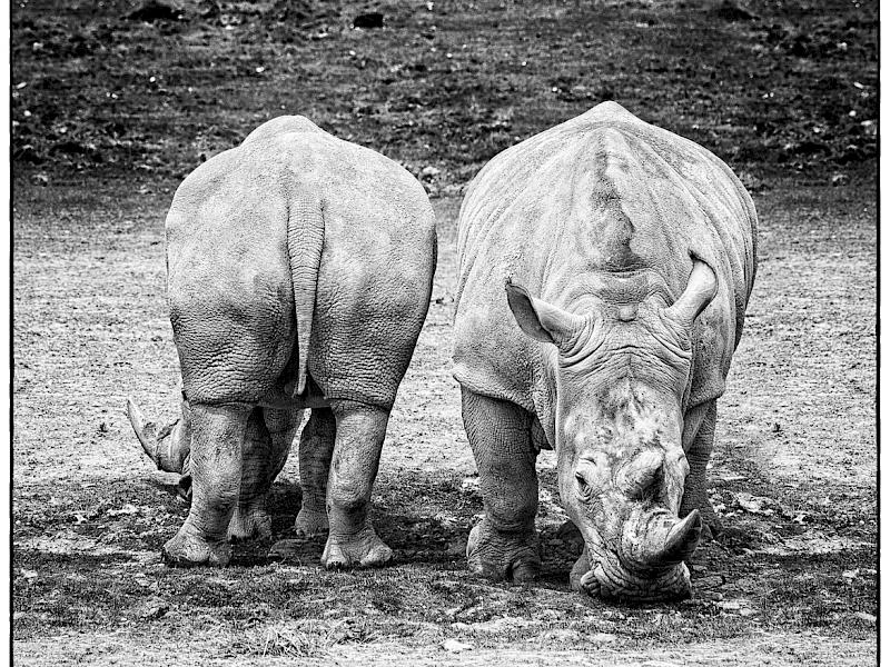
Rhinos - I feel the black and white handling of this image suits the subject and helps to showcase the amazing skin of these animal in my view. I like the fact that one is facing each way. The rhinos are well positioned in the frame.
B Grade Open
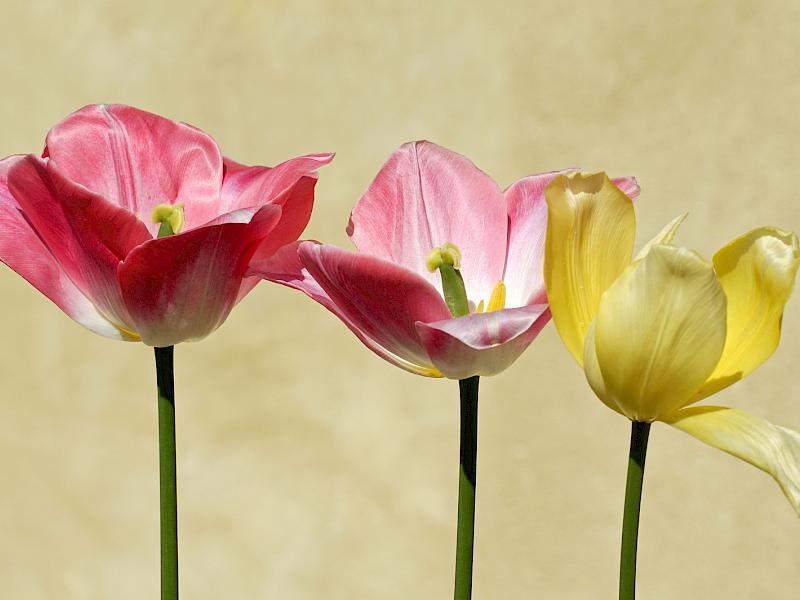
Tulips - I really like the composition of these tulips with each flower being slightly lower than the one before and then the last one is a different colour and the flow continues along that one petal to the side. In my view this is a well constructed image. I have one very small comment and that is next time leave a bit more room each side. The background is unobtrusive and being a lighter colour helps the tulips to stand proud.
Ward Beach Sunrise - The sun’s rays have been well caught and draw my eyes into the image. I like the way the rays of sunlight have touch parts of the rocks which tells the story. The sun is blown out which is unavoidable. I also feel there is a semicircle of blown out sky caused by the sun so that a great deal of the sky doesn’t add to the story. The clouds I can see show that a long exposure has been used which gives some movement to the image. I feel this is a case where two images with different exposures could be taken and then layered together in editing. The way the rocks go down each side give structure to the composition.
B Grade Set
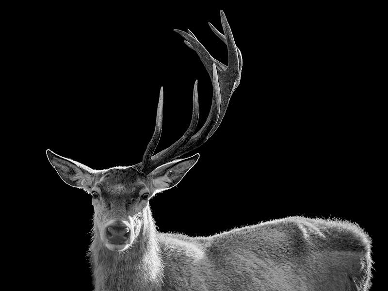
Special Head - I feel the lighting has worked well in this image showing the outlines of the deer and the antler. I feel slightly more contrast would have shown the deer more. I also suggest trying cropping some of each side - just a tad on the left and more on the right so that the head and the antler are emphasised in a portrait. There is lots of detail in the deer’s coat and in the antler which adds interest to the image.
C Grade Open
Cheeky Monkey - I like the sideways pose for this child. He has a cheeky grin too in my opinion. A lot of this image is soft and some softness in a child especially of this age is allowable in my view. For me the eyes need to be sharp and his mouth and nose too. One eye is sharp but little else so I suggest use more depth of field next time. Also watch the background when taking an image as shifting even slightly can change the background. In this case that lighter area. For me it is a lovely relaxed portrait.
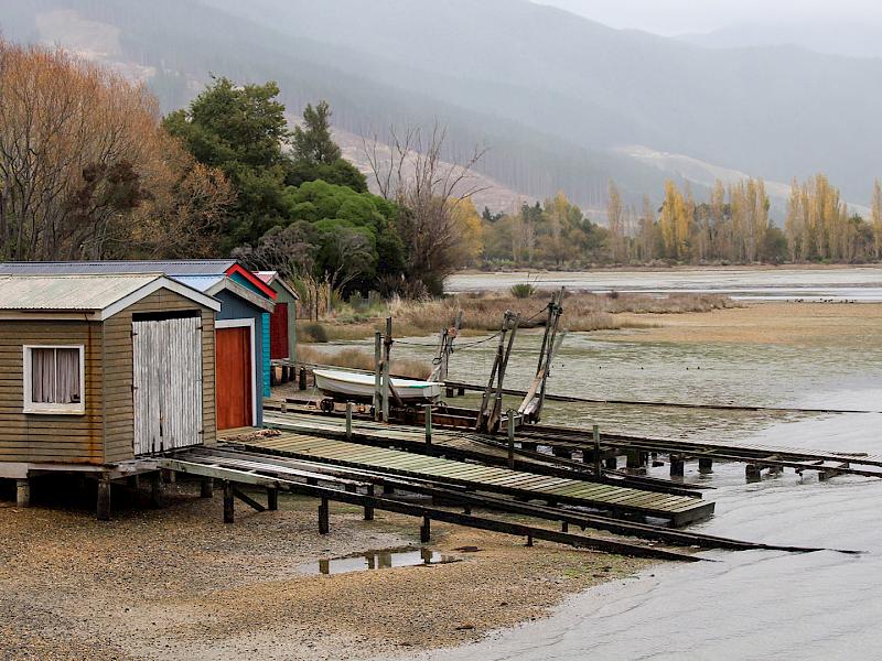
Low Tide - For me this is an iconic Kiwi scene which brings back memories of summer holidays. When I looked at this image on my screen, as I was sent the digital image too, the colours in the sheds were brighter. I find for prints I often push the brightness up higher on my computer and then they print out about the right colour. It is a question of practise, I feel. I like the composition of this image with the boats sheds a great focal point for me. I like that there are layers of beach, trees and hills in the background giving the image depth and interest .
C Grade Set
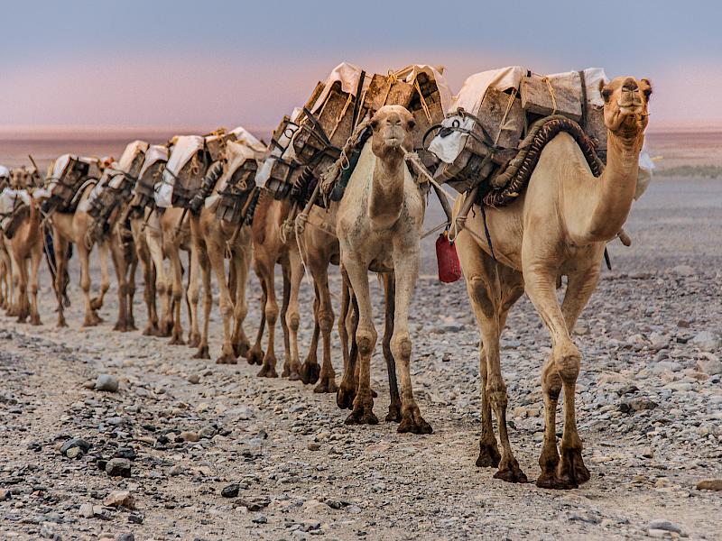
Salt Caravan - This is an image that caught my attention straight away. The positioning of the camels on the slight angle shows the story for me. I feel that you might have aimed the focus at the lead camel and maybe if you had aimed at the second one and added more depth of field more of this image would be in focus in my opinion and made it even more interesting. I love the soft light in the background which creates a setting for the camels and the story, in my view. Great image.
Samantha - I love the way this is taken close up and really shows Samantha and the look in her eyes. The depth of field has been well handled so that in my view it is sharp over all her face and gets a bit softer further back so that the face is the subject. The light bits on her coat at both sides I feel would benefit from being darkened a tad, maybe with some vignetting. This, in my opinion would show her face more and bring my attention more easily to her eyes. Great portrait.
Congratulations to those who got the top awards and to all of you for entering.
There was very little between the two top digital images and in the end I chose this one because of the lighting
- Egrets Meal Time
The best print was
- 3 Tulips
Thank you for asking me to evaluate these images. It is exciting and interesting to see other photographers work and see images of different areas. Thank you.
Share:


