Judge: Adrian Peters
Tarnished metals, rusty objects, card, vehicles, containers, pot, tools,
Anything over 80 years (and no – not your mum)
Can i use photo editing tool to make a new image rustic? You can use the tools to enahnce your image, but not to convert it to"rustic".
Members Suggestions: Old vehicles - trucks, cars, busses, trains, boats, planes, things at least 80 years old. Old and rustic - houses, woolsheds, barns. Cars, trucks, overgrown things.
Open
Set Subject

Judged for the 1st time from Adrian Peters (From TopShots)
| C Grade - Set Subject | ||
| Abandoned Bedford | An old truck. Little tight on the subject otherwise position is good, A little flat and probably needs a bit more colour punch as quite cold. Just a little bit warmer colour (maybe yellow) in there. I need something to basically punch the truck out. | accepted |
| Abandoned homestead | Using different aspect ratio on this. I would like to see it cropped. A bit too much Top space. Really could do with some contrast and colour. It’s too flat. | accepted |
| Dragons Eye | Very good composition! The image is too flat. Really just needs that black-and-white point adjusted. With more contrast and better definition of the black to white - I would’ve given this a merit | accepted |
| Garage Door | The colour is good. I like the composition of it. Once again it’s slightly off kilter. A little bit straightening required. With the rust design at the top, just needed that little bit more punch and bit more contrast.. | accepted |
| Hoult Homestead, Wakefield | Nice and straight with good composition just could’ve done with a little bit more right side and the colour needs to be punched a bit more on this one | accepted |
| Kaituna Cottage | Fence line at the front is good, possibly just leaving the composition slightly out. It’s a bit tight for the composition and the effect needs lifted. Just a little flat again. Just needs a little tweak. I like the vignette. | accepted |
| Old Homestead | Once again good composition, good use of the 16 x 9 for this particular shot. The sheep at the front really does fit the background. I like that but flat. The greenery could be a little bit more blue in it just to make it look a little bit more natural. . Not quite straight a little | accepted |
| Pebble Dash | A little flat, would like to see more contrast but very good composition. I like the camera angle on it too - good photo. | accepted |
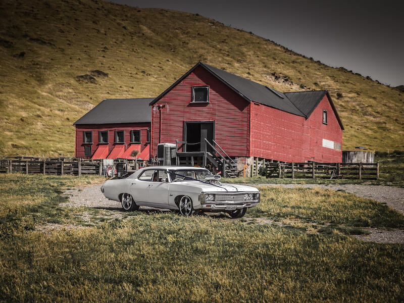
| Rustic collision | Good composition. I like the use of the 16 x 9 for this as it really suits. A bit flat; a little bit of punch would be really good to make the car really stand out from the green in the background | accepted |
| The old traction engine | Good use of square format and it really suits this particular image rather than detracting it adds to the image. I would like to see a lot more detail into the shadows. I don’t know if that’s to do with the resolution here or not, but just something to look at. Make sure that you’re seeing what you want to see | accepted |
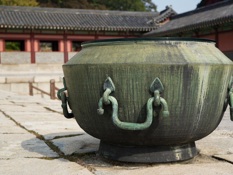
| Urn Seoul | Great composition showing definitely knowledge of framing the shot, Possibly need something just around the edges to bring the eye back into the subject regardless of how big it is in the photo. Not sure this is rustic but yeah, showing really good knowledge and taking a photo | Merit |
| C Grade - Open Subject | C Grade - Open Subject | |
| Across the lake | Position is too tight. It should either of been I think needed more left and right to really - like a Panoramic . Too much real negative space on the top, that left side could use with being straightened as well. It’s not quite straight, The reflections are nice but could’ve been punched up a bit more | accepted |
| Pasture & Pistons | Composition is excellent. The image is not quite straight. The vignette is nice. It is drawing your eye into it but it’s not strong enough. Apart from that great, great composition everything is central | Merit |
| B Grade - Set Subject | ||
| A leaf turns to Rust | Great composition. Really nicely framed. Good colours. Good detail good contrast. Really like the shot Do you think just a little bit of adjustment on the Black point to bring in the details around the edge? |
Merit |
| faded glory | Image to Flat not straight. Colour greyish yellow not natural, possibly needed to come back out.. Composition was too tight on the house. I mean the imagery going through the house with the missing wall is one point that’s good - possibly consider a bit lower down to get more out of that background coming through the windows. | Not accepted |
| Former Glory Lost | Been there. The Wakefield house doesn’t have a hill behind. It doesn’t have that tree either. Angle on the composition doesn’t suit this photo. Maybe want to photograph with silhouette. Colour of the yellow needs more blue into it. Just lacking in composition. | accepted |
| It's a long way to go | Great composition. Excellent lines, nice and straight which is good to see with that much undulation. Just little flat I could do with just bringing it up. Very close to a Merit. I think that if the person punched a bit more contrast. Bit more colour especially the Green or red which is gone from there. I like this one. | accepted |
| Old House | Composition could’ve been a bit tighter or a bit further out. Could’ve been even better. with some punch to make sure that that house is really sticking out from the surrounding flora. I would suggest something to drag your eye into the house in the centre. | accepted |
| Patina | Composition could be helped by centralising I think it really suits this particular style. Rather than being really sharp and punchy the softness of this image is quite nice | accepted |
| Relic Tracks . | Good composition I like the drawing down to the Centre. Definitely needs more contrast and it seems flat. I would like to have seen something to drag your eyes straight down to the railway tracks. Too much detail on the side makes you look at everything. I like the soft light where the rail is going. Black-and-white is best for this image | accepted |
| Rusty Wreck | Good composition. Good horizon. Very Flat. Needed a bit of a punch to make the really rusty 'patch' to stand out. They could’ve used a different angle to really draw your eye into the central part of the image. | accepted |
| Succumbing to time and tide | Composition is good and cropping is good. Unfortunately it’s not quite straight. Definitely a little too flat. Would like to see more contrast more, colour lines. The reflections are nice | accepted |
| The Tui Van . | Good composition! I like the tight crop. I like the monochrome effect on it. It’s just as too busy. Really needs a black and a white point push. It’s starting to get too busy and blending into each other, But apart from that, nice image.. | accepted |
| Three Door Outhouse | Composition is good. I would like to see a different perspective going on there. The images a bit too flat. Definitely needs that black-and-white point adjusted. I feel there is no point of interest to rest my eye on, as the three doors are quite prominent in the image. Just too much detail around the edge | accepted |
| B Grade - Open Subject | ||
| Autumn in Marlborough wine country | Good composition great Lines nice and straight which is good to see on these Vineyard soft or sharp. I love the lines for the hills. I love the softness in those hills. Foreground though is too soft needs more detail and more colour or just too soft foreground | accepted |
| A Grade - Set Subject | ||
| Abandoned | Good composition. I like the tight shot on this. I would like to see more in the background but you couldn’t do that. The Steering wheel in the shot really is good for the composition. Unfortunately too flat. With that, this could be improved with contrast and colour to really punch or make it stand out. | accepted |
| Bits and Bobs | Great I would’ve liked to see a bit more of the cattle stop behind. I think it’s cut off a bit too much but that the composition is still very good. Just a flat photo done. Nothing really to punch it out or make you want to look at it. I suggest you use something to drag you into the rustic part of this photo. I think the lighting is good. I do like the lack of colour in it. I think that actually suits it but it’s just too normal and too many things in it to distract you away. | accepted |
| Echoes of the Past | Would’ve like to see more of the right side of this image and the frontage of this particular building. I think if you had continued down that lane a little further it could of improved the image. Bit Flat once again. Apart from that it is still a good composition. | accepted |
| Fordson Major | Great photo. Excellent patina on number plate etc. Always going to be a great photo nice and tight which is good. It’s just once again too flat. I just need that black and white point adjustment specially to bring out the numbers on the number plate | accepted |
| Foundered | Great composition. The house it well placed within the image. The image is just too flat. The colour is great but it’s just too flat looking bit too grey. Just a contrast pump on that would’ve made a big difference | accepted |
| Inside the Okarito Boat Shed | Great shot. Really like the composition, Could’ve been a bit tighter II think the top and left is just too much. I like the placing of the register/table. Too Flat once again. Perhaps with the above mentioned crop and just a little bit of adjustment on that contrast - I would’ve given a merit. Nice one. | accepted |
| New Tenants | Good composition. I like the perspective. I like the warm monochrome effect rather than black-and-white. On this one I think the midpoint is too high. I don’t mind the white point being so high but I think the grey and the black need to come down. And back on that I think that’s really the difference between me and would given this a merit and instead of giving it Accepted | accepted |
| Peeling Paint | Great ,nice shot. Great composition. Looks fantastic with the multiple Lines and curves. Everything about it. Just the colour is slightly letting it down. It’s too flat in the colour especially when you’re talking about the styles. I'm very much half on the fence. I’d like to give this one in here a merit but bit too flatten colour | accepted |
| Rusticated | Great composition. Excellent. Moody, Sky Moody! Post production which I very much like, unfortunately it has been very badly cloned in the foreground and it really does stand out like a sore thumb | Not accepted |
| Seen better days | Great composition. Excellent. Unfortunately images far too flat. It needs more contrast with this type of image. You could’ve gone either way soft or over contrast. I think unfortunately it’s smack in the middle and it doesn’t lend itself to this photo. But everything else is great about it. I love it. I think with a lot more contrast or opposite side a lot softer I would’ve given this a merit! | accepted |
| Steerage in the Waverley | Great composition and like what you can see through the ship. Colours are quite nice. I feel its suffering from a little bit too much Sky on the left side, crop a little bit tighter to bring that in. There’s also just a bit of reflection where softening out parts of the metal that could’ve been edited. Perhaps a lower angle? Apart from that the composition is good. I like it. Colour is good | accepted |
| The little Abattoir | Nice and soft. I do like that, although I think unfortunately it’s too soft in the Centre. Consider giving it more punch - perhaps graduated softness coming into the centre. Nice and straight. Good composition. Just let down by lack of detail on the main point of the subject. | accepted |
| The old Farm shed | Good composition. It’s not straight though. Too flat. Really needs contrast adjustment on this one. Just needs to be straightened up. | Not accepted |
| The old farmhouse | Composition bit too much sky and not really helping. A crop just above the top of the trees could’ve enhanced the image. The lines are good. The colour is excellent. Unfortunately it’s not straight | accepted |
| Walking the Wire | Nice shot. nice composition. background beautifully blurred out. Too much negative space in the top though. 16 x 9. Can see why you’ve done it and possibly needed to go to panoramic sometimes the rule of thirds doesn’t work. Extra Green in the topic not adding anything to the image. | accepted |
| Words of Wisdom | Good composition great angle on this one. I really like the Lines. Rustic sign is fantastic, possibly a little flat and just nothing to draw your eye into any particular part of the image perceptive | accepted |
| A Grade - Open Subject | ||
| Dahlia Cafe au Lait | Very good use of lighting. I love the detail of the image. Shadows are excellent as you can see a lot of detail in the shadows. I don’t think the border is doing anything for the image although if it was going to be framed like this normally that bordering is cutting out what would’ve been classed negative space. I would consider cropping where the border was. The lighting it very good. | accepted |
| Fiesty | Good composition. Good use of light. I like the hat fading into the background but still maintaining detail. Possibly just needs a little bit of a punch on the white point but composition style and lighting is very good. | accepted |
| Shadow Play | Really good lines on this one. I love the shadows and I think the contrast is excellent. Too flat especially going for something such as this kind of architectural with the shadow lines etc. Really need to punch that white and black point. I feel that with a lot more contrast , I would’ve given this a merit | accepted |
| Supercharged | Great use of light. Very good composition. I don’t believe you’re gaining anything by having it not cantered, I love the graduated colours. I love the writing Very good. | accepted |
Shot of the image: A leaf turns to Rust by Stephen Coleman.
Share: