
Judge: Don Kelly
An image where all colour has been removed (in the post digital process or in camera). It consists of shades of grey tone that generally go from dark (black) to light (white).
Common terms sepia (warm colours) cyanotype photos (cool colours). Photos must depict B/W or limiting photos to a single colour range. https://photographylife.com/black-and-white-photography/
https://photographypro.com/black-and-white-photography/
Open


Set Subject


Follows is the Digital and then Print critique for the September MCC Black & White / Monochrome topic. 70 images.
Print of the month: Matt Croad with Shadow and Shade
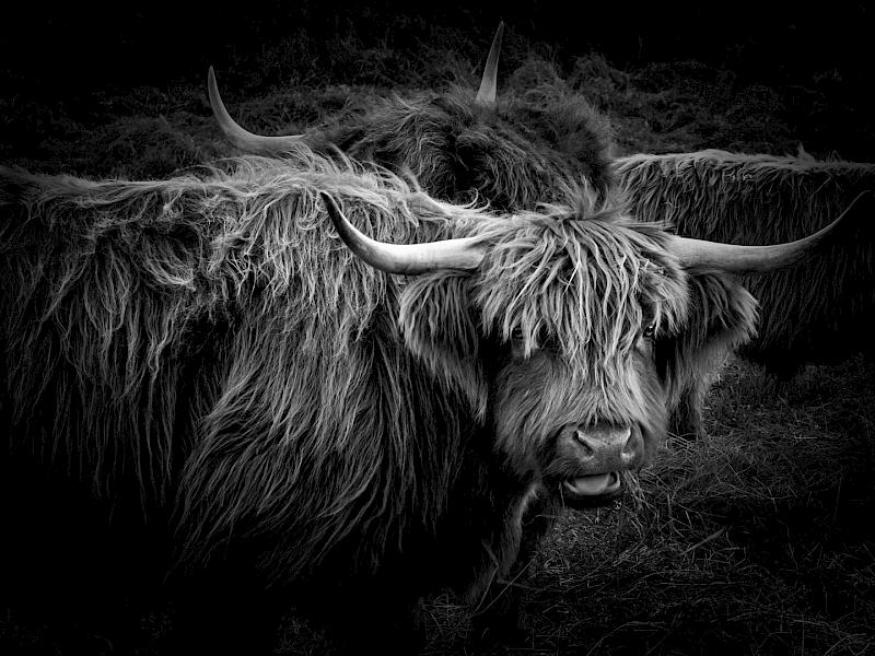
Digital of the month: Eunice Belk with Highland Cattle
=======
DIGITAL
=======
C Grade Set subject
===================
A view to nowhere - A great showing of perspective-nothing distracting and great monochrome subject - Honours
Barber 2018 Varnasi, Northern India - A great environmental subject. Sharp where needed and good tones. Excellent choice of aperture to throw all the B/G out of focus - Honours
Bare reflections - Nicely processed and exposed with a good tonal range. I am sure this is enhanced by doing it in monochrome. - Merit
Columns - I like the way you have left slight detail in the shadows. Unfortunately the verticals have a slight lean which can be corrected in many image processing programmes. - Accepted
Contentment - Head really sharp but to me let down by the dominant out of focus paw. - Accepted
Erin - I like the warm toning used here, and good on you for going in close enough to eliminate distracting detail . - Accepted
Forgotten home - A good B/W subject and no distractions. Not quite sharp, perhaps because hand held?- Accepted
Jaffa Gate - I like the way the viewers eye is led into the image along this wall. - Accepted
Moonrise -
Good monochrome treatment and tonal variation.I suggest moving slightly left so stump arms are backlit by the moonlight. I think this could make a stronger image. – Accepted
Old man and his Billygoat - I like this very much. Another good tonal range and nicely positioned subjects. The environment supports the image without dominating it. I can feel the heat! – Honours
Pachystegia Insignis - Well handled exposure showing detail in the flowers without burning detail out. - Accepted
Picket Fence - Nicely handled technically but I suggest the main subject is not the picket fence but the dark woodwork behind. I suspect this was where most viewers eye went. - Accepted
Queenscliff Post Office - Exposure and development of this is superb. I love it! - Merit
Reach - You have controlled the tonal range brilliantly and your display of a linear perspective showing depth and a 2nd dimension is excellent. - Honours
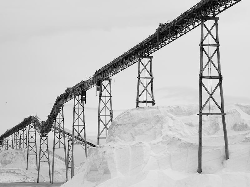
Salt - I like this. The composition of lines is excellent, as is the tonal range used. Sharpness is great. What I don’t like is ------------------nothing! - Honours
Sibling Love - This is lovely, with the ability to lift it even more, in my opinion. - Merit
The wreck - You have displayed a nice depth of detail in the dark areas. I assume this is the 'Waverley', so I suggest you go back and do some variations. - Accepted
Under New Zealand - I admire not only the model, but also the photographer Technically well handled and I like it very much. - Merit
Wake up and smell the coffee - I like the way you have displayed texture here. Demonstrates that a centre of interest is not always needed, although without it the viewer may move on promptly. - Accepted
Waterfall - Good misty atmosphere showing the receeding layers, and waterfall spray. Would like more detail in the foreground bush. - Accepted
Winters bite - Love the depth displayed by the branch and bank. Lovely sky reflections and sharp
wherever needed. Could burn in cloud detail but that’s getting 'picky'! - Merit
B Grade – Set Subject
======================
At the Beach - A good monochrome subject and you have technically handled it very well. Nice diagonal composition. I like it very much. - Merit
Burnout - Good tonal range and evidence of movement. More impressive to me if rider was seated and boot on footrest. - Merit
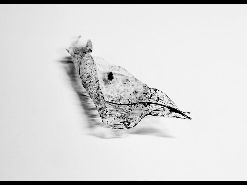
Dead Leave - Presume title intended is 'leaf', not leave? I love the delicate subject and shadows it has cast. Increased depth of field would have even greater impact on me. - Merit
Following the Path - I like the idea. It is a good display of perspective
but to me the side grasses are too dark. - Accepted
Snow capped - This is a record of what was there. To me the hills are too dark to convey emotion and the snowy peaks don’t have any 'Hey, look at me' features. Sorry but not up to B level in my opinion. Not Accepted
TeTauihu o te waka a maui Statue - A nice composition with the lighting and development being well handled. I esp. like the dramatic sky.
Could you have shot from a slightly lower point to eliminate the fence? - Accepted
Washed up with the tide - Lovely lighting and composition, only let down to me by not being quite sharp. Was it hand held? - Accepted
Window of the Past - Good idea, and the techniques have been well handled.
I dont like the way the light source directions are different on the main subject and the frame. - Accepted
Havelock Waterfall - To me, this is let down by nothing being sharp from being hand held? Also the time of day lets the sunlight cause blotches which distract me. – Not Accepted
Reflection - A balanced composition with the log adding to the image making this popular subject your view of it because of the inclusion of the log. Well done. - Merit
A Grade – Set Subject
======================
About Tern - A great wing display and ideal monochrome subject. I like the way you have shown the beak from a different angle. Lack of perfect sharpness is my only concern. - Accepted
Aliens in the Kitchen - You generated an emotion. 'Creepy' is the feeling and you have used lots of aspects to produce that emotion. I suggest leave out the vacuum cleaner. Agree? - Merit
Alpine Splendour - I like the tonal range and your technical handling of this image. The composition lines are subtle but impressive. Well done. - Merit
Attention please - This certainly demands attention. I like the head detail but suggest you consider a square format to eliminate the messy LH area. - Merit
Boulders at Ward - I like the white limestone rocks but to me the 2 boulders in front say 'keep out' viewer. I suggest moving up to the limestone and feature the rock on this as the centre of interest . - Accepted
Coffee Pods - I like your simple composition and square format. To me, though, there is too much contrast and detail lost at the tonal extremes. Not A grade in my opinion – Not accepted
Dancing feet - Good on you. You have held detail in the leg but shown movement in the dress. Has a lot of colour been lost in making this in monochrome? Some subjects suit B/W. Some colour. Accepted
Highland Cattle - I love it! Love the tones, the face detail, the eye peeping out, and the elimination of details around the edges. Superb - oh, and well done too! - Honours
Kaikoura contours - I like your display of atmospheric perspective with the receeding layers. However, nothing demands or holds my attention in this image. - Accepted
Lindis Pass - I like your tonal handling, and the connecting lines making up the composition – all leading out to the right. I would like more sky detail to be burned in to be 'picky'.. - Merit
Loved - This is a lovely show of affection and good monohrome subject. Also like the warm tones used. Not so happy with the partly shut eye – prefer completely open or shut. - Accepted
Lunch time - This is sharp where it matters and uses nice tones. Two images so similar invites comparison and this one doesn’t grab me as much as the earlier one did. - Merit
Morning Harbour - I like the sharp detail and tonal range used. Especially like the faint detail on the bush behind. Unfortunately my eye wanders around but cant settle on any item. - Accepted
Morning pick - The interest is in the bottom half. I would love to see some heavy cropping to feature the picker in her patch of light. It may be stunning. - Accepted
Rock of Ages - Can feel the power of the water and I like the rock surrounded by the white. - Accepted
Saturdays man - I like the tones used and the contrast chosen but to me it appears too posed. Dont like the wig and lack of eye detail. - Accepted
Sleeping Warriors - I like the tones and lighting but it is someone elses art work. I look to find what the photog. has added to make it different and I cant see it here. - Accepted
Summer Harvest - Textures shown are excellent but the closest bale is dominant, dark, and wrongly positioned? I would like the 2 farthest bales leading the eye into the picture. - Accepted
Te Sun and the Moon - Great 3rd shape created between the 2 contrasting faces. Lighting and texture great. If space is available do it again
but not so tightly cropped-an award winner potentially. - Merit
The tinline - Someone elses creation but the photog. has caught enough background mood to add a difference. To me the sunlight is making the scene too contrasty. Accepted
Toi toi - Simple and effective. I like the curved lines and the silhouettes. Well done. - Merit
Waterfall - Nice tones and, although this slow shutter water style is common currently this is a fine example. Can you add something to this style to make it yours? - Accepted
Wine Country - To me a lovely monochrome image which is sharp and with a nice tonal range. I like the sky detail - Merit
Winters Starkness - Nicely composed L/Scape with excellent tonal range and all nicely wrapped around the lake. I like the fenceline angling across the foreground. Well done. - Merit
A Grade – Open
==============
2 day old feet - I like the sharpness of the front foot but the harsh lighting doesn’t go with the delicate subject in my opinion. Would prefer greater depth of field too. - Accepted
Paper lights - I am impressed by the vibrant colours, the great focus, and the abstract lines. Well done! I like it very much. - Honours
Snaefellsnes - I had to google to learn where we are and it makes me envious! I like the colours and sharp detail, but the lack of a strong eye resting place disappoints me. - Accepted
Winter time - I am a fan of impressionist images you have conveyed the harsh environment and the cold atmosphere well. I would prefer to remove the dark base area. - Accepted
=======
PRINTS
=======
A open – Birch Thicket – I like the slight diffusion which adds to the feeling of ‘mystery’ this image conveys to me. Merit
A Open – Farm Track – A good idea but to me it has a bit too much exposure and contrast to achieve a higher award, especially evident on the track. Acceptance
A Set – Smoko – It is so ‘busy’ but I like it. The viewer is captured by many centres of interest but the eye keeps returning to the artist. Well done. Merit
A Set – So Happy – This will be an amusing photo in a future family album. Unfortunately it is a bit too much of a ‘record’ at A grade level for me. The mount colour doesn’t help. Not Acc.
A set – Stormy profile Iceland – Simple yet nice lead to the peak providing the centre of interest to me. Consider cropping half the bottom snow and see if you prefer it? Merit
A set – Windswept – This certainly conveys ‘windswept’, incl. the distant trees. Would like to see an increase of vignetting. Compare the vignetting effect of this with ‘August Snow’ - coming up to see what I mean. Acceptance
B Set – Shadow and Shade – Beautiful tones on the hills with composition lines all leading to the trees on the skyline. I like the time of day you have displayed with the stars Honours
B Set – Wreck of the Jamie Seddon – Excellent tones throughout and I like the ‘paving stones’ leading the viewer. Take them out and it loses impact. Merit
C Open – Blue Rinse – Nice composition with the foreground rock inviting the viewer to step out onto it. I’m not convinced you needed such intense blue – but it is good. Merit
C Open – Cascading at Havelock – I like that you have gone in close and this does suit colour and the water flow. Could the twig have been removed? Merit
C Set – August Snow – Nice detail throughout and technically well produced. Everything conveys the feeling of cold and this shows good use of vignetting to control the viewers eye. Merit
Share:


