
Judge: Ian Walls
Submit your best image and submit one image for each Shot Of Year trophy: "Digital Open" , "Digital & Print Black & White/Monochrome" , "Print Open"
Submit your best images - new or previously submitted.
Trophy Topic - Digital & Print Black & White/Monochrome Trophy
MCC Shot Of Year for the 2023/2024 club year. The results are presented as 3 places - 1st, 2nd and 3rd. The 1st placed image is awarded the trophy. :
- Only one image can be submitted as long as it hasn't been previously submitted into any previous years Shot Of Year competitions. This is entrusted to you to ensure you keep within these guidelines.
Please submit the one image under SET subject. When submitted ot the judge, the image will not be graded.
The judge will be asked for results and critique. Dependng on the volume of images, this might be restricted to just critique. The results will not be included in the end of year totals for MCC certificates.
Open
Set Subject
Hi Marlborough, it's Ian Walls here from the Christchurch Photographic Society. Thank you for your opportunity to have a look at your images in your shot of the year competition. There's a huge range of pictures in there and I enjoyed the fact that there's a wide variety of styles and presentation medium that you've done.
I'm not entirely sure how this competition generally works, as I was given the opportunity to grade each of the images with, you know, honors accepted and all that sort of stuff. But as well as that, I was asked to give first, second, and third, um, place getters and the implication again was that the first place getter is what it's all about.
What I've decided to do is to not award any of the other grades, to just comment on all of the images in an audio form. So I hope that works for you, but at the conclusion of each of the sections of commentary, I have given first, second, and third placings, as asked for. So they're going to come at you in the order that they were presented to me.
At the conclusion, you'll find out who the winners are. I hope you have a great evening with this. I hope that the commentary is of some use to you because I enjoyed looking at them and working through the sets. Thanks again.
BLACK &WHITE / MONOCHROME
In this section we'll consider the monochrome images. As I say monochrome and not black and white so it can be toned as well. Also this section jumps backwards and forwards between prints and digital representation, which is interesting. I've also been given the digital versions of the prints, but when I come to the comments, I'll make sure they’ll be done solely with reference to the actual print itself.
As with the others, I'm gonna present this in the order that it was sent to me on the on the spreadsheet. So it makes it simpler for you to read back.
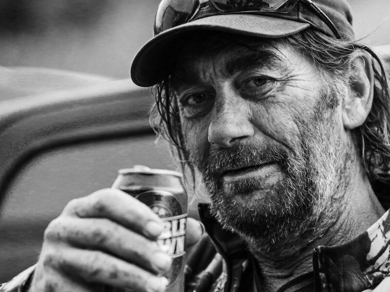
Chairs (print). This is an interesting character holding out his double brown can to you and, and definitely looking and engaging with us. The way you've presented this print is quite dark and fairly grungy, and I'm a little bit put off by the depth of the blackness underneath his cap and in his beard. I just wonder if a little bit more light in its face would bring this to alive a little more. Also, be careful when you're mounting these prints. There's a thin sliver of white above between the print and the mat at the top.
Contemplation (print). An interesting balance between the lady in the foreground and the background, which is effectively negative space here, kind of washed out, but just a little bit of detail that, so that we can see what it is. It's not completely white, so it doesn't pull my eye too much past her face. I enjoy the fact that all - there is detail in everything I can see in her face. It is quite subdued lighting and there's little splashes of highlights on, just underneath her eyes and on her chin and on her nose so that I can see in and see that she is sort of in, in a state of kind of quiet contemplation. I enjoyed this image and it's a nicely put together print.
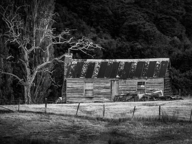
Derelict House Wairau (digital) This is a nice crisp image. You're focused well on that and there's a relatively thin level of focus so that the building does punch out and draw my eye into it. For me I just feel another element that would just lift it a little bit is a, you know, a wee bit more story. Something in the window, a door open with a hint to pull me in. I get a sense of this place being just place and I wonder what happened there. Nicely put together print, nice crisp black and well handled black and white.
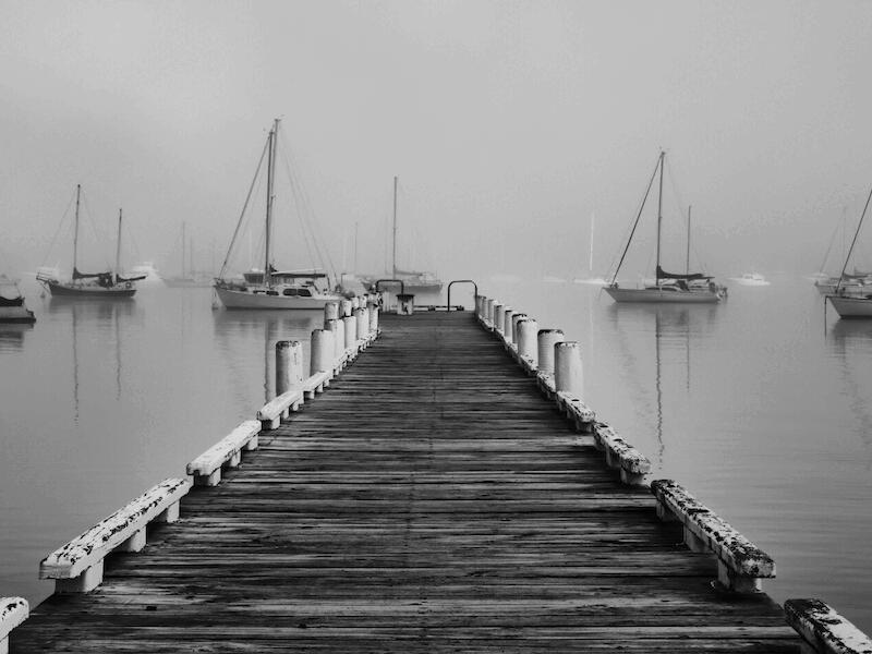
Fog Over Water (digital) My eyes drawn in by the wharf. This is something we kind of see all the time. The problem at the far end is that there's an overlapping between the boats and the edge of the wharf. And so I'm not quite sure where it leads to. Do you want me to flow off the end of it and look at the boat in the distance? Perhaps a little higher so that you could sort of focus on that dark boat right at the end of the, the wharf might improve that and equally getting the camera higher would just get the wharf down lower. So that it's below the line of the boats itself. I really enjoy the fact that there's obviously lots of boats mooring out there. And the fog is thick enough so that they fade away into the distance and so already the close ones are what you see. Just that element of separation I think could step this up a little bit.
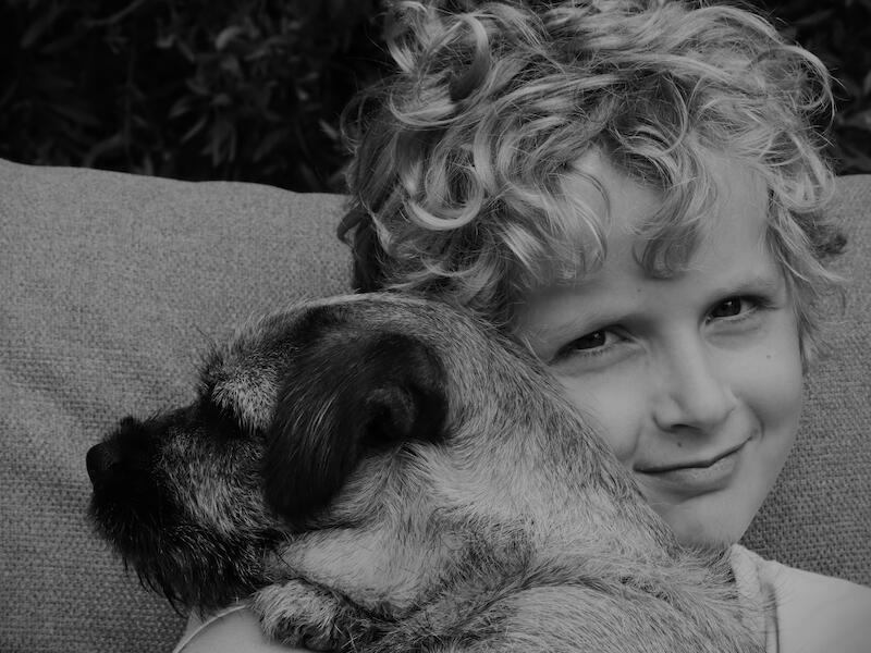
Harry Meets Sally (print). This is a well put together print and a great moment, I'm assuming Sally's the dog but it's a very contented little dog and Harry looking over the shoulder at us is kind of the story. In terms of the print, it just, the whole thing's just a bit lacking in highlights. It's a bit flat. I think you could bring this to live a little bit more with a more strongly emphasized whites and just a slightly contrastier thing, particularly if some light was brought into to both the dog and the little boy's face. So just a technical presentation I think could lift this.
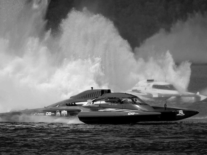
High Speed Racing (digital) Presentation of a super action packed moment of powerboat racing. You've captured the speed and the energy really well with this - the form in the foreground and, it sort of fades away as the lack of depth of field. So we can see there are other boats in the background as part of the race. I do find the presentation with the main subject right in the middle of the frame creates a relatively stationary visual picture for an event which is obviously anything but stationary. So I think if you had used your compositional techniques to create more energy and movement visually within the frame that would have improved things here.
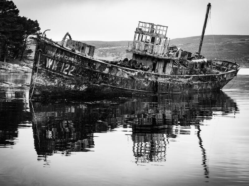
Inglorious Demise (digital) and you've captured the demise of the boat that's just been beached there and left to, to fall apart, which is a kind of a sad thing whenever you see it. A nice gritty, black and white presentation, which is appropriate for the subject that you're presenting us and you've captured everything. I like the fact that the mast at the back and the reflection of the mast are both held within the frame. For me, a point of tension is the front of the bow, the top part of the bow at the front, where there's a, it looks like a shag sitting on the top there. I just wish you'd taken a pace to the left and separated that front part of the bow from the trees behind. I think that would have made the boat stand out much more strongly. But I do think this is a well put together picture.
Just A Cabbage Tree (digital). This is a really interesting sort of almost graphic presentation of this image. I actually really enjoy the big space above the tree and the negative space that you've applied there. Quite often you'll hear people making observations about the sky that doesn't add anything to it. In this case, it adds a tremendous amount in, in design features. It's a large area of negative space, which balances the cabbage tree, which is sitting at the bottom of the frame, Right in the central position, which is completely appropriate for this situation. It's a big vertical form of the image, and I enjoyed the sort of gritty high contrast treatment of the cabbage tree, which has taken the cabbage tree from its sort of natural presentation to some place different. I enjoyed this one a lot.
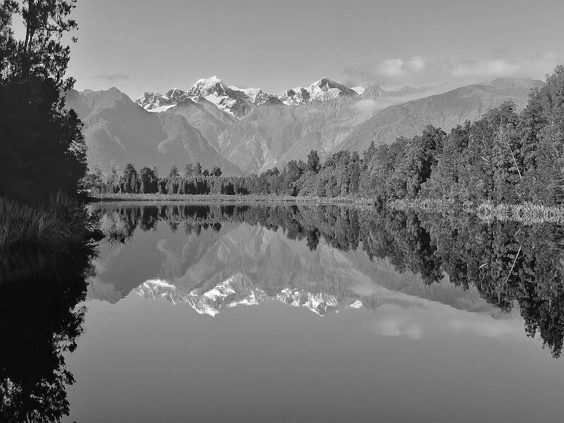
Lake Matheson View to Mount Cook and Mount Tasman (print). It has been presented slightly toned, so there's a slight bluey cool tone. Which points us in a direction at which I think works well. For me, I feel that you haven't decided whether the reflection is the key part of the picture or the mountain in the background. I think you need to choose one or the other and it'll punch things up a little bit. By that I mean cropping, you know, either up from the bottom so we only just see a hint of the mountains so that then we pull to the mountain at the top or cropping down from the top so that the reflection becomes the key. You've presented this with the horizon line or the edge of the lake – so sort of pretty close to the middle of the image. So I kind of bounce backwards and forwards between one and the other.
Light on the lake in Te Anau (digital). Is a black and white projected image and it's gorgeous. I love the fact that you've got blacks in the silhouetted sort of range of trees in the foreground of a little peninsula that stands out. And the little tree that stands out on the end of it really gives an exclamation to that. And you've got shafts of gods rays coming down between in the light and the clouds, which are bright white. And in the distance, the mountains kind of fade away and have a recession line that fits in with that. The landscape presentation also works really well. So I enjoyed this image a lot.
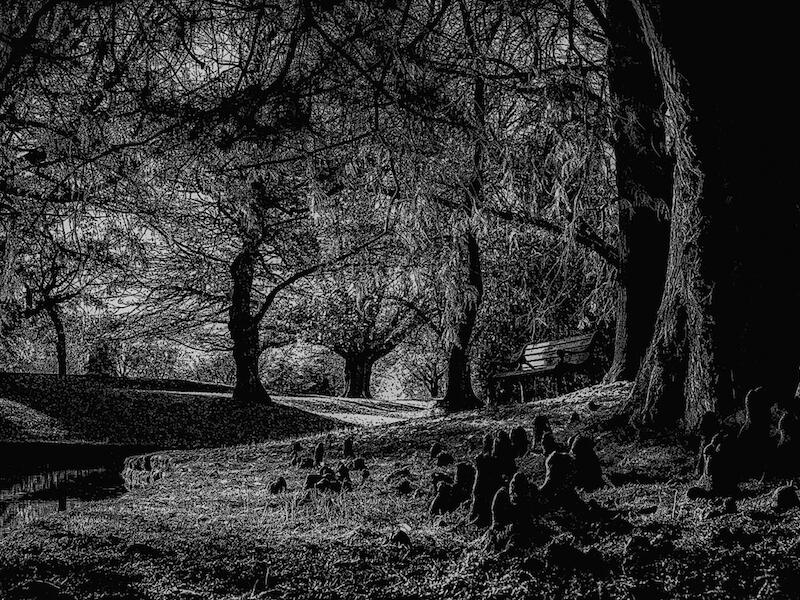
Pollard Park in Autumn (Digital). This is a strong picture of a sort of fairly oppressive feeling trees. The black and white has taken the autumnal warmth away from this and presented it as a somewhat kind of threatening sense. You know, I struggled to get past the large trees, solid looking trees on the right to find my way to the park bench. I'm not sure whether that's your intent, but that's certainly the way it feels to me. These unusual root things in the foreground feel a little bit sort of imposing. So it does work. What you've done does work, but I just don't get the sense that's what you're trying to achieve. And I struggle to find somewhere that my eye naturally falls in this picture.
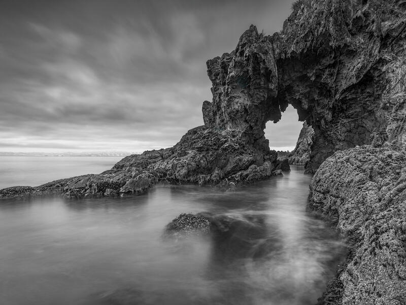
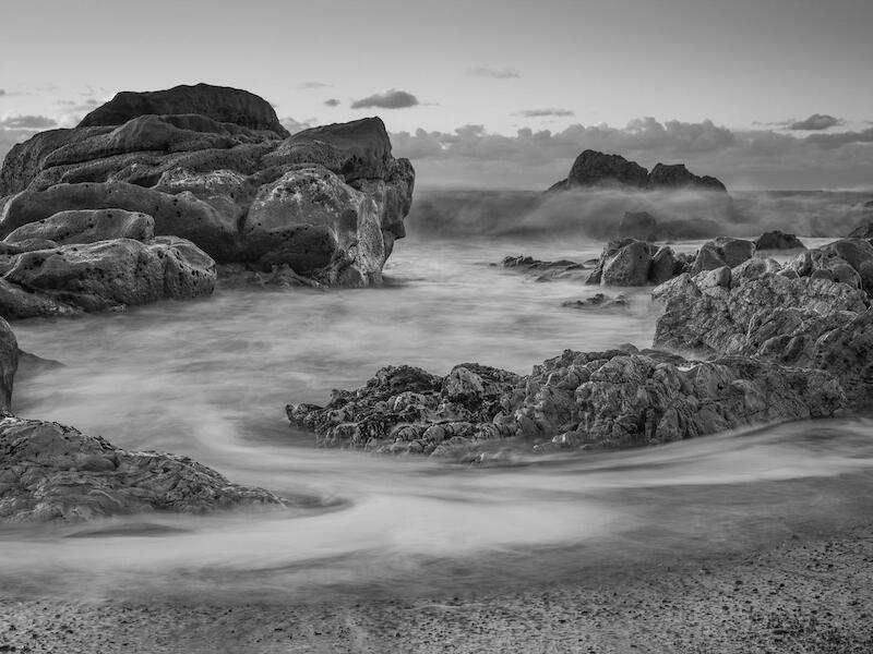
Rocky Coastline (digital) Is nicely put together, long exposure, representation of the sea. We get nice silky lines of water movement set against the crispness of the rock formation. I think you could have taken a little more care or perhaps just decided a bit more strongly what your key element is. The rock on the left hand side feels like it's got a leading line that you could follow up, a curved line that would follow up if that was the main element within the frame, but you've cut off all the rocks to the left of that. Equally, on the right hand side, the edge of that rock is cut off. Perhaps the dark rock in the background could have been the main element and the leading line goes up to the rock and across. I just think a little more care in the development of this composition could have stepped it up to the next level.
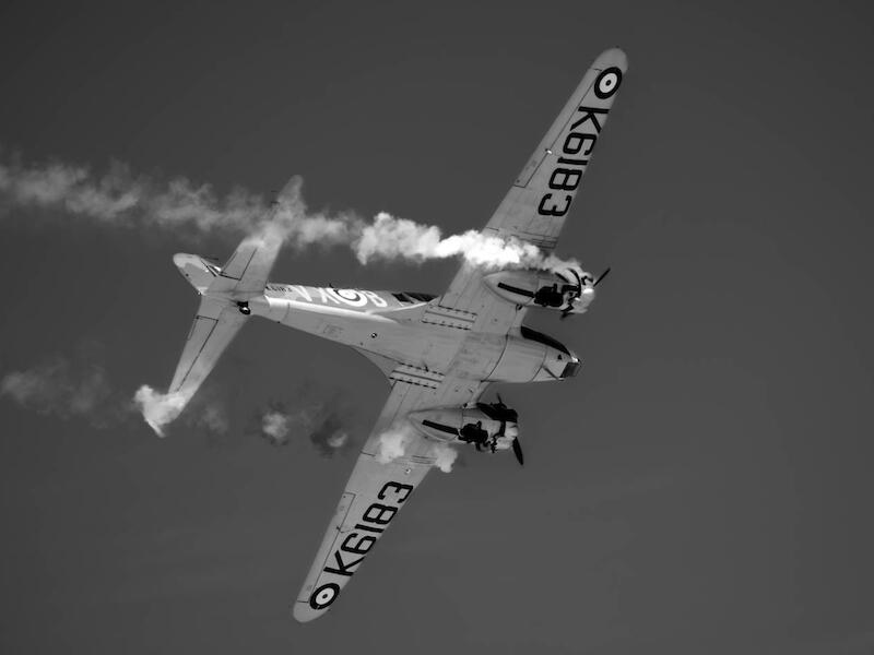
Smoke in the Sky (print) Is a print of an aeroplane at an airshow, I suspect looking up at it as it's passed across and they've obviously got the smoke generator on. Either that or the engines need a bit of an overhaul. And, yeah, it's a look up at what's happening. Looking up at the bottom of the aeroplane feels a bit like looking at the tail end of a bird flying away in some respects. We can't get a sense of the cockpit or the people that are in there operating it. We don't have a wide enough view to understand why the thing smoking. Perhaps it's part of a, you know, it's been shot down or, something. I just don't know. I'm left wondering more than what you've told me with this picture.
Splashback Action (digital) I kind of like some of the squiggly lines that have been created with the longish shutter speed as the water's exploded and bounced back off there, little droplets of water have created interesting lines. I think you could push that a little bit more strongly and make that the main component of your picture. Where as in this case, there's lots of other rocks and things that are part of it really don't kind of make much sense as well. And the brightest area which pulls my eye is that area of overexposed water in the front. So I think just delve into this idea and exploring those little splash lines would have created a more interesting abstract.
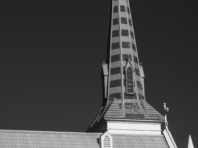
The Church (digital) Is a digital image of the spire of this oldish church. It's wooden and it's got interesting shaped windows and all those sort of things. So what you're showing me is a collection of interesting shapes, kind of triangles and rectangles and just the way things have been put together. So effectively that's produced a graphic looking shape or series of shapes. I'm just left with my eye wandering around going what is it that, what is the main thing you're trying to show me and wonder if perhaps a bird or some other element like that might have added enough for me to find a place to rest my eye.
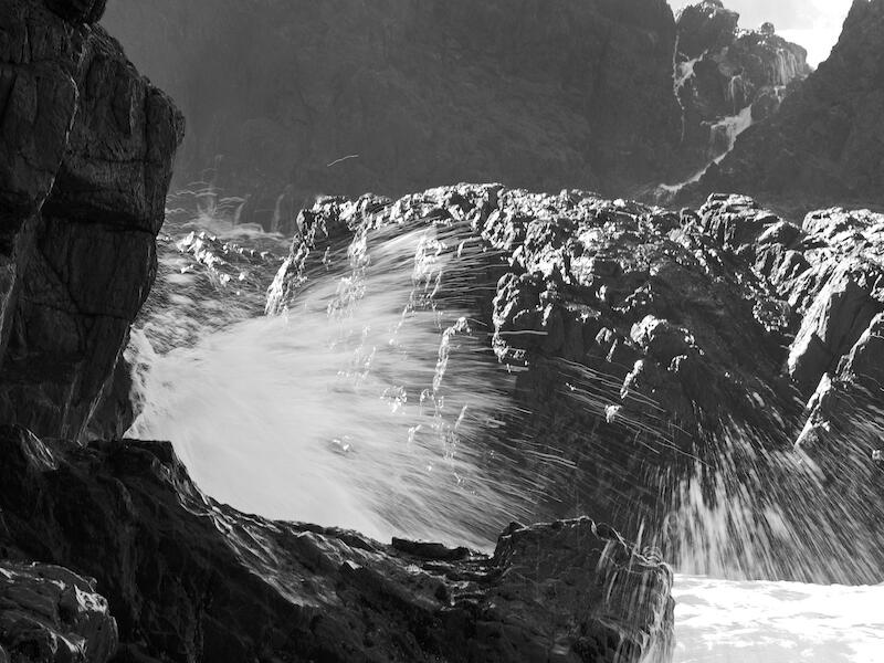
The Craggy Light (print) Is a well presented print, again a slow shutter speed representation of a cruddy looking series of rocks and some water flowing backwards and forwards with nice sharp rocks and nice, you know, ethereal floaty kind of water. The area that's brightest is on the left hand side of the frame and that's the sort of waves and stuff that are coming out away in the distance. That tends to pull my eye away from the main part of the picture, which I think you wanted to be the gap in the rock. I wonder if you consider cropping from the left to almost a square, whether that would push my visual picture in the direction you're after.
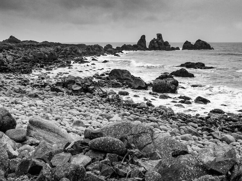
Tides Out (print) Is another black and white print, and I think you're trying to show me a lead in of the foreground of the beach, if you want to call those rocky structures a beach, as we swing around in a curved way to that interesting looking rocky structure, on the top right hand third. The difficulty for me is getting past that pile of rocks in the foreground. It provides a sort of a barrier, both physical when you were there, I suspect, and visually for me to get into the picture. I wonder if you were there again, you might step forward and put your tripod close down to those sort of larger round boulders and use them as the foreground and use the sweeping line to bring us around to the visually interesting point in the background.
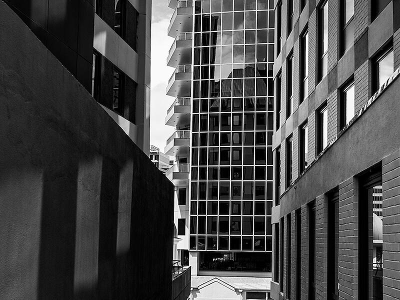
Waiting (digital) Is a picture of a gap between two buildings and you're looking through to the other side. I scratched my head a little bit about waiting and then I eventually found the guy standing, waiting on the footpath on the other side. Don't mind that but I really don't think the picture is about him. He's so small in the frame that you know he is a bit of a surprise when you eventually find him and there is a satisfaction in finding but I wonder if you cropped above him and just made the picture predominantly about the shapes and forms of the buildings that that might be a stronger representation.
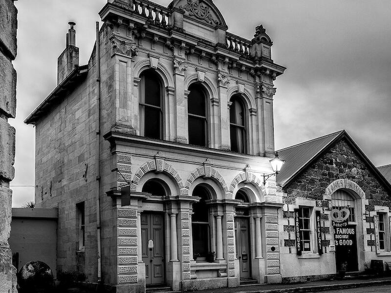
Welcome My Light Is On (Digital) And yes, the light is on outside the old bank. Or whatever it was, it's got that kind of bank look about it. There's some converging verticals happening in a funny way there. We're quite close to the bricks on the left hand side, which are vertical, but then, we're looking up at the at the old building, so that tilts back again, which is a difficult thing to overcome. The other technical issue here is that it's slightly over pushed in the sharpening, so we've got these halo lines running around the top edges of the form on the main subject. And as soon as you see that, it kind of pulls your eye and creates a difficulty in understanding what you're wanting to show me.
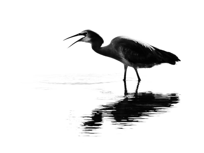
White Faced Heron (digital) It’s been pushed all the way to a really high contrast situation. So we have in the water just simply the shadow of the bird and some highlights of some ripples, which I do quite like. Where the thing is let down is that the head of the heron still is the main thing, and I'm drawn to that, and that is quite soft. I just don't think you've got the focus as crisply on the head of the bird as potentially it could be. The feathers are sharp, but the head isn’t. So that kind of lets that down, although the treatment is interesting.
The trophy winners and place getters were presented at our August club evening (and AGM) on 8th Aug 2024.
Trophy - Print/Digital Monochrome Shot of Year 2024
3rd - Contemplation – Carol Spaulding
2nd - Just a Cabbage Tree – Rose McConchie
1st - Light On The Lake Te Anau – Michelle Brown
Share:


