
Judge: Simon Forsyth
Your best digital
SOY - Shot of the Year - 3 topics
1: Digital Open.
2: Print Open.
3: Print & Digital B&W/Mono
Submit your best images - new or previously submitted.
Trophy Topic - Digital - Colour
MCC Shot Of Year for the 2024/2025 club year. The results are presented as 3 places - 1st, 2nd and 3rd. The 1st placed image is awarded the trophy. :
- Only one image can be submitted as long as it hasn't been previously submitted into any previous years Shot Of Year competitions. This is entrusted to you to ensure you keep within these guidelines.
Please submit the one image under SET subject. When submitted ot the judge, the image will not be graded.
The judge will be asked for results and critique. Depending on the volume of images, this might be restricted to just critique. The results will not be included in the end of year totals for MCC certificates.
Open
Set Subject
Digital Open
Bird Love
This is well seen and captured.
Exposure and general processing is excellent.
The middle bird looking a different way to the other two creates a good juxtaposition.
I would crop some off the top and right side to make it somewhat tighter. Also, adding a little texture and sharpening would give some more definition to the birds.
Well seen.
Merit
Egretta Novaehollandiae
Composition is good here with more space at the right of the bird than the back.
The reflection helps break up the foreground, but is not too distinct so that it would compete with the subject.
Depth of field is good with the bird in focus, but the front and background are out of focus. This makes the subject stand out well!
The colours are great. I suggest that you look at adjusting the various sliders to make the image pop more. Also, adding some texture and sharpening will make this stand out more.
Accepted
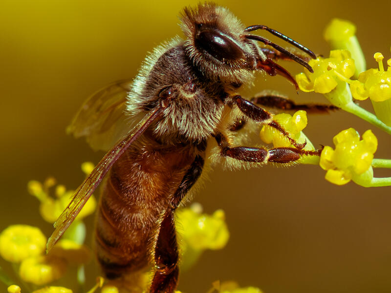
Honeybee
The bright colours work well here in making the image stand out.
Composition is great with the bee dominant against a progressively out of focus background.
I suggest you increase the exposure slightly and adjust the other sliders to make this pop more.
The image is sharp, and the individual hairs on the bee stand out well.
Merit
Punakaiki
This is a well photographed location.
I like the camera position you have used, which has resulted in some layering of the rocks.
Exposure is good with the tones spread over the histogram.
There are a couple of things I suggest. First, have a look at cropping this as a 16:9 from the bottom so most of the sky is removed. Because it is brighter than the rest of the image the eye automatically goes to it!
Also, have a look at what this looks like in black and white. The rocks have lots of texture and converting to monochrome and adding some texture will make these stand out more!
Then I would use the B&W sliders to change how each part looks.
With a few adjustments, this could really stand out!
Accepted
Rest and reflect on Autumn
This is a nice, peaceful scene with lots of warm colours.
Because of the title and the fact that it is on the bottom third, my eye immediately goes to the bench. I feel it is a little lost in the image, though! The canopy dominates too much of the image!
I suggest that you look at cropping some of the top off the image so the bench appears lower and more dominant. It won’t change the overall message, but will improve it!
As this is presented, it is a bit flat for the lighting.
As it is a sunny day, some processing adjustments will help make this pop. To me it needs around two-thirds of a stop increase in exposure, and the other sliders adjusted to finish this off.
Accepted
Sacred Kingfisher Watching
The bird is sharp here, which is always a challenge with wildlife images. But the detail in the body is lost, possibly because the image has been cropped from a larger file.
The background is nice and out of focus, making the Kingfisher stand out.
Because a large area of the background is bright, the eye automatically goes to it.
I would mask the bird and post, then duplicate and invert the mask and darken the bright part of the background. It looks like you have already attempted this as there is some haloing around the bird.
I would also add some texture to the bird and post and warm it up slightly!
Not Accepted
Salt Ponds
I like the early morning feel of this. The softish light and haze all help the image.
Exposure is good generally, but I would darken the sky slightly so it doesn’t draw the viewer away from the rest of the image. Applying some dehaze could achieve this effect. The is some flare in the sky and this would need to be removed. This can be done easily using generative Ai in Lightroom.
Personally, I find the ground at the bottom distracting! There isn’t enough of it to anchor the image, but just enough to be distracting. Have a look at what this looks like if you crop it out!
Accepted
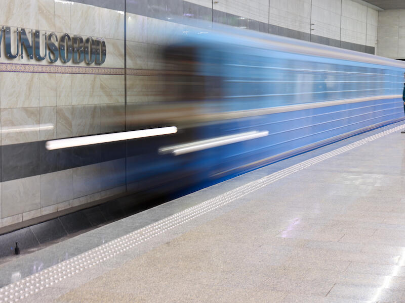
Waiting for the Train
The use of a longish exposure to blur the train is great. It allows the train to be semi-transparent, but also allows some of the wall behind it and the station name to show.
The fact that there is a person near the end of the platform helps close the platform.
Generally, exposure is good; however, I suggest you mask the platform and reduce the highlights and the whites so it isn’t so bright. As presented, the brightness of it is distracting.
I would also warm the white balance as it is very cold.
Well executed.
Merit
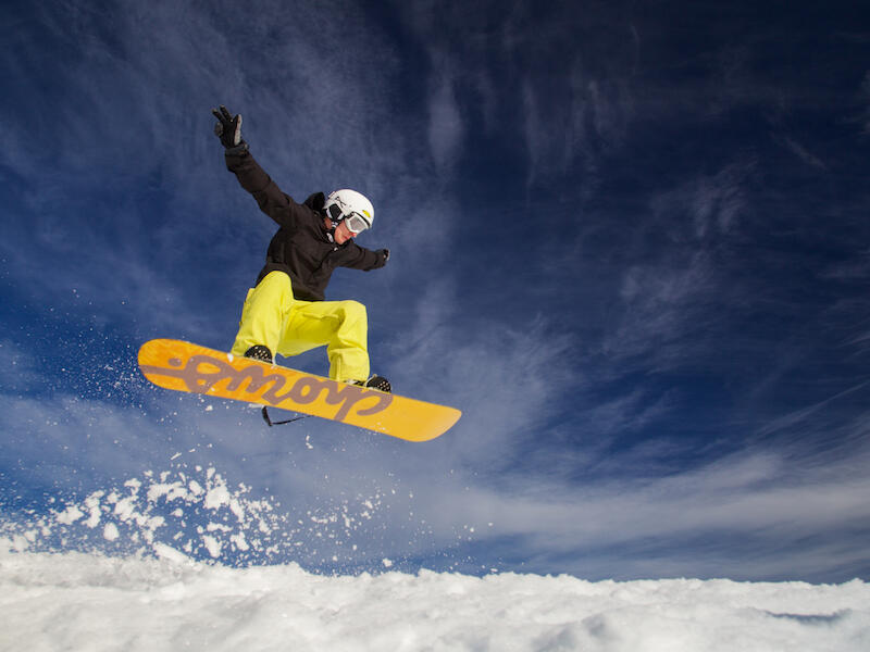
Boarder Getting Some Air
The colours here are nice and bright and the yellow contrasts nicely with the dark blue of the sky.
The space to the right of the subject works well, being more than the space at the left.
The use of a fast shutter speed allows the snow spray to be reasonably sharp.
I would reduce the highlights and blacks, while increasing the whites and shadows to make this pop just a little more.
A great shot!
Honours
Juvenile Piwakawaka
The cropping and composition of this is great. The bird coming in from the right to the middle means the viewer first comes across the head as we look across from left to right.
If this had been the other way around, then we would first encounter the birds back and it wouldn’t work as well.
The bird is sharp and the background well out of focus, meaning the bird is well separated from it.
The image is flat which detracts from it. I suggest you set the black and white points then increase the shadows. This will make the image pop! If this were done, then this would score higher!
Accepted
Red in the Hedge
The berries are well saturated and stand out well. There are a few things I suggest that would improve this.
The leaf at the left, being lighter, is distracting. I suggest you remove it using the removal tools available. Lightroom Classic does a good job!
There is a fair amount of grain in this, but removal isn’t that difficult nowadays!
I would increase the whites and shadows while reducing the highlights to make this pop more. Additionally, some sharpening would help.
Accepted
Serinity in the Park
The composition of this is lovely. The river leads the viewer into the image and towards the background.
It looks like the camera meter has been fooled by the light area in the background, as if you look at the histogram, most of the data is left of the midpoint, indicating darker tones. If you had increased the exposure by a stop you would have had a better file to work with.
If you were to use a fairly hard linear gradient on the bottom up to the bench and increase the exposure there by around a stop and another on the top, you would improve this! The white balance is also a little cold so I would warm it up. Have a look at the colour profiles available in your processing software to see what will help.
It is worth reworking this as it is a nice shot.
Not Accepted
An Alpine Encounter
This well exposed and is colourful. I do find my eye switching between the plant and the background because both are fairly sharp. If you had used a wider aperture so the background was out of focus, the plant would stand out. You could do this in Lightroom using Lens Blur, which would help make the plant stand out! You could also use a linear gradient on the top, remembering to subtract the plant, and darken it to again make the foreground stand out.
Nicely seen and some more processing will improve this!
Not Accepted
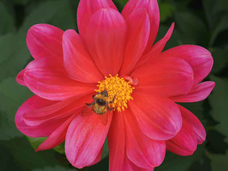
Bumble Bee Foraging
The square crop of this works well with the shape of the flower. The flower is well-centred in the frame.
Exposure is good, and all I can suggest is masking the subject, duplicating and inverting it, then darkening the background. Next, I would increase the saturation on the mask of the flower.
Adding some texture to the flower will make the bee pop out more.
Very nice.
Merit
Cashel Street
I like the multiple exposure use here. The image almost has both a positive and negative look to it.
Personally, I would darken the light areas as they are very bright and therefore distracting. Lowering them will make them slightly darker, but won’t change the overall effect. I suggest that you see what the auto-develop button does in your processing software then. Work from there.
Well thought out!
Accepted
Clematis Foetida
The composition is well done here. The fact that the far background is well out of focus is good.
Darkening the blacks will darken the background, making the subject stand out more.
The subject would be enhanced by adding some texture and sharpening. It looks a little soft. It looks like you have focused on the bush on the left as opposed to the subject and with close up images such as this, depth of field is very limited, so make sure you focus on the subject.
The softness of the image may also be due to overcropping the image.
Not Accepted
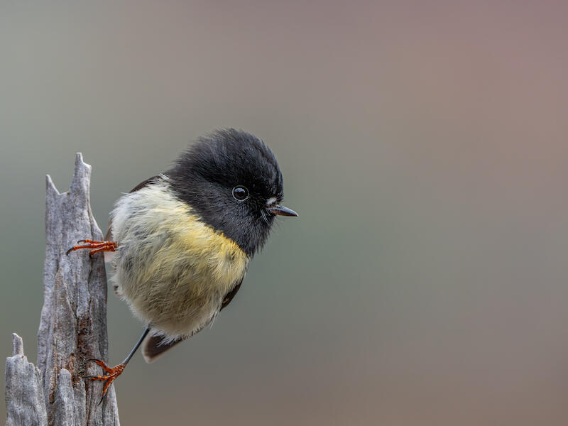
Male Tomtit
The placement of the bird and post is great with the blank space at the right creating some tension.
Exposure is good and all I would do is darken the blacks and raise the shadows. I would add a little texture to the subject to make it pop more.
The subject stands out well from the background and that is nicely blurred.
Very nice!
Honours
Mycena Interrupta
There is good use of depth of field here! The main subject and the two smaller ones to the left are in focus, while the rest is more progressively out of focus. The very front is somewhat soft, which is a pity as it distracts from the rest of the image. Have a look at whether cropping it out helps. You could also look at darkening the bottom.
I would lighten the top of the main fungi a little, as it looks like the image was lit from below.
This is competently executed.
Accepted
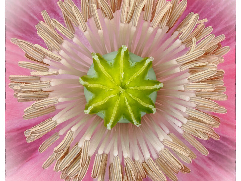
Poppy Patterns
Cropping this as a square works well with the symmetry of the image. Adding a frame around it is also good.
Increasing the vibrance and saturation slightly will make the image pop more.
The subject is sharp and works well.
Honours
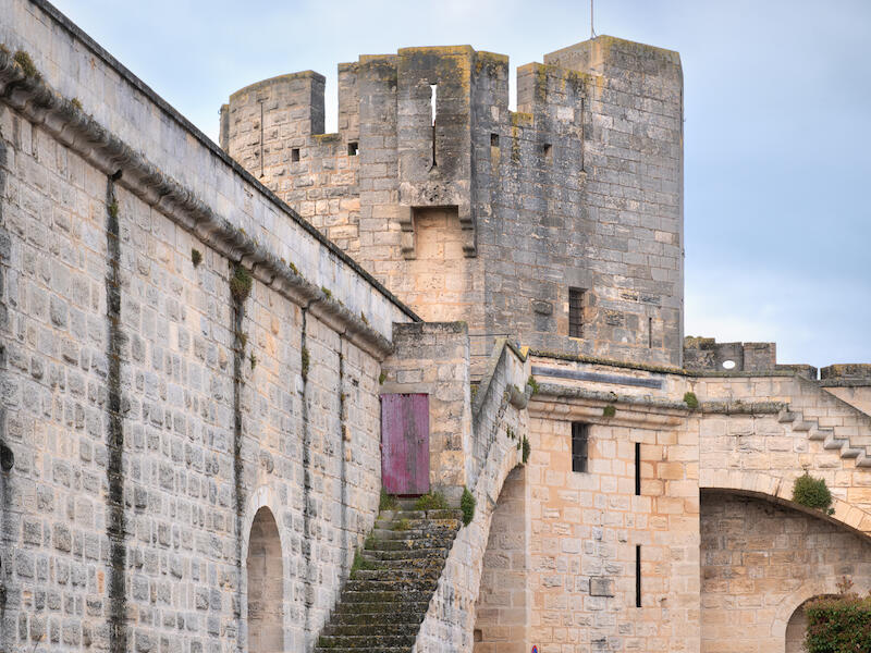
The Towers Aigues Mortes
The composition of this is a little different, in that it isn’t just the usual snapshot. By moving in close you have managed to bring out the detail in the brickwork and the curvature of the steps as well as the lichen on them!
I would add some texture to further enhance the brickwork as well as some sharpening.
Very nice.
Merit
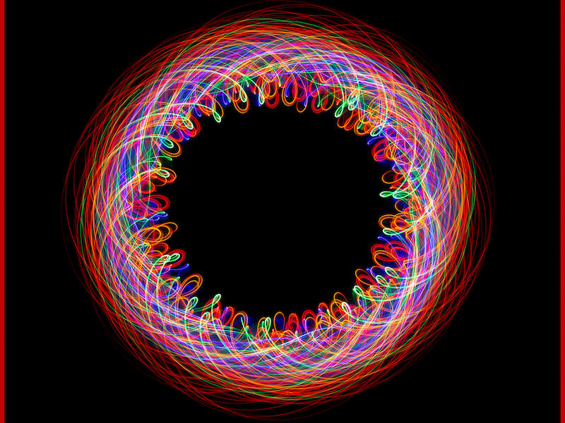
Twirling Fairy Lights
This is great! The square crop, black background, and the red line around it all work well to create an excellent image.
This is well edited with no highlights blown out.
This reminds me of a Spirograph pattern made with different coloured ballpoint pens back in the 1970s!
Excellent!
Honours
Open Digital Shot of the Year
Twirling Fairy Lights By Sue Smith
Second Place
Boarder Getting Some Air By Stu Wilson
Third Place
Poppy Patterns By Mike Alexander
Share:


