Judge: Irene Callaghan APSNZ
Your best Print for the Year
MCC Shot Of Year for the 2026 / 2027 club year. The results are presented as 3 places - 1st, 2nd, and 3rd. The 1st placed image is awarded the trophy. :
- Only one image can be submitted as long as it hasn't been previously submitted into any previous years' Shot Of The Year competitions. This is entrusted to you to ensure you keep within these guidelines.
Please submit one image under SET subject. When submitted ot the judge, the image will not be graded.
The judge will be asked for results and a critique. Depending on the volume of images, this might be restricted to just critique. The results will not be included in the end of year totals for MCC certificates.
Open
Set Subject


Shot of Year (SOY) Trophy competition 2026
Prints Open
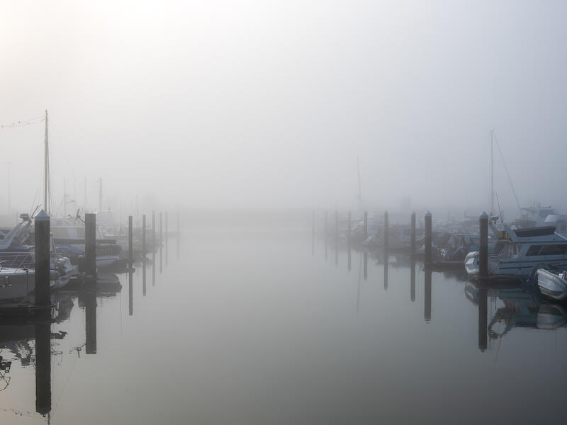
Anchored in Solitude:
There’s an appealing quietness to this image, with the fog creating a soft, atmospheric mood. The still water and the reflections of the boats add to that sense of calm and helps to draw the viewer into the scene. To lift the image consider strengthening the composition by establishing a clearer focal point, or adjust the angle so the boats lead the eye more decisively. A touch more contrast or selective clarity could also help to define the key elements without losing the misty ambience. Overall, this is a gentle, contemplative capture that shows good awareness of mood and timing. MERIT
Day's Rest:
There’s a lovely sense of calm in this scene, with the warm sunset colours and the soft reflection creating a peaceful mood. The inclusion of the bird adds a gentle point of interest and helps bring life to the landscape. To strengthen the image, consider working on the overall clarity and contrast so the horizon and foreground read more distinctly. A little more attention to the placement of the bird or a stronger focal point would help guide the viewer’s eye and give the composition more purpose. It’s a well observed moment, and the photographer shows a good instinct for capturing the atmosphere. ACCEPTED
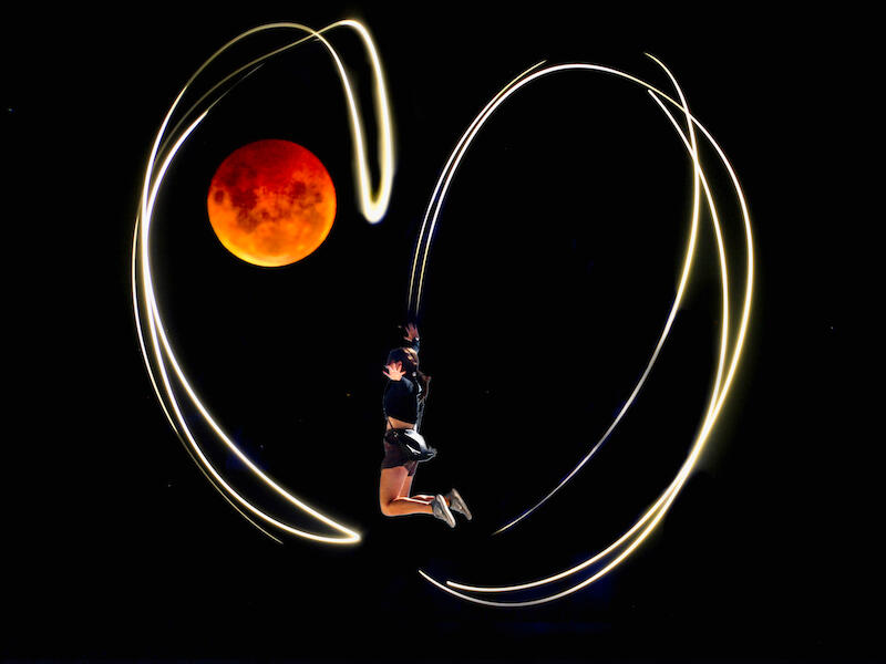
Total Eclipse of the Heart:
There’s a strong sense of imagination here, with the leaping figure and light trails creating an energetic, almost dreamlike moment. The bold use of colour and movement gives the image an immediate visual impact. To strengthen the overall presentation, consider refining the control of the light trails and leaving more room at the top of the image and the placement of the figure so the composition feels more intentional. A little more clarity around the subject would help anchor the viewer and give the creative idea a stronger foundation. Overall, it’s an inventive and playful concept that shows a willingness to experiment and push beyond the ordinary. Well done. HONOURS.
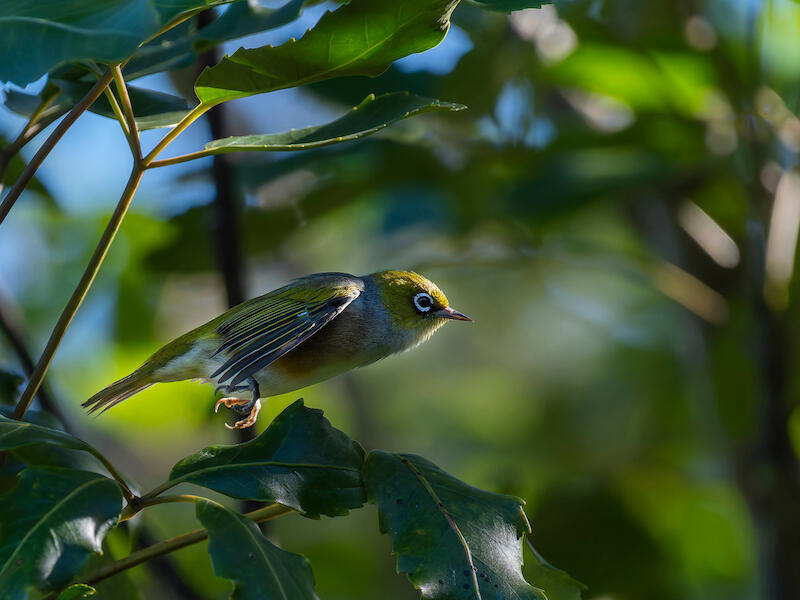
Flight:
The capture of the silvereye in crisp focus mid flight is a real strength. Freezing such a small, fast moving bird is no small feat, and the detail in the feathers and eye ring gives the image immediate appeal. Consider refining the composition so the bird has a clearer space to fly into and the surrounding foliage supports rather than competes with the subject. A touch more separation from the background, either through angle, light, or depth of field, would help the bird stand out even more confidently. This is a well timed nature image that shows solid technical control and a good instinct for capturing behavior in flight. MERIT
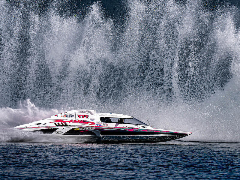
Hydrofoil 777:
There is an immediate sense of power and excitement here, with the boat captured at full speed and the spray creating a dramatic backdrop. The colour and branding are clear, and the photographer has timed the moment well to convey energy. Managing highlights in the spray could add polish without losing the sense of movement. This is a strong, confident capture that shows good timing and an eye for dynamic subject matter. HONOURS
Kotuku Family:
There is strong visual energy in the interaction between the birds, and the bright white plumage stands out against the rich background which creates a sense of drama. The composition feels a little disjointed mainly because the legs are cut off at the supporting foliage. Allowing more space for the birds’ bodies, or choosing a more deliberate crop, would help the image feel more cohesive and intentional. A touch more separation between the subjects could also clarify the story you want the viewer to follow. Even so, the colour, movement, and bold presentation show a confident willingness to explore expressive imagery. NOT ACCEPTED
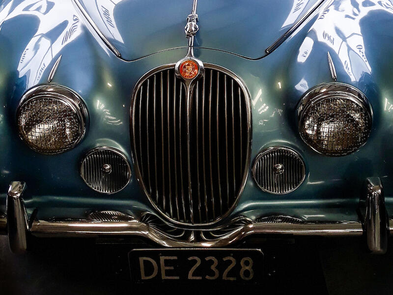
Classic - not a Ranger!
Nice title! There’s excellent control and presentation here. The symmetry of the front on view is handled with precision, and the polished chrome, grille detail, and headlights all read beautifully. The rich tones of colour and the shine of the bodywork give the image a strong, luxurious presence. More shaping of the light or a touch more depth in the shadows could add even greater dimensionality. Exploring how different contrast treatments influence the chrome and curves might elevate the print from strong to exceptional. This is a stylish, and well executed automotive portrait with excellent attention to detail and a confident sense of presentation. A few minutes removing marks and spots will elevate this image to the next level. MERIT.
Feisty:
There’s a strong sense of character and style here, with the hat, goggles, and pocket watch elements working together to create a cohesive steam punk aesthetic. The reflective lenses add an extra layer of interest and help pull the viewer deeper into the story. At this level you might consider how the background texture interacts with the subject. Slightly more separation from the background, or controlled lighting could give the figure even greater presence. A small adjustment to the tonal balance around the face and accessories could also enhance depth without losing the moody atmosphere. I find the shirt pattern dominates the print, however this is a well crafted portrait with strong styling and a clear creative vision. MERIT
Power to the People:
There is an immediate sense of control and intention in this image. The long road, the vineyard rows, and the receding hills all work together to create a strong, confident perspective. The light is nicely handled, with the warm sky adding depth and mood without overwhelming the landscape. The refinements are subtle rather than corrective. You might consider how the power pole sits within the composition. Its presence is strong, and a slight shift in viewpoint could either integrate it more deliberately or reduce its dominance. Exploring how different compositional balances affect the relationship between man-made and natural elements could elevate the image even further in print. Overall, this is a polished, landscape with excellent use of light and perspective. HONOURS.
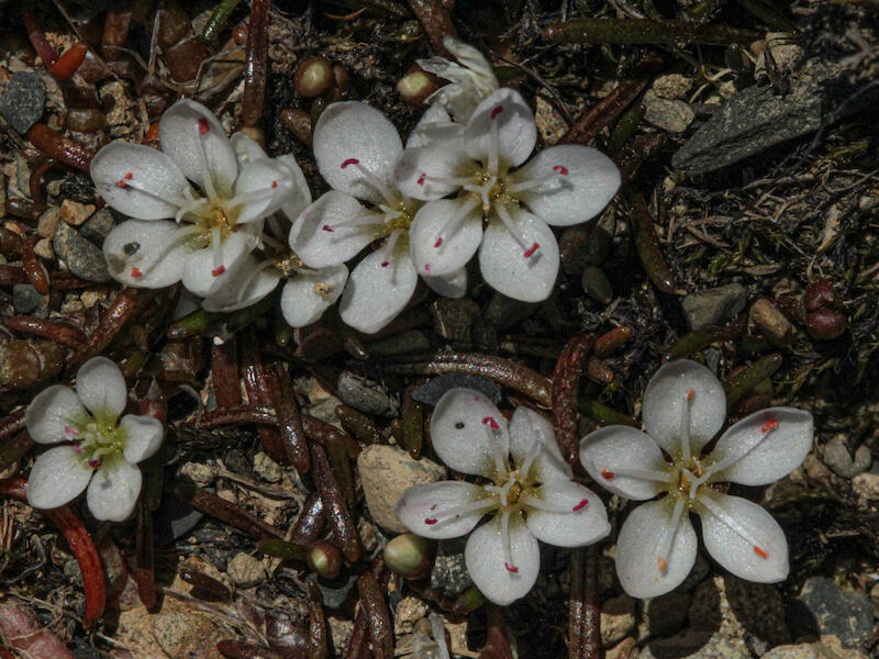
Scree portulaca, Montia angustifolia:
There is a lovely sense of delicacy in these native blooms, and you’ve captured them with clean detail and gentle light. The contrast between the fragile white petals and the rugged ground gives the image a natural authenticity that works well in print. To elevate it even further, consider refining the composition so the flowers sit more decisively within the frame perhaps on a diagonal line. A slight shift in angle or depth of field could reduce the visual pull of the surrounding stones and debris, allowing the blossoms to take full command of the viewer’s attention. Exploring how different background control techniques affect the final print could also add refinement. This is a well observed study of a native species presented with care, with a strong appreciation for its natural environment. HONOURS.
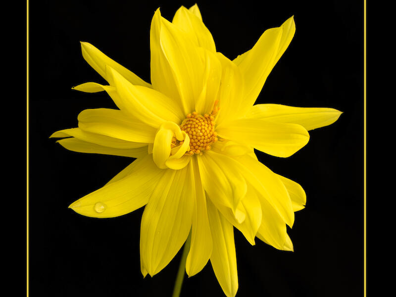
Sublime:
The flower is nicely presented, with rich colour, and a clean black background that allows the image to shine. The single droplet adds a lovely point of delicacy and elevates the simplicity of the composition. The extra border is a stylistic choice, but it may not be strictly necessary. Because the subject already has strong contrast against the black, the yellow border risks drawing the eye outward rather than inward. A more restrained presentation, or a more subtle border, could give the image an even more refined, gallery ready feel. You might explore how different border treatments influence the viewer’s first read. This is a confident print with a strong visual impact. MERIT
The Intruder:
The wasp is rendered with excellent clarity, showing fine detail in the body, wings, and textures. The clean and uncluttered background and the V shaped stem create a strong, stage that allows the subject to stand out in print. Consider refining the tonal balance so the darker areas of the wasp hold full detail without blocking up. A touch more light on the head or eye area would help the viewer to connect more immediately with the subject. Overall, this is a polished, well executed macro study with excellent technical control and strong print potential. A square crop of the right side of the image would enlarge the available detail. ACCEPTANCE
Share: