Judge: Irene Callaghan APSNZ
Your best B&W/Mono either Digital or Print
Submit your best images - new or previously submitted.
Trophy Topic - Digital & Print Black & White/Monochrome Trophy
MCC Shot Of Year for the 2026 -2027 club year. The results are presented as 3 places - 1st, 2nd and 3rd. The 1st placed image is awarded the trophy. :
- Only one image can be submitted as long as it hasn't been previously submitted in any previous years' Shot Of The Year competitions. This is entrusted to you to ensure you keep within these guidelines.
Please submit one image under SET subject. When submitted ot the judge, the image will not be graded.
The judge will be asked for results and critique. Dependng on the volume of images, this might be restricted to just critique. The results will not be included in the end of year totals for MCC certificates.
Open
Set Subject
Shot of Year (SOY) Trophy competition 2026
DIGITAL B&W/MONO
Farm Mist:
A quietly atmospheric scene with lovely depth created by the receding, mist covered ridgelines. The rural foreground adds human scale without distracting, and the transition from fields to forest to mountains is handled smoothly. Tonal balance is strong, with the mist giving a gentle lift to the mid tones. A slightly clearer foreground anchor could strengthen the entry point, but overall this is a calm, layered, and well observed landscape. ACCEPTANCE
Silver estuary:
A dramatic monochrome landscape with excellent tonal contrast. The winding patterns on the water create a strong visual lead in, guiding the eye toward the layered, misty hills. Light breaking through the clouds adds mood and depth, giving the scene a quiet sense of drama. The foreground grasses provide grounding, though a slightly cleaner edge might strengthen the entry point. ACCEPTANCE
Wild Kaikoura Coast:
A powerful monochrome coastal study with strong mood. The dark, rugged mountains and low cloud create a dramatic backdrop, while the bright surf provides a clean, energetic counterpoint. Tonal contrast is excellent, giving the image real presence. The composition feels balanced, though a slightly stronger foreground anchor could heighten depth. A striking and atmospheric portrayal of sea and land in tension. ACCEPTANCE
Glacier Country:
The soft gradation of the peaks disappearing into mist creates depth. The mood is quiet and contemplative, and the monochrome treatment enhances that sense of mystery. The darkest foreground ridge is quite dominant; a slight lift in those shadows or a gentle reduction in contrast would help the eye travel further into the layered peaks. A touch more separation in the mid tones could strengthen the sense of recession. The mist, the subdued palette, and the rugged silhouettes all work together. ACCEPTANCE
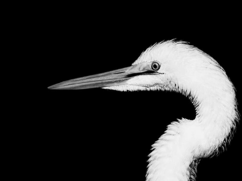
Kotuku – White Heron:
The sculptural curve of the neck against the deep black background lets the bird’s form take centre stage. The brightest feather details verge on clipping; a slight softening of the highlights would preserve texture and keep the viewer’s eye moving through the plumage rather than sticking on the brightest spots. The contrast is striking and purposeful, giving the image a refined, almost studio portrait feel. It’s a strong, confident monochrome study. MERIT
The big picture:
A thoughtful documentary style image that captures the scale and texture of a complex artwork. The viewer’s presence adds a sense of engagement and gives the piece context and proportion. Tonal control is solid, with the complex surface detail of the artwork reading clearly against the simpler gallery space. Composition is steady, though shifting the observer slightly off centre could add a touch more dynamism. I would like to have seen the photographer do more to make this their own work. ACCEPTANCE
Wairau River:
A well composed monochrome landscape with strong tonal contrast. The rocky riverbed provides a solid foreground anchor, and the calm water leads the eye naturally toward the distant hills. The dramatic cloud layers add real atmosphere and balance the darker tones below. Detail is well held throughout, though a slightly lower viewpoint might have strengthened the foreground flow. A study of land, water, and sky. ACCEPTANCE
Iceberg:
An environmental study with a strong sense of place. The ice form is the natural focal point, and its texture is well rendered, rough, and sculptural. The surrounding mountain slopes provide scale and context without overwhelming the subject. The restricted colour palette suits the cold, glacial environment. Light is soft but directional enough to give the ice definition. The composition is generally balanced, though the foreground water could carry a little more visual interest. A slightly lower viewpoint might have strengthened the separation between ice and background. ACCEPTANCE
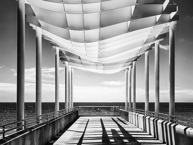
Napier Pier:
This is a strong architectural study with excellent use of repeating forms and directional light. The shadows become a key design element, giving the image its rhythm and energy. Perspective is well handled, with the walkway drawing the viewer through the frame and the low horizon keeping attention on the structure. The monochrome treatment suits the subject, and the tonal control is confident with the bright canopy, mid tone structure, and deep but clean shadows. A graphic and disciplined composition. HONOURS
Raw Power:
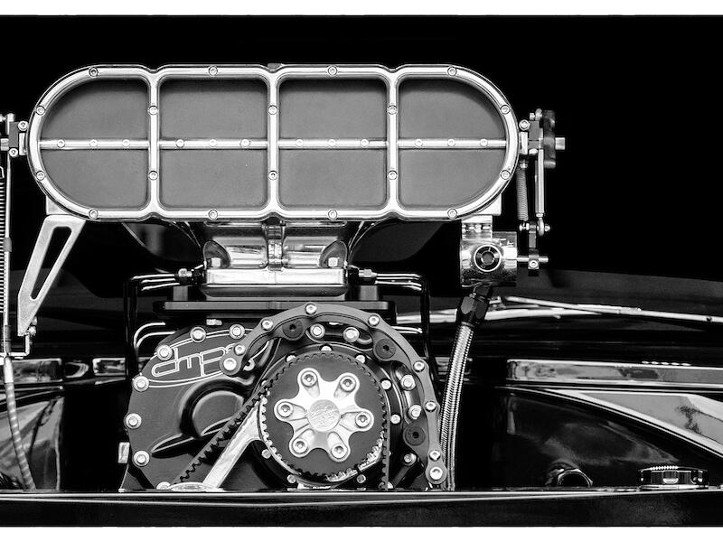
A bold mechanical close up with strong graphic impact. The tight framing suits the subject, letting the viewer appreciate the precision of the metalwork and the clean handling of reflections. The monochrome treatment emphasizes texture and form, giving the machinery a sculptural presence. Depth of field is well judged, keeping the key components sharp. This is a well executed study of engineering detail. HONOUR
Rough Coast:
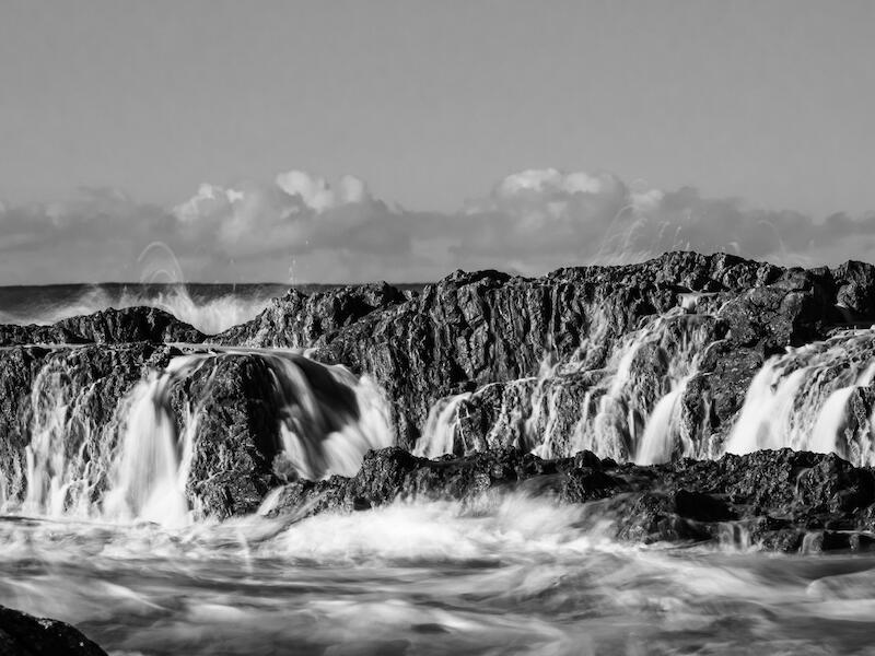
A strong monochrome seascape with excellent control of long exposure. The water flows cleanly over the rocks, creating a soft contrast against the harder textures of the coastline. Tonal balance is well handled, with enough detail in both the whites of the water and the darker rock forms. The composition leads the eye naturally through the frame toward the horizon. There could be a touch more separation between mid ground rocks and water, but overall this is a well crafted and atmospheric coastal study. MERIT
These Boots Are Made For Walking:
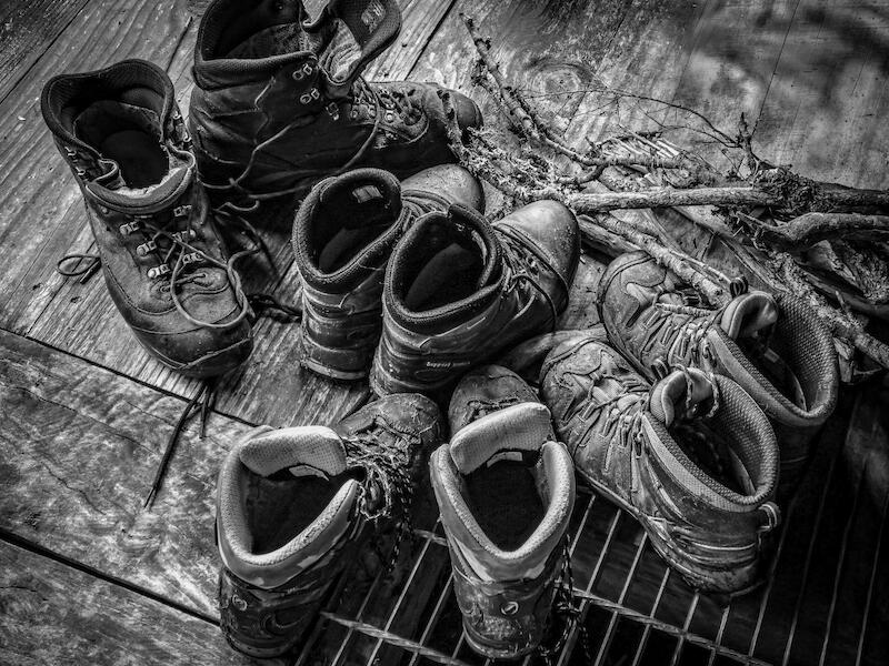
A well observed still life with a strong sense of story. The worn boots and scattered laces suggest shared journeys, and the rough branches add a natural, outdoorsy context. The monochrome treatment suits the textures, especially the scuffed leather and grain of the floor. Composition is tidy, though a touch more spacing between pairs would give each boot its own presence. Overall, a grounded, character rich study. MERIT
Waiuta Mine Remains:
A strong monochrome study of decay and endurance. The crumbling brick structure has real character, and the contrast with the intact bunker beside it adds tension and narrative. Textures are well handled with the rough stone, exposed metal, and scattered vegetation all reading cleanly. The composition is steady, though bringing the main ruin slightly off centre could add more dynamism. A thoughtful, atmospheric portrayal of a place with history. ACCEPTANCE
Wonderful Westland:
The monochrome treatment suits the scene well, with strong separation between water, forest, and mountain. The reflection adds calm balance. The brightest sky areas pull the eye a little high and a gentle highlight reduction would strengthen focus on the ridge. ACCEPTANCE
PRINTS MONO
Monaco Estuary:
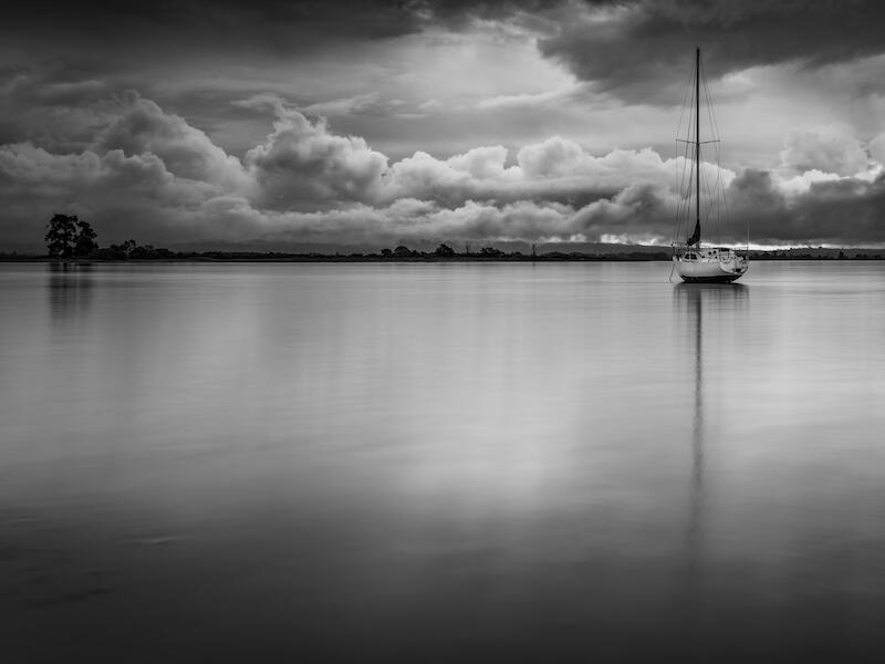
The yacht is sitting just past the third and the shadow of the mast intersects with the line of the horizon. The vignette at the base of the image helps to deflect and direct the light to give a lovely diffused quality. This image has a soft glow that I find attractive and the tonal range is well utilized. MERIT
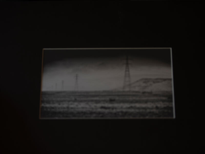
Nine:
There is a raw cold and misty feel to this scene. Keeping the image small in relation to the size of the matt has increased the feeling of isolation within the image. The pylons are nine in number and very sharp as they march into the far distance. There is a refreshing simplicity to this image. A couple of small spots could have been removed before printing although these may have accumulated later during a previous viewing. HONOURS
Whispers in the Wind:
I find the grey and flat appearance of this image has removed some detail and blurred the subject. I tend to wander around the image looking for detail but not finding any major points of interest to engage me. NOT ACCEPTED
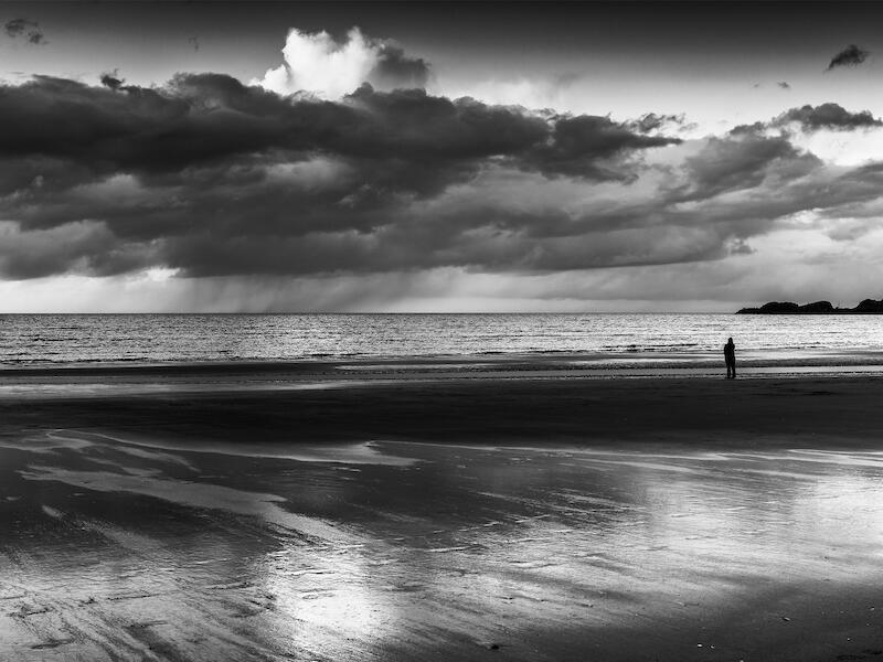
Calling Home:
Silhouetted against the lighter water but anchored in the darker sand, the main subject is well placed at the junction of the headland to create some tension within the image. The person stands at the cross point of the horizon and the island, and this balances the rain shower which is situated further out to sea. A full range of tones has been used which brings a lovely shimmery light to the sand. HONOURS
Share: