Judge: Simon Forsyth
Your best B&W/Mono either Digital or Print
SOY - Shot of the Year - 3 topics
1: Digital Open.
2: Print Open.
3: Print & Digital B&W/Mono
Submit your best images - new or previously submitted.
Trophy Topic - Digital & Print Black & White/Monochrome Trophy
MCC Shot Of Year for the 2024/2025 club year. The results are presented as 3 places - 1st, 2nd and 3rd. The 1st placed image is awarded the trophy. :
- Only one image can be submitted as long as it hasn't been previously submitted into any previous years Shot Of Year competitions. This is entrusted to you to ensure you keep within these guidelines.
Please submit the one image under SET subject. When submitted ot the judge, the image will not be graded.
The judge will be asked for results and critique. Dependng on the volume of images, this might be restricted to just critique. The results will not be included in the end of year totals for MCC certificates.
Open
Set Subject
Prints
Kaikoura Waterfront
The layering works well here, leading the viewer up from the sea to the mountains and sky.
My eye goes to the single tree on top of the hill at the right. This is not a bad thing as it stands out with all the other greenery close together.
The two buildings on the left are a bit bright, and the image would benefit if they were toned down somewhat.
Have a look at masking the mountains and sky, and apply a little dehaze to make them stand out slightly more. You could also use the B&W panel in Lightroom if you use it to darken the trees.
Very nice!
Accepted
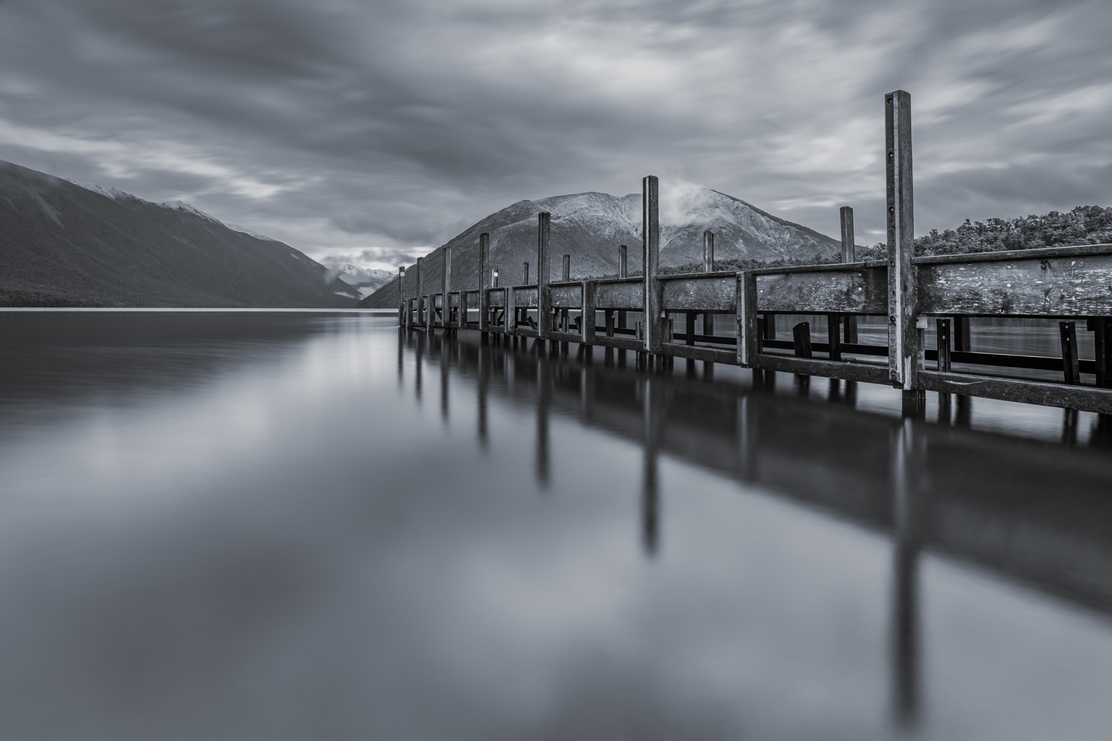
Lake Rotoiti
This is a different shot than the one normally taken of the jetty here. God on you for looking for something different!
The jetty leads the viewer into the frame from the right to the intersection of the two hills in the background.
The softness of the water on the left is good, as it means the reflections aren’t hard.
All I would do is mask the hill on the left and apply a little dehaze to make it stand out a little more. As it is, I want to see a little more contrast there.
This is well well-composed and executed image, and the processing is great.
Honours
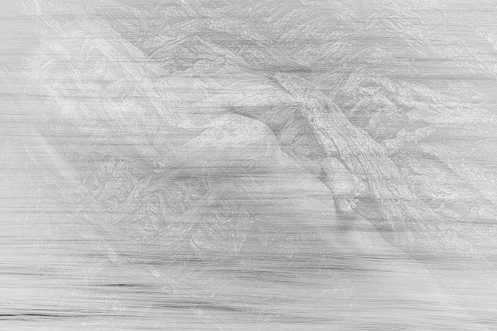
Surfaces
This is a very subtle image and, because of this, requires some examination to see all that is in it!
It gives the appearance of a pencil drawing.
For me, the mat is too big around the image and makes it look smaller. I would make the mat smaller.
The fact that the left side is lighter and what looks like water is moving to the right helps move the viewer across the image to the right where there is more detail.
The main image looks like something that would be made in the Victorian era!
Very nice and well thought out!
Honours
Digital Images.
B&W Old House
Composition is good here, and the use of monochrome helps make the weathering of the house and the shape of the dead tree stand out more. Monochrome removes the colour so relies on shapes, textures and light to work.
The house stands out well; however, I would lighten the background very slightly. Also, the vignette is a little strong. A vignette should be subtle and almost non-existent!
I would also darken the grass behind the fence, as it is very bright and draws the viewer’s eye away from the subject. If you used Lightroom, you can change how the colours appear in Black and White by using the B&W panel.
You could look at masking the house and adding some texture to further show the weathering.
Very nice!
Accepted
Nelson Lakes
The low viewpoint works well here, accentuating the length of the jetty. This is a well-known view, but is usually taken from eye height!
The moody sky isn’t what tourists want to see, but it works well here, as does the use of black and white.
You could look at masking and adding a little texture to the jetty to bring out the grain more.
If you look at the histogram, there is no data in the right quarter where the highlights and whites should be. I would look at raising the whites somewhat, as this will make the reflections on the jetty stand out more.
There are some sensor spots on the image, and I suggest you always look for them before finishing an image!
Accepted
On the Edge
The layering of the landscape works well here, and if you accentuated it more, I think this would work better.
The three men stand out in the image as the head of the man on the right is blown out and therefore commands attention.
I suggest you could crop this to just below the people as the hill below this has nothing that adds to the image. If you cropped this to 16:9 and placed it so just the top of the sky is removed, I feel it would work better. By doing this you will lower the position of the people making them less dominant.
The sky could do with darkening and have the contrast increased as the clouds around the left look odd.
You could also apply some dehaze to make the mountains in the background stand out a little more.
Accepted
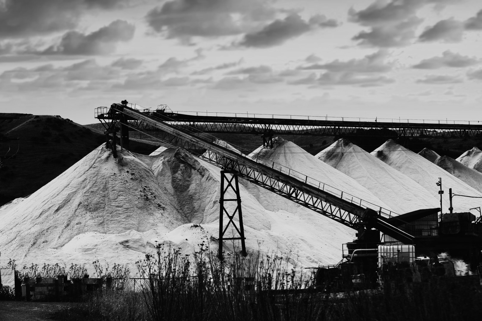
Pass the Salt Please
This is a very dramatic image and is great in black and white. The processing is great as it has retained the texture in the salt, which, being white, will blow out easily!
The contrast is great, though I would raise the light in the shadows by around 20-25% to reveal a little detail, especially at the bottom right!
I would crop this to a 16:9 format to crop some of the sky off, as being bright the eye can be drawn to it! The other option would be to darken the sky and increase the contrast there!
Very nice!
Merit
The 3 Photographers
The shaft of light coming from the top left is great as it directs the viewer to the three photographers at the bottom. The contrast of the picture works well, with the people standing out by being completely black. The slight detail on the hill in the background is necessary to make the people stand out. The framing works well.
All I would do is mask the highlights on the water at the left using a range mask and then reduce the highlights.
Well seen!
Accepted
Watching for the train
Black and white works well here, as I suspect if this were in colour, the colours would be distracting.
While normally, there should be more space in front of the subject to visually be balanced, in this case, the negative space works here.
Processing is good with just a little black. I would possibly increase the exposure by up to 35% just to make things pop a little. More.
Well seen.
Accepted
White Faced Heron
The placement of the bird in this image works well with the head in the middle section and on the thirds.
Ideally, if the camera angle was higher so to remove the stones in the foreground this would work better. The stones are out of focus so distracting. I suggest you try this with the remove tool in Lightroom to see what I mean!
The image would benefit from masking the Heron and lightening it as well as darkening the blacks. Otherwise, the image is a bit flat. I’m guessing that the reflections in the water fooled the camera meter into underexposing this.
Finally, the picture could benefit from some texture and sharpening.
Not Accepted
Bridge by Night
Working in black and white works for this picture because otherwise the artificial lights would add all sorts of colour casts.
Night exposures such as this are notorious for excessive contrast. You could look at cropping some of the left side off, which will make the bridge more dominant and lead the viewer more easily to it. Crop to the tree trunk just left of the bridge sign. You could also look at raising the light in the shadows with the shadows slider. This will reduce the black in the tree on the right that frames the bridge.
Accepted
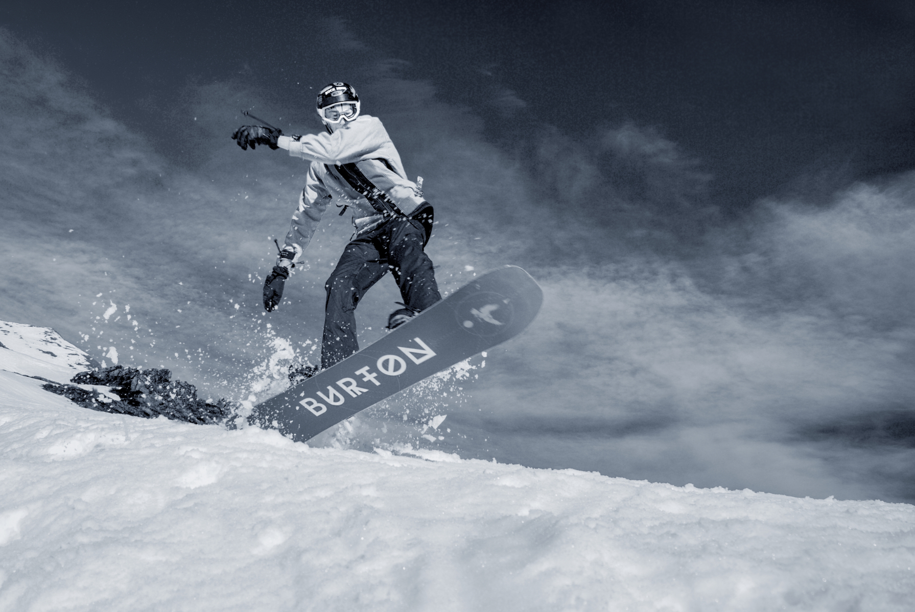
Burton
The blue tone of this works well and helps create a cold feeling.
Composition is great with the low camera angle working well, which helps the sense of action.
Exposure is ok; however, you could raise the whites and still not blow them out.
Depth of field is generally good; however, the front of the snowboard is losing sharpness!
There appears to be some noise in the sky which detracts from the overall image. Nowadays, this is easily removed. I would also apply some sharpening, as this will make the image pop a bit more.
I hope that this was a remote-controlled camera, or a long lens, as being that close looks dangerous!
Merit
Fantasy Driveway
Composition is great here with the trees helping to contain the viewer to the road and lead the viewer to the background.
Black and white helps reveal the textures of the tree trunks, although a little more texture would help make it more visible.
I feel the image could benefit from an increase in exposure. I would start with the auto develop button, then adjust from there! Even using the auto button will make things pop more. If these adjustments were made the image would score higher!
Accepted
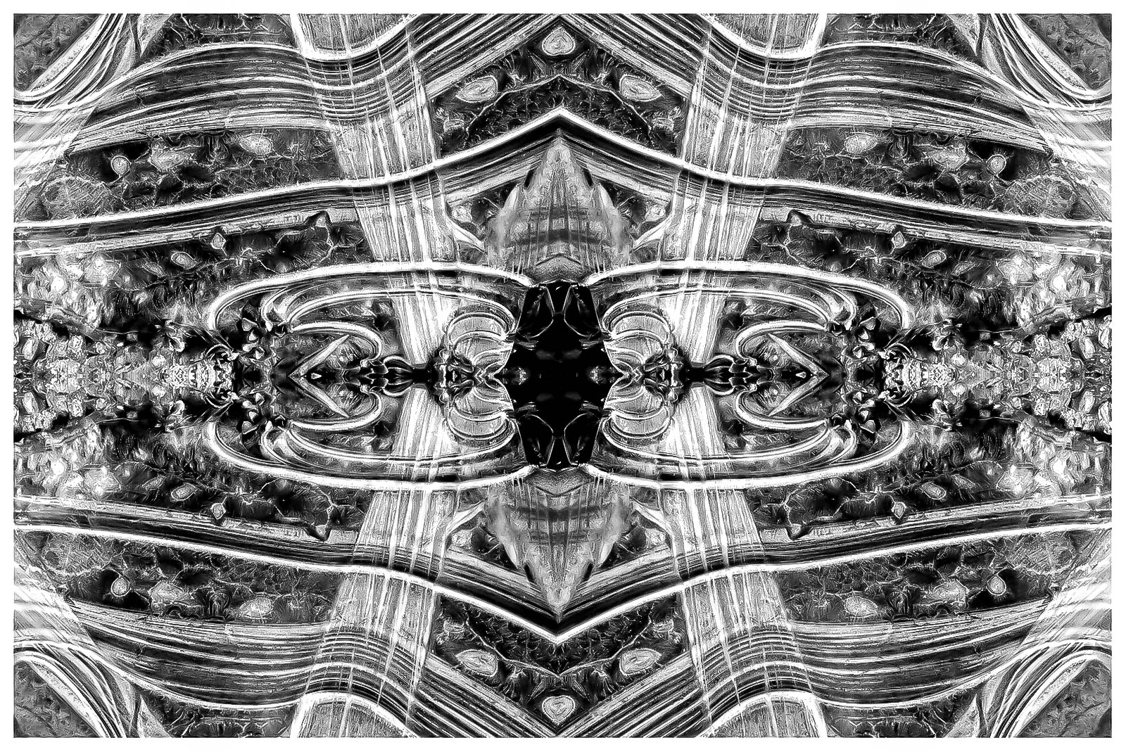
Ice Patterns Abstract
This works well. The fact you have mirrored the image shows that you have thought about this and tried something that is not used that often! The use of a white border helps close the image and stops the viewer from drifting away from it.
I suggest that you could increase the light in the shadows slightly, so that more detail is revealed in the very centre. Otherwise, processing is excellent!
A great image!
Honours
Bruce Bay
I like the wide composition of this. The angle of the waves and the beach help direct the viewer to the line of trees at the right.
As this is presented, it is a bit flat. Also, the whites in the clouds being the brightest part of the image, which means the viewer is automatically drawn to them!
I suggest that you look at reprocessing this. Increasing the exposure by at least a stop and darkening the blacks as well as darkening the sky will make this pop more.
Have a look to see if cropping a little more off the bottom so the bottom third lines up with top of the sand bar at the right, makes it work better! For me it helps the flow of everything.
Nicely seen!
Accepted
Buzzing
This is well exposed and composed. The positioning of the subject works well being in the middle.
The only thing I would do is tone down and increase the size of the vignette. A vignette should be just dark enough to almost not be visible. It is distracting, especially on the left as there is plenty of detail in the waves that is interesting. This lets the image down!
The rest of the image is excellent!
Accepted
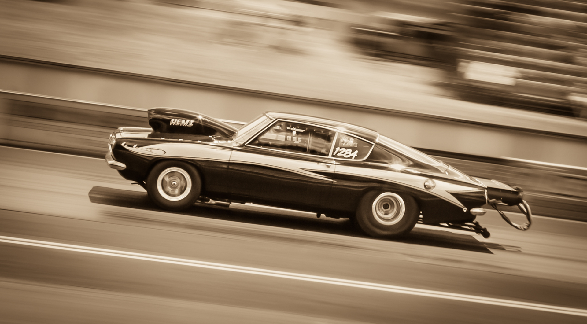
Full Throttle
Technical execution is excellent here. The skewing of the image so it is higher at the left is great. The panning to blur the background helps make the car stand out, but the shutter speed is still low enough to blur the wheels.
This is so well done and with the thing at the back I am left wondering if this might be a model set up. Even if it is, it is well executed!
The warm tone of the image works well.
Well done!
Honours
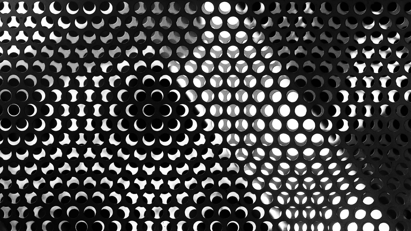
Illusion
This abstract is great. It is busy, but mesmerising, and keeps the viewer moving around it!
My eye initially goes to black area in the middle, but the contrast keeps the eye moving!
The image works because it is in black and white. If it were in colour, it wouldn’t be so mesmerising as the colour would be distracting!
Processing is excellent!
The only thing I may do is put a narrow white line around the picture to contain the viewer!
Honours
My Old Tramping Mate
Composition is good, and the fact that the subject is looking away works well!
Apart from the vignette a the left being too dark, exposure is good.
If you were to add some texture and sharpening to this it would make the guy stand out more.
Again, this is an image that benefits from being in black and white because it helps bring out the textures in the wall behind the seat and the wood.
Well seen.
Accepted
The New Inn
The crooked building and textures work well here! Black and white also helps!
I’d suggest that you crop the left to remove the road, as the sky being bright becomes distracting.
Have a look at raising the exposure and adjusting the other sliders to increase the contrast. The image, as it is, is a bit flat. Also, adding some texture will help reveal them in the wood and bricks on the right side.
Well seen as it is a different composition to the normal straight on picture!
Accepted
Monochrome Shot of the Year
Surfaces by Iain Galloway
Second Place
Ice Patterns Abstract By Rose McConchie
Third Place
Illusion by Mike Alexander
Share:

