
Judge: Simon Forsyth
Your best Print for the Year
SOY - Shot of the Year - 3 topics
1: Digital Open.
2: Print Open.
3: Print & Digital B&W/Mono
MCC Shot Of Year for the 2024/2025 club year. The results are presented as 3 places - 1st, 2nd and 3rd. The 1st placed image is awarded the trophy. :
- Only one image can be submitted as long as it hasn't been previously submitted into any previous years Shot Of Year competitions. This is entrusted to you to ensure you keep within these guidelines.
Please submit the one image under SET subject. When submitted ot the judge, the image will not be graded.
The judge will be asked for results and critique. Depending on the volume of images, this might be restricted to just critique. The results will not be included in the end of year totals for MCC certificates.
Open
Set Subject
Print Open
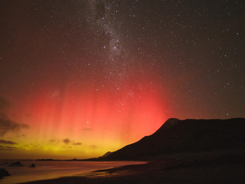
Aurora Celebrates Winter’s Arrival
I like the colours in this print. The semi-matt print surface works well as a glossy surface would create all sorts of reflections, which would make the image harder to view properly!
The aurora’s colours are well saturated and because of this it stands out.
With some further processing, you could make more of the stars stand out. Masking the top and increasing the whites, highlights and applying some texture would achieve this.
Astro photography is very hit and miss, even more so with auroras, as usually you can’t see them! This image shows that you have a good grasp of the technique.
Merit
Bellbird Taylor River Dam
The eye of the bird is nice and sharp, and the composition is good with the branch diagonally across the picture. Exposure is ok; however, there are some things that could be done to improve this image! Depth of field is very shallow, so much so that the branch, which is the anchor point, is out of focus as is the rear part of the bird’s body!
For this image, I would darken the background as being light, it dominates the image to the detriment of the subject.
Once you have darkened the background, I would adjust the subject to lighten it, and lighten the shadows so the head and the area under it is brighter. This will make it stand out more.
A competent shot!
Accepted
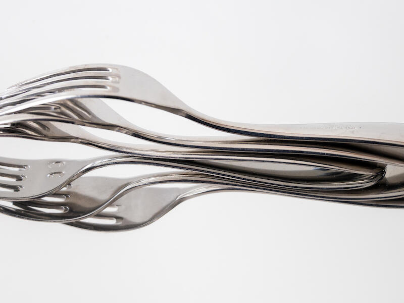
Flower Fork
I like the simplicity of this image. If the object between the forks at the left were removed or desaturated, it could be in monochrome!
Exposure is excellent with the background white and near black in the shadows.
There looks to be a mark on the handle of the top fork. I am not sure if it is a blemish on the print, or the manufacturer’s mark, but it does stand out. With shiny objects, it is important to look out for these things!
The thing that I find odd here is the blue object between the forks. The blue makes it stand out against the silver of the rest of the subject, which makes it stand out and attracts the viewer away from the main subject. Maybe if you had desaturated it, it wouldn’t be so obvious.
Otherwise, an excellent well well-executed image!
Merit
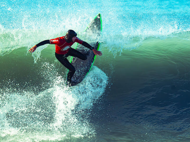
Surfer in Motion
This image is well captured with a fast enough shutter speed to arrest the water movement. Focus and depth of field are good.
There are a couple of things I would do to this to improve it. First, the right side doesn’t have anything there that is necessary for the picture to work, and because it is darkish against the white, it tends to attract the viewer’s attention. I would crop about half of the empty area off.
The other thing is that I would brighten the surfer somewhat as the white of the water makes him look dark.
Otherwise, this is well captured at almost peak time!
Well done!
Merit
Wear over Time
Good on you for trying something different by making this into a triptych! This makes the rocks in the middle more dominant!
This has to be a well-captured location on the West Coast! The location limits how you can photograph it, really!
I feel there are two separate white balances here, the sea, which is blue and the sky which has a cyan cast to it. The sky looks a little odd!
Placement of the horizon near the top of the image works well.
The bright out-of-focus leaves at the bottom are somewhat distracting, and I would either darken them or remove them completely.
Another option would have been to focus stack this with a shot focused on the leaves in the foreground, then take a second shot focusing on the far side of the patch of bush in the front, and finally focus on the rocks in the middle. You could then focus stack them in Photoshop.
Accepted
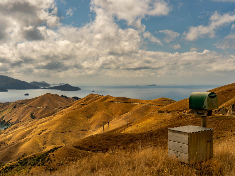
5575 French Pass Road
I like this shot. It shows a rugged, dry landscape with not much apart from the necessary post box.
The camera height is enough to ensure there is no overlap of the foreground with the peninsula in the background. The placement of the post box is great, being in the lower right near the bottom and right third intersection.
I suggest you decrease the saturation somewhat, as the colour on the ground in the foreground is very dominant. You could also look at brightening it a little.
Honours
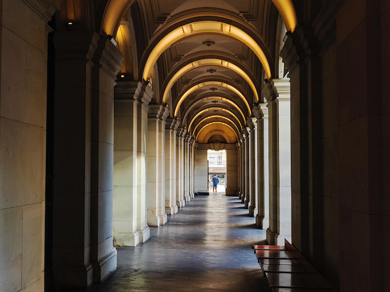
Covered Way
I like the interplay between light and dark in this image. The light and dark on the right side pillars help lead the viewer to the doorway at the end.
There is good detail even in the shadows, which shows good control, and the warm tone of the lighting at the top works well.
All I would suggest here is that if you had been able to move to the left slightly to ensure you were in the middle the image would look more balanced. You could try to crop some off the right to even things up more.
Merit
Digging Deep
The tight cropping of this image works well. It helps show the intensity on the subject’s face.
Generally, exposure is good; however, the highlights on the left arm and the water are beginning to blow out. You may be able to retrieve them by toning them down with the highlights and whites sliders.
If you look carefully, the face and eyes are slightly soft. I’m guessing that in between the time you focused and tripped the shutter, he moved just enough to cause this. Maybe continuous AF would have helped?
I would apply some texture and sharpening to see if this improves things. Otherwise this is a good shot.
Accepted
Haastia Sinclairii
The composition is pleasing here, and the depth of field is good, especially as it is a close-up where DoF issues tend to show up.
The diagonal placement of the subject works well.
Personally, I would lighten the shadows a little to brighten the bottom right area.
This image is let down by the blown highlights on the tops of the plants. As the plants are the subject, this detracts from them. If you can tone them down to bring back detail there, I would do this. It is possible that you could see detail in the highlights on your screen, but this may not have transferred over to the print. This is one reason it is important to calibrate the screen and the paper, and printer you use. Also, as the screen is backlit and the print reflected light, this can make a big difference.
Not Accepted
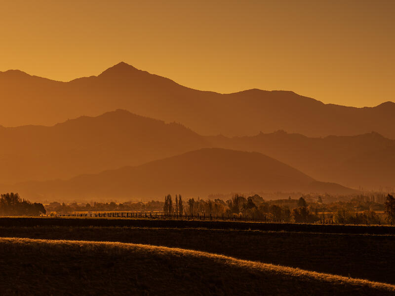
Hazy Days of Marlborough
This is a lovely image. The monochrome look (monochrome doesn’t have to be black and white!) works well, enhancing the layers in this.
The layering from the bottom leads the viewer up the image to the sky.
There appears to be a little colour fringing especially on the edges of the hills and this can be removed easily using the colour profiles in your processing software.
Exposure is great.
Honours
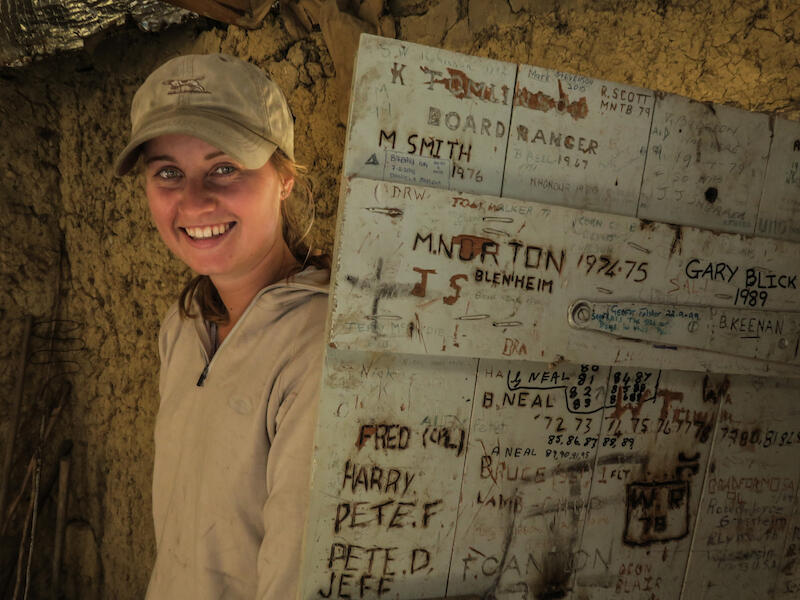
New Generation in the Musterers Hut
The idea is good here! The woman is linked to the door (?) where past occupants have carved their names.
I feel the shot would work better if the woman was turned towards the camera more, maybe facing into the door.
The darkening of the door is good, as, being bright, it would otherwise dominate if it were brighter.
I suggest that some sharpening on the girl would help, as she looks very slightly soft.
I like the tone of the image as it creates a warm feel.
Very nice.
Merit
Wainui River
The layering in this image works well. Normally, water images such as this work best looking up the river as opposed to across it, but this works because of the layering of the rocks. The rocks lead the viewer from the bottom left to the big rock above it the gradually across the picture to the right.
The fact that you have got low and looked across rather than looking down is good.
The white balance looks a little off to me. If you look at the greenery in the background, the colour looks strange. Likewise, the tone of the highlights in the water has an orangish tone.
I like the fact that you have used a slow shutter speed which has blurred the movement of the water.
Accepted
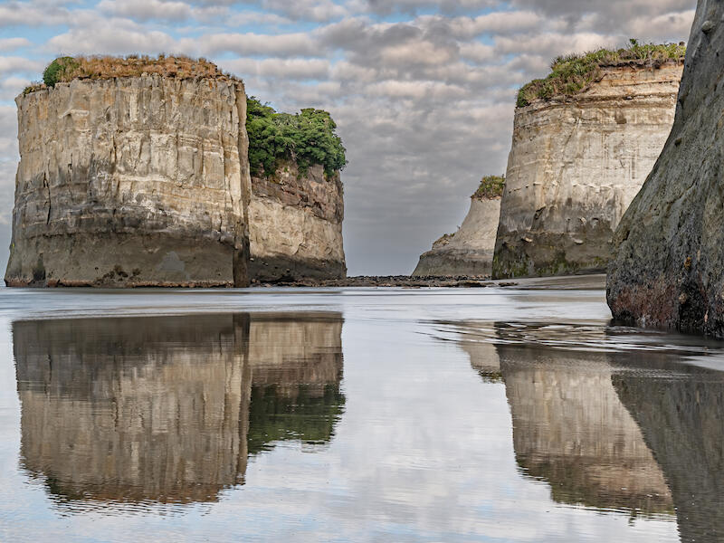
West Coast Sea Stacks
The fact that you have filled the frame with these and their reflections is great. The low camera angle, as opposed to looking down on them, helps give an idea of size.
The light is relatively soft, which helps reveal the texture in the sea stacks.
It looks as if you have darkened the sky slightly as there are halos around some edges of the stacks. There are several easy ways to fix this, and I suggest you learn how to do this.
All in all an excellent image that you should be proud of.
Honours
Shot of the Year Print Open
West Coast Sea Stacks By Helen Rietveld
Second Place
5575 French Pass Road By Rose McConchie
Third Place
Hazy Days of Marlborough By Sue Henley
Share:


