
Judge: Cushla Moorhead
Open
Set Subject


Good evening everyone. Photography means drawing with light . It’s from the
Greek photo meaning light and graph being drawing. The light is important and
can make such a difference to an image whether it is there naturally or done in
post production.
It was a pleasure to be able to judge your images for this landscape competition.
Landscape needs to have a foreground, middle ground and a background and the
eye needs to be able to move through the image. So what I was looking for were
images that were balanced, cohesive and used the light well.
Remember that these comments are my views as photography is very subjective. I
would like to congratulate all of you for entering and thank you for giving me the
pleasure of judging your lovely images
Digital
Beyond the Tarn - The ripple on the water makes an interesting foreground. The
curve of the hills draw me through the image and into the mountains beyond.
There seems to be no separation between the mountains and the hill at the back of
the tarn. I feel lifting the exposure would give that separation as the mountains are
usually lighter in the distance. This would lighten the feel of the image in my view
as well. Accepted
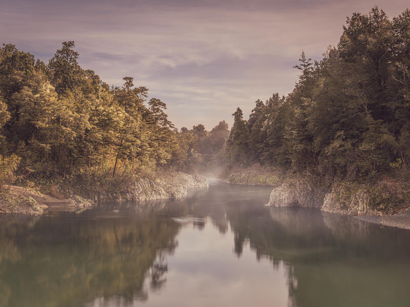
Blues and Greens in Harmony - The colour and the movement of the river
suggests it is deep. The lighter green of the bush frames the river pulling my
attention to it. For me the blue of the sky leaves a discordant note as in my
opinion it is too bright for the greens in the image. I feel it needs to be toned down
to have the balance with the greens. I like how the river draws me through to the
patch of bush on the distant hill with the sunlight on it. Accepted
Coastal Landforms of Kaikoura - There is a definite foreground, middle ground
and background in this image. The mistiness of the mountains helps give
emphasis to the distance. I like the detail in the weeds in the foreground. The
rocks in the foreground are very bright and tend to halt my progression through the
image. I feel a slight darkening would give the image more balance. Once I saw
the blue of the person I kept being drawn back . Having a person in a scene like
this does gives scale yet in this case as it is so close to the edge I feel it would
have been better cropped out. Accepted
Dawn on the Waitaki - I know that there are some amazing colours to be seen at
dawn yet I feel that in this one the colours are oversaturated. The shutter speed
has blurred the water slightly. There is still texture and it gives me the sensation of
the speed of the water as well. I like the curve of the river and the way it leads
through the image. The mist adds atmosphere. Not Accepted
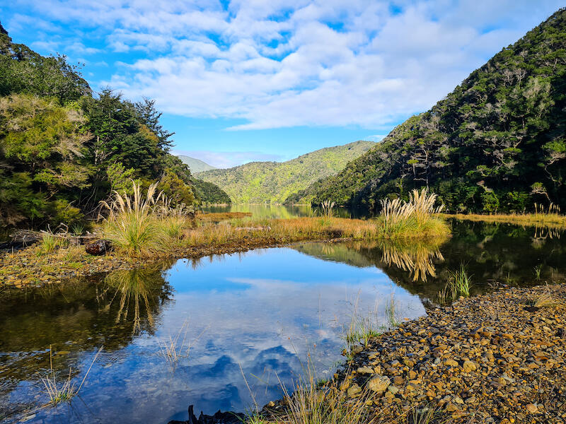
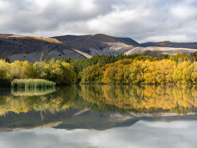
Early Morning at Wairepo Arm -There is a lovely tranquil feel to this image. The
warmth of the autumn colours and the way the light shines on them brings the
image to life.I feel that there are two focal points in the image - the reeds/raupo on
the left and the golden willow on the right. This for me creates that ping pong
effect as I look from one to the other. The sunlight on patches in the hills add
depth and draw my eyes through. Merit
Farewell Spit - I alway find it fascinating along these cliffs with the lines in the
rocks so pronounced and the way they are straight and then slant towards the
ocean. It is hard to show the scale here and yet I feel this image does convey that.
And then there is the vast distance to the horizon. I think the image looks a bit flat
as even though it is not a dull day there is virtually no variation in the light. Maybe
some work in post production could change this. Accepted
Gibson’s Beach - The foreground, middle ground and the background are all well
defined. The slow shutter speed gives interesting patterns in the sand and the
sea. I like how I am pulled by the water to the archway and then through to the
horizon. The rocks in the foreground anchor the image. The green on the rocks
add extra interest to this scene. There is a lovely flow to this image in my mind
with the shape of the rocks as well as the sea itself. Honours
Kaikoura - The foreground rocks lead me into the sea and so to the island of
rocks. It feels fresh. I’m not sure what is the focus point as my eyes continue to
roam. More contrast I feel would elevate this image. I like the way the subtle
colours of the sunrise add warmth to the image. Accepted
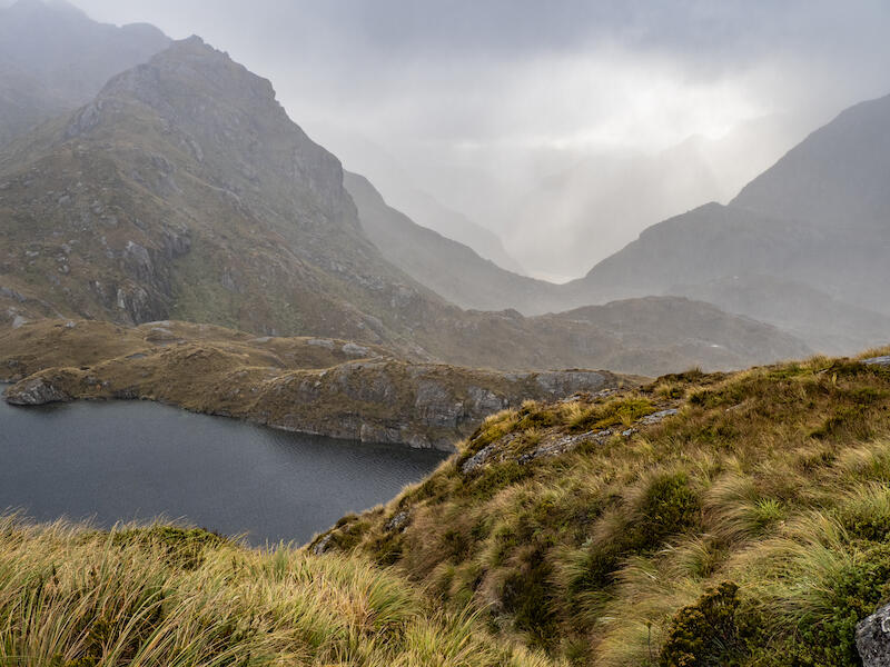
Lake Harris - I like the atmosphere created by the fog. The grass in the
foreground is sharp and leads me into the image. The ripples on the lake add
some additional detail yet I feel the lake is a bit of a distraction because my eyes
want to travel up the valley. The lake takes me out of the image. The layers of the
ridges emphasises the distance between them and gives the image depth. Merit
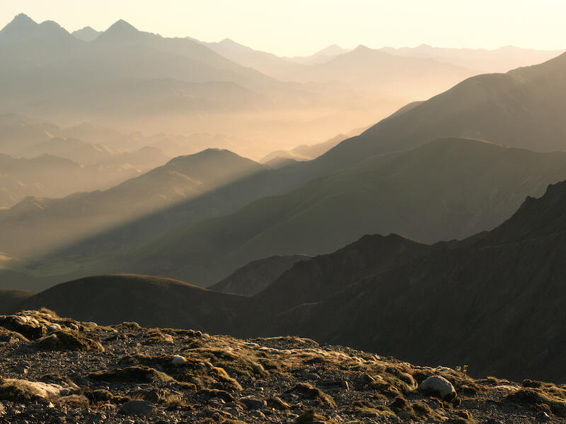
Layers of the Landscape - The mountain attracts my attention so my eyes go
straight to it. It is very dominant and I miss all the foreground. There is a blue cast
to the image. I feel changing the white balance would help this or adding more
exposure. It is a sunny day as I can see in the foreground and I feel the bare trees
need more definition to give them prominence and thus separation from the hills
behind. Not Accepted
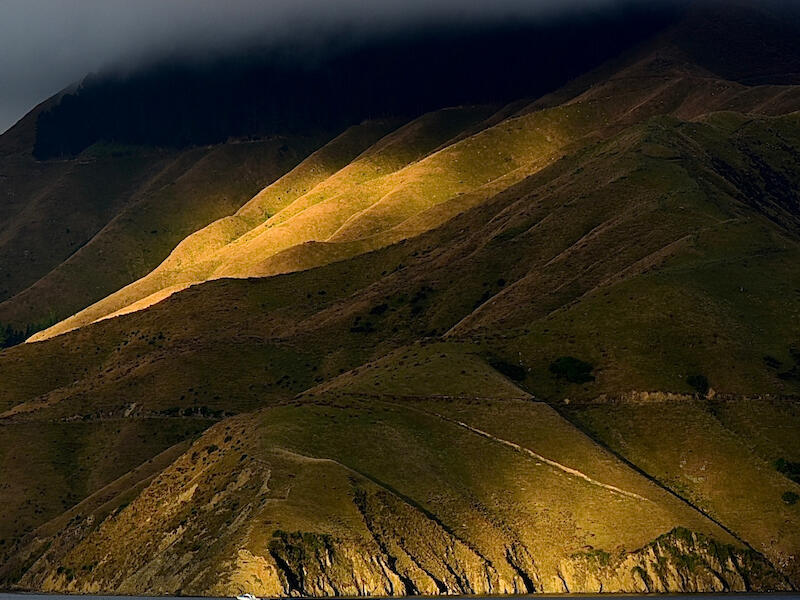
Marlborough High Country - The foreground has lots of detail which the light
shows. Then the misty middle ground yet there is still a band of light drawing my
eyes through the countryside. The mountains less well defined form the
background to give it all balance. I like the way there is a zigzag track through it
giving my eyes a path to follow. There is a lovely feeling of peace.
Honours
McLean Falls - The slow shutter speed slows the water which emphasises the
strong flow down the falls. I feel that maybe the author was trying to get too much
in the frame. I like the falls at the top yet I feel this would have been a stronger
image without them. The leaves in the foreground add a lovely touch of colour for
me. Merit
Moody Morning - This image is very atmospheric to my mind. I feel the low
horizon emphasises the feel of spaciousness and calm and then there are the low
lying clouds that add a feeling of suspense. There is some burnout where the sun
is so I wonder if taking it with the sun out of the shot might have made a more
cohesive image. The lines of sea and sand are a strong contrast for the softness
of the clouds. Merit
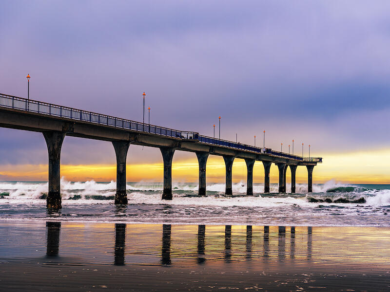
New Brighton Pier - I love the lighting and the colours in this image. The vertical
lines of the pier and the horizontal lines of the waves and the ripples in the sand
combine well. The waves have some lovely action to bring more interest and
movement in my view. I’m intrigued by the item on the end of the line. The way it
has been caught against the wave shows it well and adds that point of interest and
on the lower third. A cohesive balanced image. Honours
Peaceful Waterfall - The choice of shutter speed emphasises the speed of the
water. I like the faint pink in the rocks which is a foil for the water and makes a
frame. There are a lot of interesting textures in the rocks that complement the
smoothness of the water. I am wondering about the two black area at the top of
the image, left and right? My eyes keep being drawn to the one on the left
because of its shape. The waterfall is well positioned in the frame Merit
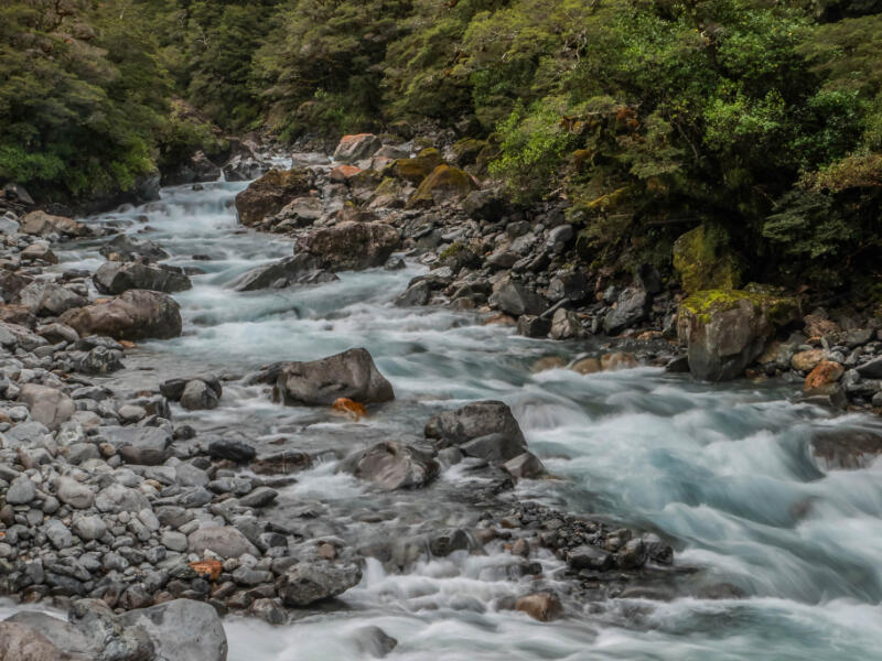
Pelorus River - This is a peaceful feeling scene in my view. The calmness of the
silky water leads me into the image. There is an s bend giving it more impact. The
golden willows create a pop of colour. Although the light is good I feel some more
contrast with the darks would give depth. I like the bits of mist floating in the
valleys. Merit
Pukehina Sunrise - Use of the Intentional Camera movement has created lots of
different textures in the bands of colour. The differing tones add to the contrast
between the warm orange and the cool blues. Although I realise it is sunrise. I’m
wondering how it would look without the top band of orange as I find there is that
pin pong effect between the two bands of orange. This leaves an unbalanced
feeling in me.The top band being so close to the top of the frame takes me out.
The first band of blue has a more swirling texture and structure which makes a
focus for me. And anchors the image Merit
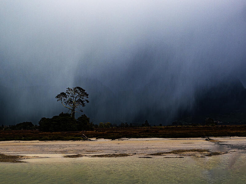
Stormy Night Rarotonga - I certainly get the feeling of a stormy night with the
blurriness of the tree tops. I feel the composition could have done with more work
as the trunk on the left is a strong leading line yet it takes me up and out of the
image. I do like the way the light is on it though. The one on the right leads into
the image and maybe darkening the one on the left and lightening the one on the
right would give it the prominence it needs. Having three trees gives a balance.
Not Accepted
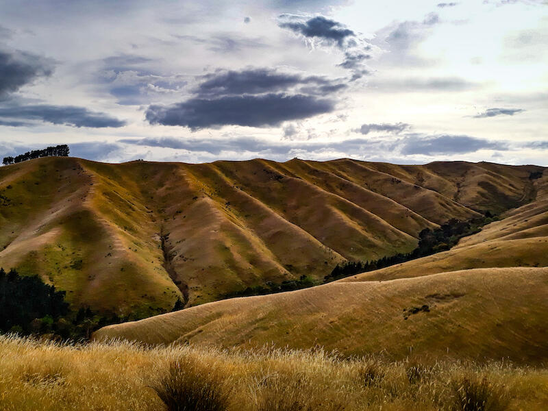
Summer Contours - I love the golden colour of the hills. The folds are well
defined up all along the valley. The sky in my view could be cropped down as it
adds very little to the story. That would bring more emphasis on the lovely hills.
The grasses in the foreground set the scene and then that little zag into the valley
and winding up gives a flow to the image. I also like the detail of the trees on the
skyline. Merit
Tranquillity - I’m not sure how tranquil I would feel with that dark cloud hovering
overhead. I like the path of light that shines across the land and sea yet my eyes
tend to go up to the white clouds. I feel that cropping from the top would give the
image a more tranquil feel and the emphasis would be on the path of light so my
eyes could travel along it to the far distance. It would lessen the sense of
foreboding I feel. Accepted
Wanui Falls - These falls are lovely with the bush surrounds. I feel the light
balance could be adjusted as I looks slightly yellow to me and the water in the falls
would look benefit for some blue to balance it. There are spots that are burnt out
in the falls. The rocks in the foreground have some intricate detail that draws me
into the falls. The slow shutter speed enhances the water. Merit
Waiting for the Storm - The lighthouse is the focus of this image and is well
placed on the third. I feel the foreground needs to be lightened to show more
details. The “god rays” in the distance give depth to the image. The composition
is balanced and there is flow with the track to the gate leading me round to explore
further. Merit
Sea Mist in the Ranges - Having the image in black and white shows the mist so
that it is prominent. I don’t feel that the black and white shows this image in the
best light. It makes the sky more prominent and my eye keeps being pulled past
the mist to the v-shape at the top of the hills on the left because it is lighter than
the mist and because of its shape. The breaking waves add interest in the
foreground. Accepted
Bucolic England - The animal lying on the ground attracts my attention. The size
and the lighter colours make it a focal point. I feel that more of the foreground
could have been included ion the image as although it is on a third it is low in the
frame. The other cattle add to the story and give it some background. For me all
the story is in the bottom half of the frame.I find the size of the tree a distraction.
Accepted
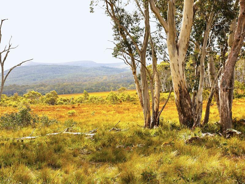
Edge of the Bush Tasmania - The colours screamed Australia to me before I even
looked at the title. I love the brightness. I feel that the bit to the right of the group
of gum trees could have been left out so that the gum trees framed the view and
so focus my attention more rather than allowing it to wander. The trunks of the
trees have lots of different textures as does the vegetation on the whole. The
typical mistiness of the hills in the background give the depth to the image. There
is a lot to see and to keep me interested. Honours
Kaikoura - The mountains are magnificent and stand out in the image. There are
two main features in this image - the mountains and the raised rock area in the
foreground. They are both strong components in this image. I feel there needs to
be a focal point as I feel they are both fighting for the attention. Maybe focusing
on one area more would have made a more cohesive image although I can
understand why the whole was included. Some time less is more. I like the way
the figure has been included as it gives the scene scale. Accepted
Lake Ohau - The crystal clear water catches my eye and leads me out to the
reflection and then the mountain. I’m unsure which way to go after that- up the
lake to the left or to the right with all the added interest with the rocks in the water
and the beach and the bush. One side shows the expansiveness of the lake and
the other the character. I feel taking one or the other would have made a more
cohesive image. The mountain needs to be the dominant feature to my mind.
Maybe cropping in on the left to where the two background ranges join would
bring my eyes to concentrate more on the main mountain. I like how the mountain
is off centre Merit
Marlborough Mirror - The intense blue and white of the sky catches my attention
and then my eyes go to the reflection in the river. Reflections often create a ping
pong effect unless there is something to differentiate. The white of the clouds
against such a blue sky keep catching my eye to the detriment of the rest of the
image.I like the way the river leads me through the image and round the corner to
leave me wondering where it goes thus engaging me. Accepted
Morning Glory - What lovely colours in the sky which are anchored by the dark
landscape below. As the story is on the sky I feel that not all the foreground is
needed and a lower horizon give more balance. The first pool of water could easily
be cropped out as it doesn’t add anything to the story. I like the way the clouds
sweep across the sky giving movement to the image. Accepted
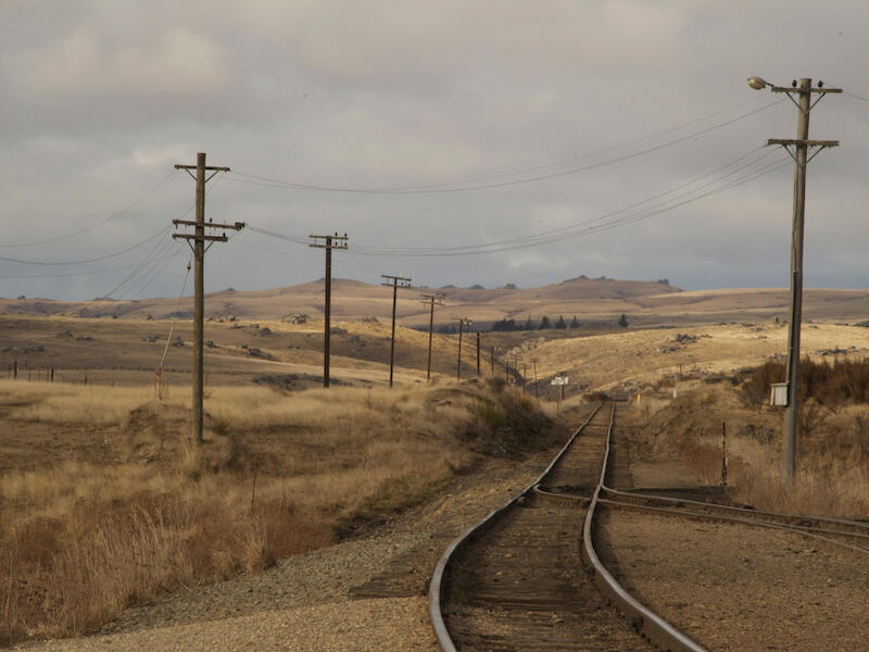
Pukerangi - The soft subtle colours and tones suit the style of the image. I love
the way the railway lines sweep round to lead my down the valley. The power lines
keep my attention on the rails and give depth and perspective as well. The
contrast of the looping lines adds a softness to the structure. If you look at the top
left corner there is a black spot. There are a few more in the wires and another top
right. They seem to be spots on the lens or sensor and can so easily be taken out
with a spot healing brush or like. Otherwise this is a cohesive, balance image
balanced and would have achieved a higher award. Merit
Remarkable Light - The sunlight across the range pulls me instantly. To me this
feels over processed. I find the white buildings being at the bottom of the frame a
distraction from the light on the mountains. I feel some burning there would have
helped them to blend in to the rest of the image. The light is remarkable.
Accepted
Sunrise On the Wairau Lagoon - The lovely soft light gives me a warm feeling.
The low horizon suits this scene making the most of the colours in the sky. I’m
wondering how long it was before the birds flew in as they make the image.
Sometimes luck has a hand and often it is having the patience to wait for the right
moment. It creates a peaceful feeling for me. Merit
The Call - The clouds are very striking. I like the silhouette of the person standing
on the beach as they bring me down to the land. They bring perspective to the rest
of the scene on my view. I feel the colour of the cloud is over saturated and I find
the reflection distracting because of the ping pong effect and the closeness to the
edge of the frame. Next time I suggest taking the clouds with more room above
them and disregard the reflection. I feel that would strengthen the image. The
changes in texture of the sand and the sea , then the clouds creates and
interesting contrast. Accepted
View from Rainbow Ski Field- It seems strange to me to see these mountains
without the snow. It is lovely to see a different view of them. I feel the image
needs more contrast as there is very little difference in tone except for the
foreground. Even strengthening the darks would help, I feel. I like the was the
valleys make a zig zag path which leads into the image and then right into the
distance Accepted
9 Mile Beach - The coastline has a rhythm to it in the way it curves in and out that
draws me through the image. The misty spray gives it some atmosphere as well. I
find that because the rocks are in the foreground and have more colour my
attention tends to stay there. I feel this image needs something more to attract
attention further in the image for a focal point. Just changing the lighting very
subtly can do that. I like the detail in the water of the stream. Accepted
Black Mountain - I love the feel of these rugged mountains. They stand so strong
against all the elements. I like the way the shadow falls across the right to keep
my eyes in the image and I feel that some darkening of the mountain on the left
would have given more emphasis on the tallest mountain. There is a lot of sky that
adds nothing to the story and I think cropping form the top would make this a
stronger more cohesive image. Merit
Delaware Pepping Island Estuary - The bright light shows me that it is a sunny
day. I can feel the warmth of the sun. The wispy clouds add some character to
the sky. I feel cropping from the top could focus my attention on the hill and the
foreground which is what tells the story of the estuary. The change of colour in the
sea tells of the shallowness near the foreshore. I like the different tones of blue in
the image. I feel that a more definite focal point would make the image more
interesting. The birds over the end of the hill add extra interest to the scene.
Accepted
Lake Kenerie - The way the vegetation in the foreground frames and contains the
lake means my eyes go through that and on to the lake and the mountains in the
background. The reflection adds depth to the image and the wisps of cloud add
another dimension. Half the image is sky and I feel that this image would have
more impact cropped as a panorama. I like the different tones of blue that holds
the image together. Merit
Light the Gap - What a moody dramatic sky. I love the feel of drama. On my
screen the foreground is too dark and I would have like to see some detail even if
faint. The different ridges are shown by the mist and clouds which gives depth to
the image in my view. The solidity of the hills is a good foil for the lightness and
movement in the clouds. Merit
Mill Arm Reflections - I like the way the stream meanders along the valley floor,
leading in from the foreground .The calmness of the water creates beautiful
reflections in different places. The clump pf toi toi up the stream is a strong focal
point because of its colour and its position. The dark of the bush reflection helps
the toi toi to shine. Merit
Monkey Bay Sunrise - There is a magic about sunrises for me. This reminds me
more of a moon rise as I can see the roundness of the sun. I’m presuming there is
a filter involved for that. The track across the water leads me top the sun. It is
blown out as it always will be yet the use of a filter has enable the whole of the sun
to be seen. I like the way the flax stalk is leaning inward as if it is saluting the sun.
Its silhouette is a strong contrast to the bright colour of the sunrise with the sea
linking them together with the light across it. Merit
Skylights Across the Harbour - The rays of light immediately catch my attention.
The silver light on the water adds to this. I feel the foreground would add to the
story if there was more exposure. Lightening that area would add more detail and
interest in my view. The way the rays of light go behind the ridge line give it depth.
Acceptance
Storm over the vines - The rows of posts and the road lead into the image giving
it depth and adding to the sense of perspective. Then there is the storm. While
the vines remain as yet unaffected the storm clouds gather. I like all the nuances in
the clouds. I’m not sure about the blue patch of sky as for me it is a distraction.
The rays of light against the dark cloud say there is some sun still. Acceptance
Sunrise Over Mayor Island - The low horizon is a good choice and sets the sun
on the third. I like how the rays extend up against the clouds and across the water.
The texture of the water give the foreground interest. The clouds are very dark and
if this image had been taken slightly earlier I feel there would be more balance in
the light in the sunrise. To get the sun showing and not blown out I think it has
made the clouds too dark. The touches of light on the clouds sets off the top
ones. Acceptance
Prints
I loved how many prints there were in this competition and as there was a
high standard that made my job much harder. I did notice that some of the prints
were a bit darker than the digital image and most of the time it didn’t make much
difference but in some cases it did. I have found that when I am printing an Image
I do the post processing and at that stage I would send it to a digital comp. But If I
am wanting to print it I would slide the Brightness between 20-30 . This is
because of the difference between the way the computer screen shows the image
and photo paper. This helps me print an image similar in exposure to the one on
the screen. Congratulations to all of you for taking part. And congratulations to the
winners.
Falls Creek - The water is the main part of this image and I feel the choice of a
portrait aspect suits the shot. The colour of the rushing water gives me the feeling
of cold. It seems to be slightly tilted to the left I which I feel is more apparent in the
background of the stream. I feel that maybe some enhancement of a part of the
creek in post processing to give a point of interest would have made a stronger
image as the cloudy day means the light is a bit flat. The placement of the creek in
the frame makes full use of the space and the change of direction in the
foreground keeps my eye in the frame. Merit
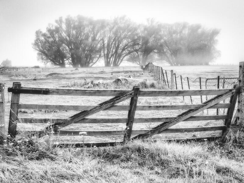
For and Structure - I think the choice of black and white for this image suits the
subject. The bit of track leading to the gate brings my eye into the image. The
structure of the gate and also its stronger tones anchor the image. I like the way
the fence line leads me to the trees in the distance. I can feel the cold which I
think the black and white enhances.. Honours
Iveagh Bay Lake Brunner - This looks so placid to me. The slight blurring of the
reflection by the ripples gives that separation from the reality. I feel that the
shadows need to be darkened so the trees will stand out to give more depth in that
part of the image. I like the layers of water - then raupo - then water a - nd then
rushes and trees. Merit
Lindis Folds - This for me is very graphic in design which I like. There are clear
blocks of colour and texture. The triangles in the front and then the snowy area
behind make a zig zag path as well. The patch of sky is a very intense blue and I
feel that toned down it would make a more balanced image. The different textures
on the shapes add interest. Merit
Misty Morning Pelorous - The peaceful feel of the early morning on the water
permeates this image, In my view. The slight mistiness adds atmosphere. I like the
way the river bends round the rocks intriguing me. The colours are like an old
painting, muted and subtle. which gives it a distinctive feel. Honours
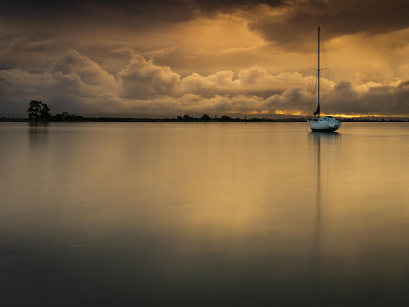
Monaco Estuary - It is the beautiful lighting that attracts my attention in this image
and how it lights the clouds and then the water giving a peaceful feel. The darker
tree line makes a clear demarcation line between the sky and the water. The
contrast between the fluffiness of the clouds and the smooth water I feel
emphasises the peaceful feel. The boat anchors it all. The darker areas around
the edges of the frame hold it all together so that vision is concentrated on the
area with the light. The black matte with the line of white sets it off . Honours
Raglan - I’m not sure what I am looking at here. It confused me and fascinated
me when I first saw it. I like the way the art pieces are placed and I feel the choice
of black and white suits the subject. The foreground grass is sharp leading into
the shapes. Even though there is an even number it works because of the way
they are placed. I find the area of cloud that has sort of stripes a tad distracting as
the sharp contrast between black and white brings my attention to it and it is near
the top of the frame. If this are could have been blended more without the sharp
definition it would not stand out the same. Overall the image has different
textures and lines that give interest. Merit
Te-Aho-A-Maui-Wellington - I have never seen this in person but I have seen
photos of it. I really like the angle this image has been taken from. It joins the
symbols on the poles together with the main sculpture so that they are all one
which the steps complete. The white background sets them off.The aqua colour
and the brown of the steps go well together. This has simplified the structure
which I feel is very effective - I am wondering how it would look with a black matte
with the white line. Honours
The Golden Hour - The golden light on the grasses pulls me into the image.
There is lots of detail in the foreground to interest me. It holds my attention more
than the ridges of the hills behind. The mistiness in the valleys separates the
ranges giving the image depth. I feel the yellow in the background could be toned
down as to me it looks over exposed. The gradient of the purple shows the
distance between the hills. Accepted
The Spell of the Mountains - The bush and the mountains - what more could I
want. I can see that it is a sunny day yet the image doesn’t really show this. In my
mind. It feels flat. Maybe try more exposure yet leave the darks. I think this would
show more definition in the image. The closeness of the mountains still needs
some separation from the bush and changes in the contrast and the lighting will do
this.. The components are there. I like the way the hill comes down on the right
and the mountains on the left drawing my view to the middle. Acceptance
When the Peaks Breathe Winter into Spring - The mountains pull me in . The
remnants of snow show off the cragginess. Then there is the contrast in the lush
green grass of spring in the foreground. I feel the foreground needs something
other than grass to hold my attention. While that’s is not always in the author’s
control I realise, it would add interest in that area. The hills between are rather
dark so maybe more exposure on them and the grass would give depth to the
image. Accepted
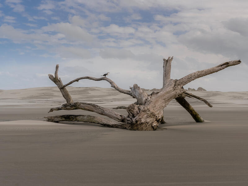
When Time leaves only Shape - What a fantastic piece of drift wood. I like the
simplicity of this image. The drift wood is quite majestic in its form. As the drift
wood is in the same colour range as the surrounds I feel some attention to
lightening some of it in post processing would create a stronger image. I love the
shag sitting on it. It adds that extra interest and acts as a marker to show just how
big this piece is. Merit
Collingwood - I’m not sure where to begin with in this image. The colours and the
mistiness give it an amazing atmosphere, almost spooky. It sends shivers up my
back. The colours in the foreground of the water, the sand and the bank blend well
together. The tree stands out against the mist to give a focal point. The lines in the
foreground are horizontal and the foil for that is the vertical movement of the mist.
There are lots of different textures too. A cohesive, well balanced image. Honours
Home Before Dark - I love the patches of light in this image. I had the digital
copy before the prints arrived and looked through them. This image stood out for
me . When I saw the print I found that it had printed darker. I feel that the whole
print needs more exposure for printing. I like the composition and the mist at the
top. The patches of light glow in that light. When I am up close I can see the
foreground hills but a image is meant to be viewed not smelt and at any distance I
can only see two patches of light and the rest is dark. It is intriguing. The matte
suits the atmosphere of the image . Merit
Waitapu - The light on the water shimmers as the ripples disturb it giving a soft
feel for me.The clouds are interesting because of all the movement and the
different colours and shapes. I find where the light shines through them is
distracting as it is near the top of the frame ands is the lightest part of the image
so my eyes keep going back there. Accepted
Anchored in Solitude - The poles each side are leading lines and show the
perspective of the image. I like the misty effect too. The clear path between the
rows of vessels would have made sense if there had been something at the end. I
know it is misty and that tells a story yet I feel there needs to be more there.
Accepted
Veil of Te Hoiere - I like the way the river flows through the image leading me on a
journey. The birds in the foreground are a nice to touch which adds to the scene. I
feel the whole image is underexposed - not by much. There is a touch of light on
the tops of the trees on the left. I would like to see more of that subtle lighting.
Using tools to lighten parts of it along the left bank would make a stronger Image I
feel. It is a peaceful scene for me. Accepted
Share:


