
Judge: Christopher Ford APSNZ
Not only is minimalism for this months topic - but we weill re-use for the 2026 international competition with Hay On Wye.
Minimalism emphasizes simplicity and careful composition, using sparse elements to create impactful imagery, often focusing on landscapes, architecture, or still life with a focus on shapes, textures, and colors
Link and below is an extract: From www.helen.co.nz
Here are some tips on how to capture more with less in your minimalist photos:
1. Keep it simple
2. Use negative space
3. Experiment with angles
4. Play with light
5. Use a limited color palette
6. Focus on details
7. Keep it natural: Finally, remember that minimalist photography is about capturing the essence of a subject in a natural and unforced way. Avoid staging your photos or manipulating the subject, and let the beauty of simplicity speak for itself.
https://www.wallartprints.com.au/blog/minimalist-photography/
Open
Set Subject

C Grade – Set.
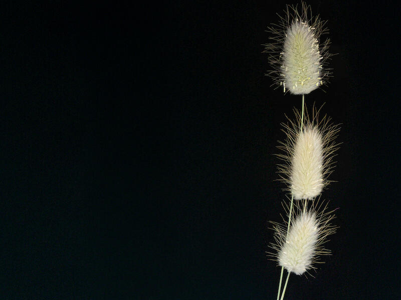
‘Bunny tails’. The grasses are very nicely lit against the inky background and show great detail with the structure of each stalk clearly visible. I find the colour of the grasses against the background very pleasing. I like the fact that the author has taken charge of the crop and placement of the subject within the image even though I find it somewhat extreme. The stalks seem a long way over in the frame, the top of the subject is very close to the edge and having all the heads in a line doesn’t bring much energy to the composition. Perhaps the author could try arranging the heads in a triangle to bring a touch of looseness to the image and hopefully some curves in the stems. There is also the opportunity to explore revealing a little texture in the blacks. Nonetheless, this a technically skilled and visually pleasing image. Merit
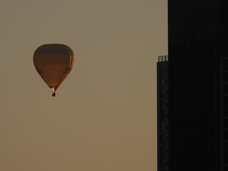
‘High Rise’. I like the graphic simplicity of this composition. I imagine dawn in a desert city. The block of desaturated orange against the black of the buildings with the hot air balloon bringing focus and balance to the overall image. Kudos to the author. I would suggest revisiting the lighting. A touch more overall exposure could reveal some subtle detail in the buildings and lighten the sky giving it a more golden tone. Selecting the balloon and adding light, contrast and some saturation could really make it pop and look like it was lit by the ‘Golden hour’ searchlight. I think it’s a nice touch that the author has captured the burner in action this is the detail that really captures my attention. Well done. Merit.
‘Lonesome’. A nicely atmospheric shot. I certainly get the feeling of silence and solitude, and everything completely drenched. I like the way the background dissolves into the mist and the dark hill sweeps up to the right hand corner. The B&W treatment suits the topic and I feel that there’s an opportunity to try a film simulation in post to add a touch of grain to taste. The water’s edge seems to be not quite level and with the jetty’s deck tilting in the opposite direction the overall effect is somewhat unsettling for me. It looks like the author may have added contrast to the jetty and this has certainly made it the focus of my attention. Not shooting the jetty perfectly square on and central has probably avoided the more formulaic presentation and gives the image a bit of tension to my eye. Nicely seen. Accepted.
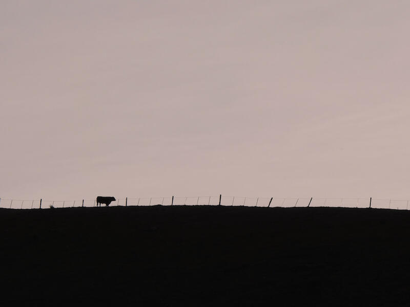
‘Mini meat’. This image and title made me smile. The topic has been addressed with a touch of wit. The steer? and horizon are safely ensconced on their respective thirds and it looks to me like the author has converted to B&W and added some toning which is interesting. I’m not convinced that leaving the gate on the left-hand edge of the fame is such a good idea because once seen, it keeps dragging my eye back to it. Well thought out and executed though. Merit.
‘Odd one out’. Solid minimalist image with the tracery of the trees outlined against a moody sky. I like the dense black tone of the foliage at the bottom of the image that provides a nice base to proceedings. The rhythm of the trees interrupted is a nice touch and a good idea to include that clue in the title. When I zoom in to the image the trees don’t seem to have much detail and it’s hard to see if they are sharp. Perhaps a larger file size might help. The bright area of sky at the top centre of the picture tends to pull my eye up towards it so perhaps darkening it down a touch would stop that and increase the overall moodiness of the image. Nicely constructed composition. Accepted.
‘Rope swing awaits’. This brings back memories of a nearly forgotten childhood. I can see some interesting textures and shapes in the rope which could be enhanced by some extra light and contrast. I think the rope should hang vertically and the patches of light on the ground could have been more artfully arranged by moving the viewing point around. An original idea. Accepted.
‘Sand castles’. There are some interesting curves and shapes in this image. There’s probably too much information for this set subject and no single point of focus. I would suggest returning when the sun is lower in the sky, when the raking light will exaggerate the ripples and deliver much more contrast. The author could then focus on a smaller patch of beach with fewer elements within it and can concentrate on arranging them pleasingly within the frame. It looks like a good location for some minimalist photography. Accepted.
‘Walking’. I find some very interesting lines and textures in this image and a lovely range of tones. Compositionally this is probably a bit busy for a ‘minimalist image and having the brightest area in the top right corner tends to drag my eye up there. A point of focus, like a leaf strategically placed to taste, would strengthen the image in my opinion. I feel zooming in to reduce the number of elements and really focusing on their placement in the frame would reap benefits. Nicely imagined and technically spot on. Accepted.
B Grade ‘set’.
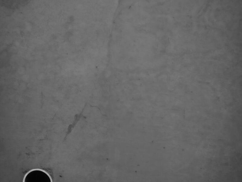
‘An imperfect world’. When I first saw this, I was bemused… three pipes coming out of a polished concrete surface. Not much detail when I zoom in. Is it even sharp? However once I abandoned the literal, pushed my chair back and just soaked in the image for a while my impressions changed. The three black and white circles gained the weight of an obscure symbolism, and their eccentric placement almost seemed to make them vibrate against the surrounding negative space. A very subjective reading, granted, but we have many hallmarks of the minimalist image… the tiny number of visual elements, careful placement of a clear subject against a large area of negative space and deliberate compositional restraint. Creative and bold, this ticks a lot of boxes for me. Merit.
‘Blackbird’. I have seen this done before but this is a particularly minimalist interpretation of the image. The image is substantially pure black and when I zoom in to the details, visible in the eye and beak, it dissolves into pixels almost immediately. Perhaps a larger file size might help. There is a nice catchlight in the bird’s eye and the subject sits around the third but it’s also horizontal so there is no tension within the frame. I feel that at least a suggestion of the bird’s form would make for a stronger image. I think it is an interesting subject to explore further. Accepted.
‘Caspian Tern’. I love the elegance of the local terns and although the Caspian’s are the dumpiest of the bunch they are still pure form fitted to function. I feel that the image overall is a little underexposed. I can see what I think is the shadow of the birds foot against its body so I would expect that body to be approaching a pure white. When I brighten the image up there appears to be some blotchiness in the sky, tonal banding on the left edge and what looks like a partially deleted wingtip. Simple enough to tidy up in editing. The bird is placed on the thirds with a nice angle to its flight path which could perhaps be exaggerated to make it a bit more dramatic. Nicely imagined picture. Accepted.
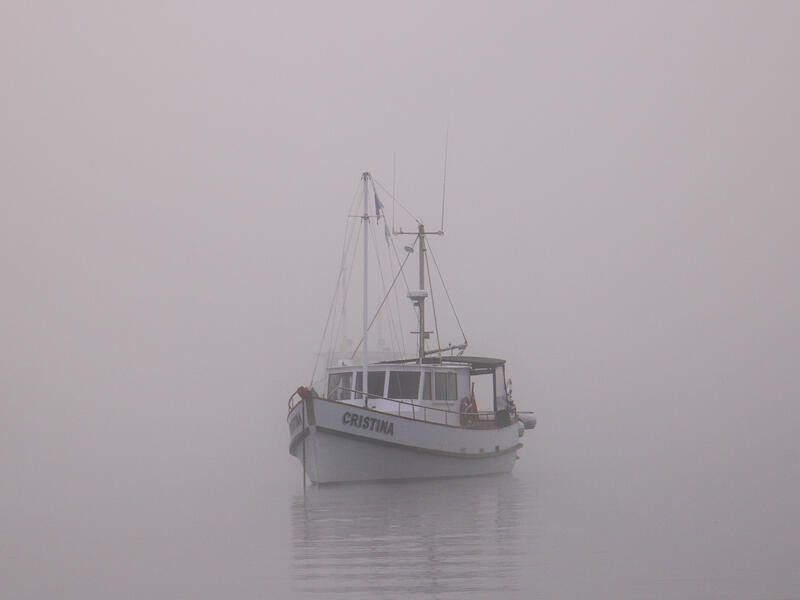
‘Christina’. Moody and mysterious this is a great subject and nice presentation for the set topic. The square crop and central placement are a little bit static but it’s an artistic choice for the artist to make. A low contrast image that I feel could be made more dramatic with more dynamic range. There seems to be a reddish tint to the image. I am not sure whether that adds anything positive. The sky and the lake blend seamlessly together very nicely. The second boat behind is a bit unfortunate, confusing the image somewhat. Nicely conceived and presented. Merit.
‘Early morning’. I feel that while there is an interesting idea here it is a little too busy to fit the ‘minimalism’ theme. Particularly the background net curtains which have also lost all detail in parts of their highlights. There is also a wicker basket in there that could have been removed. Every element in the frame should be carefully considered for this set topic. The angle on the back of the chair looks radical. Is this a super wide angle lens? If so, that could add some interesting visual quirks but make a ‘minimalist’ image trickier. Not accepted.
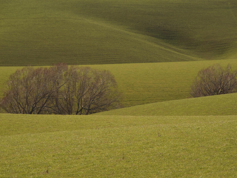
‘Flowing pasture’. This reminds me somewhat of the landscape work of Franco Fontana who used a telephoto lens to zoom in on interesting parts of the landscape to eliminate distractions and compress the perspective so that the image stacked up like a two-dimensional plane. My eye is drawn to the red in the trees against the rippling green of the grass. The image seems dark and the greens are very yellow. Adjusting these may increase the drama and vibrance of the image. The three thistle seed heads in the foreground catch my eye repeatedly. There is a light coloured track coming down the hill on the top right that keeps snagging my attention. Perhaps have a look at these in post processing. I think the author is showing a keen eye for composition. Merit.
‘Lone Kayaker’. A minimalist composition with the vibrant red kayak set off against the desaturated blue of the sea. Perhaps the white vignette implies the kayaker is venturing off into the mists of uncertainty? When I zoom in the subject doesn’t seem terribly sharp. The author has chosen to place the subject centrally and horizontal which delivers a balanced but static composition. Conventional wisdom would suggest placing the kayak somewhere around the right hand third so the subject is facing into the frame and has an implied motion forward. Accepted.
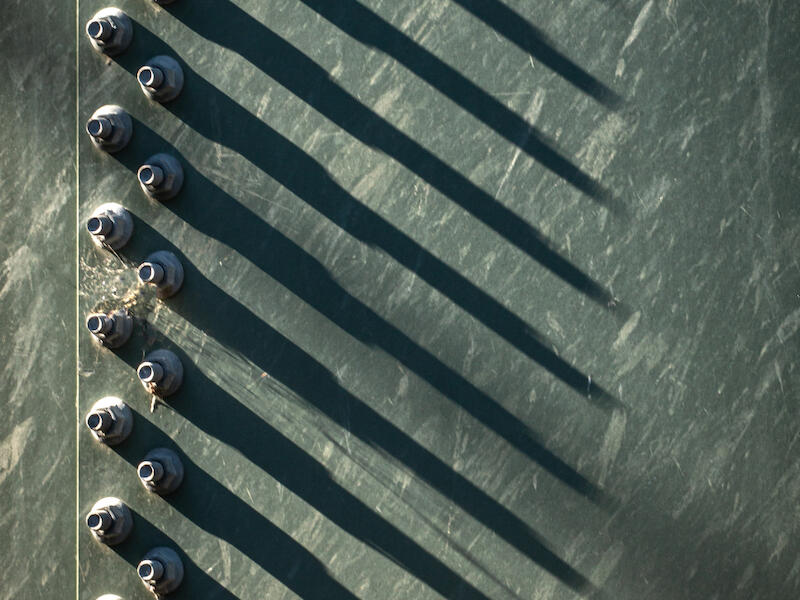
‘March of shadows’. I like the graphic simplicity of this image and it hits the spot for the set topic. Nicely seen repetition of elements. There seems to be some highlight clipping on the brightest parts of the fastenings that could be toned down somewhat in post. I feel there’s room to increase the drama of the image with increased contrast and lightening of the midtones. If I had noticed the spiders web before shooting, I would have removed it but that is just personal taste and it does kind of give a point for the eye to return to. Particularly nicely composed. Merit.
‘Red’. This image gives me a sense of isolation on a featureless expanse of ocean. The subject vessel is placed on the left hand vertical third with room to move into the picture and the horizon sits on the lower third. The blue of the sea seems oversaturated to my eye, and it dominated my first impression of the picture. It also seems to work against one of the ideas of the set subject which values restraint. There is a sliver of beach that intrudes on the lower right edge. This could be easily cropped out. Because the gantry of the ship practically touches the horizon, I get a weird optical effect where the convergence point of these lines seems to be holding up the sky. Not much use when the picture is already taken but I think it would be visually better to have the ship surrounded by the water. Solid composition though. Accepted.
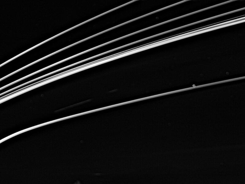
‘Streaker’. Dramatic, monochrome and abstract image that conveys a lot of energy through the curves and sweep of the lines up from the lower left to the top right corner. There’s some clipping in the brighter lines which probably doesn’t matter that much unless you print it, when there would be no ink applied on those parts. There are some lighter bubbles and smudges in the black areas that could be cloned out easily. Is the bubble on the lower line supposed to be there? Because that is where my eye keeps returning to. Good work though. Merit.
‘Wakes crossing’. Lovely silhouettes of a pair of ducks heading off into the sunset of a placid lake with their wakes criss crossing and then criss crossing again with some other ducks’ wakes. Nice complementary colour action of the orange gradient at the top and the blue of the lake. There is a lot of information and drama for a ‘minimalist’ image so this is really pushing the limits. If the author cropped the picture down to about 25% of its size and had the two ducks heading off into the negative space of the lake at the top it would be more appropriate for the salon. It is a nice picture though. Accepted.
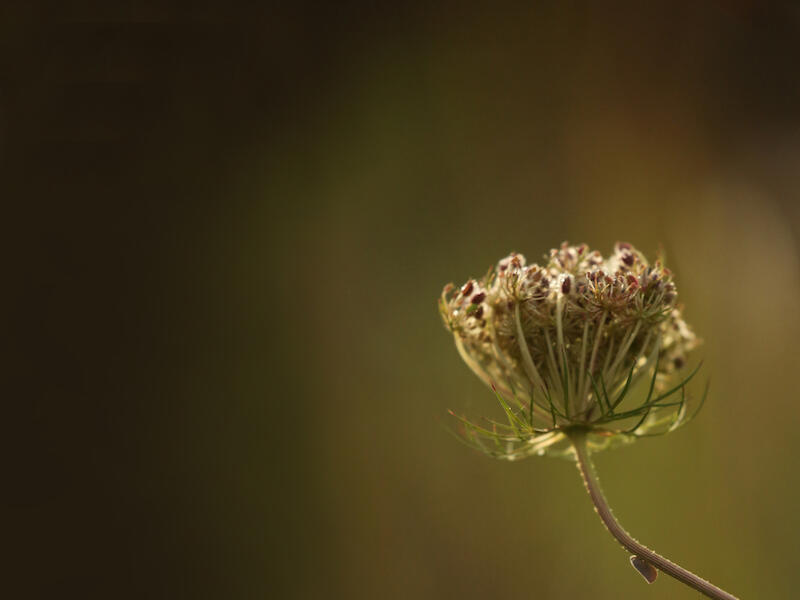
‘Wild carrot’. An artistic presentation of the wild carrot seed head. We have a clear subject, cleanly presented with the stem running down to the bottom right corner, a restricted greeny yellow colour palette and lots of negative space. I wish more of the seed head was in focus because there’s a lot of fascinating structure in there. Perhaps this is an impressionistic rendition and an artistic choice. I think I would have cloned out the leaf hopper on the stem to make it more minmalist. Nice subject worthy of further exploration. Merit.
B Grade ‘Open’.
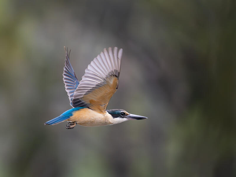
‘Kingfisher in flight’. Crikey! Even at this scale of file this is a pretty spectacular image. Sharp, with a catchlight in the eye, lovely colours and terrific separation from the background. Some serious skills on display. I’d love to see a print of it. Honours.
Parkins Bay, L. Wanaka. For me this image conveys a strong ‘Scandi noir’ type mood, with the glowering hill across the lake, perhaps, witness to many tragic stories. I looked closely for a body in the lake… to no avail. It would have been a heck of a focal point! A balanced composition, for me, with the black hill and reflection anchoring it and the lighter area of the sky providing depth. I like the glassy lake and the darker periphery holding my attention in the picture. The impenetrable darkness of the hill absorbs my attention and leaves my mind free to wander. There seems to be some minor haloing on the edges of the darker hills that could be looked at again in post. Very atmospheric. Merit.
A Grade ‘Set’.
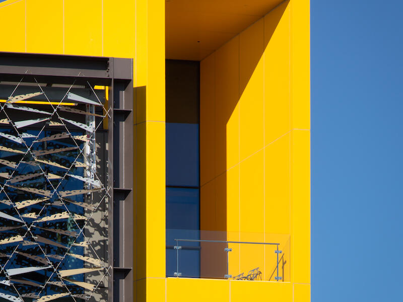
‘Affluent outlook ASB Bank’. I love the limited colour palette and the intense yellow and blue pack a real punch. Dramatic shapes with the verticals vertical. Crisp shadows and if the author deliberately aligned the line of the shadow with the centre of the decks glass panel… I am in awe. The arrangement of the separate blocks sits very nicely in the frame. Honours.
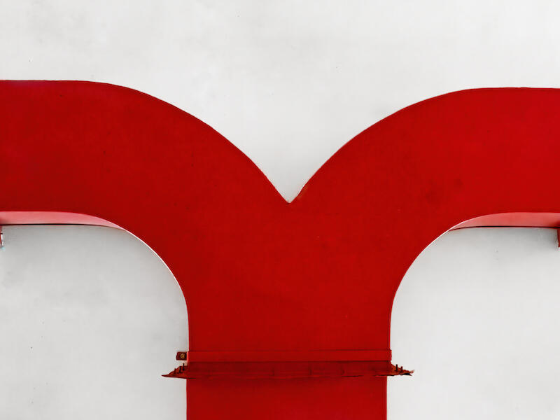
‘Bent reeds’. I think the authors decision to reflect the image of the reeds has led to a beautifully balanced picture that ends up looking like an alien calligraphy carrying an unknown meaning. There is colour in the reeds and I wonder if converting to B&W and increasing the contrast so that the blacks are very black and the background heads off towards white might increase the drama. Perhaps a very subtle vignette? Nonetheless The picture is lovely as it is and fits the subject well. Honours.
‘Between industry and infinity’. I don’t think this quite hits the spot for a minimalist image. It is graphically quite complex without a strong focal point. It does have negative space and a monochrome palette though. As an architectural photo, the central pillar is nearly vertical but not quite, it is nearly in the middle of the image but not quite and the point where the image was taken from was nearly in the middle of the building but not quite. So there’s an accumulation of tiny errors that annoy my OCD. I think the author is right that there is an interesting image here and I think that taking another run at it would be beneficial. Great title too. Accepted.
‘Elegance’. An elegantly placed single leaf in raking light that gives nice modelling in the leaf and a lovely complimentary shadow that makes it almost look like two figures dancing. I don’t think that the surface that the leaf is on could be considered ‘negative space’. It is full of crisp detail that constantly attracts my attention. The author could try selecting the background and adding blur or try the same composition on a more neutral surface. It is a nice idea though. Accepted.
‘Hanging out’. Graceful but menacing curves coming our way. Very shallow depth of field focused on the head of the snake. Although the head of the snake is the point of focus it is relatively dark compared to the brighter curves on the snakes body and these lighter areas pull my attention away from the subject. I would suggest adding light, contrast and structure to the head until it becomes the dominant feature of the image and perhaps darkening down some of the brightest areas of the body. I would also suggest taking the square crop and dragging it down from the upper right corner until the head is centrally placed from left to right. This will eliminate some of the most out of focus areas of the tail and give a more pleasing composition in my opinion. Great subject. Merit.
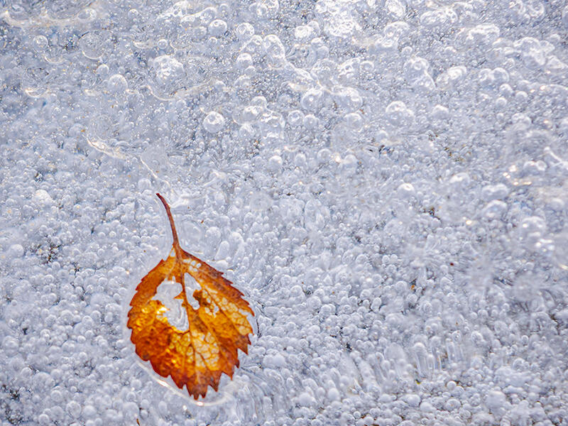
Ice bubble bound. Nicely seen image with a pleasing colour dynamic between the orange of the leaf and the grey blues in the ice. I think the surrounding ice pushes hard at the concept of negative space. There is a lot of ‘in focus’ detail to attract my attention particularly towards the top of the image where it is the brightest part of the picture. I think it’s a shame that the midrib of the leaf points out of the frame when if the leaf was on the lower right third it would point into the picture. The lower right third also works as a natural endpoint because of the way in which Western visual culture tends to read things from upper left to lower right. The crop is somewhat ‘dumpy’, wide and squat. I feel a 3x2 portrait crop would be more elegant. Cool picture though. Merit.
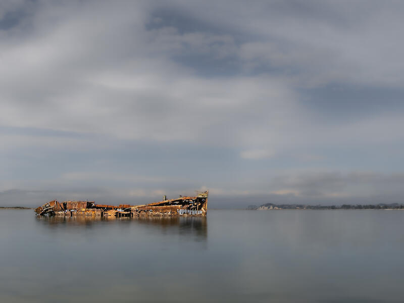
‘Janie Seddon’. This image speaks to me of the passage of time and abandonment. A very photogenic scene with some nice warm light kissing the wreck and a composition built around the ‘rule of thirds’ with the vessel facing into the frame. What seems to be a long exposure has turned the sea and sky into diffuse areas of negative space. It seems quite a low contrast edit. I think this might work better with a fuller tonal range with the whites in the clouds approaching pure white and a flicker of black in the shadows but it is down to the author’s personal vision. What looks like a long exposure treatment lifts this out of the ordinary. Merit.
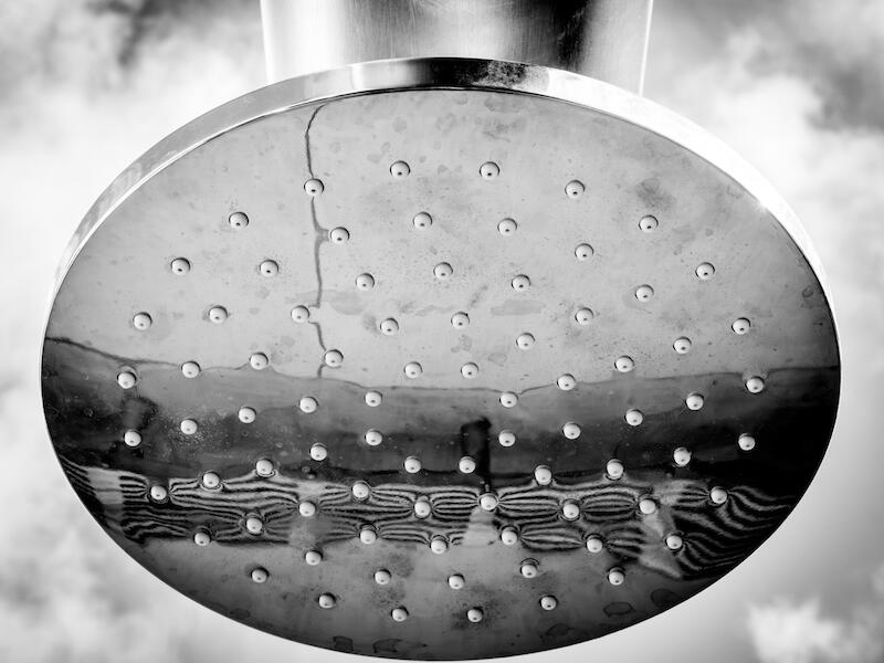
‘Liquidity outdoor shower head’. A different take on the minimalist theme. The negative space takes a more subdued role here but there is still a single dominant subject, monochrome palette and a clean composition. There seems to be some highlight clipping in the upper right that could be controlled in post. Is that water staining on the shower head? If so, I think a quick polish might be in order. Nicely seen and composed. Honours.
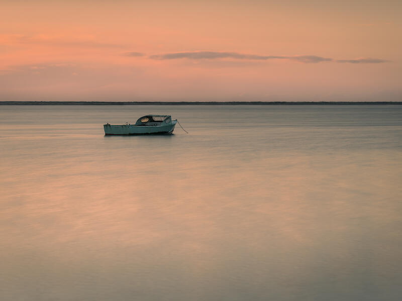
‘Mooring on the estuary’. Delightfully peaceful composition. Dreamy colour palette. Long exposure on the water but the boat is crisp and detailed… nice work. Lots of horizontal lines in the water, boat, horizon and clouds. All working together. Oceans of negative space. My only observation would be on the crop. What about a more cinematic 16x9 crop? There’s a lot of water at the bottom of the image and I think we get the point. There may also be an opportunity to crop in a little from the left to move the boat a smidgen further away from the centre of the image. This image would make a beautiful print in my opinion. Honours.
‘North beach at dawn’. I like that the author has taken charge of the crop and selected a widescreen view that suits the picture. Pleasant ‘Golden hour’ colours. I presume this is an ICM rendition of the scene. It’s nicely done to my eye and conveys a peaceful mood. The horizon isn’t flat, perhaps because there is some land out there that has been washed out in the blur. Lots of negative space but no dominant subject and I think the composition would benefit from something that my eye could latch on to. Nice technique demonstrated though. Accepted.
‘On a mission’. A terrific ‘nature’ shot. With the frog caught mid stride and tack sharp. A nice diagonal brings energy to the picture. Lots of negative space. Perhaps, if there is the possibility of a recrop, the subject could be moved further to the right so that it is walking into rather than out of the frame. There are a couple of stray hairs around the rear legs that might be cloned out. I think if this had been a monochrome version of the picture it would have been a standout but the beautiful range of colours on display take it out of this ‘set’ subject which requires a restricted palette. So to allow this to be resubmitted in a more appropriate salon where I am sure it will do well… ‘Not accepted’.
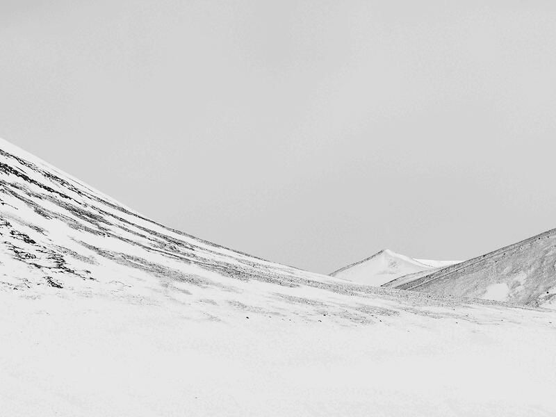
‘Peak’. Graceful sweeping lines guide my eye to the distant peak which becomes my focus of attention. A zen like simplicity and calm embrace me. Spot on for the salon set topic. There is a lot of negative space and given that most of the information is contained in the central band of the picture I would suggest exploring something like a 16x9 crop. Perhaps adding a bit of extra light to the peak would separate it and make it pop. The sky and the snow at the bottom are practically featureless and I wonder if applying a B&W film simulation with some grain might give the eye something to grasp on to here. Maybe a delicate vignette to bring some modulation to these areas. Nicely seen and composed. Merit.
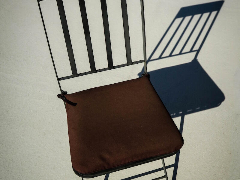
‘Please be seated’. What a great concept. It’s like some of the early surrealists B&W work. It would probably look cool in B&W too. Nice negative space with a whisper of a texture. Perhaps a slightly more generous crop would let it breathe a little easier. There’s a light coloured patch in the top left corner and some streakiness up there too that could be cloned out. Well imagined and produced. Honours.
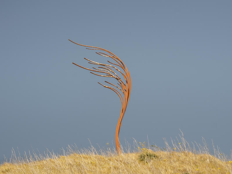
‘Pride of place’. Nice complementary colours of blue and orange and yellow. I think the central placement of the sculpture and the base of the dry grassy hill give a balanced composition set against the negative space of the sky that fits the set topic well. Perhaps placing the sculpture more to the left in the frame with the pipework pointing up towards the top left corner would give a more dramatic presentation. As though the sculpture was battling forward against the wind but this is nicely seen and thoughtfully composed. Merit.
‘Repose’. I like the rich monochromatic orange colour palette and I think the widescreen crop really suits the picture. The tire track at the lower left catches my eye and anchors the image in the present day when the rest of the picture is almost timeless. For the set subject there is just too much interesting detail in my opinion. Sorry. I imagine it might do well in a different salon. Not accepted.
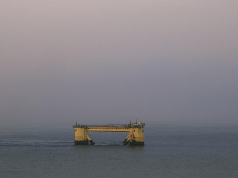
‘Rig in the North Sea’. An atmospheric image. It’s like the world has a gradient filter on it, going from the darker tones of the sea and gradually getting lighter in the sky. The horizon has vanished into the mist and there is just the rig, alone, in the emptiness. I think the crop suits the subject, demonstrating its isolation. The rig is nearly in the lower middle of the frame. I’m not sure why it isn’t actually in the lower middle of the frame. This would give the picture balance and stability, emphasising the improbability of this man made creation sitting in the North Sea. There is the opportunity to add a smidgen of light to the rig to make it pop but this is down to the author’s intentions. There’s also a black dot above the rig that could be cloned out. A good idea for the salon. Merit.
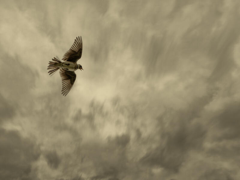
‘The Skylark’. Shot against the light there is still lovely detail in the bird. Hats off to the photographer. The feature that really catches my eye is the beak, the skylark is in full song. Wonderful. Even though the bird is conventionally placed on the third and flying into the picture it doesn’t look at all contrived to my eye. The background has a lovely out of focus rendering even though there is a level of detail in it that is pushing against the boundaries of my interpretation of ‘negative space’. Criticisms? I’m not fond of the toning and the bottom edge of the frame has some dark patches on it that I keep looking at which could be cropped out. Congratulations. Honours.
‘Vented’. A nicely observed subject for this salon. Graphically simple and striking. The right and left wings of the ducting aren’t quite the same size which can be massaged in software like Viewpoint 5 should the author desire. There is some mottling in the white background and a bright dot in the lower right corner that could be cloned out. Well spotted. Merit.
A Grade ‘Open’.
‘Calm waters’. A pleasant, peaceful scene. I like the widescreen crop and the wharf providing a leading line to the boat. To my eye there seems to be something of a cool cast to the image. Warming it up a bit and adding a lift to the midtones could make it look like a sunnier, more inviting, day. Does the image need the buoy? Probably not. It just seems like a bit of visual clutter that snags my attention without adding anything to the story. Compositionally it feels a bit static. The boat is in the middle, the horizon is in the middle. I feel there was a more dynamic image to be found here. I would suggest that to lift the image further it needs something like a person on the dock. This would grab the viewers attention and engage their imagination to provide a story of what is happening. Technically strong and an absolutely gorgeous spot. Accepted.
‘Pollen cones’. An interesting botanical study. I like the light on the cones and there’s plenty of rich detail to keep my interest. I like the desaturated greens of the needles and there’s a muted background that keeps things simple. There seems to be some clipping in the highlights and shadows that could be addressed in post. I think, if there is room for a recrop, moving the cone towards the lower right and rotating it slightly so that the needles create a diagonal might make a more dramatic image. At the moment it seems like the right hand third of the picture doesn’t add much to the composition. Well seen subject and I think the unobserved life of plants could provide a fascinating source of images in the future. Accepted.
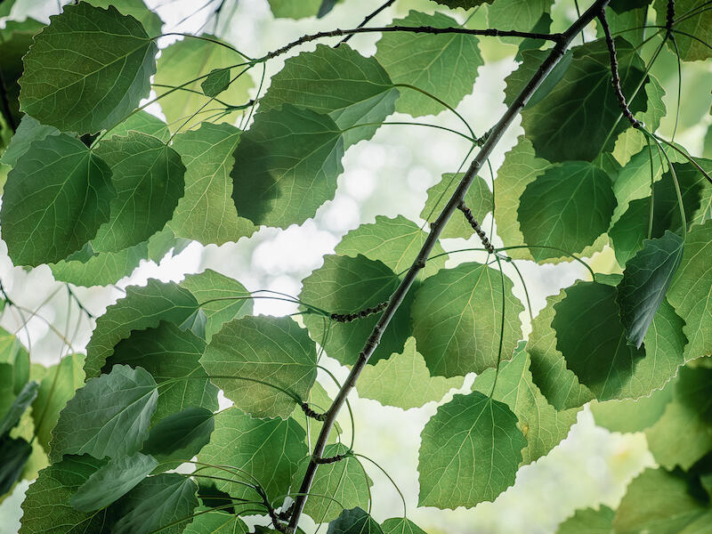
‘Shades of green’. Shot against the light there is still plenty of detail in the darker leaves. Although the background is bright the shallow depth of field employed here has rendered it out of focus and with a decent bokeh. My eye remains on the pleasingly lit and sharply focused leaves. What fascinating textures and colours. The angled branch brings some order and energy to the composition. I suppose the next development to pursue would be finding a single point of focus for the eye to rest on. A seed capsule, an insect, or flower perhaps. Something within that lovely tracery of leaves for the viewer to fixate on. Merit.
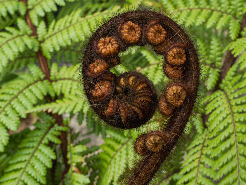
‘Spiral of life’. An apposite title speaking of new beginnings and the endless unfurling of life. I like the graphical simplicity of the image. The formal nature of the square crop is pleasingly contrasted with the fractal spiral of the frond. The very centre of the unfolding spiral is set in the middle of the image, which seems logical but means that there is more room on the left hand side of the image than on the right which I am not fond of. Perhaps a second look at the crop concentrating on overall balance rather than mathematical precision might be beneficial. Whether to leave the unfurling frond cut by the lower edge of the frame could also be investigated. Adding some light and contrast to the unfolding fern would make it stand out more from the background and darkening the lightest parts of the background, seen through the leaves, would stop them catching the eye. I think the image is strong enough to reward persevering with. Merit.
‘West Coast sunset’. There are lovely colours and well handled light in this image of the big horizons on the West coast. There is a lot of foreground with some bright grasses and a lot of motion blur that catches my eye and distracts from the subject. I would suggest trying a 16x9 crop removing most of the foreground and darkening what is left so that the viewers eye goes straight to the sunset and the foreground is reduced to a framing element. I like how the author has captured the haze in front of the mountains and look forward to returning to ‘The Coast’ soon. Accepted.
Image of the month… ‘Affluent outlook ASB Bank’ by Sue Smith
Share:


