
Judge: Cushla Moorhead
They require work - but it's worth the effort.
Refer to the Nelson Triyptic website for some assistance in construction'
https://www.nelsoncameraclub.co.nz/goodies-box.html and refer to the details in the triptych window
Open


Set Subject


Shot of the Month Salvins Albatross taken by Mike Alexander
C Grade
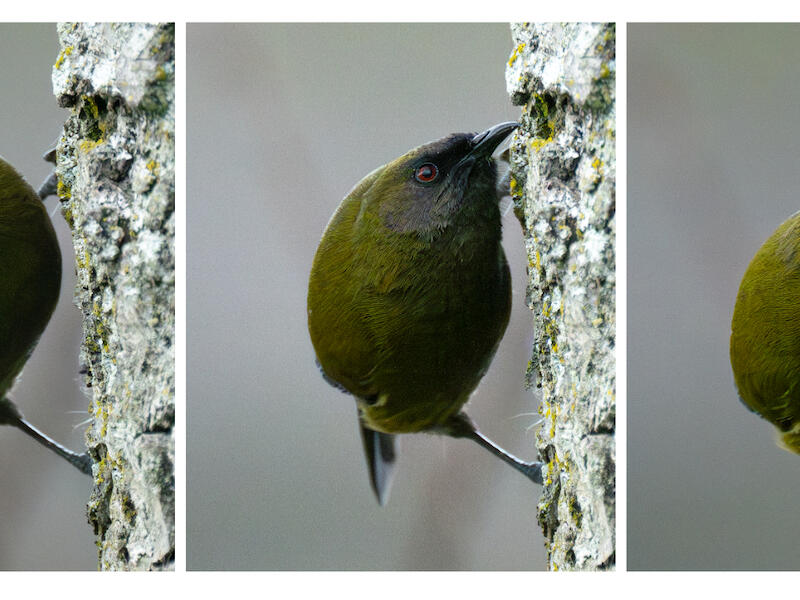
A Bellbird Goes Bug Hunting - This interesting story of the bug hunting has been well captured giving me a miniature nature study lesson. The details of the bird show clear details although I feel lifting the mid tones in post production would increase the visibility of the feather detail. At the same time I feel burning the branch so that it is not quite as bright would give a more balanced image. I like the way the bird is seen closely and the eyes are sharp in all three. Merit
Escape Pods - The strength of this visual image pulls me into the story. The repetition of the seed pods in the reflection adds another dimension. The placement of the seed pods and the one little seed show me a clear story. I like the way the story progresses with the difference in the pods and that one seed in the middle. The seed holds the visual weight and thus my attention. The black background details all the delicacy of the pods and the seeds. Honours.
Someone Stole My Nose - I found this image a bit confusing to begin with. I am glad there was a title. The bright red of the tomato tends to hold me in the first image and then I tend to stay there. The lighting on the last image is darker than the first two so for me, the flow isn’t there. I find the red border distracting and the white area of the background covers far more than the images. I suggest trying a plain black background for a stronger image. All the elements are sharp. Accepted
Notre Dames de Bruges - These three images are sharp and I think the use of black and white was a good choice for this subject. A triptych is about putting three images together that flow and have a story. The author’s input is critical. In this I would like to see some atmosphere or contrast that would show me their vision. Accepted
Oh for a Cuppa - The story of the making of a cuppa has been well thought out. I feel that there might have been a better balance if the actual cuppa image was in the centre as the colouring is different from the other two. The depth of field is too narrow as well as the part of the handle leading to the second image is soft and that distract form the effect. I like the way that it does lead on. Some of the beans in the second image are soft too.. The continuous use of the wooden spoon in all three images has linked them all together and the story is well told. Accepted
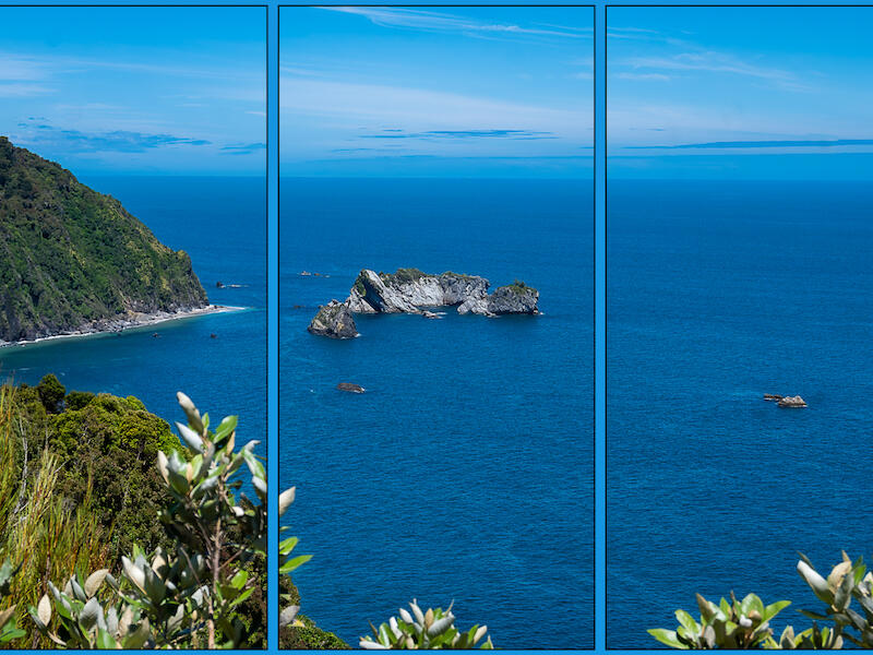
Red Skies - With this image I feel as if I am looking out a window at this beautiful view of the red sky. Using black for the background has made it feel like that for me. The reflection of the red in the sea adds interest to the view and gives depth to the image. The last third has the bright part where the sun is going down and I find my eyes going between there and the reflection in the centre panel. I feel it would have had a better flow if those two parts could have been in the same panel. Maybe that wasn’t possible. Merit
River to the Sea Recycled - Well done with the title. If an image is made into a triptych it needs to add something to the original image. I don’t think that has happened here. I think this image would be stronger without the distractions of the lines down it. I would have liked to see the image as a whole rather than a triptych. The choice of black and white shows up the details in the water on the sand. The composition has a flow as a whole. Accepted
See, Hear, Speak No Evil - Cropping the girl’s face tightly like this has worked well to put the emphasis on the story that is being told. The black and white works so that the focus is on the story. I feel that the light on her hands in the first and last images are too bright and are out of balance with the rest of the image. The narrow background works really well for this triptych. Merit
Sheep Dog at Work - Catching the dog in all these different stances takes me back to watching the sheep dog trials at the Christchurch A&P Shows which I always enjoyed. It is a pity the dog has dark patches over its eyes as it means it is harder to see them and they are such a feature of these dogs and the way they control the sheep. Maybe this could have been rectified in post product. I feel that it might have made a stronger visual image if the background had been black instead of white because of all the white on the dog. Great story. Merit.
The Progression of a Fine Art Image - I really like this unusual topic for a triptych. The progressions have been well shown and I find it interesting to see the stages of this image from the raw file to the finished product. No doubt there was more to it but it has been well done. So the story is clear. Without the title it wouldn’t have worked because of the variation in the quality of the images which has rectified in the final one. Merit.
Watchful Tiger - Each of these make a portrait of the tiger. For me they tell the same story. I feel there needs to be some sort of progression in the images so that I am lead through them. I also feel some more contrast in the images would have improved their impact. I like how they have been arranged and I think the black background was a good choice to show case the tiger. The lighter border works well too. Accepted
Wild Apple - I like the choice of topic and the story of the bud through to the hips. The second two images are sharp and show the details. The first one is a bit on the soft side. I feel this would have worked better with less white border top and bottom as I find it overpowers the images. The flow through the images carries me through the story. Merit
B Grade Set
Corsair Sortie - The flow of the story has been well conveyed. I like the way the first plane is facing in and the end one also facing in so they make the triptych complete for me and hold my attention in the image. I feel some of the images need more exposure especially the middle image. More exposure on it may have ade a stronger visual balance. It is great seeing these old planes.Acceptance
Twirl, Zoom, Swipe - Show casing the different ways of doing ICM has made an interesting image for me with the contrasts. The colours of the first two blend well together. The third one feels much cooler. I’m wondering if the third one would have been better at the beginning and the one full of movement and fire ending the triptych. Of course that is my opinion and for me the static one introduces the theme and then more movement is added. Each image of its self has been well crafted. Merit
Preening Birds - Having the birds close up gives a sense of intimacy that I like. I feel the middle image is sharp and has clarity because of the blue sky whereas the other two have backgrounds that tend to interfere with the clarity of the birds. I think changing the positions of the two at either end by having them face inward would give a better flow to the triptych and so my eyes would flow along but not out. There is lots of detail in the feathers of all the birds. Acceptance
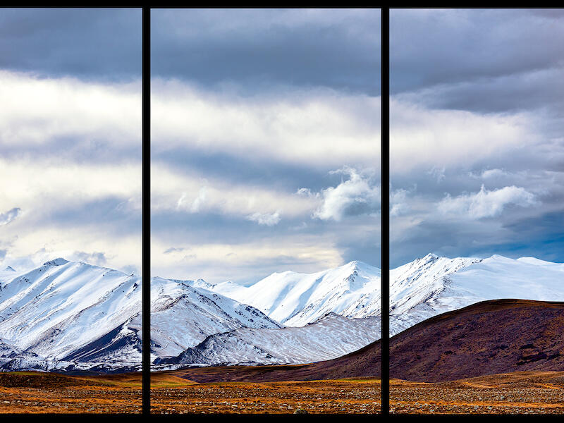
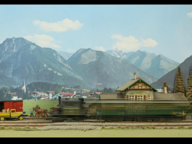
Ready, Going, Gone - The story is well told. Although the middle image is a lovely scene I feel the triptych would have been stronger visually if the middle image had the train and the station without so much of the surrounding area. It is the mountains that pull my attention instead of the train. The light and colours work well together. The images stand out in the black frame. Merit
Relic Treasure in the Grass - It took me a while to understand what this image was. I like the black and white as it has made the lines clearer for me. The filter has added a sense of rhythm and movement. I’m not sure that all the movement is needed as it is hard to know where to look. Acceptance
Rows and Rows of Vines - When I first saw this image I thought it was a soldiers’ cemetery and the end one was the soldiers and then I read the title. The unusual framing in this triptych suits the subject with the further away vines separated from the closer ones and on a different angle. The lines and rows create a myriad of patterns with lots of repetition that carries me along. I feel there needs to be more exposure in the first two images as they are darker than the last one which makes the over all image slightly unbalanced. This image certainly brings back to me all the vineyards in Marlborough. Merit.
The Cartwheel - The black silhouette stands out against the white background. What makes me feel really uncomfortable is the missing parts of hands and feet. If some ground had been there is would have felt a more finished product in my opinion. The progression was a good choice for a triptych. Acceptance.
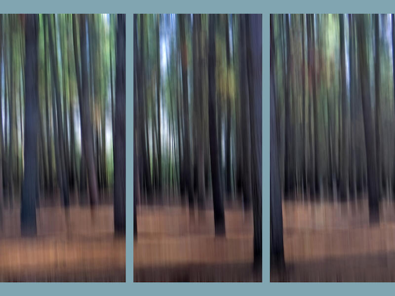
The Mystic Forest - The ICM has added some movement to this image. I like the bits of light showing through the darker trees. The blue framing I find really distracting and wonder how it would look with a darker frame which I feel would allow the image to come forward. Here I feel the frame dominates because of its light colour. The warm colour of the ground anchors the image. Merit.
Whoops - It is indeed whoops. I’m sure that the intention was to jump clear yet that adds another dimension to the triptych. I feel the horse needs more exposure maybe in post production. The flow of the story tells it all and the ending is unexpected which I like. The rider no doubt didn’t. Everything is sharp and well balanced Merit.
B Grade Open
Cape Petrel - I like the way the bird seems to be looking at me. The detail in the feathers catches my eye. When such a fast shutter speed has been used when a bird is in flight it feels, to me, that it is suspended in the air rather than flying. I know it is tricky to get one in flight but I would like to see more of a story. Merit
Salvins Albatross - What magnificent birds these. I love the movement in the feathers which in my opinion adds to the story of the bird preening. The light shows the details and texture in the feathers. The sea is a foil for the bird and a great back ground in the way it is sharp in the foreground and diffused further back. The albatross dominates the image. Honours.
Sunset At St Anne’s Lagoon - The golden light shows the old house in detail. The bales lead me into the image and on to the house giving the image flow. I suggest cropping the bales from the right so that my focus remains on the old house which has great detail. That would create a better balance in my view. Merit.
A Grade Set
Birds of a Feather - The subtle colours create a calm feeling for me. I like the progression of the number of birds and their different poses. The green leaves at the beginning hold my attention because of the stronger colour and totally different shapes so it is hard for me to progress along to the other images. The light on the birds has captured the detail in their feathers which is often hard to do with dark coloured birds and those details add interest for me. Merit
Its a Wrap - I love the story here and the images are sharp. I feel that the author didn’t read or understand the rules for a triptych as there is no overlapping allowed and no writing on the background. Because of this I have had to say no award. Maybe try it in another competition as there is a lovely story there and it is well executed. No Award
Land Based Sled Dog Racing - What an interesting subject. I’ve heard of this yet never seen it. The first image gives me the sense of movement as they come round the corner. The shutter speed has bee used well to get the front dogs sharp. The middle image show them closer so I can see more of the details. I feel the end image is too similar to the middle one so the overall balance feels a bit off. Maybe one of them going away from the photographer? There is a good separation from the background and the black edging of the images pulls them all together. Accepted
Fungi - These images are beautifully sharp with lot of detail in each one showing the fungi and their habitat. The black frames have contained each fungus I like the way the fungi are lit which brings them to life. Honours
Reflections - I love the quirky feel of these images through the windows. The progression of the images selected gives a flow to the story. The way the glass slightly distorts the image adds a fun element to the look that , for me, makes it more interesting. If anything I feel less of the white frame would give more emphasis on the images yet that is a small point. The cool colour of the green is a foil for the warmer colours of the scenes. Honours
The Many Poses of Please - What an intelligent looking dog. I like the sharpness of his head and seeing his eyes so well. The hind legs are soft and I feel that it would have been a stronger image if the depth of field had included that part. The blurred background works well to isolate the dog. Each portrait has been well done yet I feel, for a triptych there needs to be more variety in the poses to capture my attention. The framing suits the images. Accepted
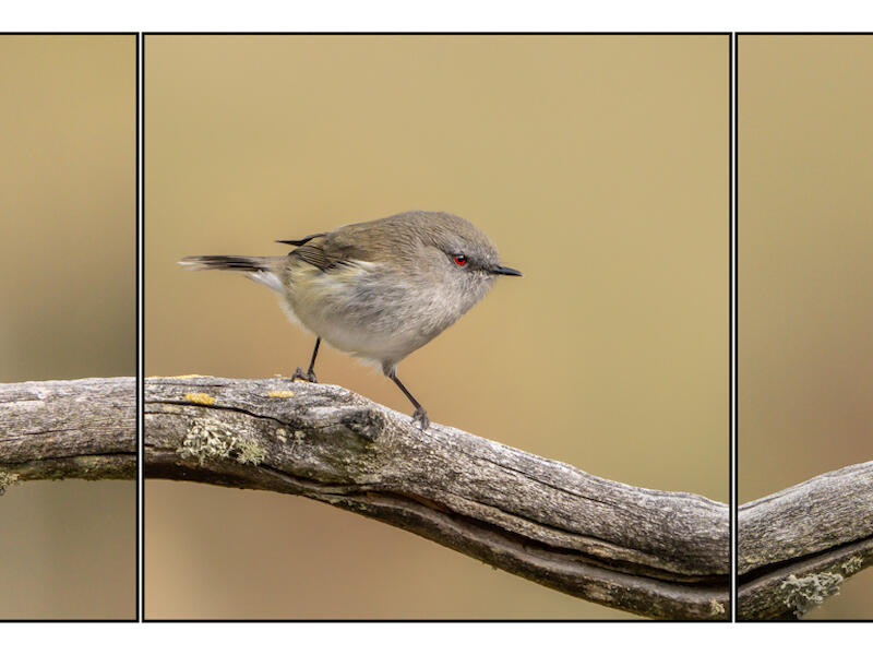
The Warblers - This brings a smile to my face as I follow along the branches. I like the way these images have been put together so that it looks like one continuous branch thus taking me on a journey along it. The lighting and background show the detail of the birds and their different poses are a delight especially the last one. To me this feels balanced. The colours work well too. Honours
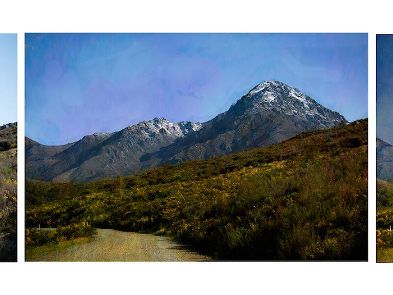
Two Thumb - This scenic shot draws me into the mountains. It reminds me of the grandeur of them and how easily our environment can be destroyed. The lines dividing this image have been placed so that the mountains each side frame the middle area which I like. I feel there needs to be more contrast in the image to bring out the variation in the mountains giving them more impact and drawing me into the middle area. The warm tones in the foreground tend to draw me to them because of the stronger colour. Merit
A Grade Open
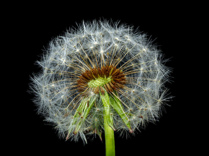
Dandelion - These seed heads are so photogenic and I feel that this is a great example of one. The colour is bright and fresh feeling that takes me into the detail of the seeds and how they are placed. The depth of field has been well handled so that everything is sharp. The black background gives the separation needed to see this seed head to advantage. Honours
Prints
It is lovely to see people putting in prints so thank you. I love unpacking them and seeing all the interesting images.
C Grade Set
Wear Over Time - To begin with I thought this was a nice seascape and then I saw the title and the significance of the way it was divided. The story is strong and so current with erosion and climate change etc. The execution and the composition draw me into the image. The progression is clear and I like the little touch of the leaves in the right hand corner that balances the ones on the left. I notice there are fine marks on the print that are usually made when it isn’t held by the edges before it is matted. Something for the author to be aware of. Otherwise well matted and printed. Honours
B Grade Open
Late For Work - The shutter speed emphasises the speed of the bike so that I can feel the hurrying and the urgency. I feel this image would have worked better if it was cropped from the top so that most of the building behind was eliminated and thus bring the attention to the cyclist. The pavement is very bright and if this had been darkened then the wheels would have had more impact I feel. The story is strong. Accepted
The Little Emperor’s New Clothes - What a delightful child in his finery. I like the way the lines lead into him with both doors. I feel this image could have been stronger visually if the boy was bigger in the image either with cropping in or getting closer. He is the subject yet he is dominated by the red door and the gold pattern. These are bright bold colours that pull my attention and the boy fades into the background. The image is sharp. I like the paper the image is printed on and it is matted firmly. Accepted
A Grade Set
Fence Lines - The fence line in the first image leads me into the triptych and the last fence line makes a stop that holds me in. The middle image is stronger as far as the fence line is concerned. I feel the triptych would have worked better visually if the colour of the middle one was more in tune with the other two. Because of its colour and the way the fence stands out it tends to hold my attention so I lose the flow of the story. The black background works well . Accepted
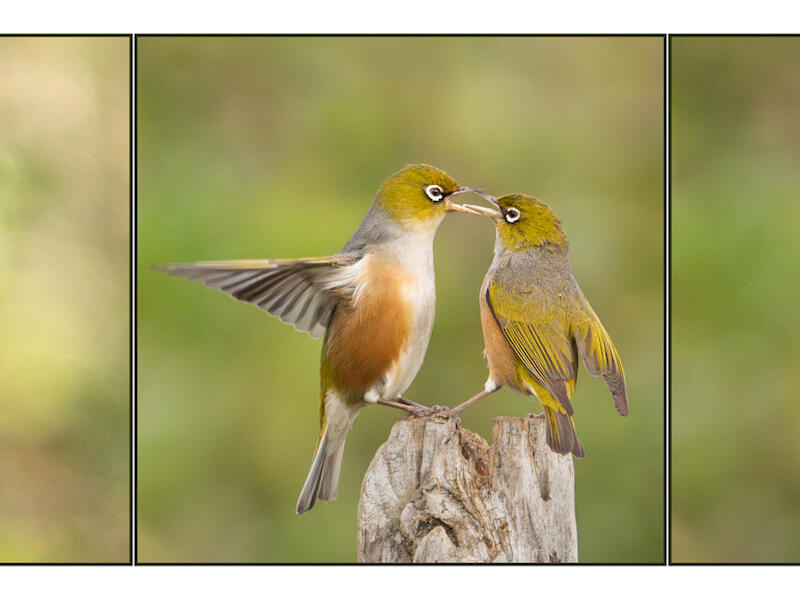
Ruling the Roost - I love these little birds and the ways they interact. The first image captures so much character in the bird and then there is the confrontation. A well executed story. The birds are sharp with lots of detail in their feathers showing the birds to advantage. The background being blurred separates the subjects from the background. The colours are balanced across all three images. I like the way there are fine lines between the images and then the white frame around them. around them. The paper shows the birds well. Honours
Share:


